HOME BAR/DINING (LOUNGE) ADDITION: constructioN

Here is a 2017 view of the back of our house. As described elsewhere on this site, this balcony and deck assembly (which is not original to the house) was improperly anchored to the brick façade/veneer rather than the structural brick. As a result, over the years, the porch and deck began pulling away from the house and, in the process, damaging the brick veneer. This damage was misinterpreted by many before us as structural damage.

We jacked up the upper deck using car jacks, which remained in place from 2016 until we began work in October 2020. At some point in 2017, we determined repair of the rear wall veneer was infeasible, both economically and practically. We therefore decided, in lieu of repairing the veneer, we would add a four season room.
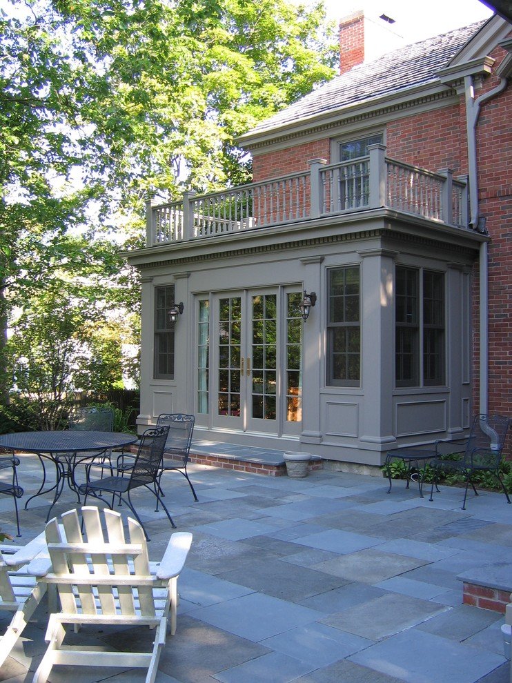
This photo, which we found somewhere on Pinterest, is the inspiration for the four season room.
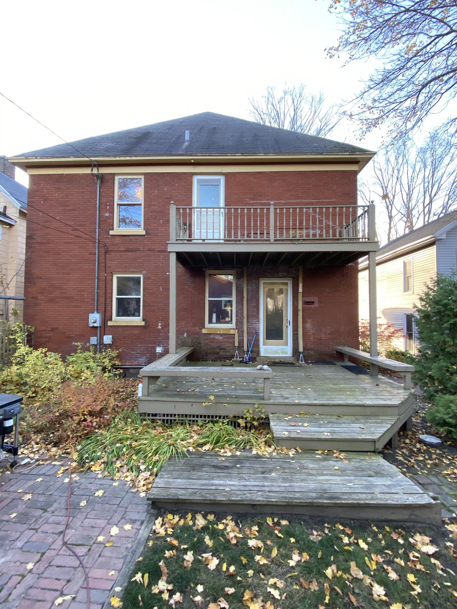
This is how the property looked in October of 2020 when we commenced work. In total, construction of the room as a drywalled but untrimmed "blank slate" would take about nine months, and then completing the "finish" work/decor would take another seven months (about a year-and-a-half total).
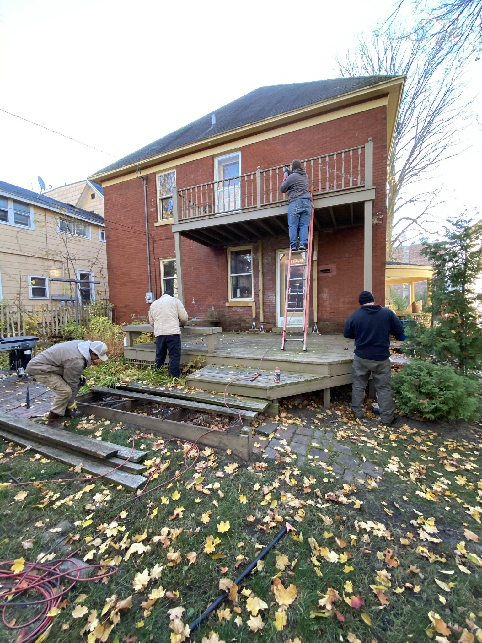
Here we have the crew demolishing the porch and upper deck.
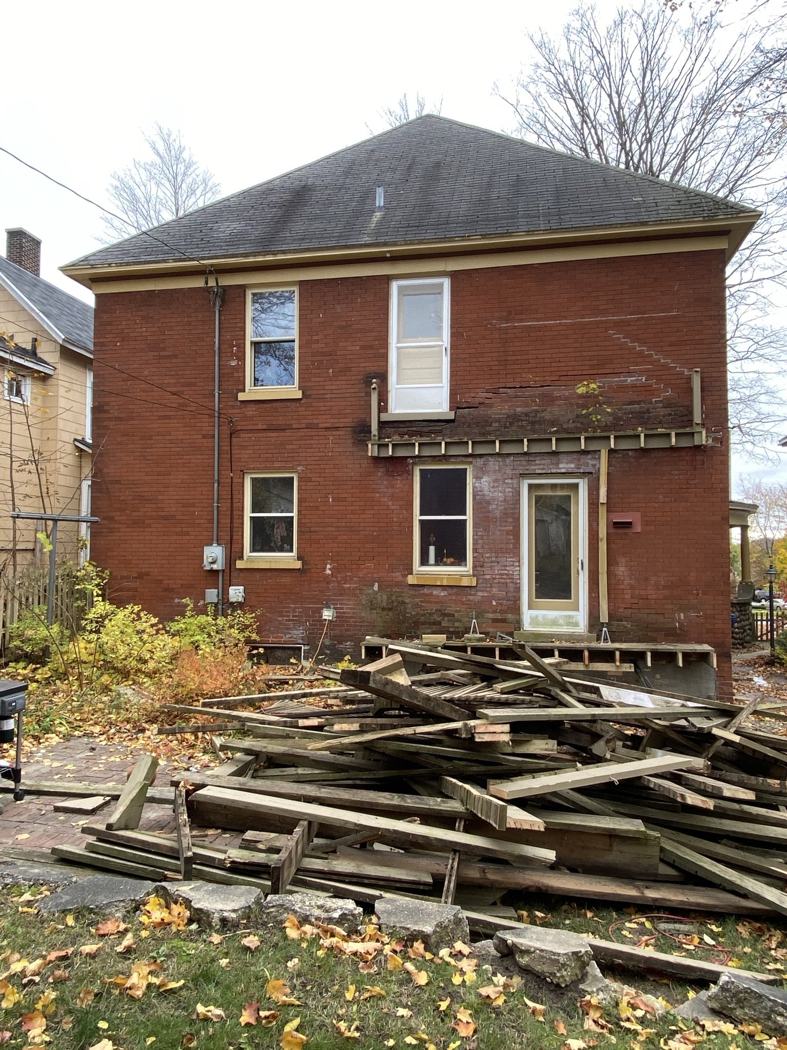
It only took a few hours to tear all this terror off.
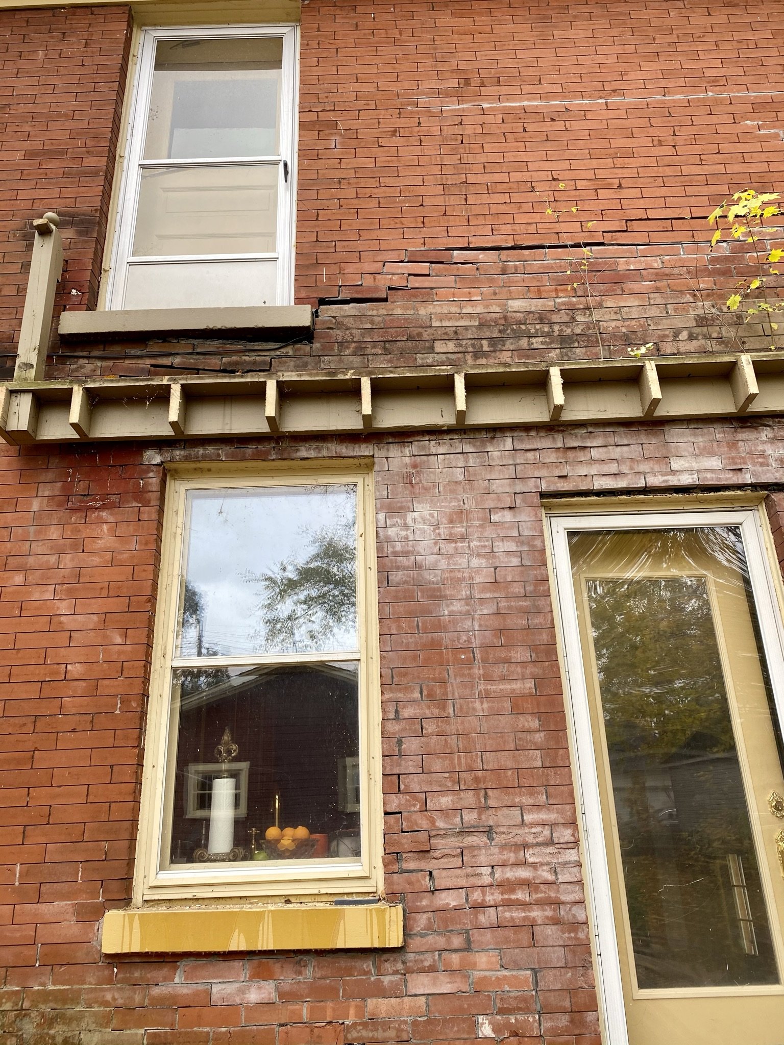
Close up of the damage to the brick veneer (and the maple tree growing out of the wall).
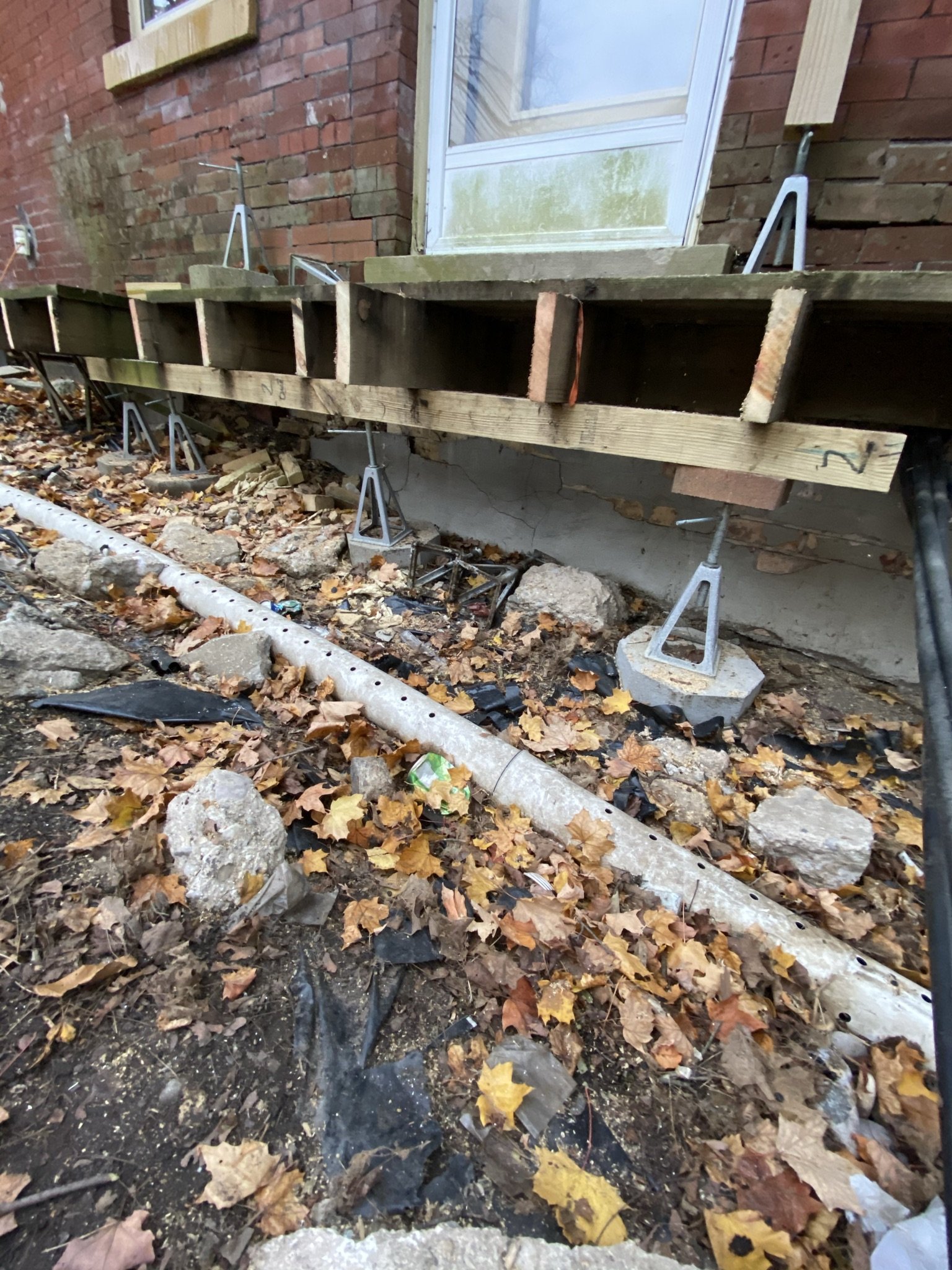
We still needed jacks to hold up the threshold.
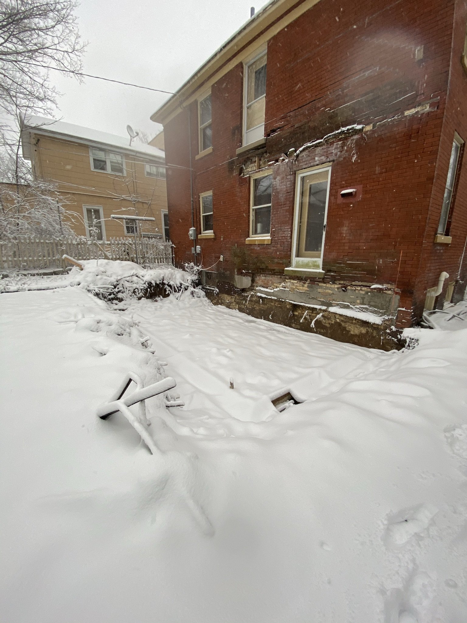
After demolition, the project was at a standstill over the holidays and we were left with a snow-filled hole. The door you see here leads to the kitchen. To the left of the door is the window over the kitchen sink, and the window to the left of that is in the butler's pantry. The downstairs powder room is to the left of the butler's pantry.
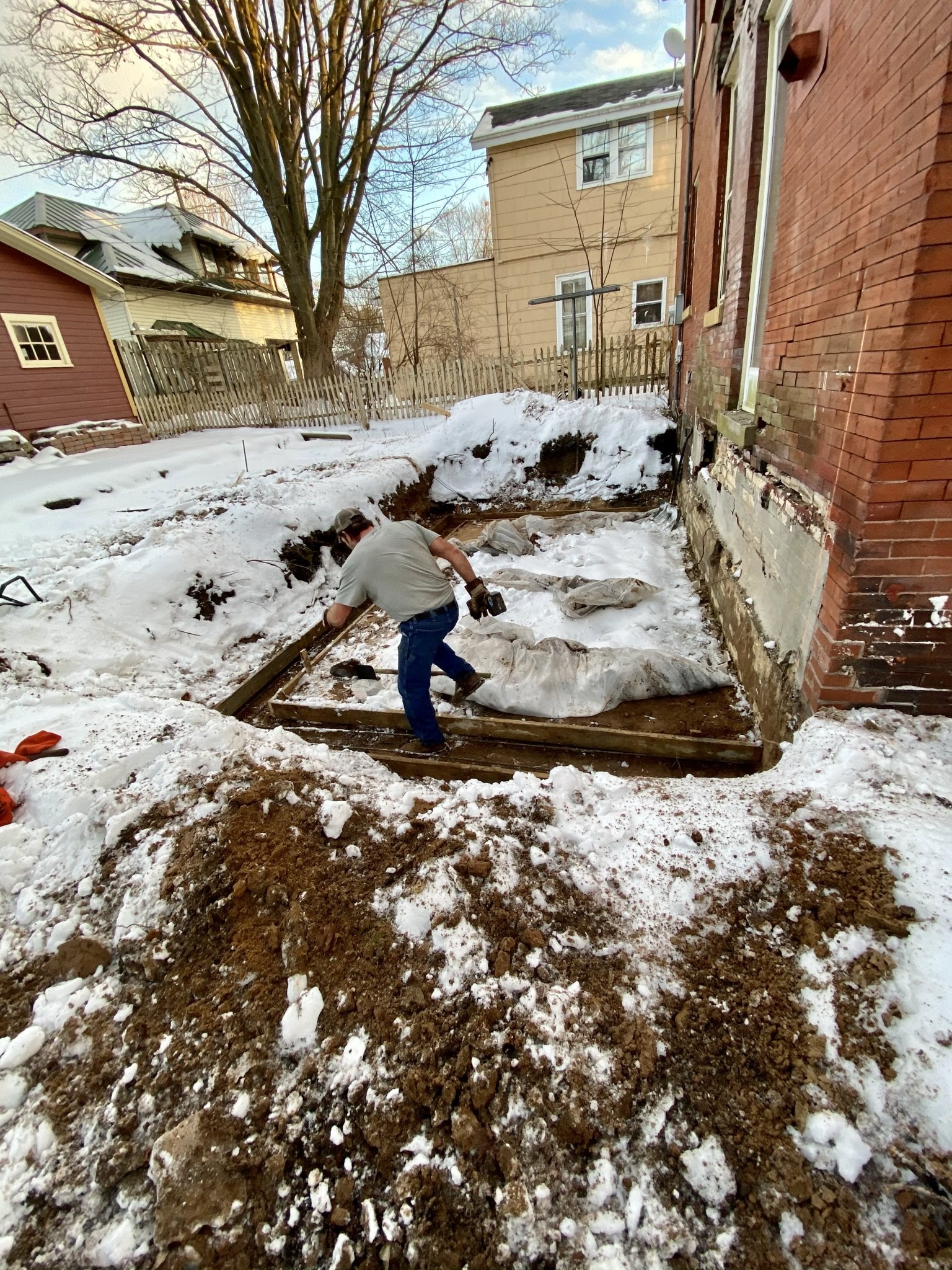
Work re-commenced in January 2021, with the concrete subcontractor pouring the shallow basement under the room addition.
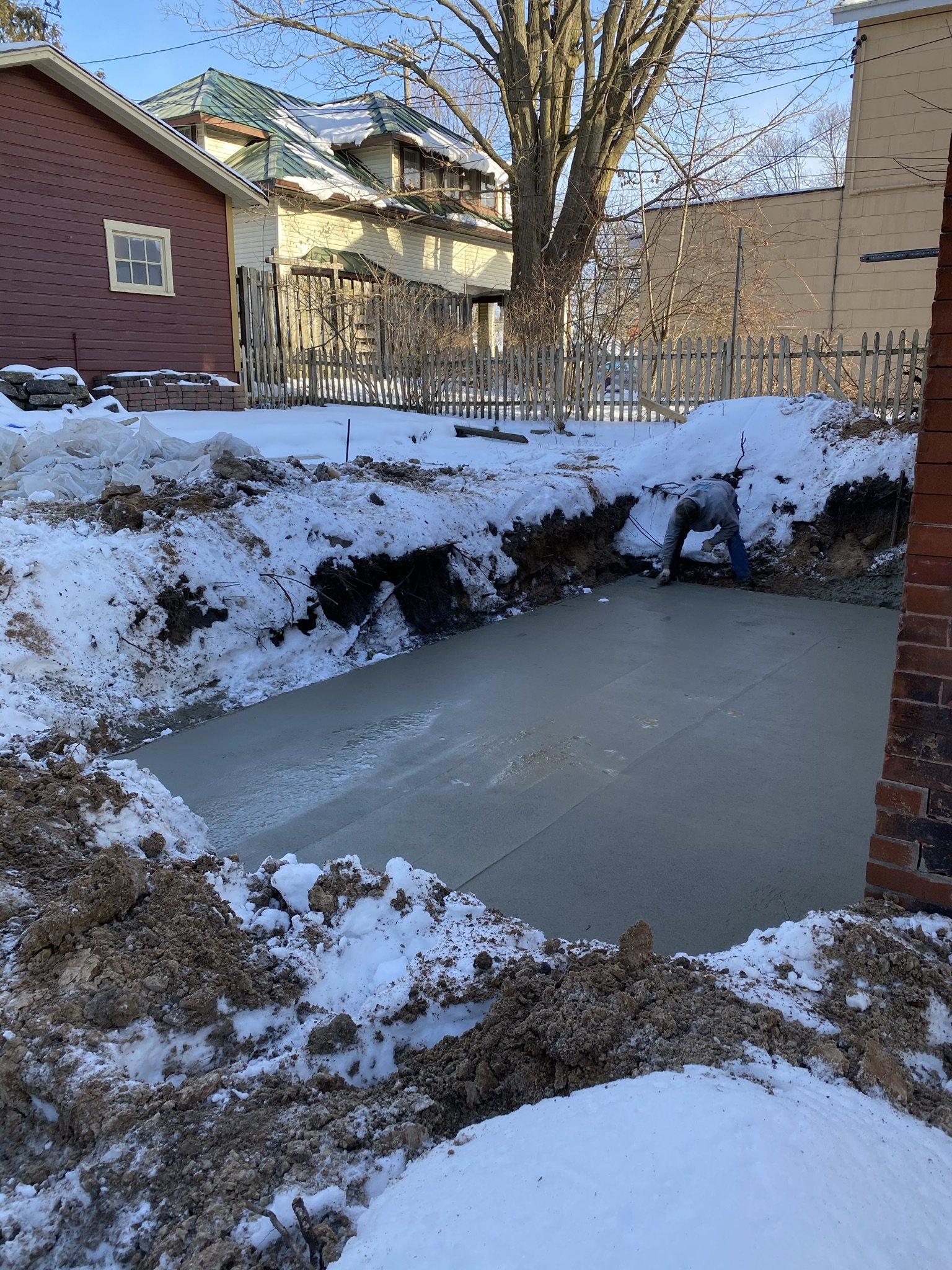
And we have a slab.
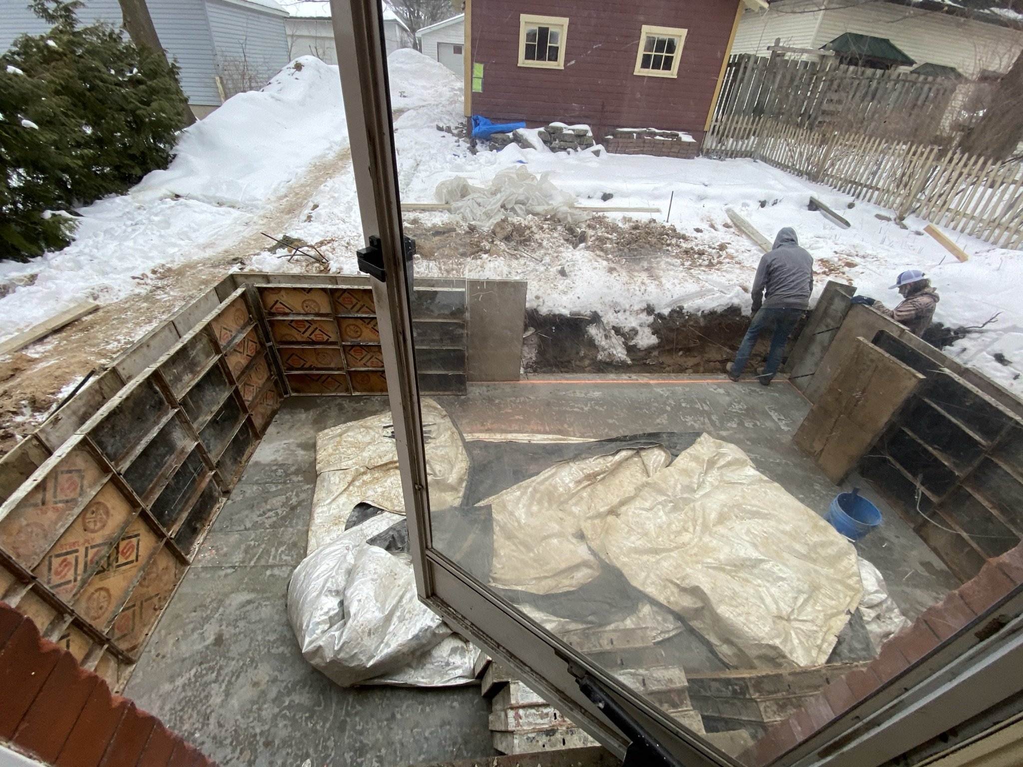
Next step is the forms and pouring the basement walls.

Because the houses in our neighborhood are so close together, they had to bring the concrete in from the alley via a hose.
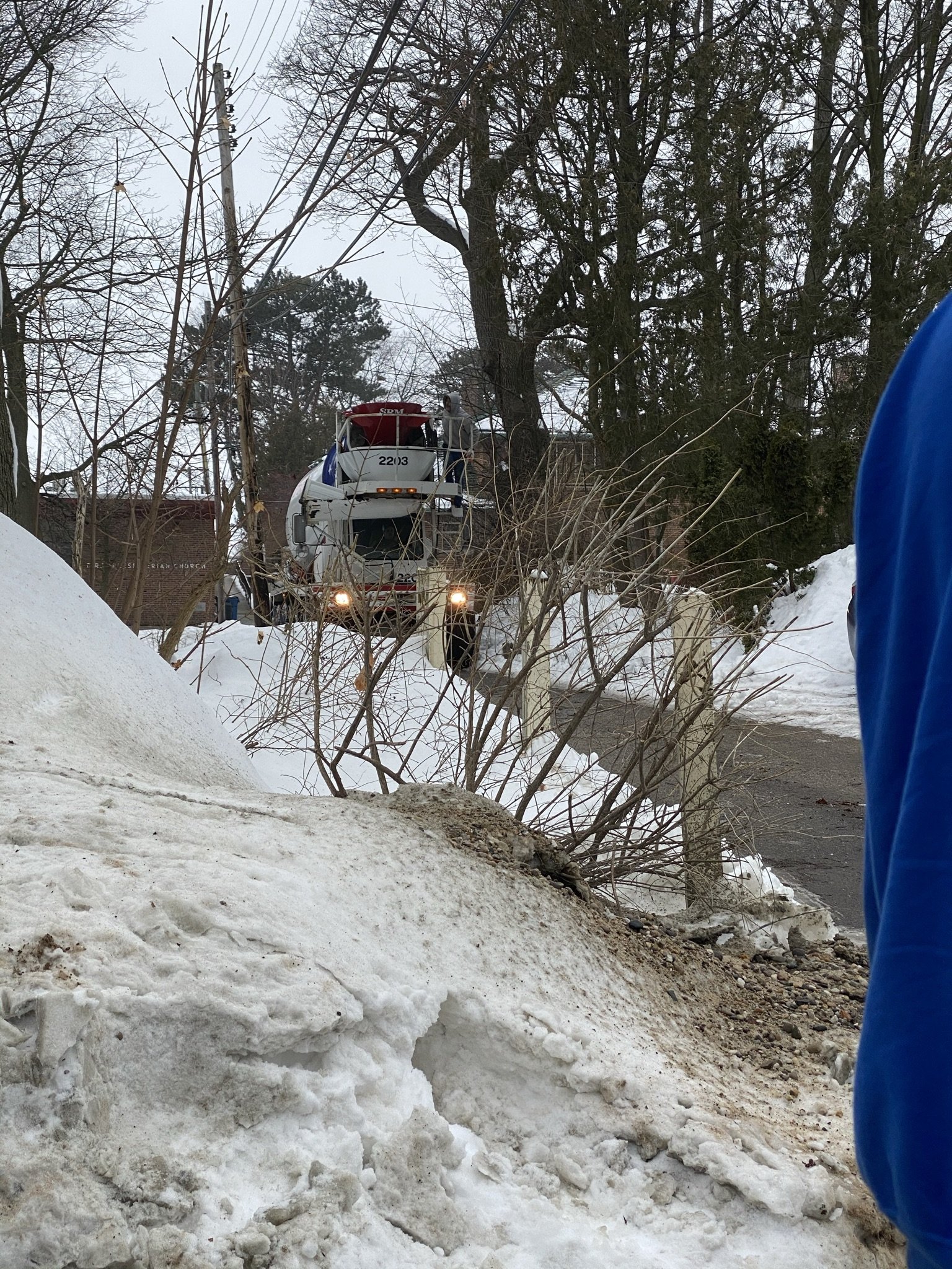
Here comes the truck! I felt like I was in a movie awaiting the arrival of a super hero. So exciting.
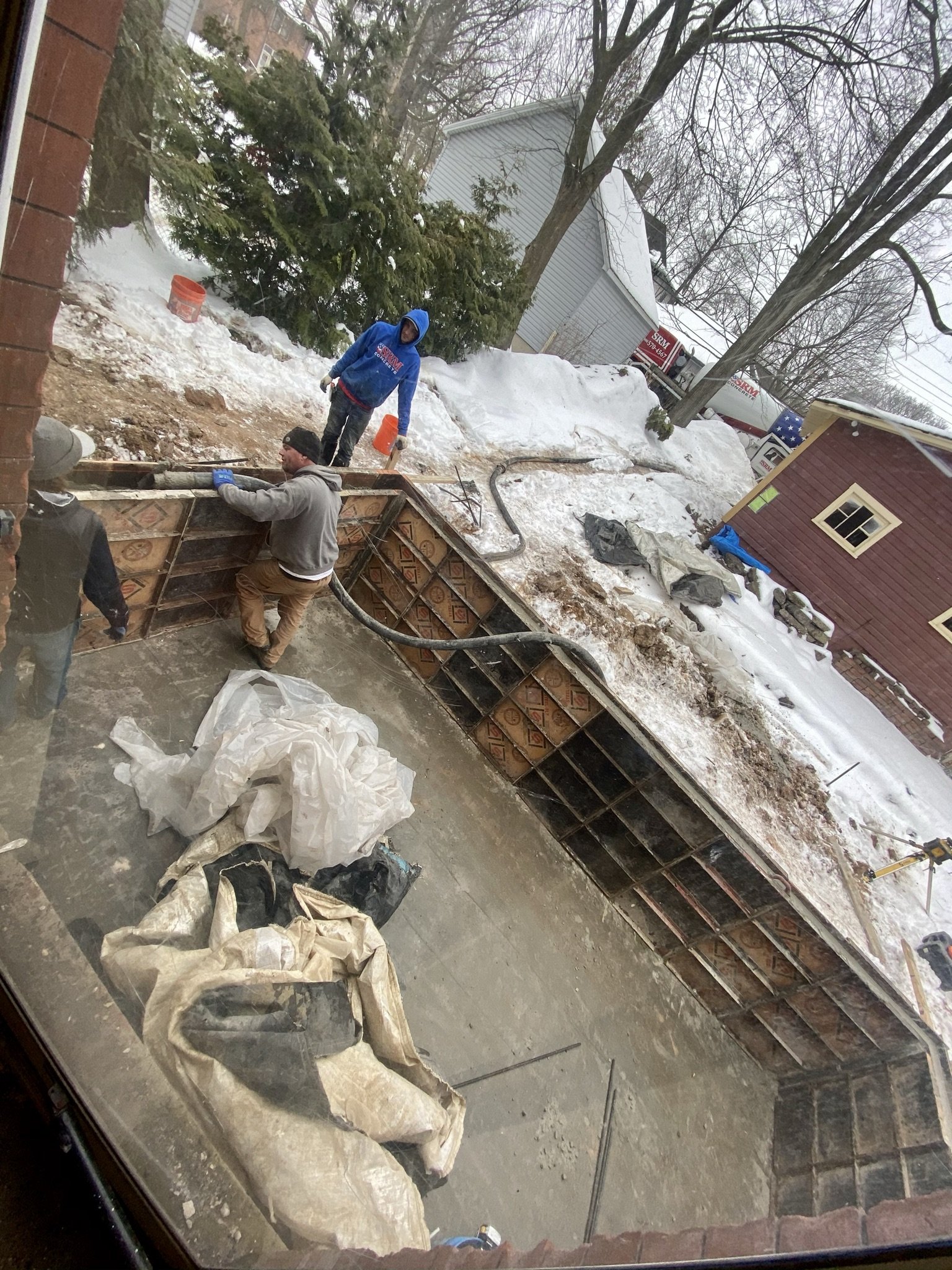
Here they are pouring the basement walls. This basement, of course, is not tied into the existing/original basement underlying the house.
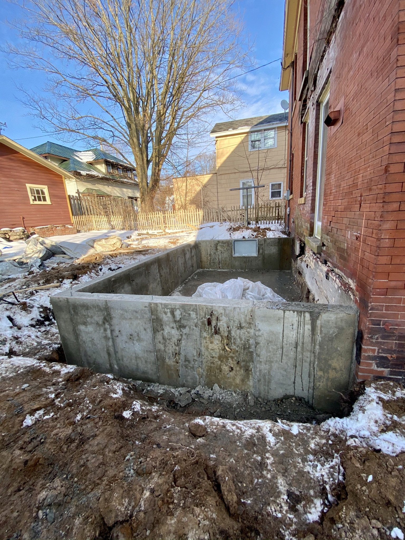
And we have basement walls.
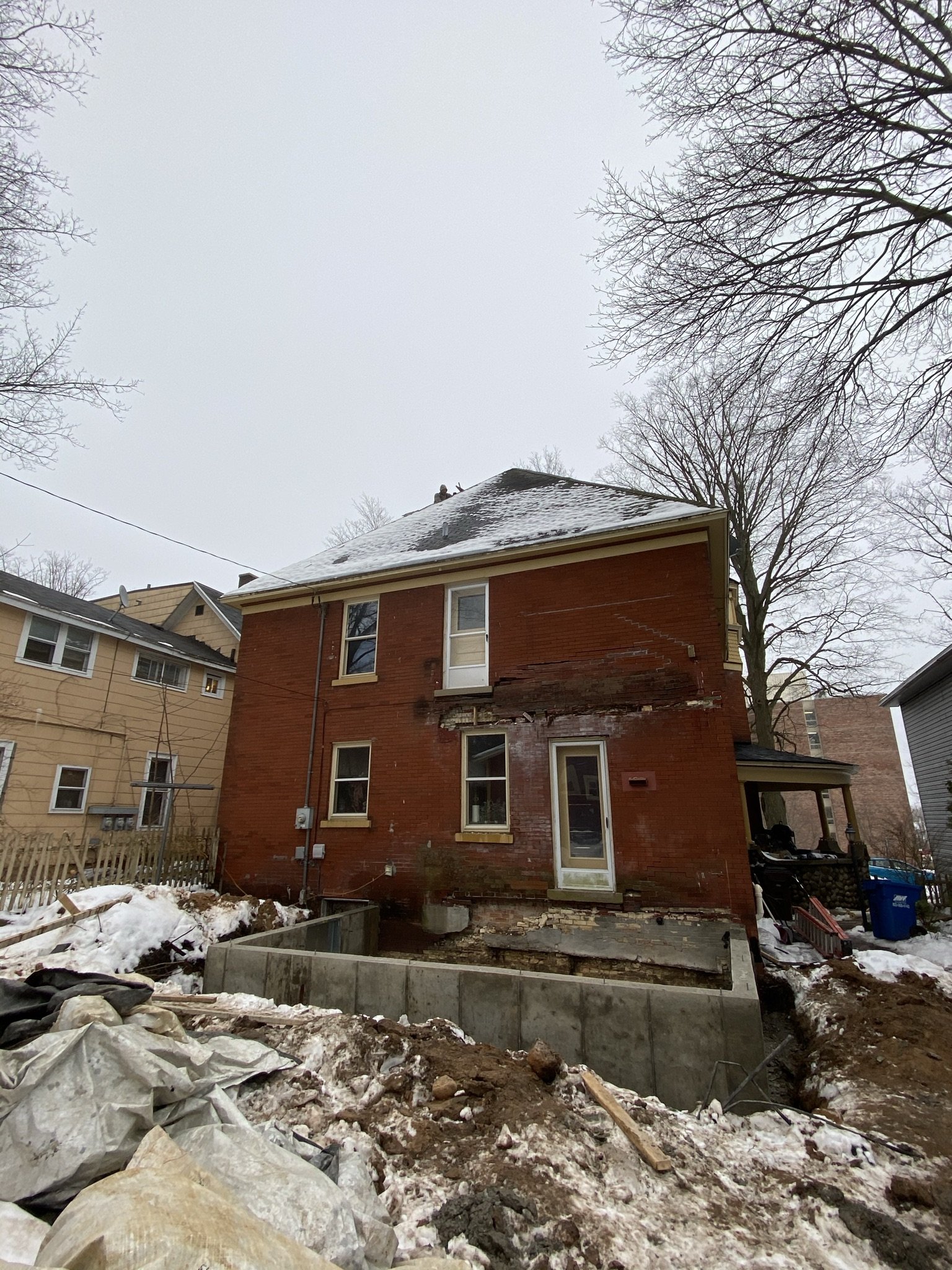
The room addition footprint is 12 x 20 (compared to the demolished deck and porch assembly, which was 16 x 26). Of course, we had approval from the Historic Districts Commission for this project.
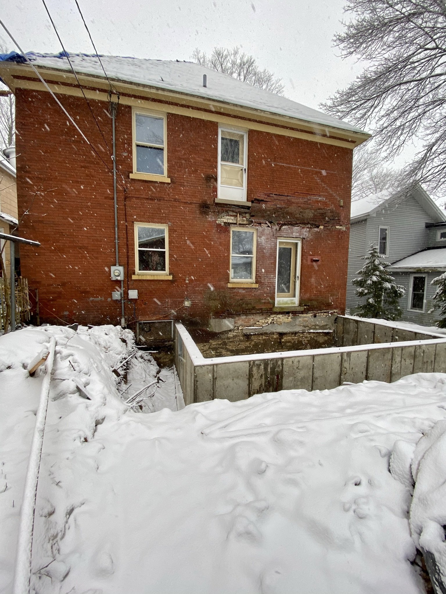
The corner formed by the new basement under the butler's pantry window unfortunately is now an area of flooding into the basement under the house, as the contractors removed the well surrounding the existing basement window. We are awaiting a fix to this problem that doesn't involved multiple tarps. That hopefully will happen in 2023 in conjunction with the landscaping.
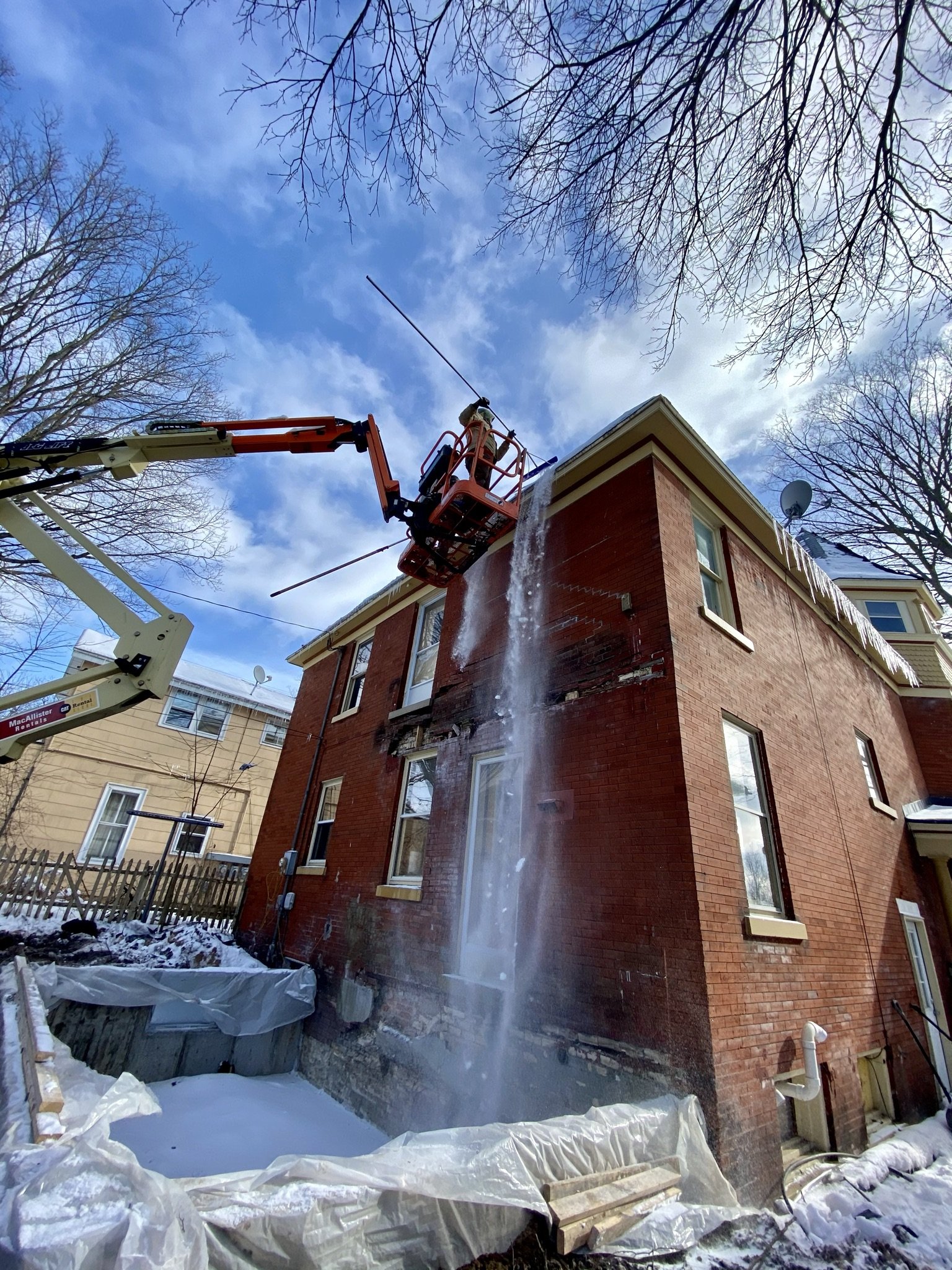
As of late January, the crew was also re-roofing the house and would soon be starting the attic conversion. Here, they are clearing snow from the roof in preparation for installing the roof jacks.
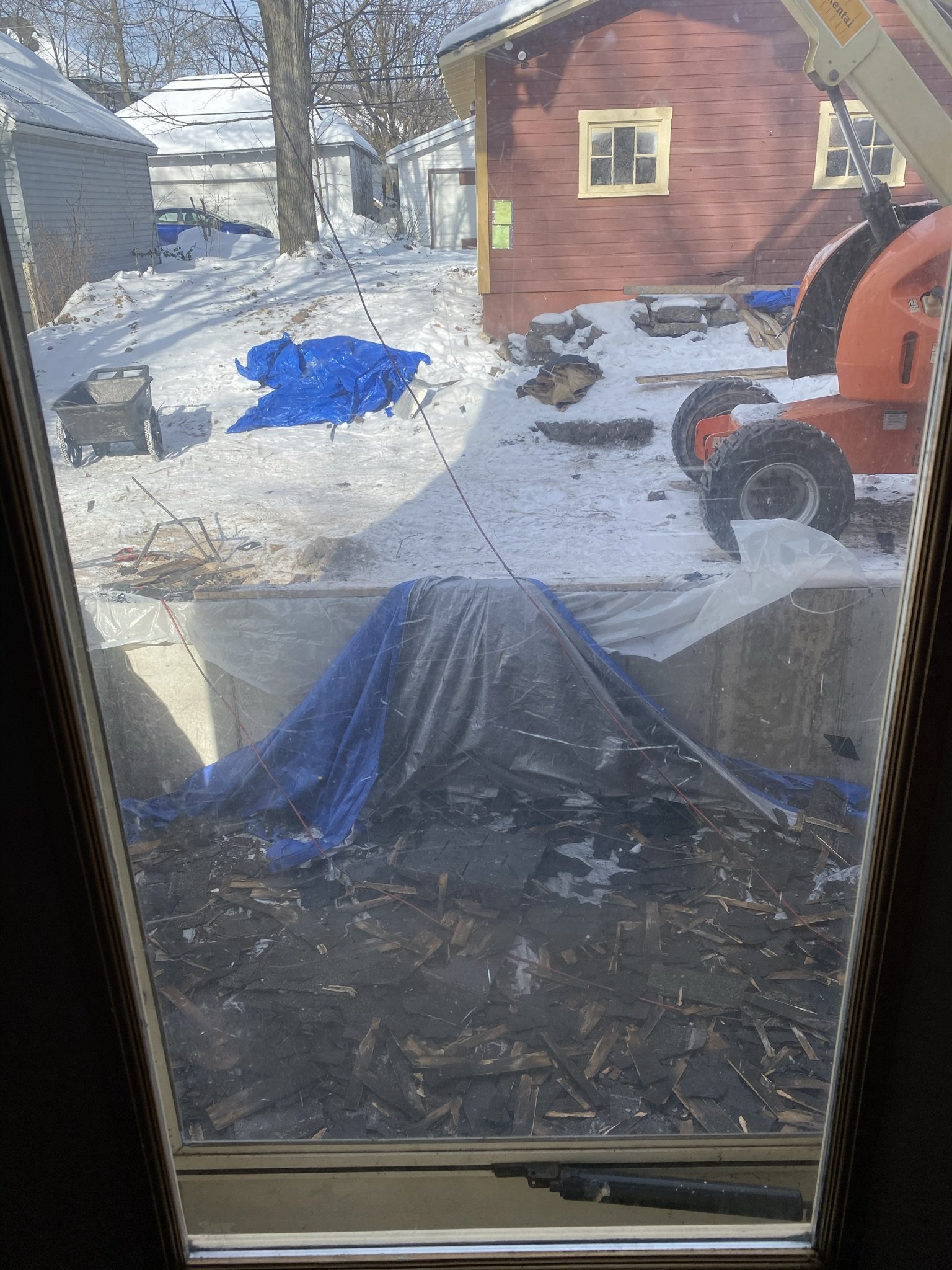
Looking out the kitchen window on January 25, 2021, the basement of the future lounge addition is filled with decades worth of shingles.
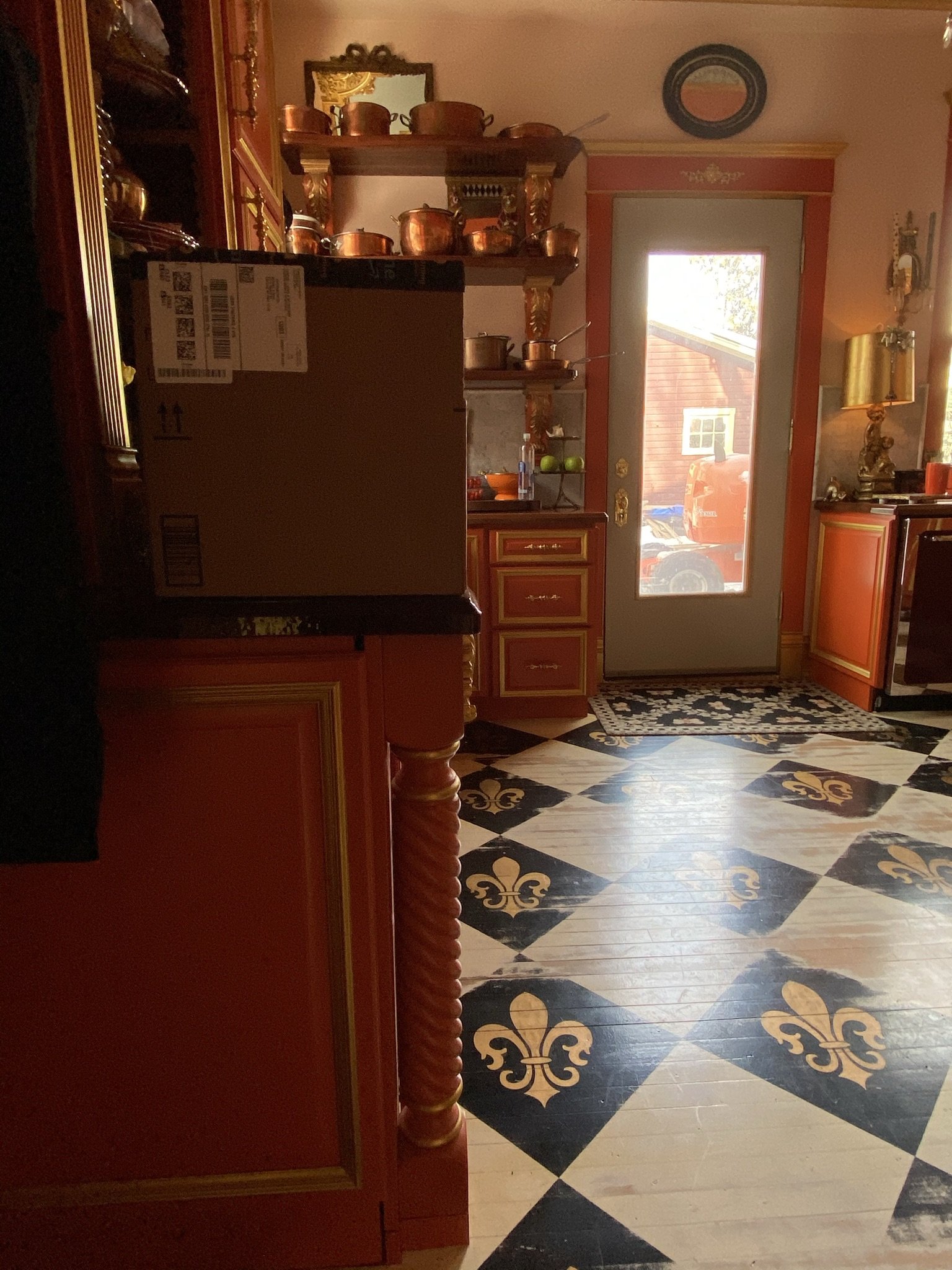
This is the view through the kitchen from the top of the basement stairs looking at what will be a pass through into the lounge addition (out the kitchen door). At some time during the build out, we decided to use the new room as a combination dining room and home bar. We sometimes refer to the new room as the lounge.
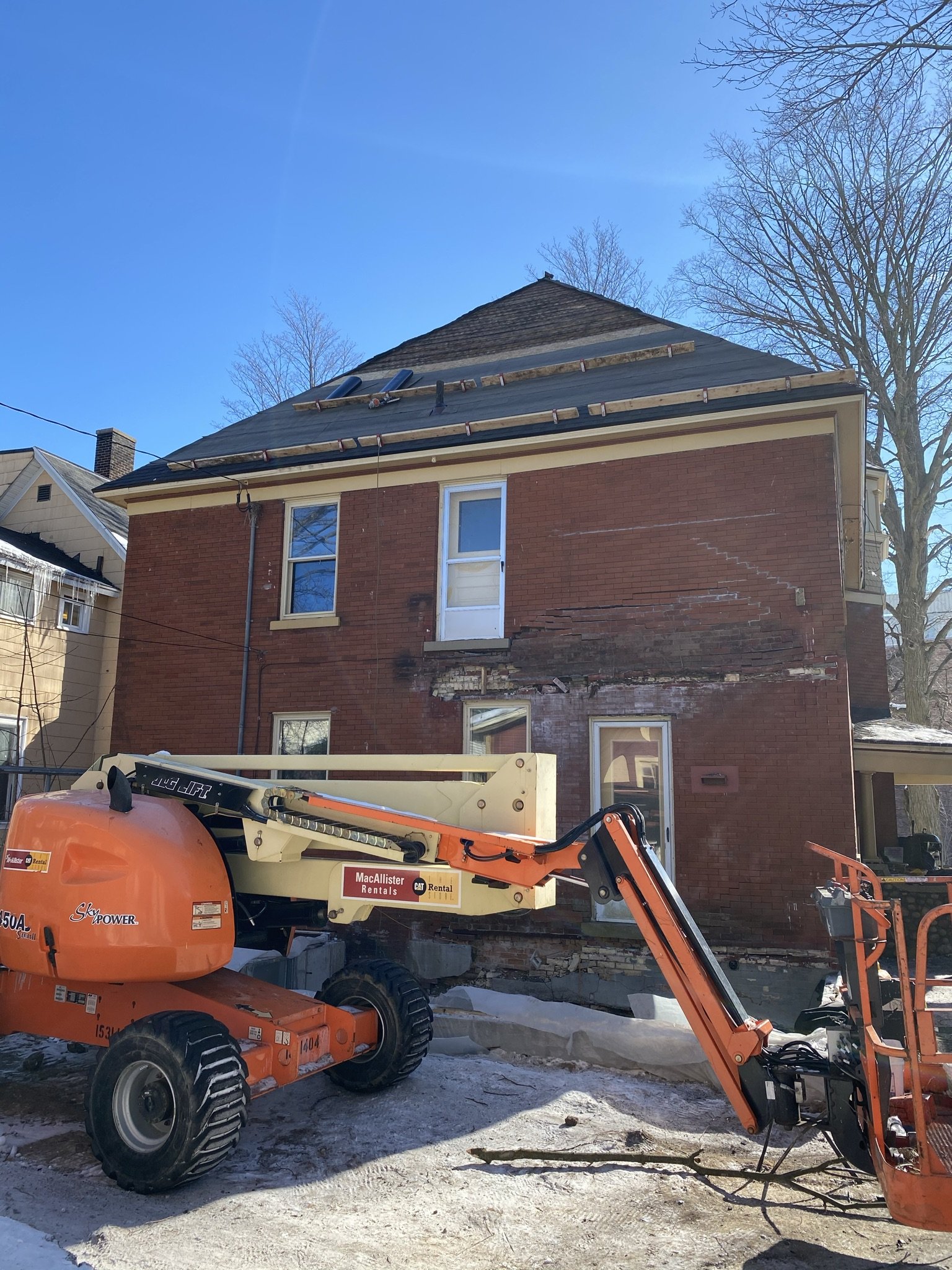
Here, we have some of the roof jacks installed. There ultimately will be a dormer popped out over the second-floor door. This door will lead to a deck over the lounge addition.
During construction, which went on for a year (and still isn't tied up two years later), the house was constantly being doused in dust and dirt.
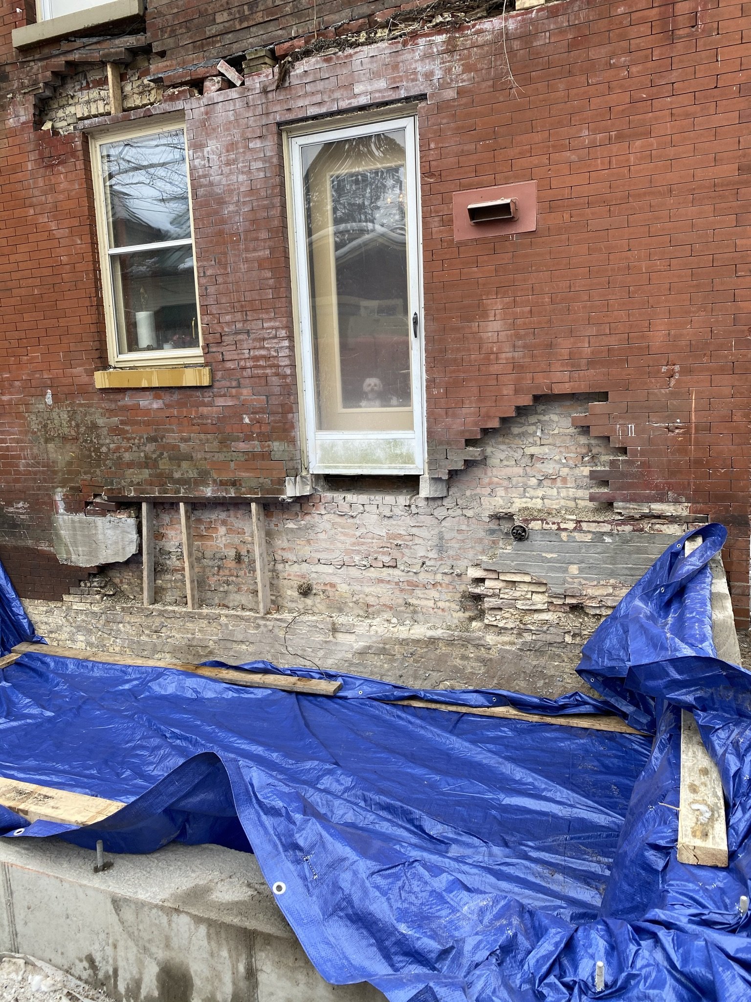
Another photo showing the extent of damage to the brick veneer. It looks terrible, but the damage is superficial and limited to the veneer.
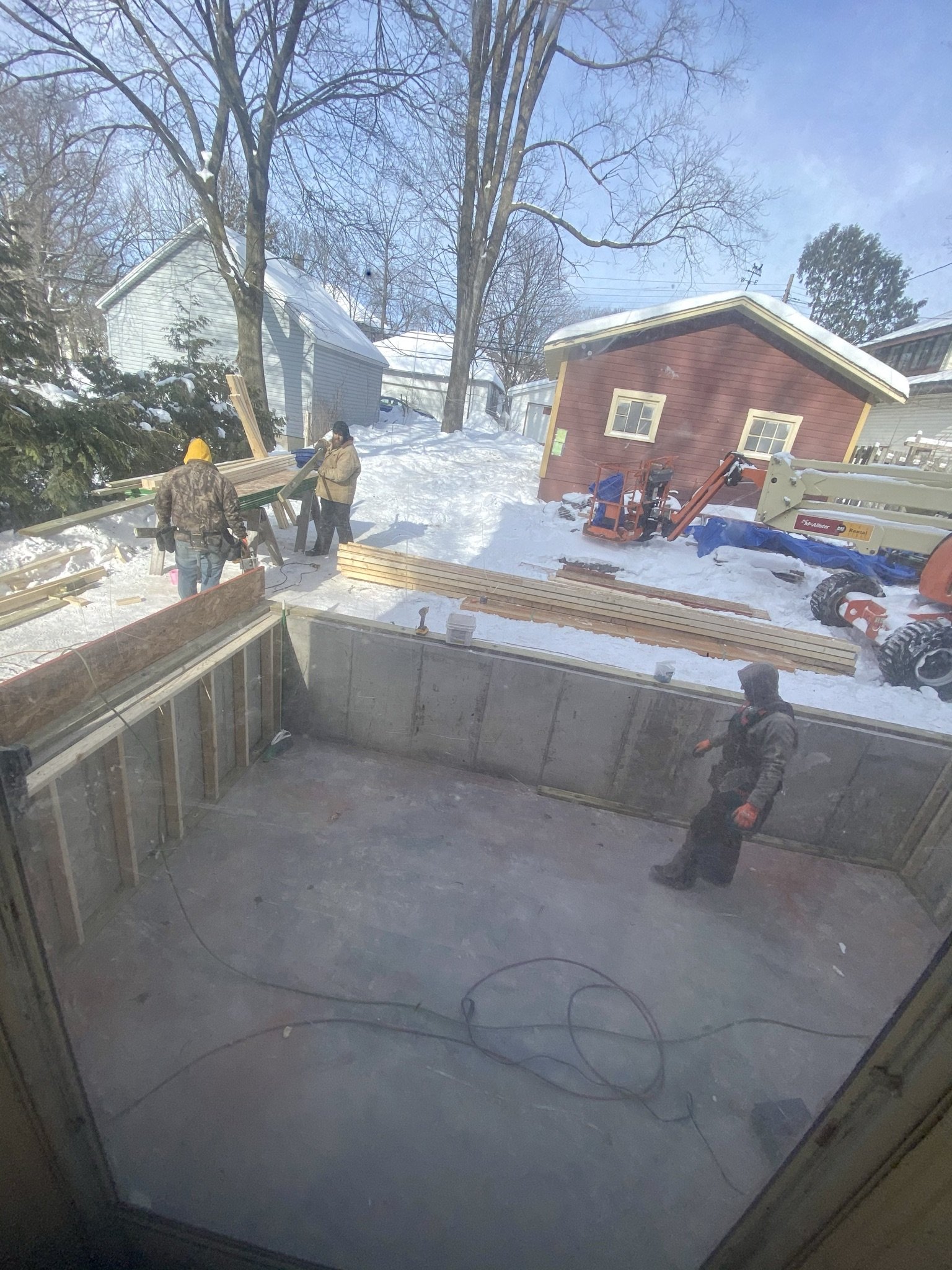
Here we are on February 9, 2021 with the crew preparing to build the floor of the addition.
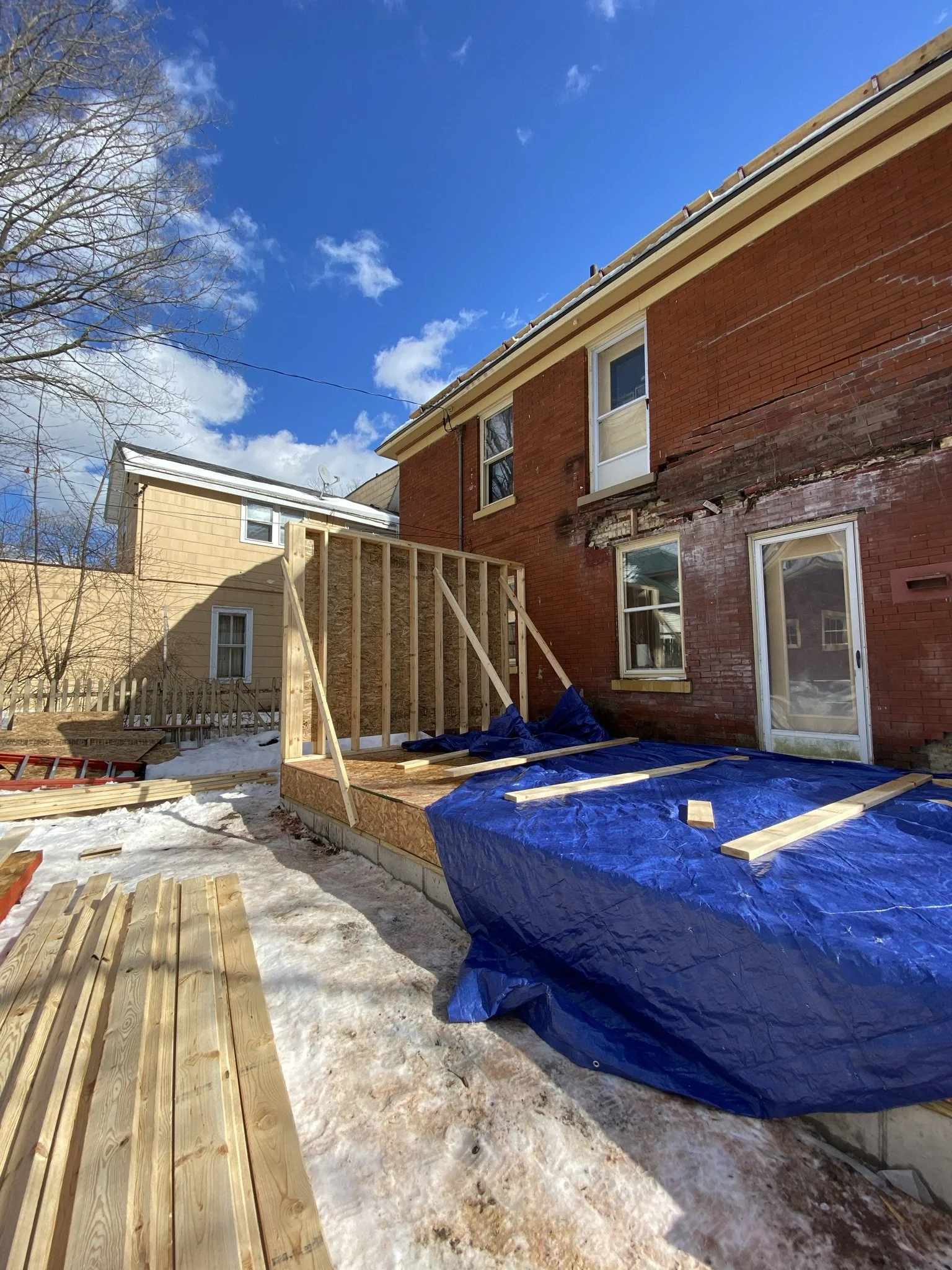
And by February 23, 2021 we had a floor and a wall!
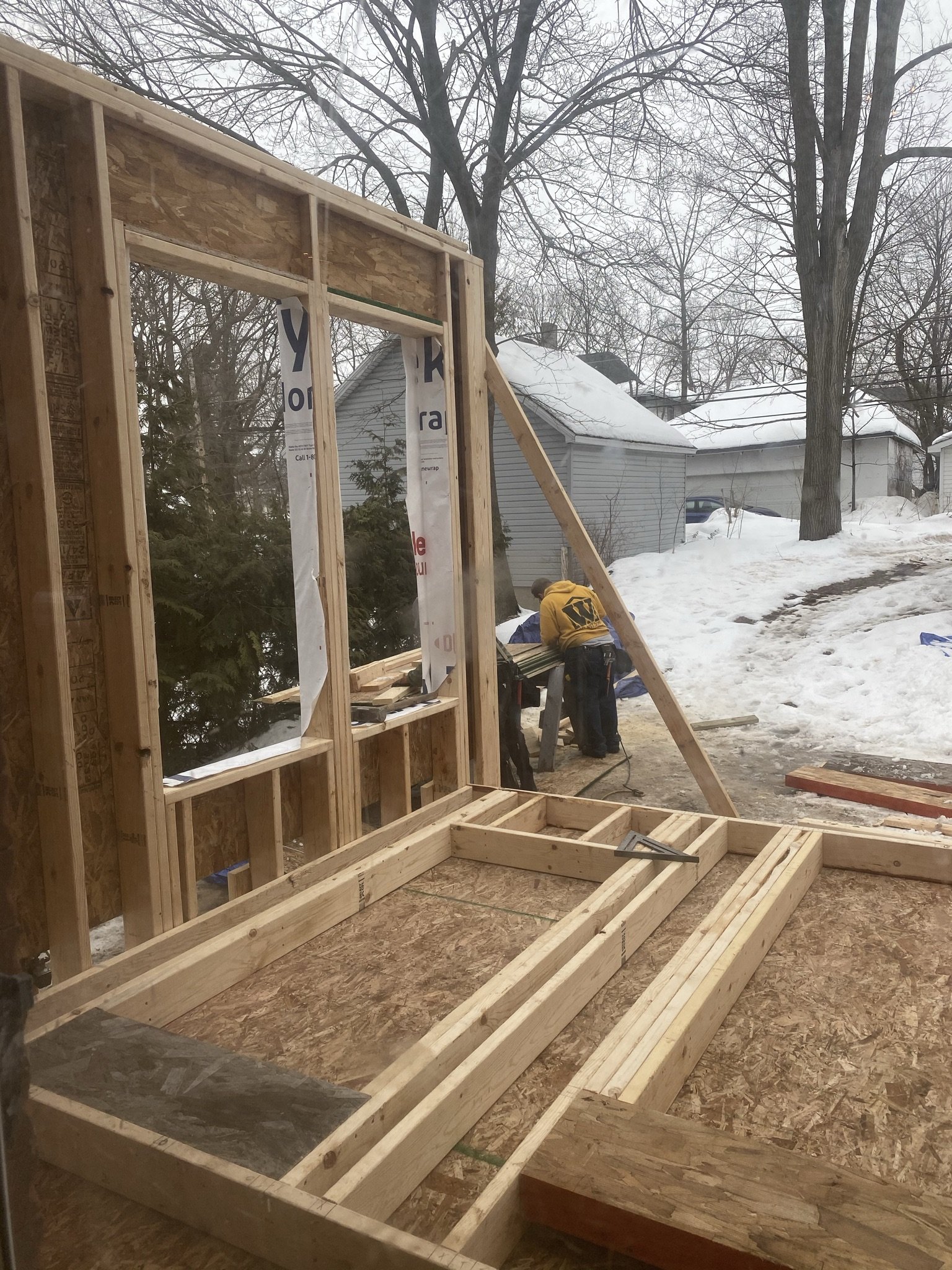
Walls and framing in progress. This view is from the kitchen door looking towards what will be the dining side of the lounge.
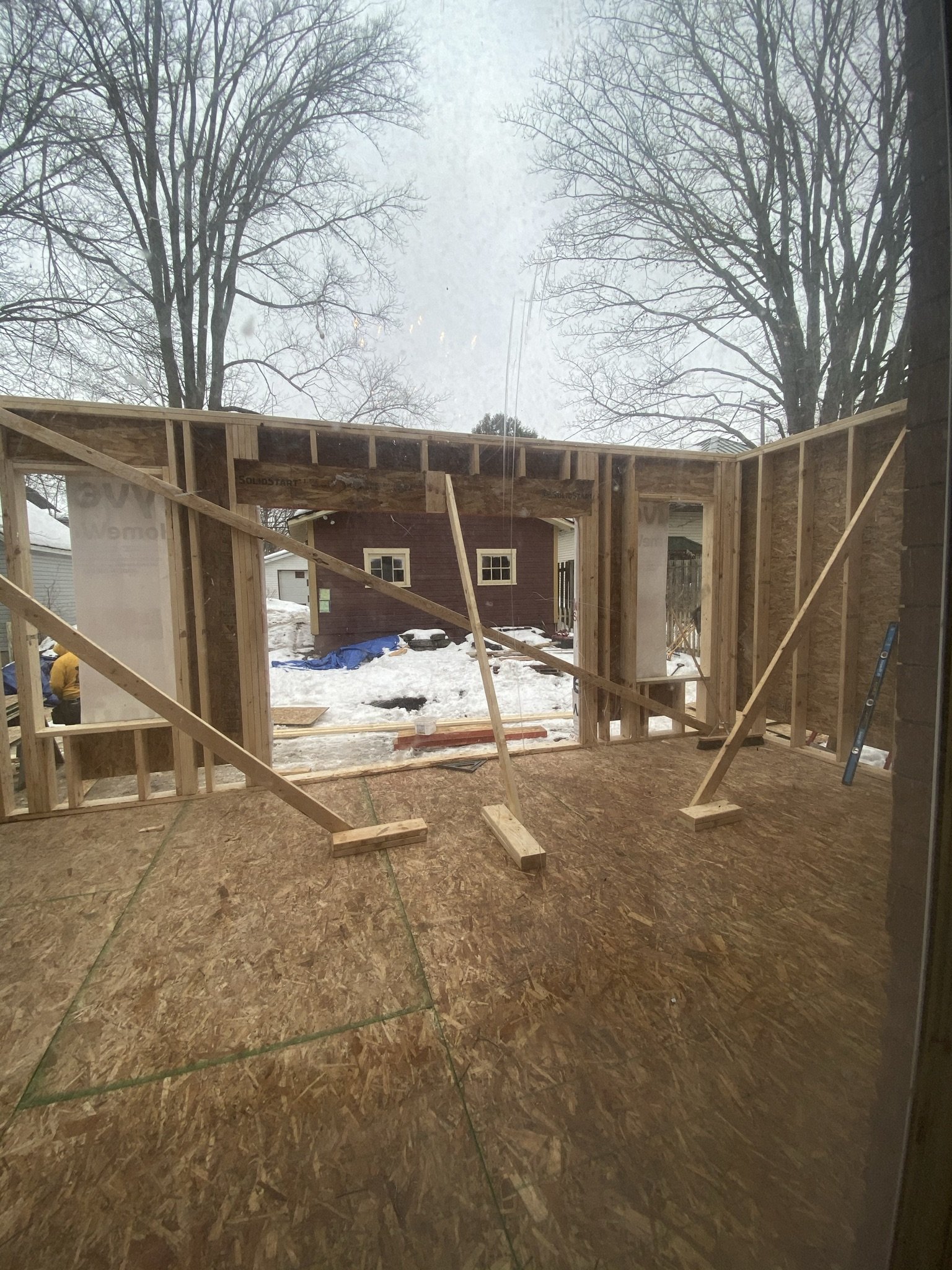
The view from the same vantage point looking straight out through the addition. The area to the right will be the bar side of the lounge.
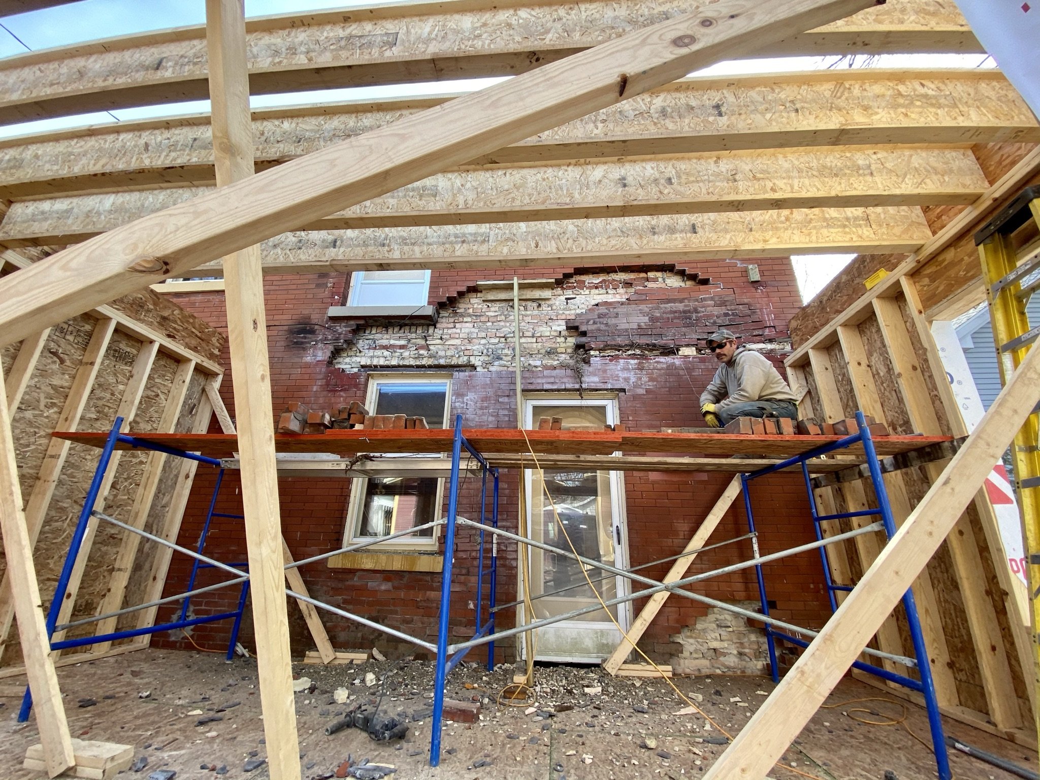
In the midst of this, the concrete subcontractor started "repair" of the veneer. The idea was to remove the damaged brick veneer in the area over the roof of the addition, which would be a deck similar (but larger) that the one which pre-existed construction. Undamaged brick veneer from the areas that would form the walls against the house would be relocated to the areas adjacent to the upper deck where damaged brick was removed.
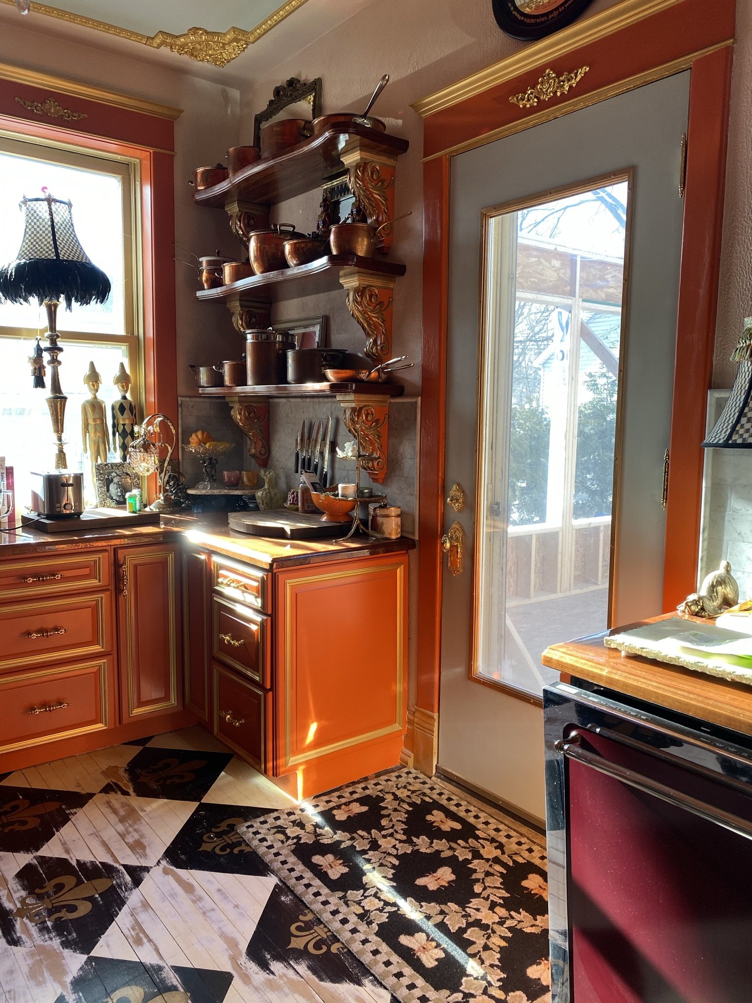
Here's the view of construction from the kitchen.
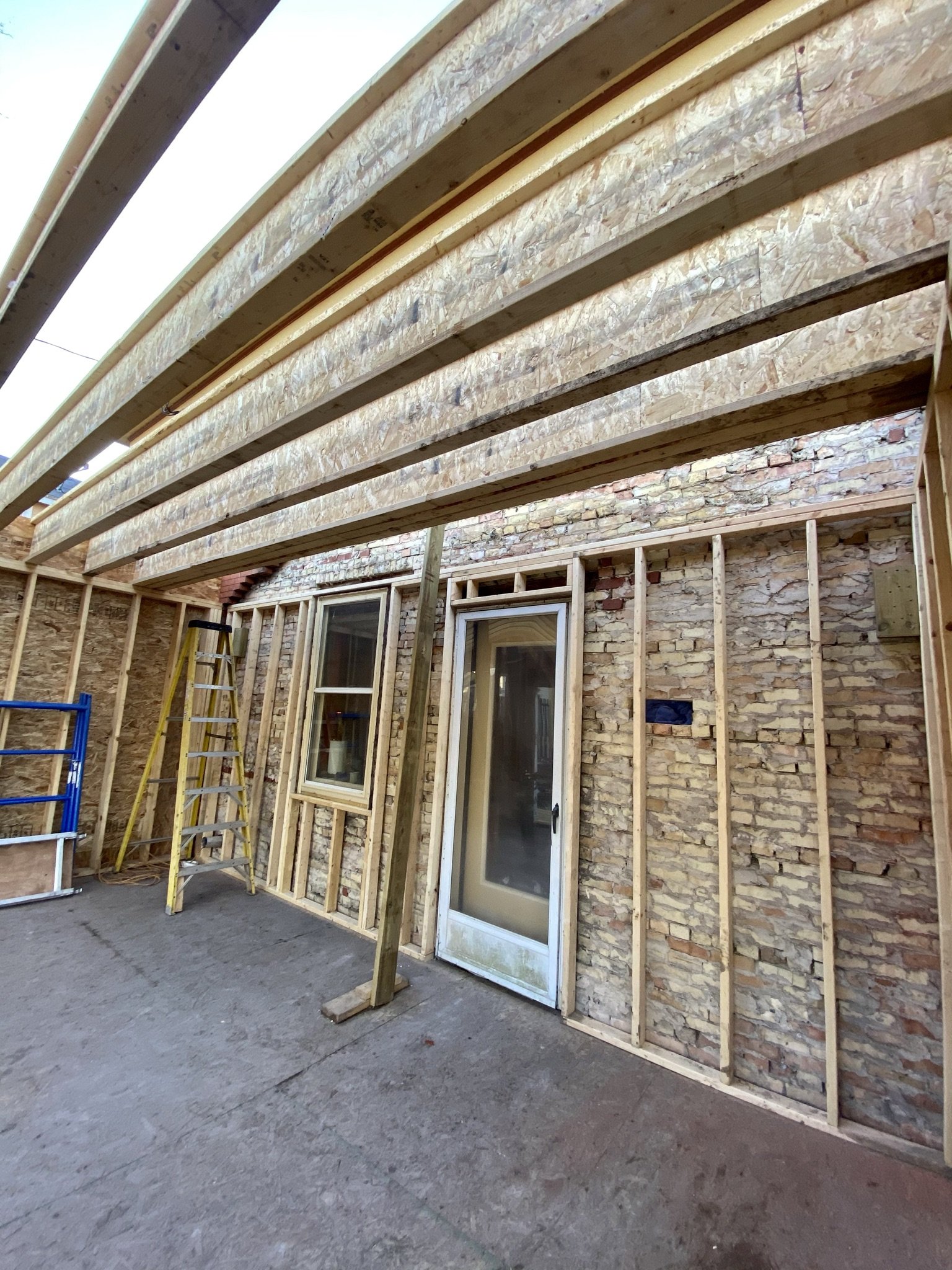
By March 12, 2021, all the brick veneer had been removed in the area behind the soon-to-be room addition walls, and some of the interior walls are framed. This view is from what will be the dining side of the lounge looking towards the bar side on the left of the frame and the kitchen entry in the middle of the frame.
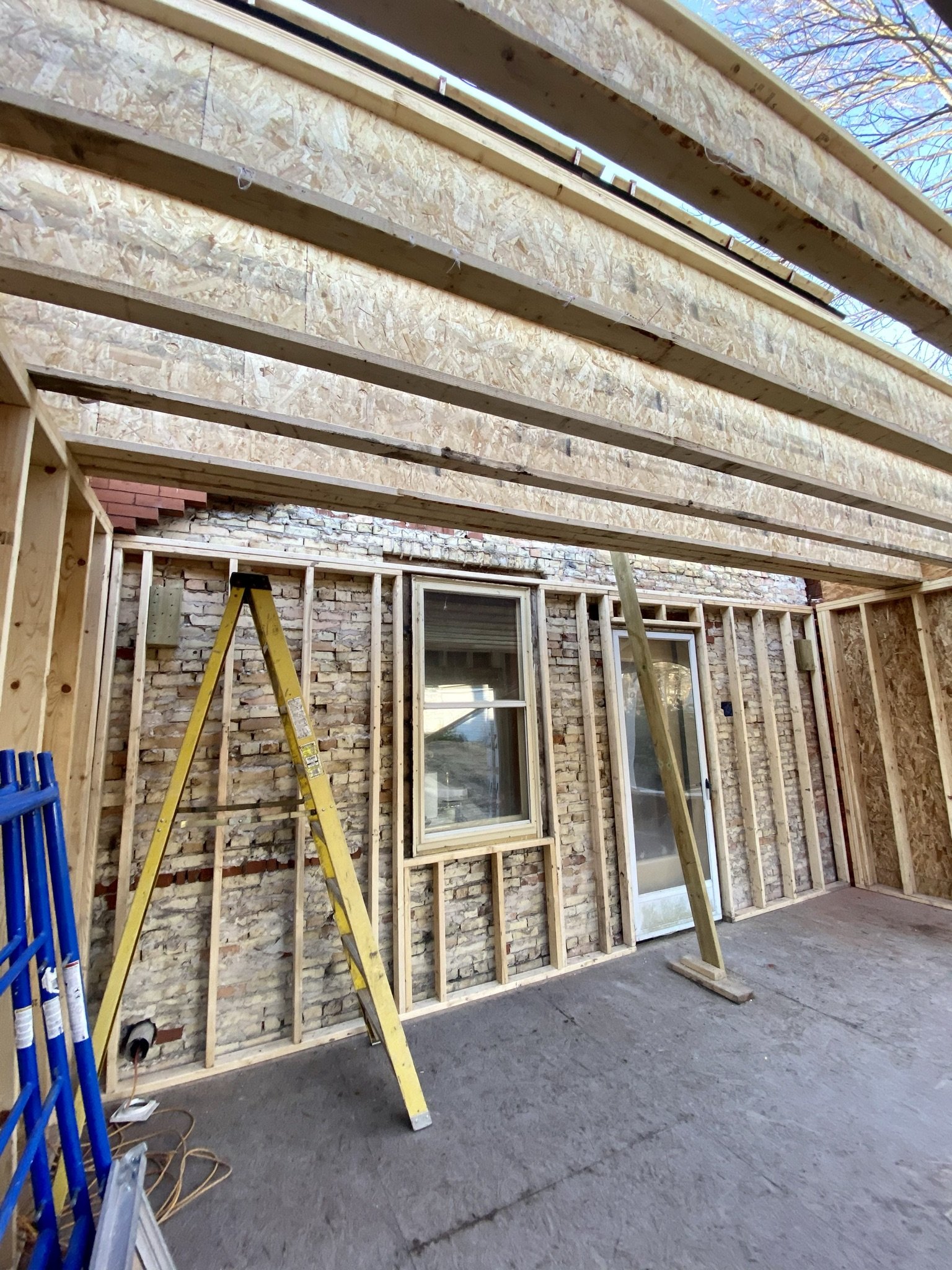
This picture was taken on the same day (March 12, 2021) from the bar side of the lounge looking towards the dining side to the right of the frame and the kitchen window in the middle.
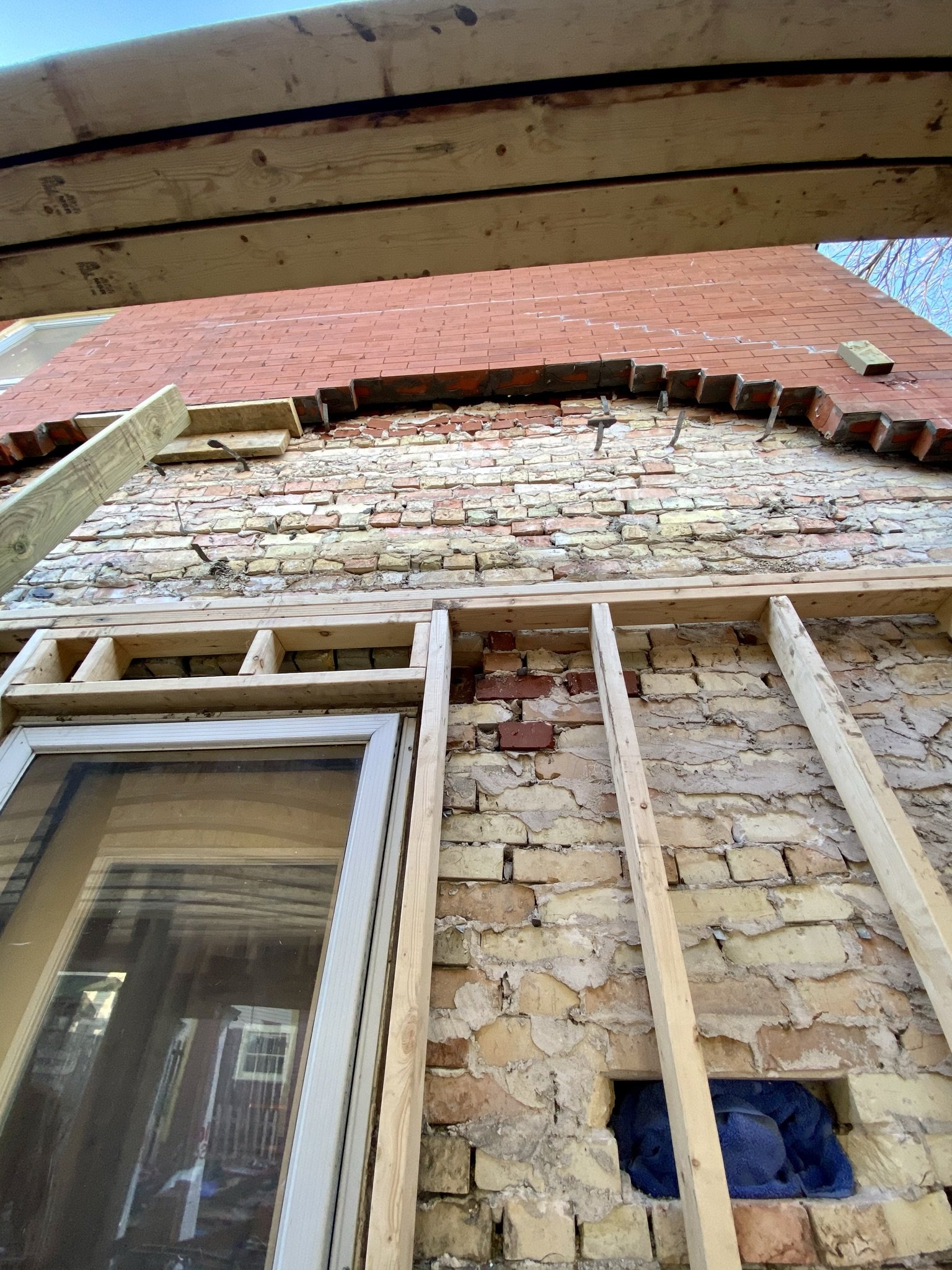
Looking up, this photo shows the state of the structural brick after removal of the veneer. As we expected, it was sound. Prior to building the roof, the contractors installed a support beam at the junction between the roof/upper deck floor of the addition and the house.
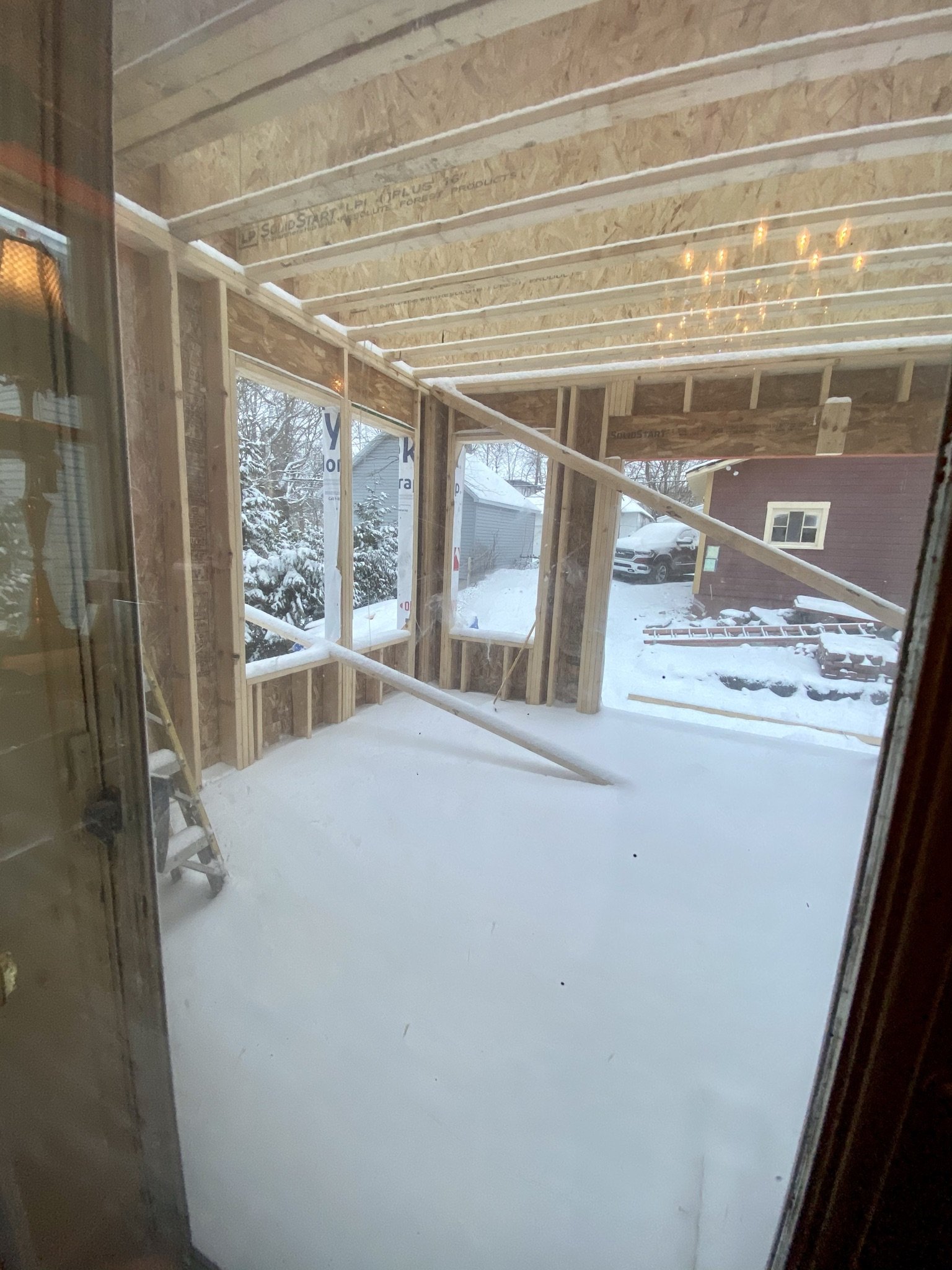
Four days later, on March 16, 2021, this was the view out the kitchen door towards the dining side of the addition.
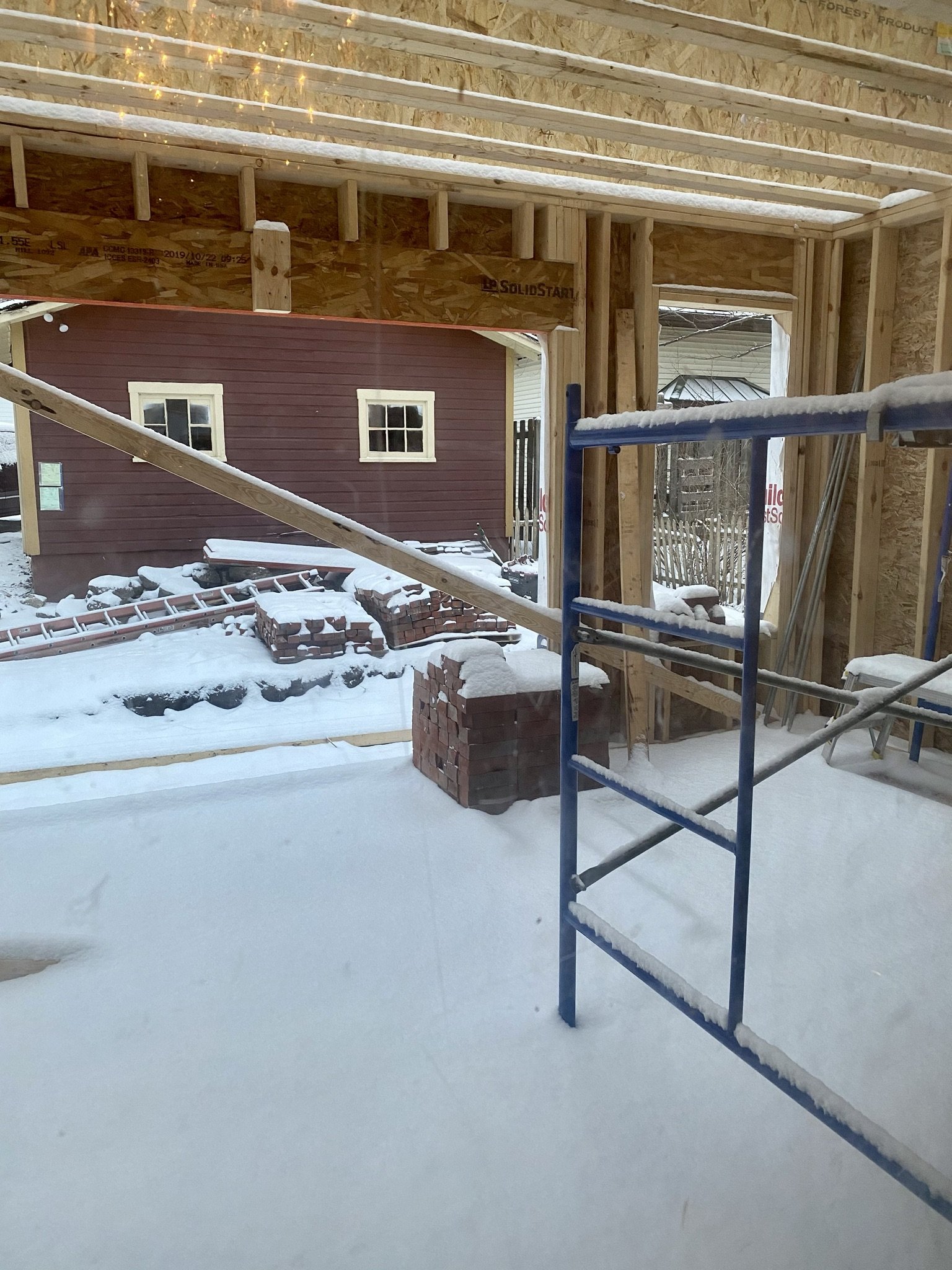
And from the same vantage point, this is looking towards the future bar side.
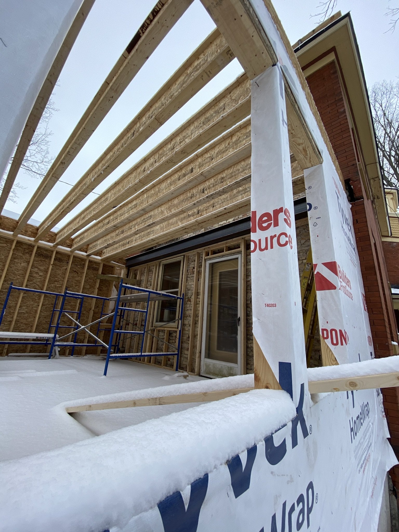
Here we are again on the west corner of the exterior of the addition looking towards the bar side and the kitchen.
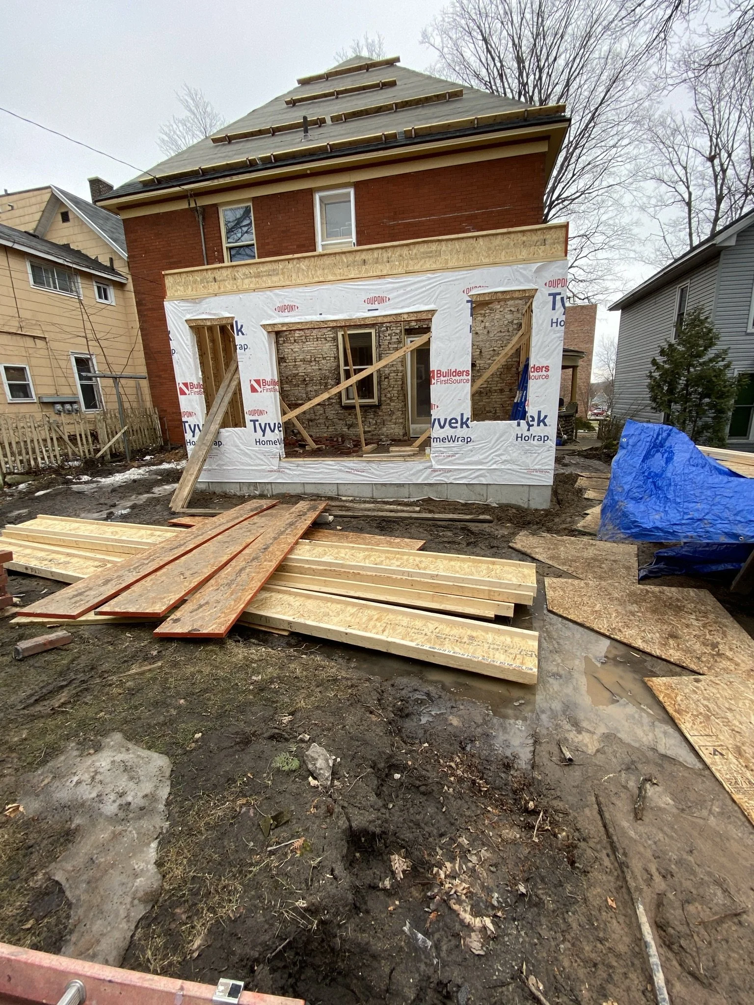
This is how the property looked from the garage just before opening the roof for the attic dormer.
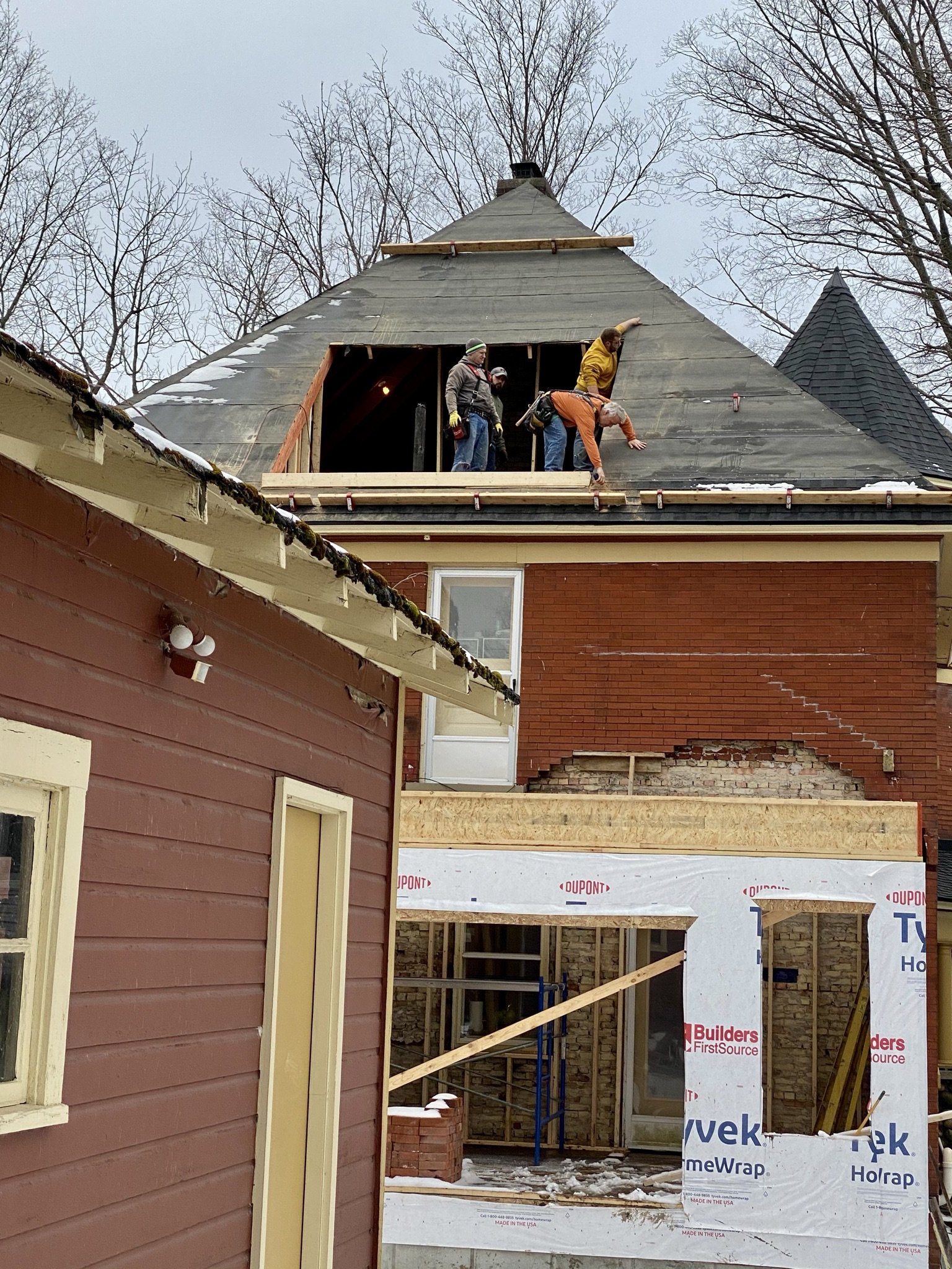
Here we are a day later, on March 17, 2021 with the crew opening the roof to build the attic dormer. The area directly beneath is the lounge and upper deck which is accessed from the exterior door on the second floor.
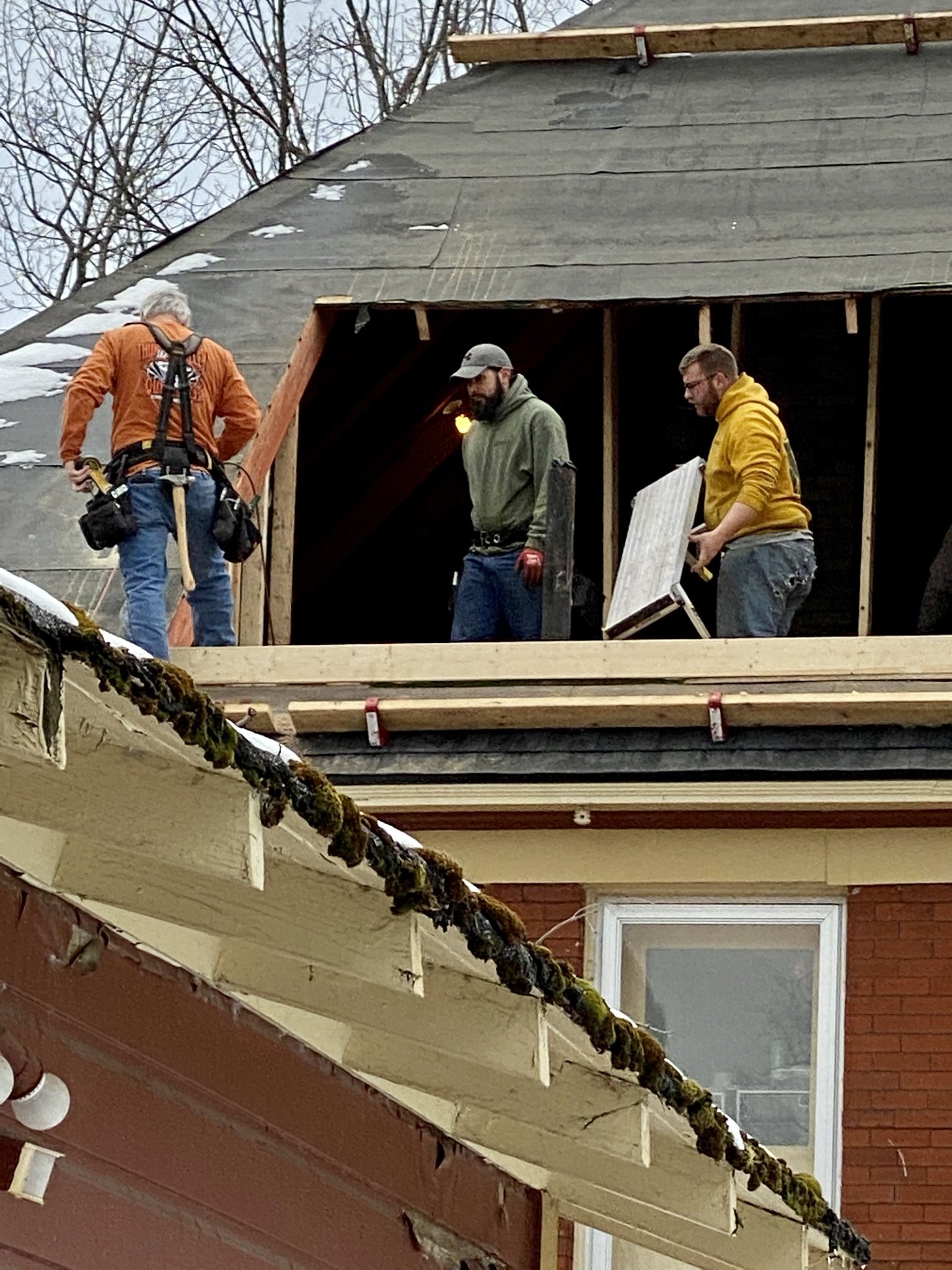
Close up.
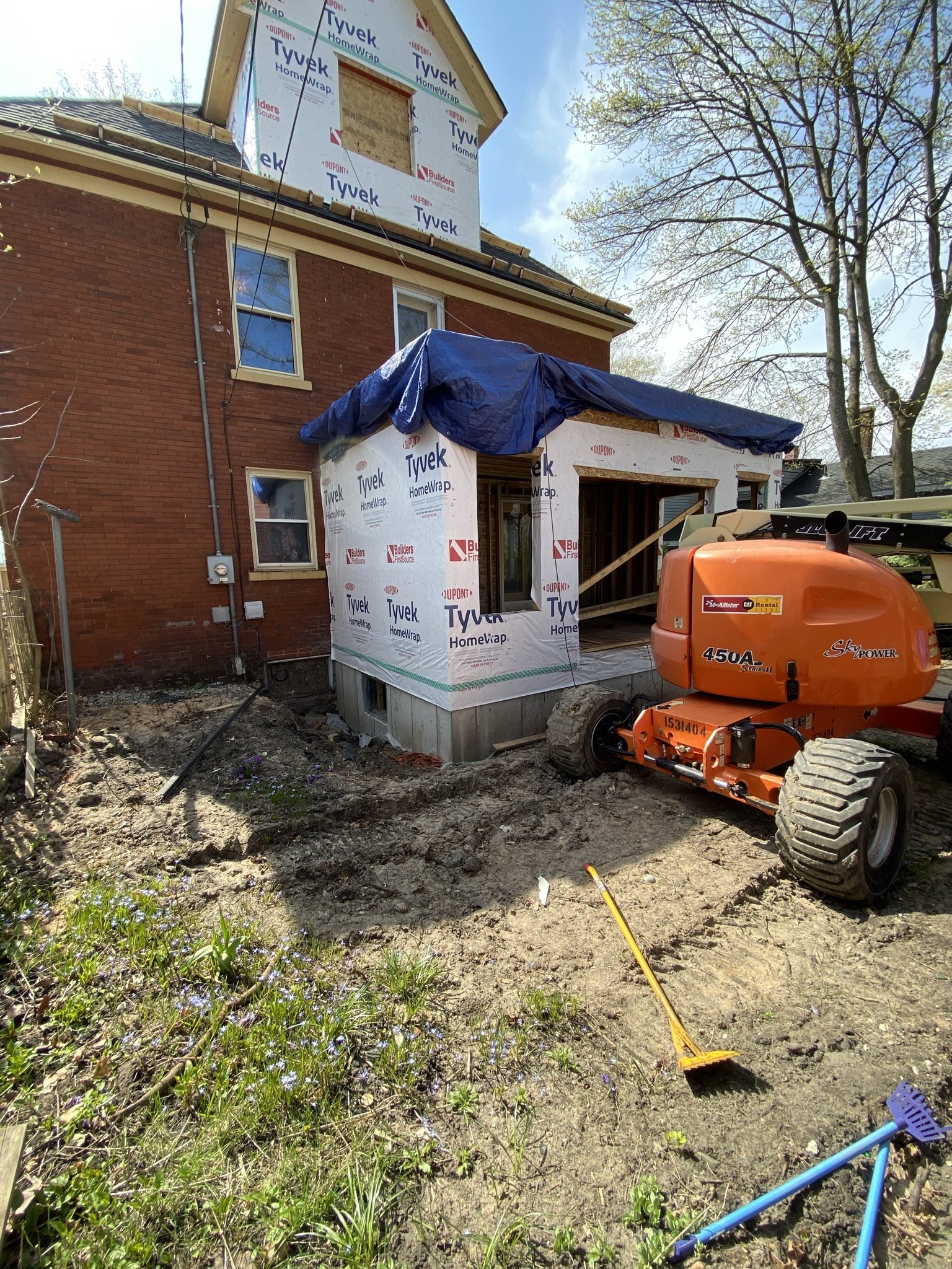
Here we are on April 23, 2021 with the dormer built and the lounge walls and roof built.
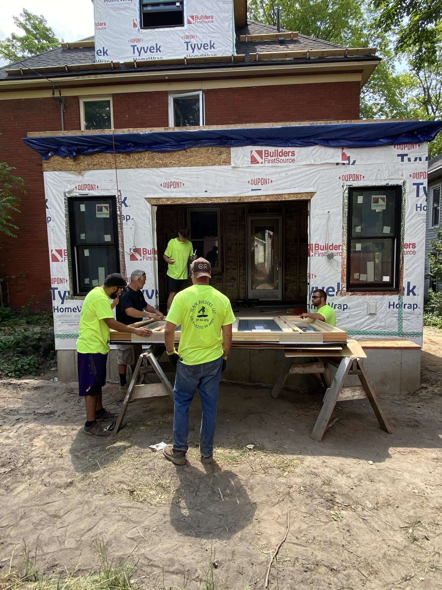
Fast forward to June 11, 2021, and the crew is installing the French door at the back of the addition. We went with Anderson windows and doors and to be honest, we aren't impressed. At all. Either the installation wasn't great or the product isn't, as this door leaks cold air up the wazoo in the winter.
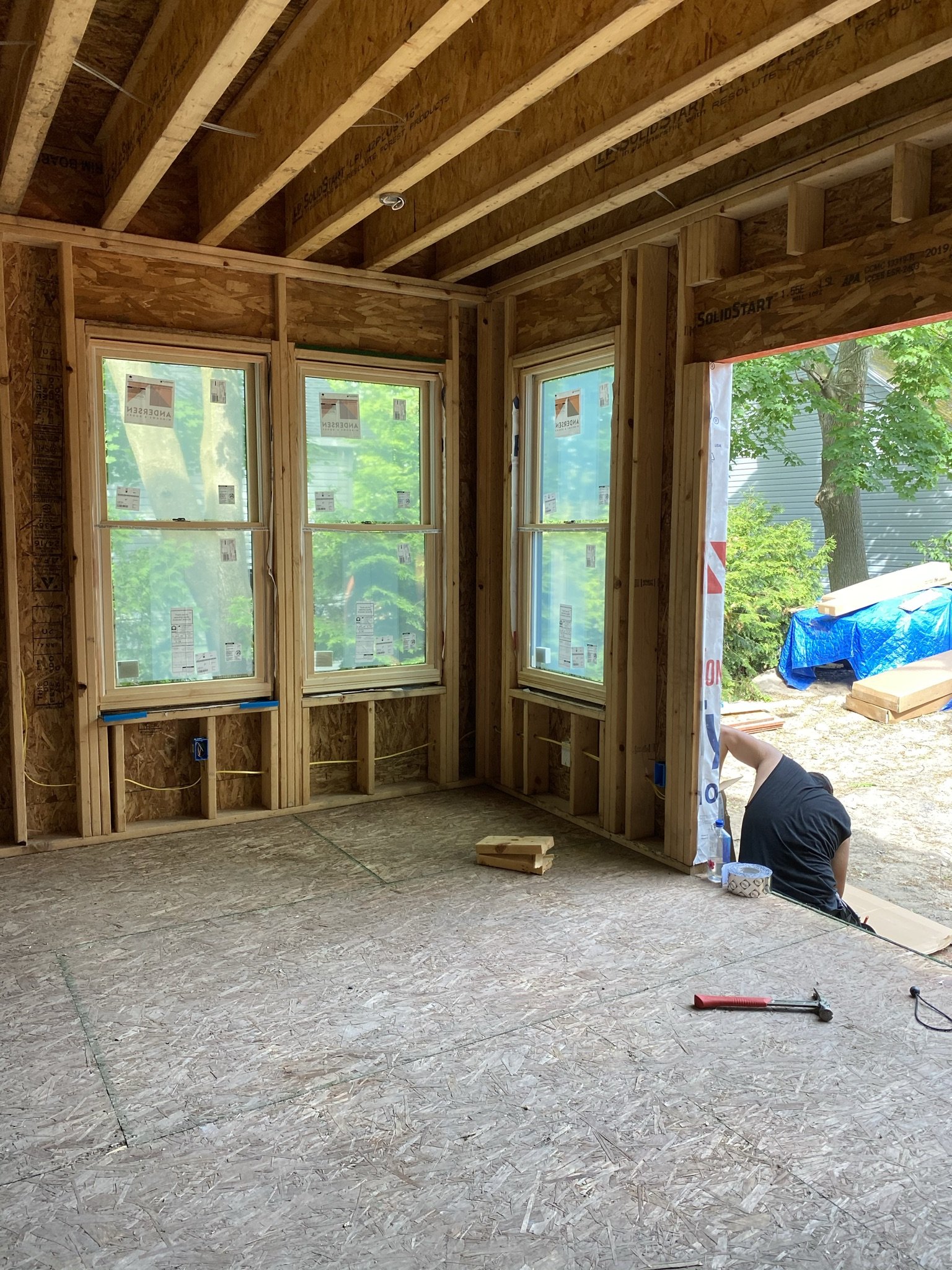
Just prior to installing the rear door and side lights, here is how the room looked standing on the bar side.
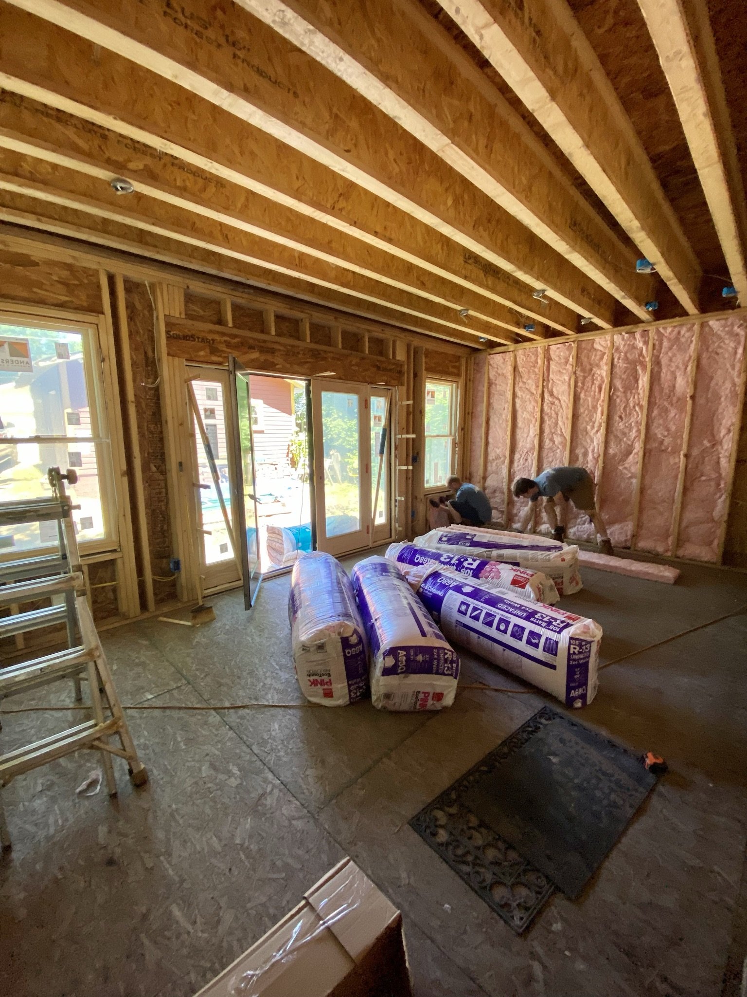
Shortly after installing the door, the insulation sub came and did their work.
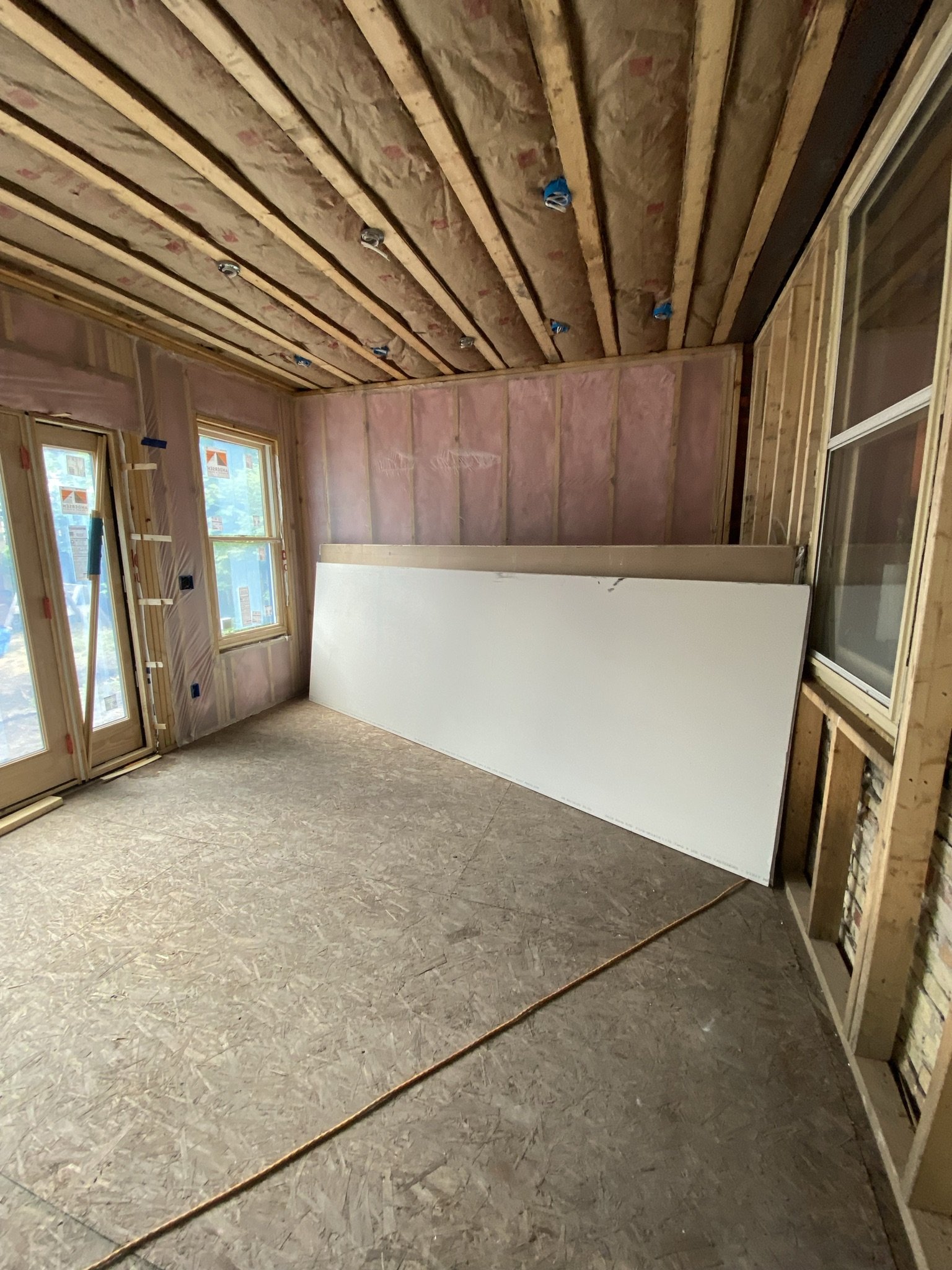
Here's the room insulated and ready for drywall. You're looking at the future bar side.
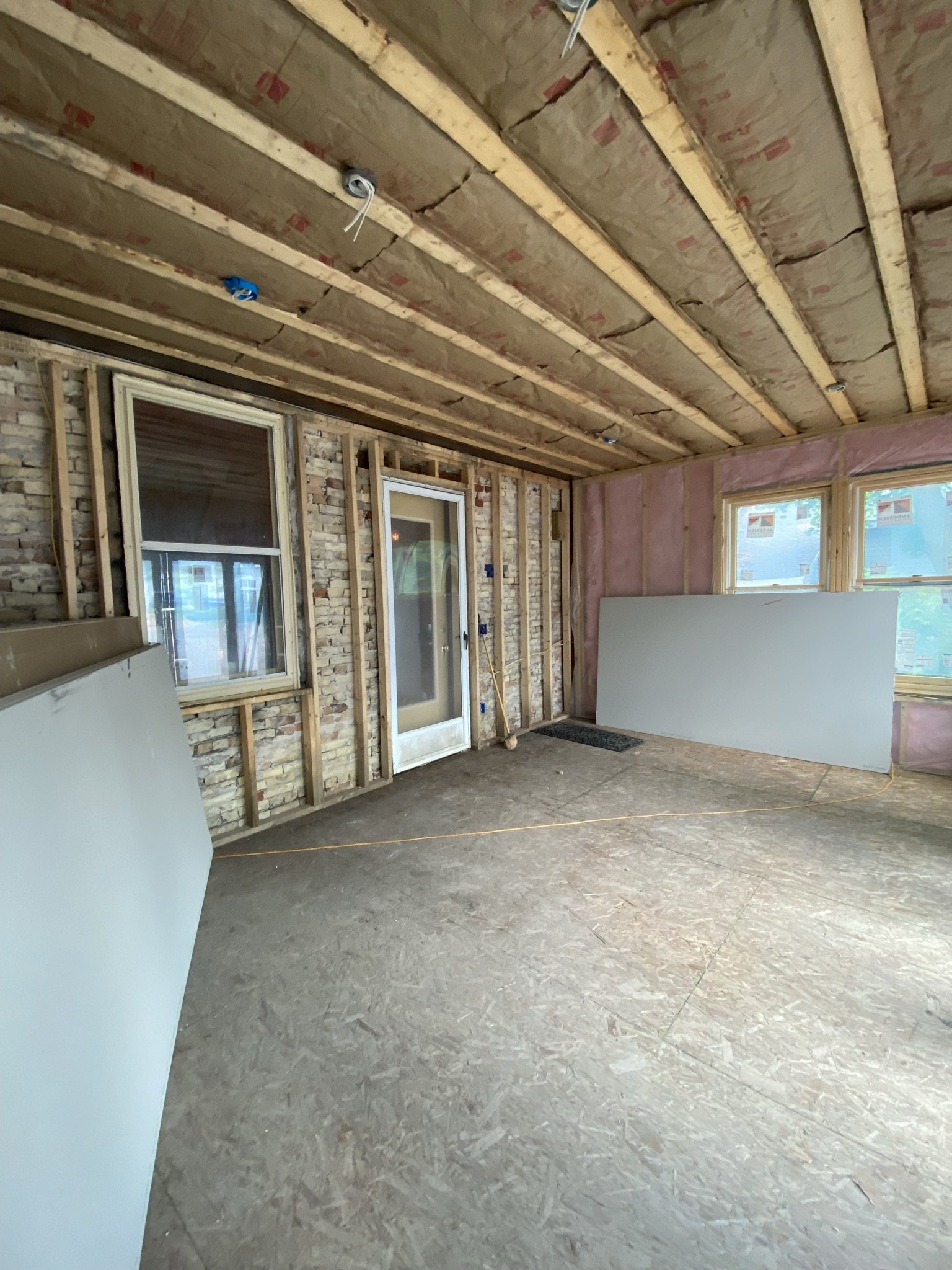
And here is the room looking towards the dining side.
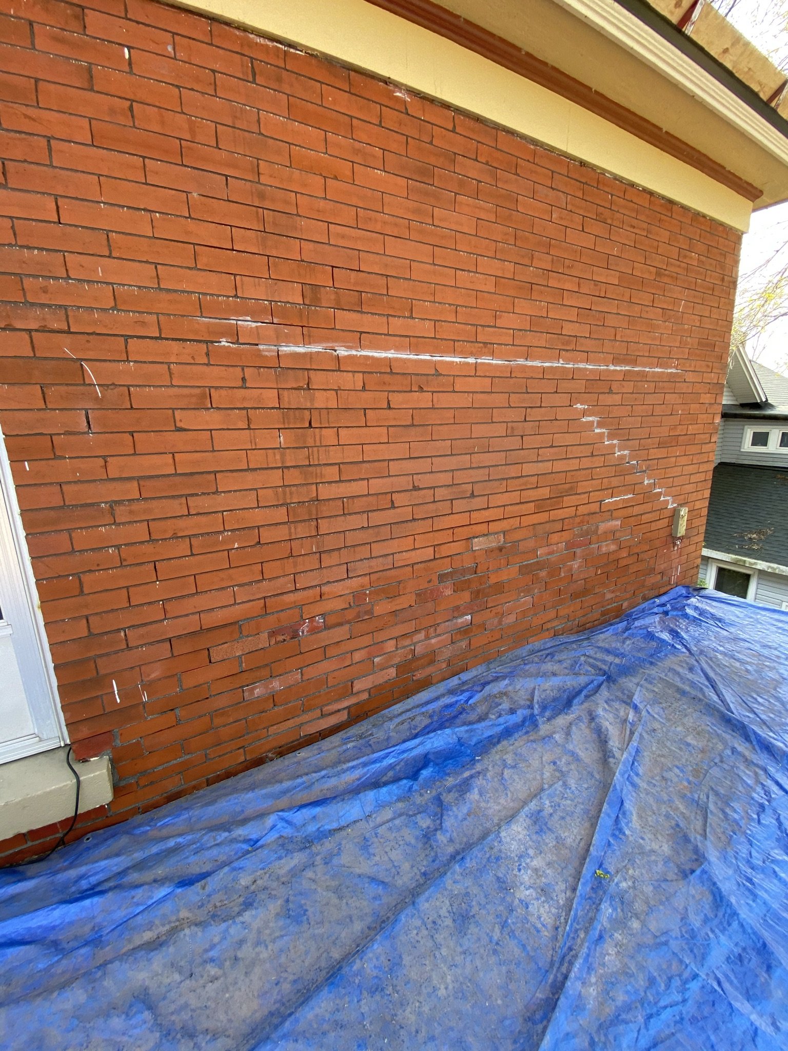
Back outside, here's the view of the upper deck before the underlayment and deck floor was installed.
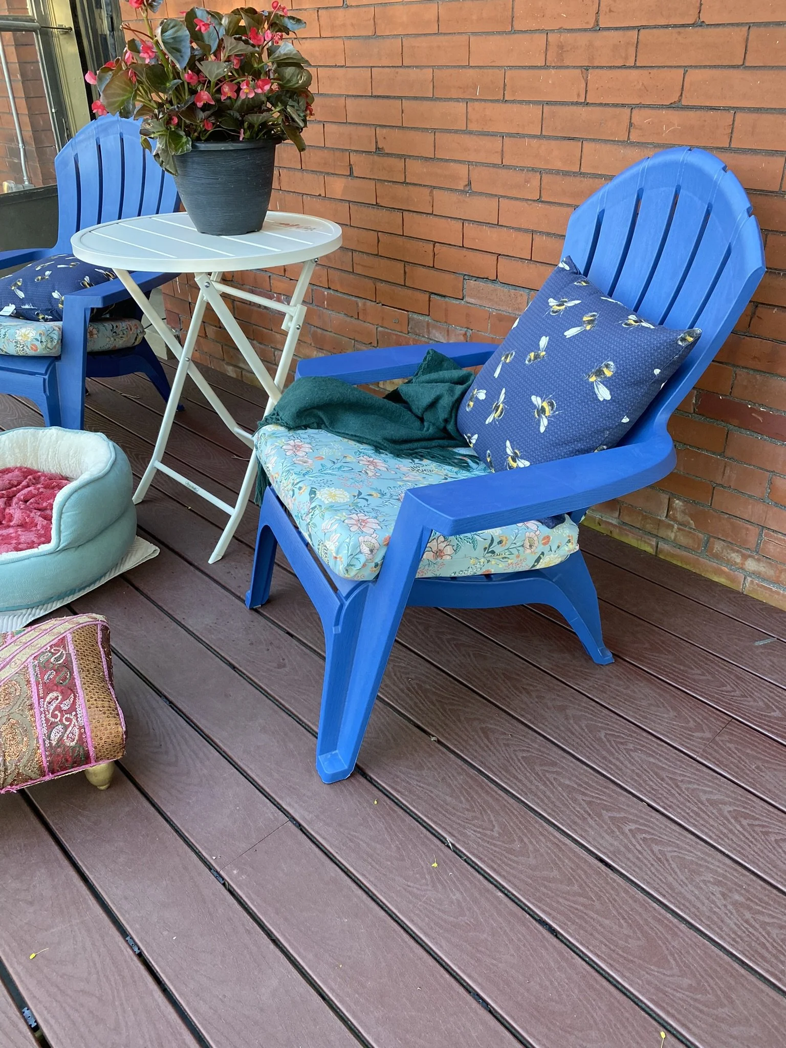
Here's the same area after the underlayment and deck floor were installed.
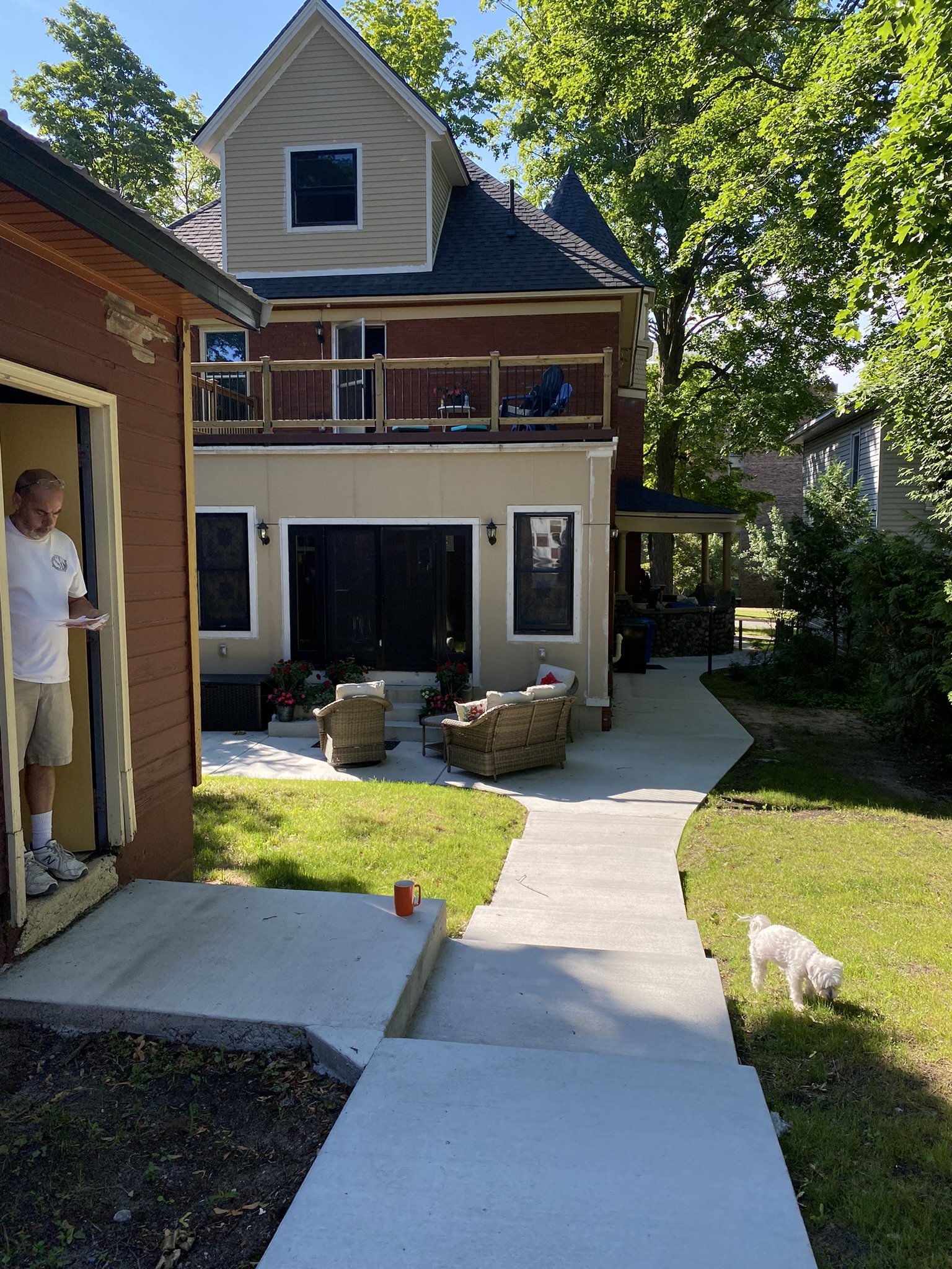
And here it is, looking from the parking pad area next to the garage, towards the house. Needless to say, the builder didn't come close to the inspiration photo and Mike unfortunately will end up having to finish all of the trim work. The brick on the house also will be stained black and the trim will be painted copper, pale aqua and black, hopefully in Spring of 2023. Scroll down to go inside!
HOME BAR/DINING (LOUNGE) ADDITION: design and decoR
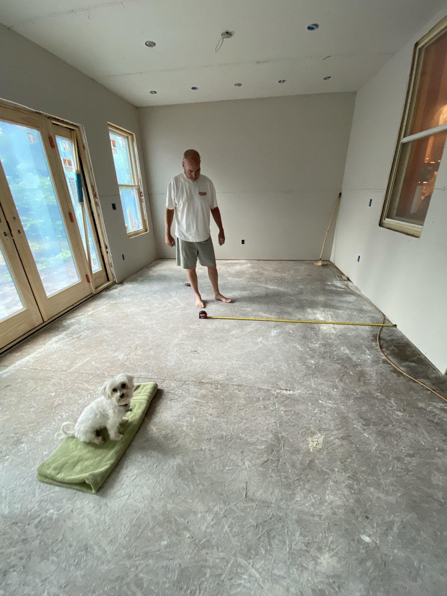
This is the state of things on June 26, 2021. Drywall is in, but not mudded. Here, Mike is measuring for the front bar.
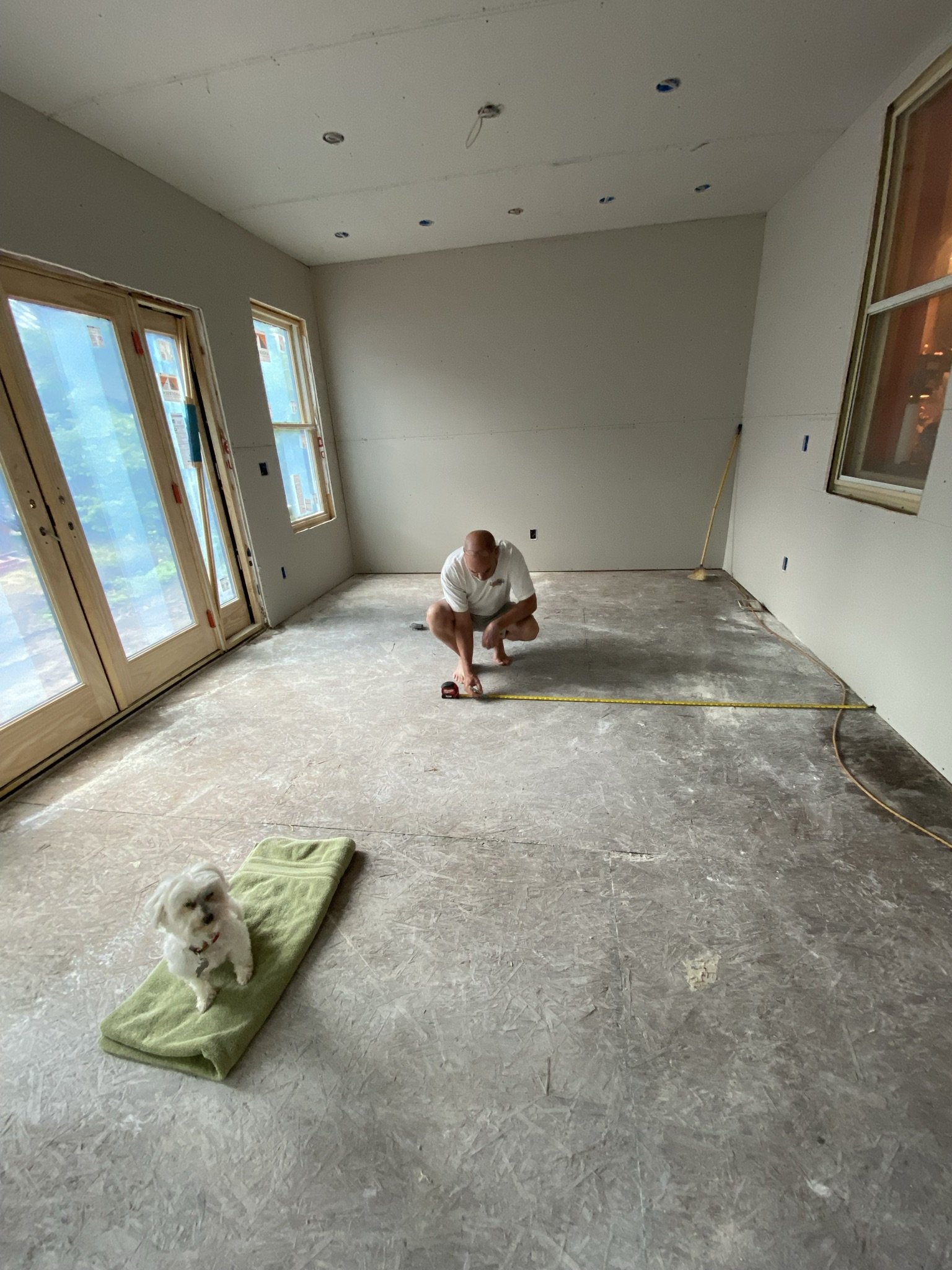
By this time, Mike and I had scoured the continent for a bar that would fit the space. We originally wanted to do a finished bar (pre-made) but didn't find one in our price range that also fit the space given the window configurations. So, we decided to build our own, either by cobbling together pieces of furniture, building it from scratch, or a combination of both.
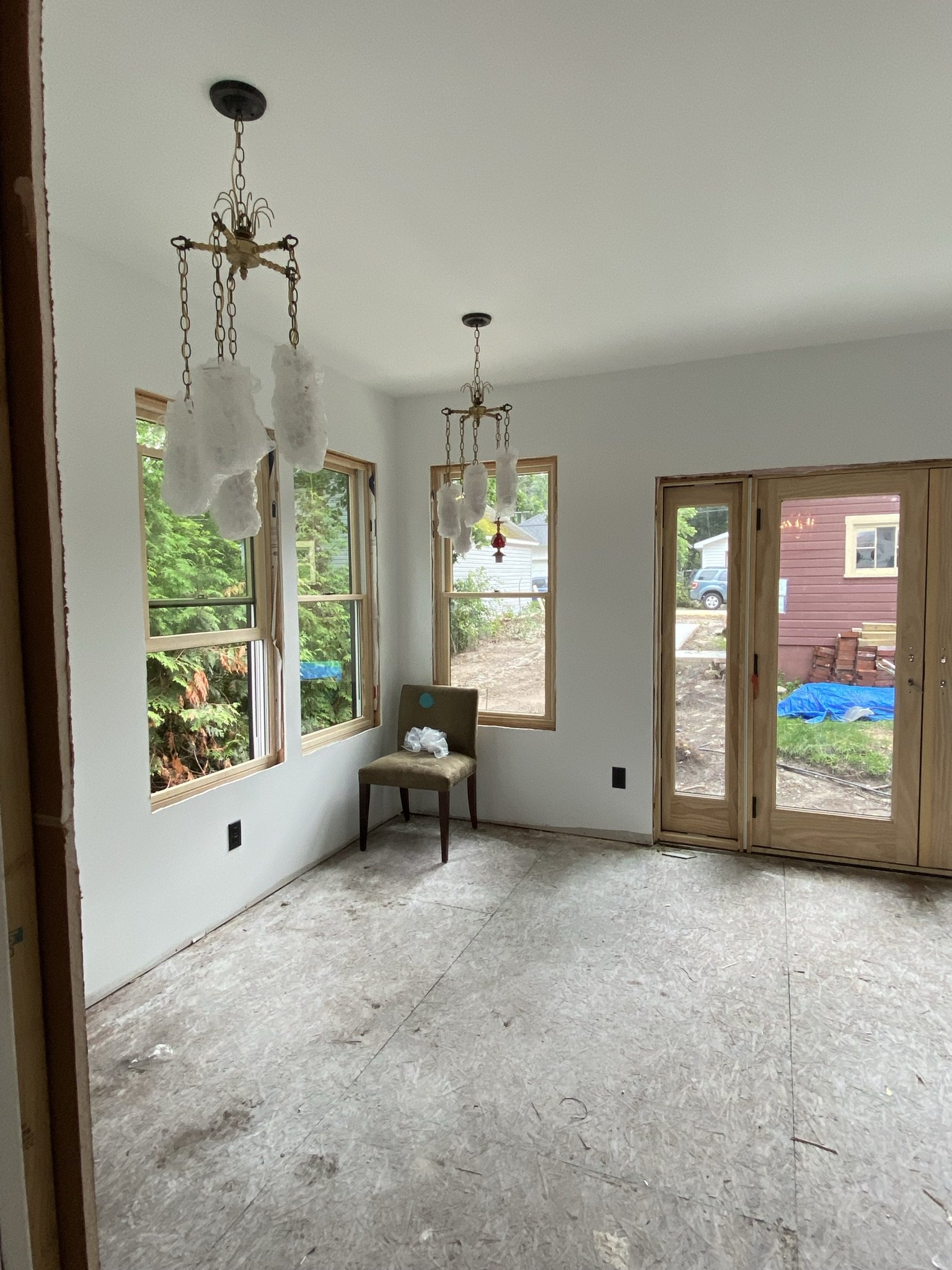
Here, we have the dining side of the lounge after drywall is mudded and electrical installed. The electrical and plumbing contractors were subpar, to put it mildly. Mike ended up redoing much of the electrician's (slovenly and code noncompliant) work and the plumber wasn't much better. The drywall subcontractor, on the other hand, was outstanding.
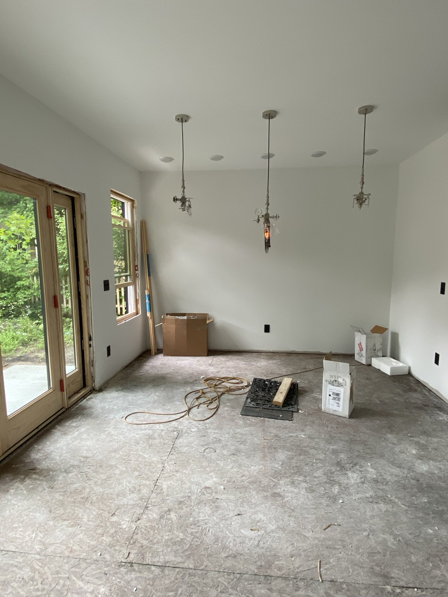
Bar side with electrical installed.
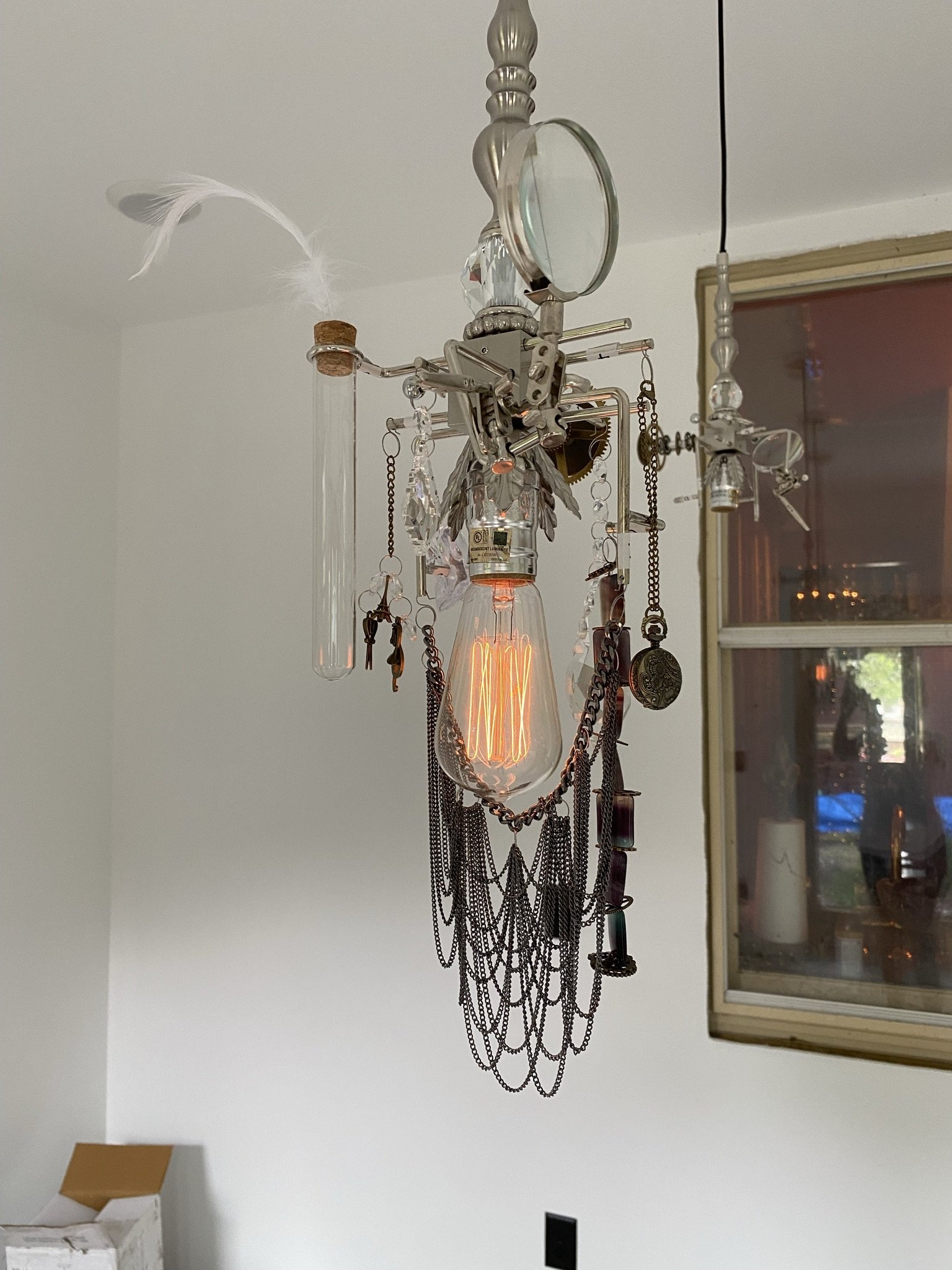
The pendants, which would hang over the front bar, are called Love Potion Number Nine by Nick Alain.
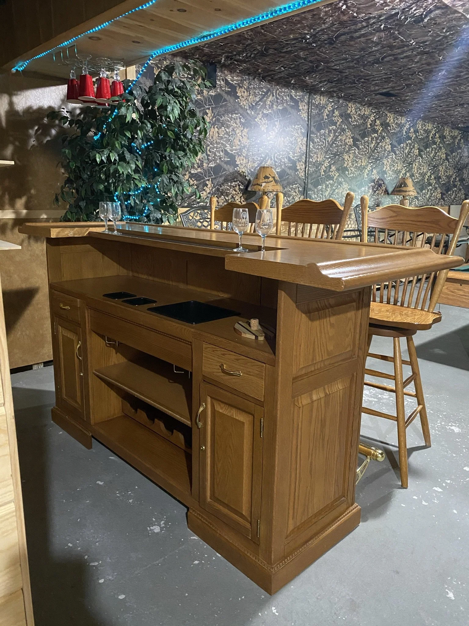
In June of 2021, I found this front bar on Facebook Marketplace in the basement of a gentleman who sadly died unexpectedly from a heart attack, so his family was liquidating his possessions. His sister told me this basement bar was his dream and was completed just before he died. I promised to give it a good home.
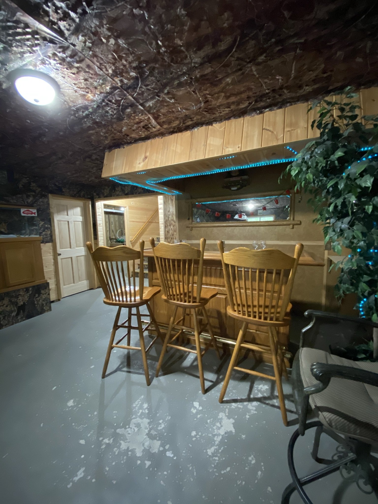
The oak finish would not work. I was sure of that. Nor would the bar stools. My plan was to paint it.

Our first idea for a back bar was to convert an antique sideboard/buffet. We found and bought this piece on eBay and felt it was perfect. Unfortunately, the seller said he lost the key to the cabinets then dropped off the face of the earth. We are experts at all things Plan B.
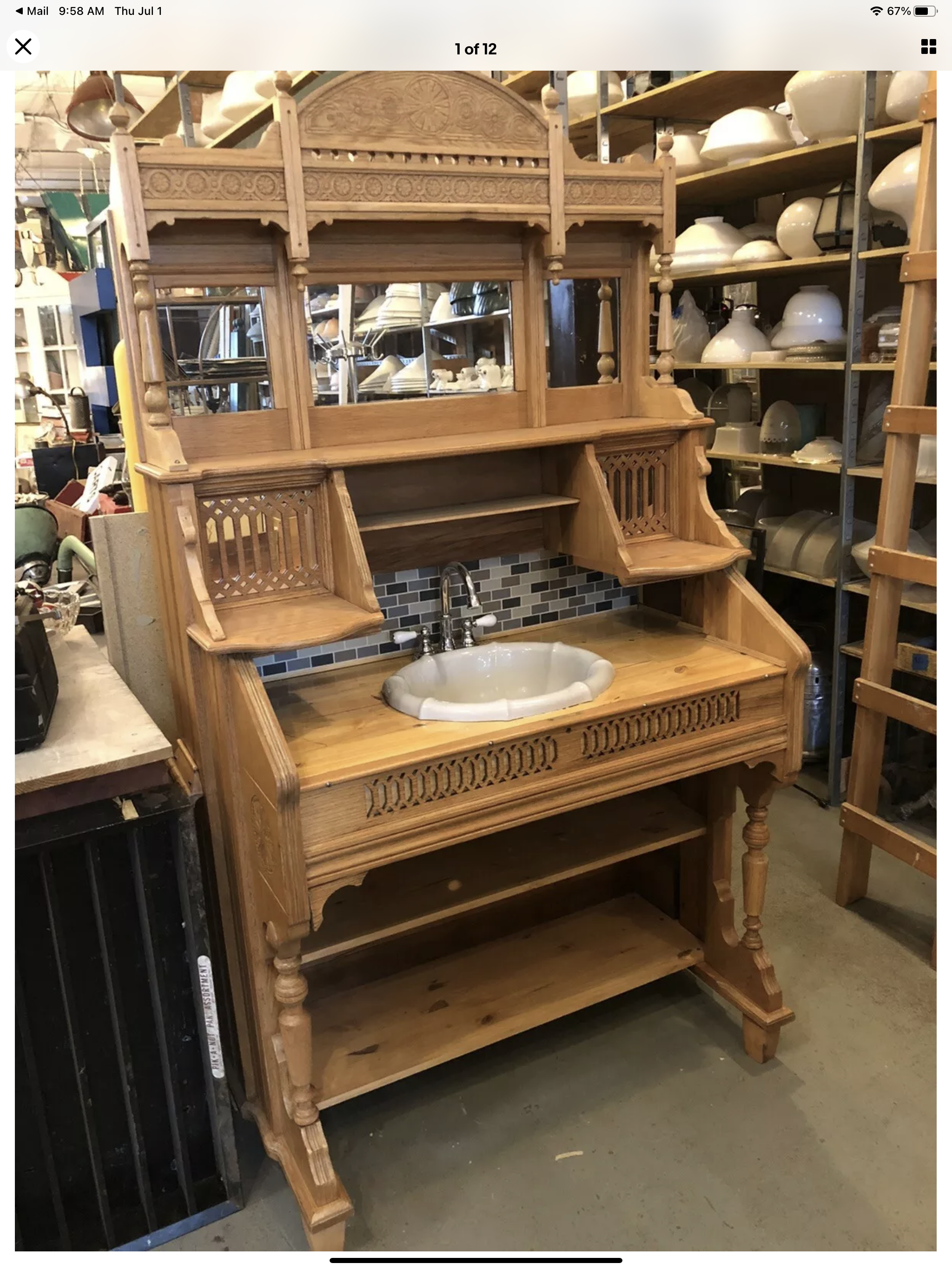
So, I found this parlor organ on eBay which had been converted into a bathroom sink. I didn't want this particular piece, but it did give me an idea.
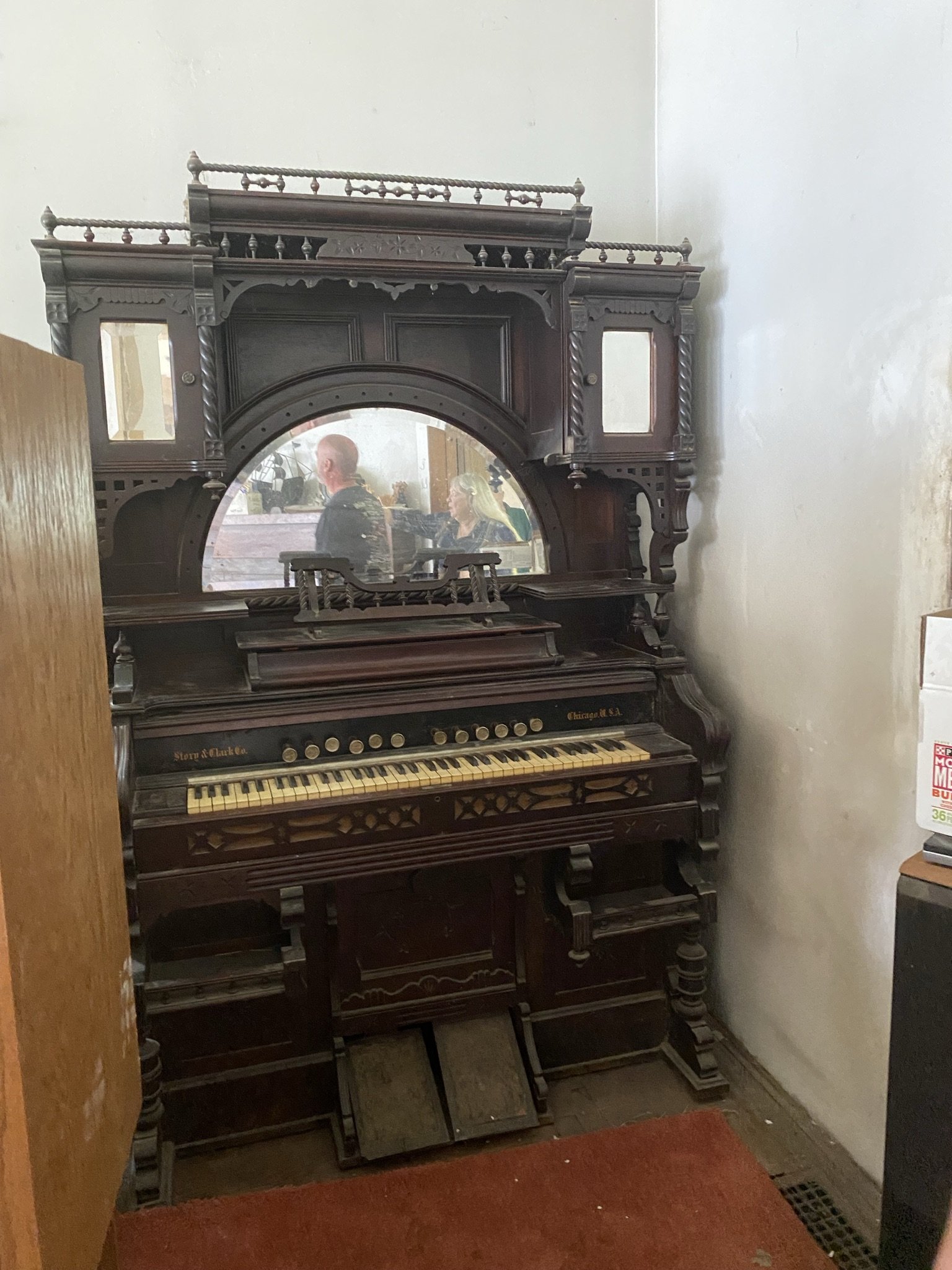
So I started searching Facebook Marketplace for antique pump/parlor organs and found this piece. It was salvaged off a river boat that washed ashore onto some Illinois farmland in the Great Flood of 1927. The story of picking up this organ is one of the more amusing in the history of our renovation and can be viewed in my Instagram highlights.
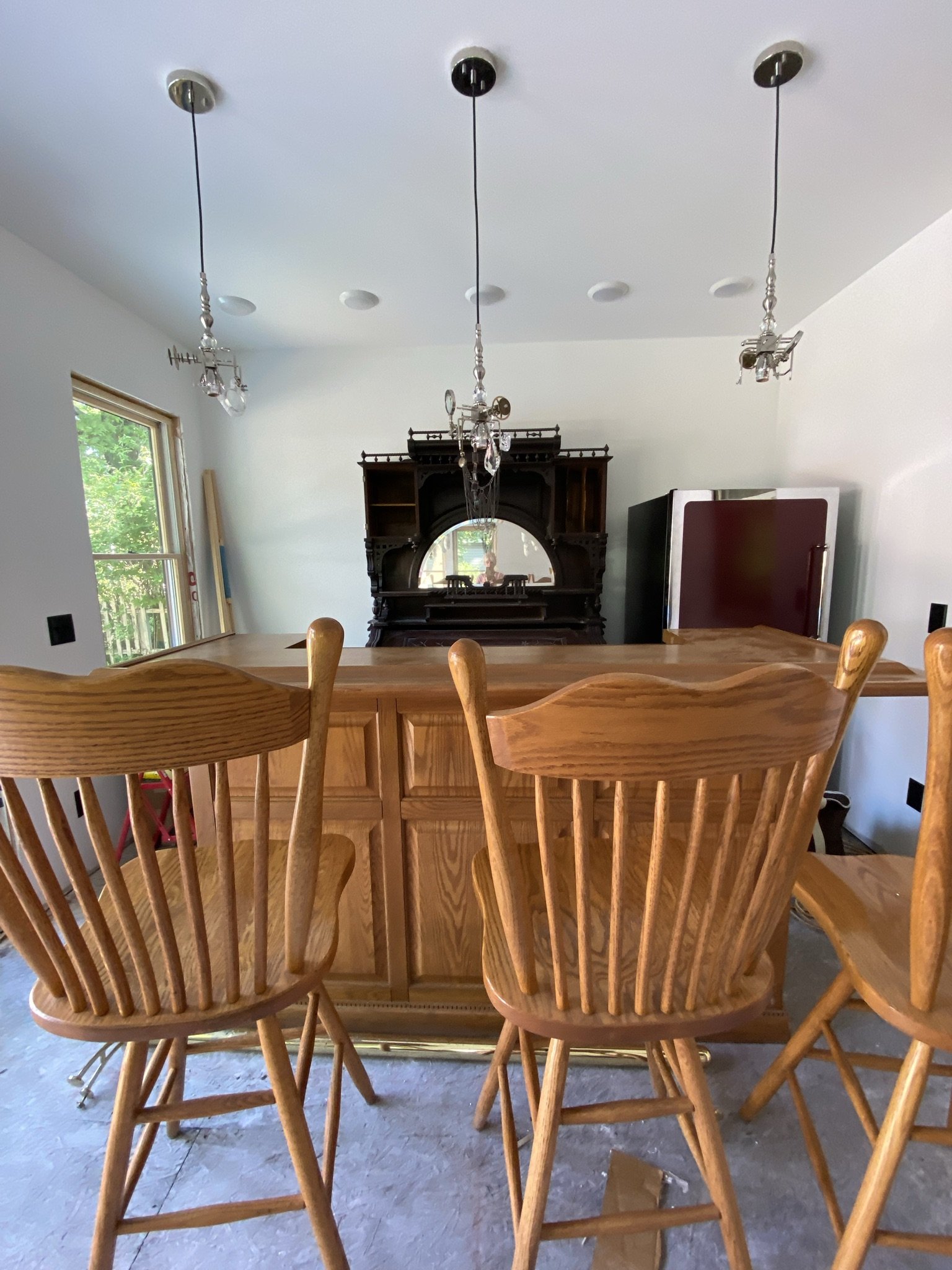
Because we had a Labor Day party in 2021, we put in the front and back bar before I painted the room (and before trim or even floors were installed). This is a rough idea of the layout, with the exception of building a tall bookshelf-type cabinet to the left of the parlor organ which would be used for liquor storage.
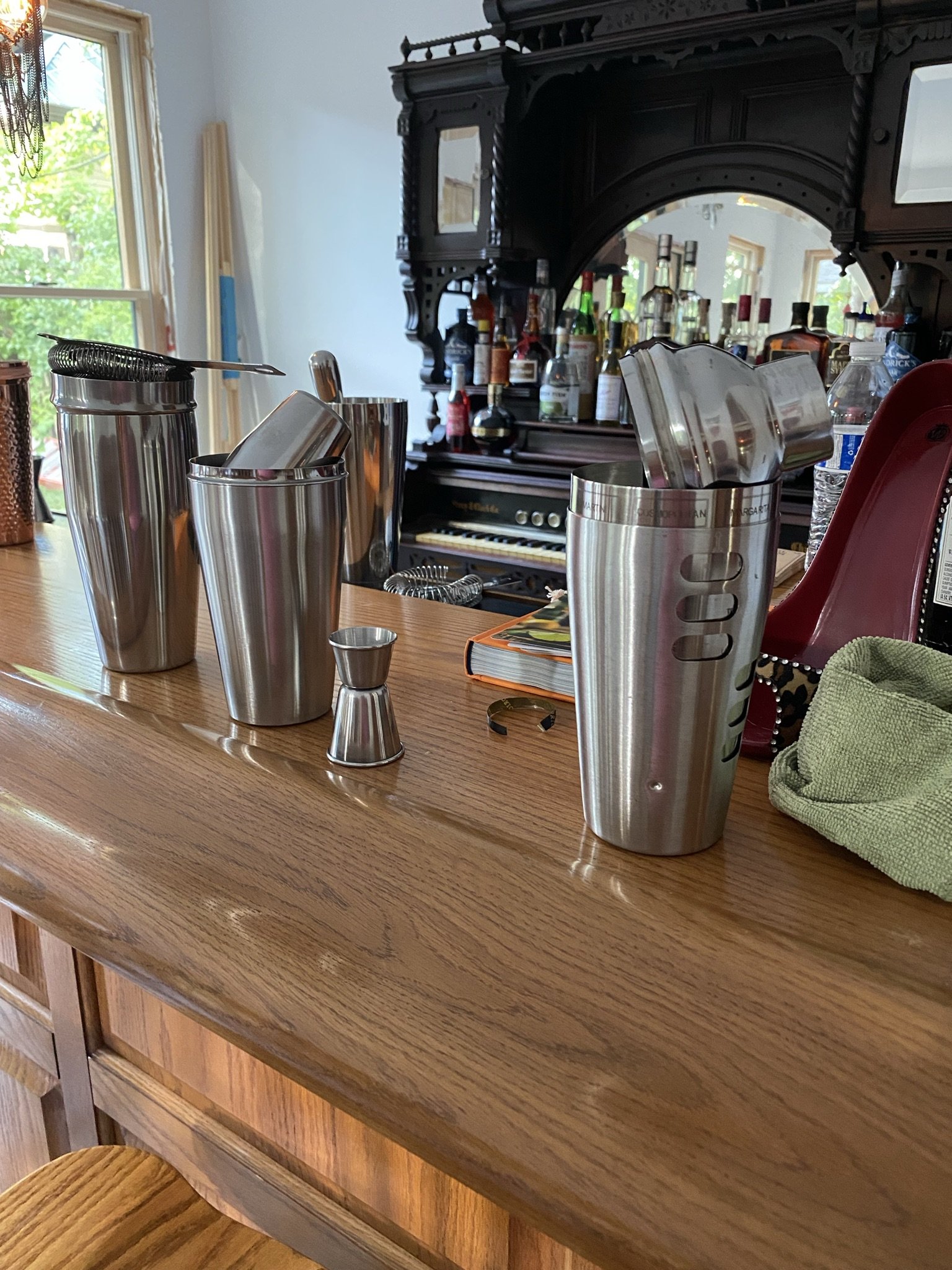
By this time (end of summer 2021), I was still vacillating regarding color choices and what I would do with the ceiling. Tippling helped the process.
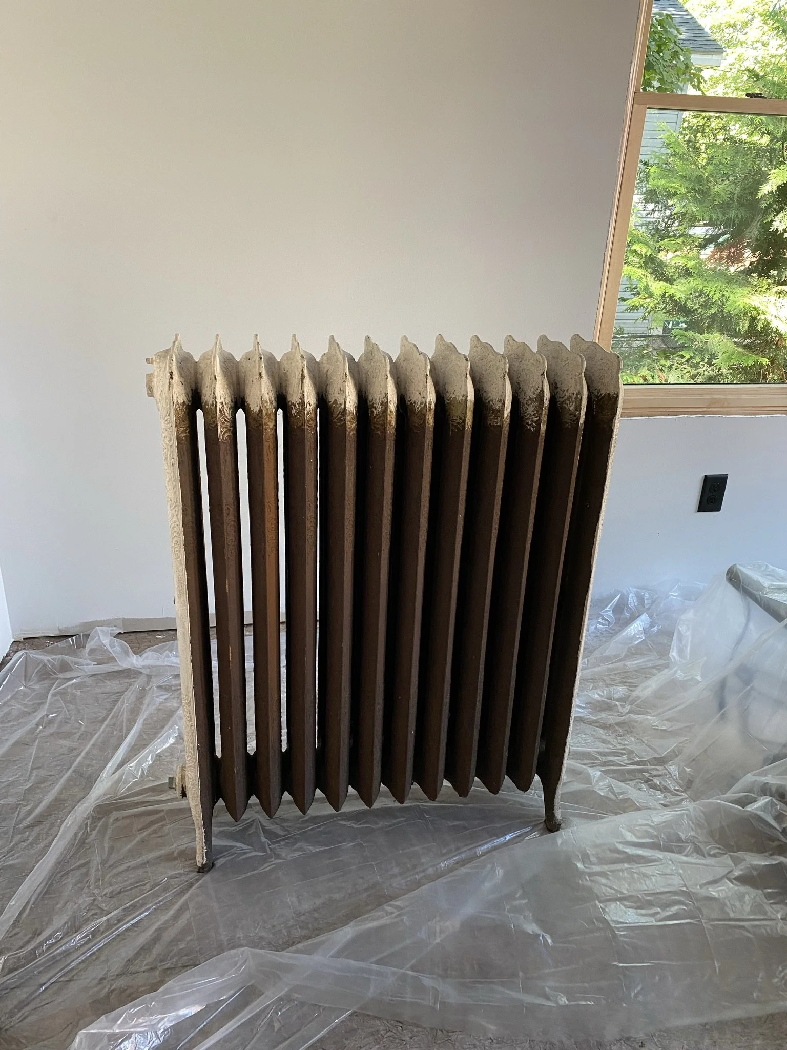
Even though it was summer, we knew we needed to get heat in order before winter. The owner of Brinks Framing, a local frame shop, gave me this rad which he was no longer using.
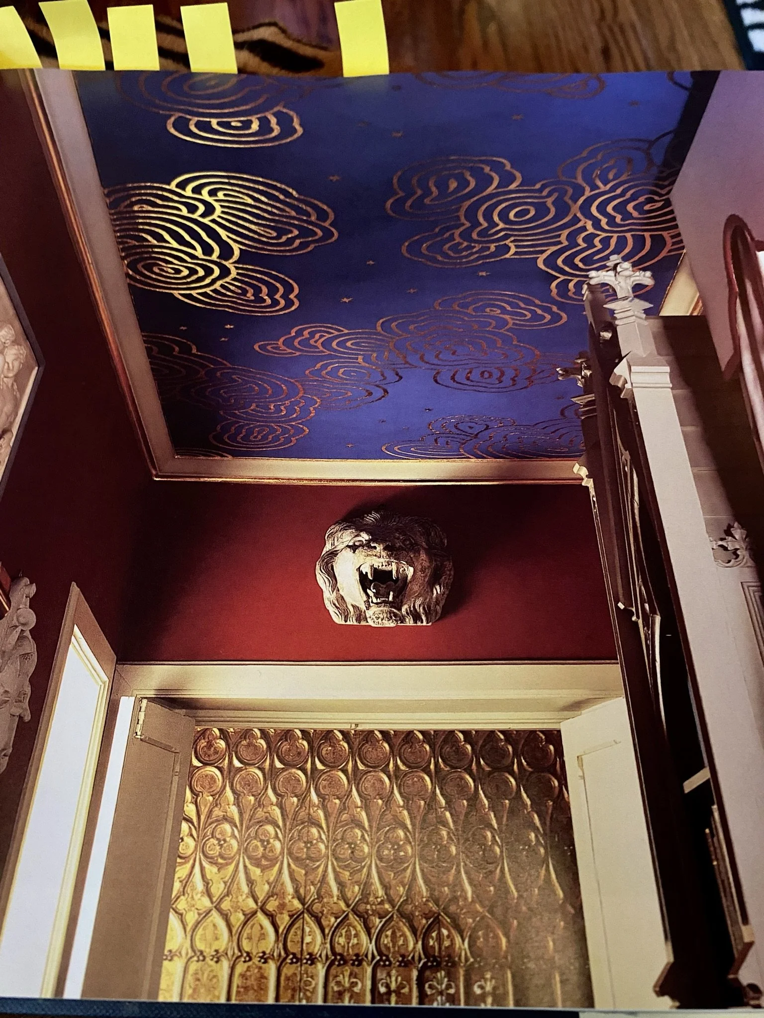
My first idea for the ceiling came from my beloved Painted Ceilings book. I liked the idea of a blue ceiling with stylized gold leaf clouds. Probably over my head, literally, but that's never stopped me before.
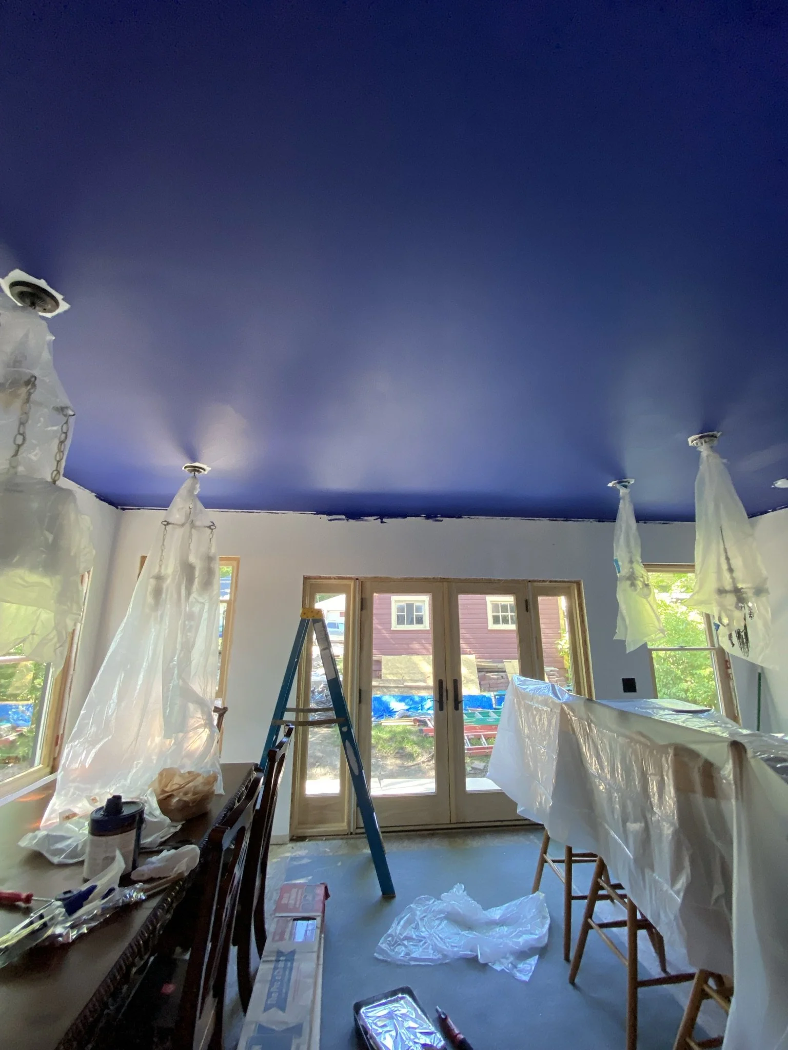
Here is the ceiling, which I painted in a blue tone similar to the inspiration photo.
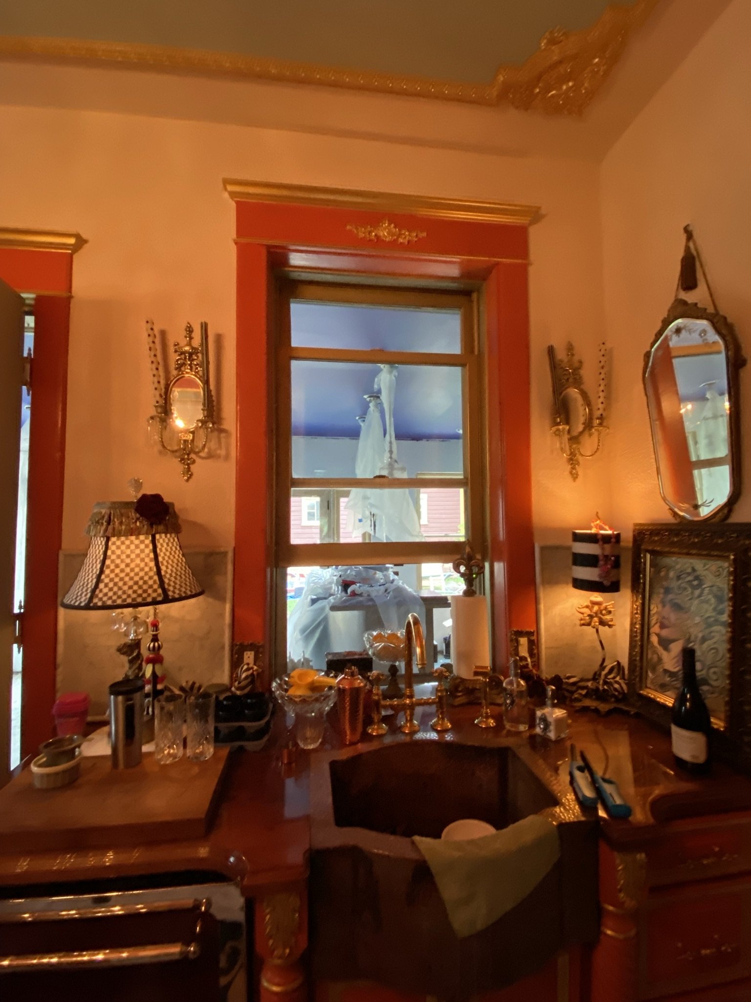
Here's the view from the kitchen after I finished the ceiling (for the first time, lol).
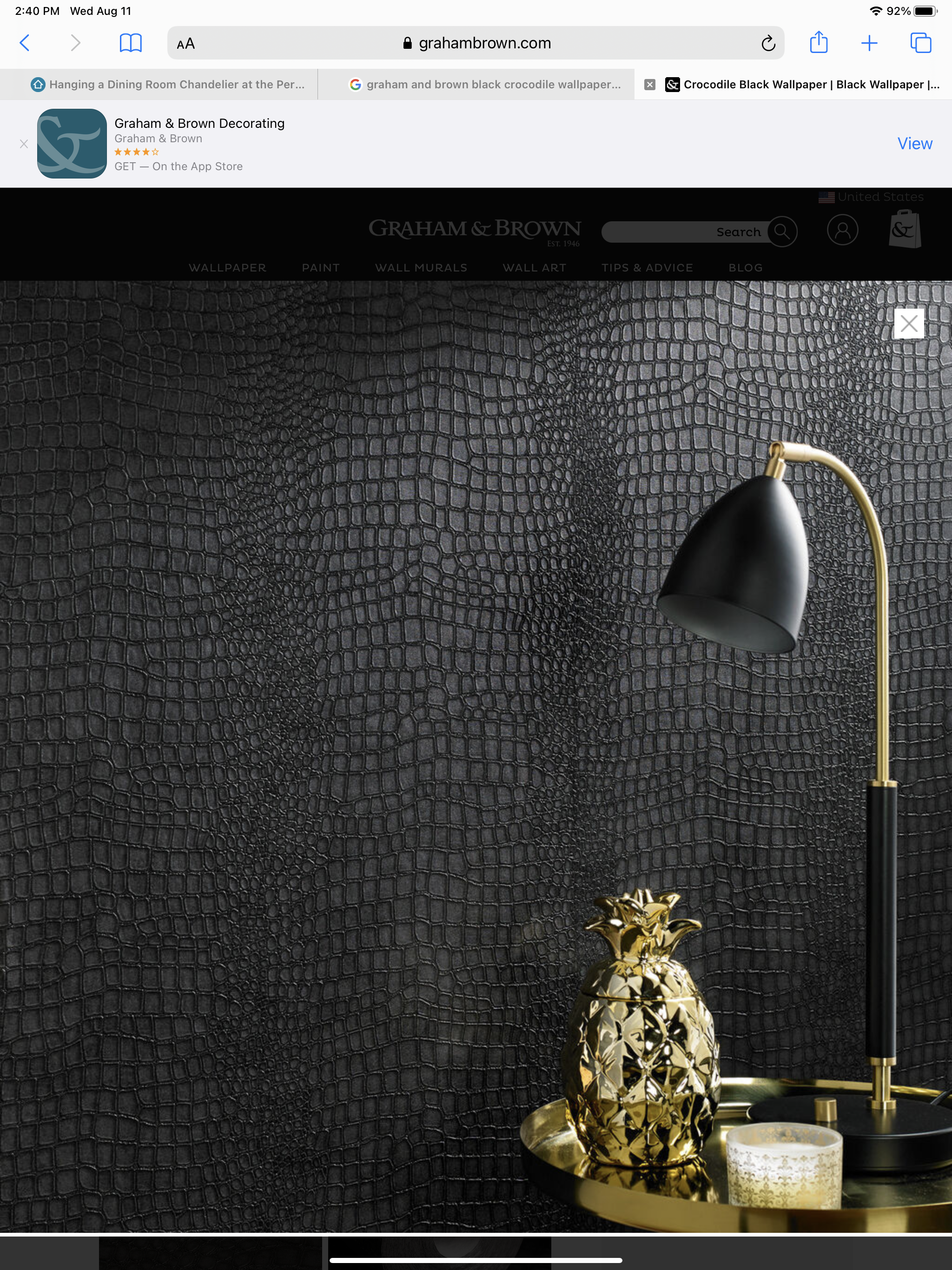
Rather than doing red walls per the inspiration photo, I wanted to do black crocodile wallpaper. We were close to ordering this from Graham and Brown, but then reality set in regarding the hell of wallpaper installation. Frankly, I'd rather have a root canal than install wallpaper.
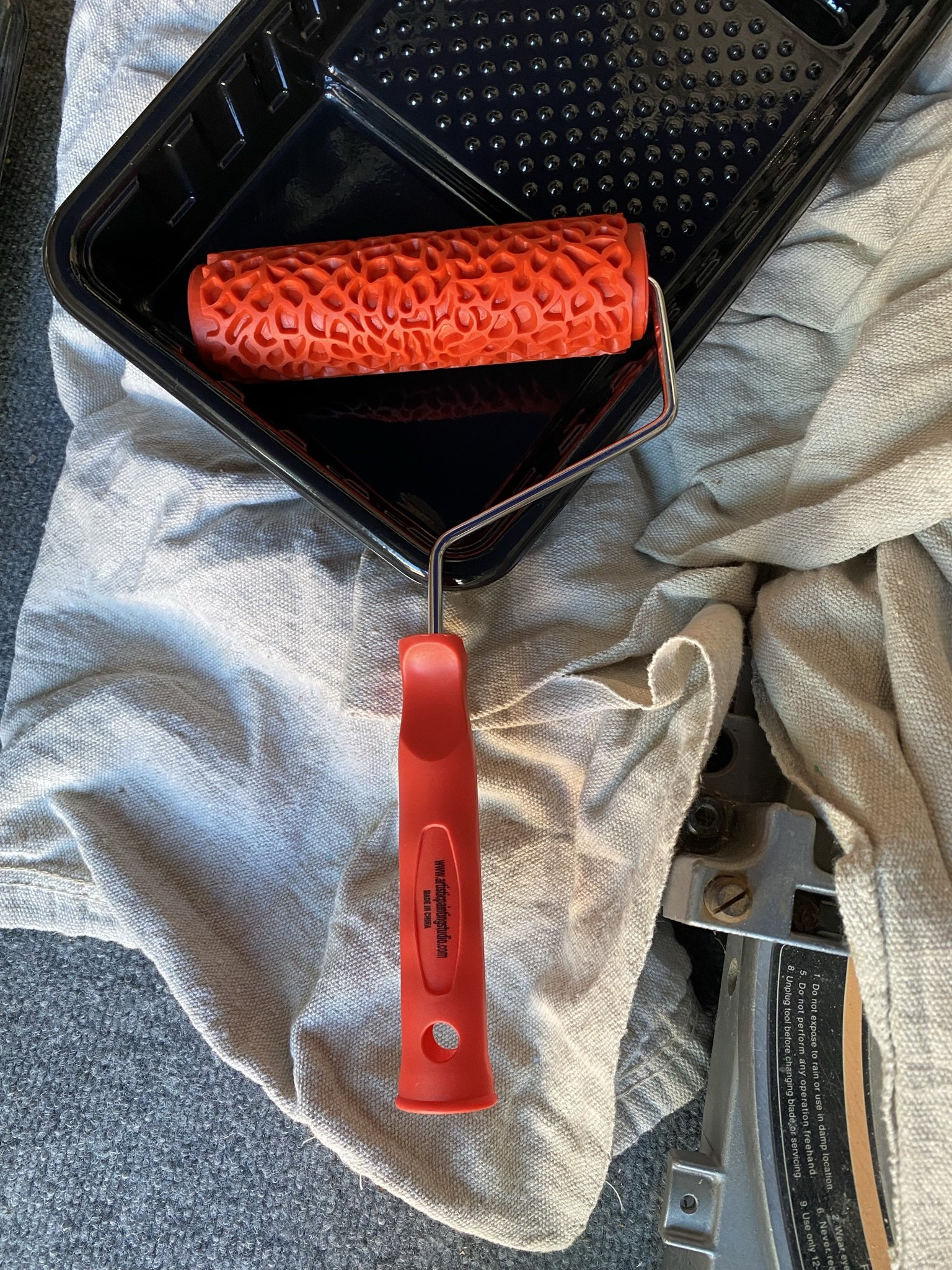
So I found this decorative roller on Amazon and decided to give it a try.
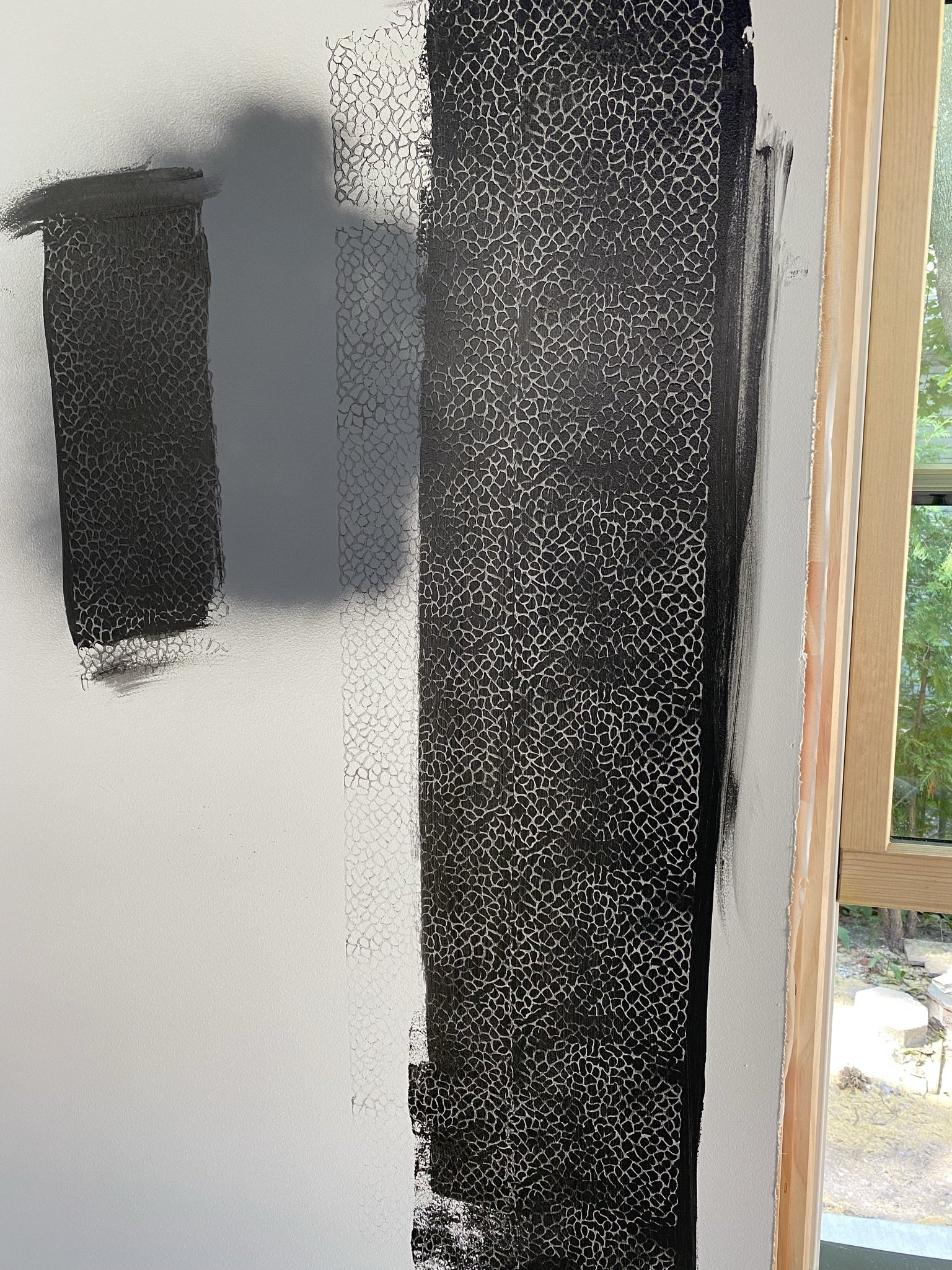
This was my first foray into the world of decorative rolling. I didn't like the undercoat, but I had a feeling that with the right colors, this might work.

I'd always loved this CB2 rug (which I never bought and don't think is sold anymore) and it caused me to lean more towards reds, purples and warmer/richer colors.
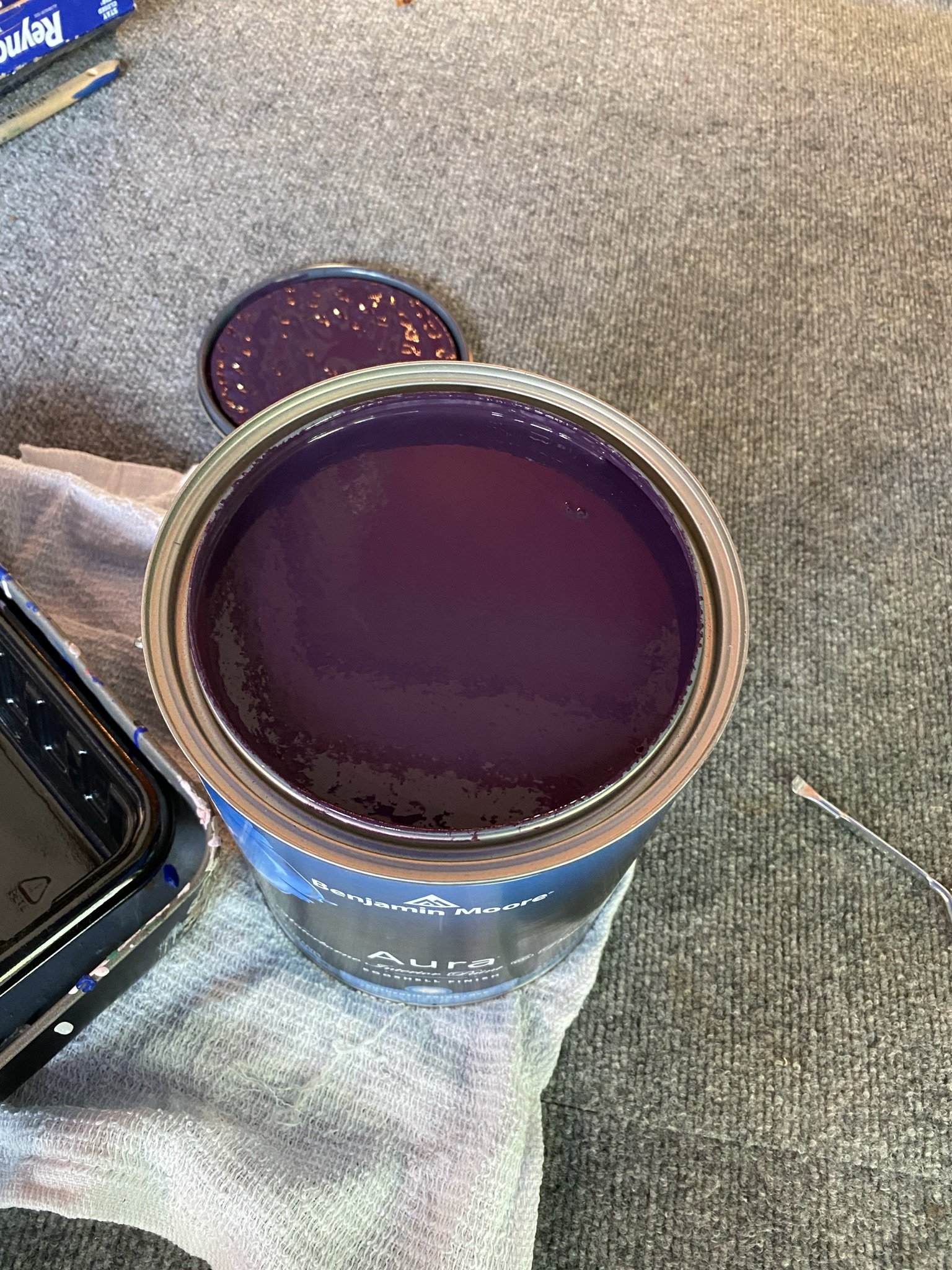
I had this paint mixed by Benjamin Moore. It's Velvet Cloak, but with the saturation increased. This I would use as the base coat.
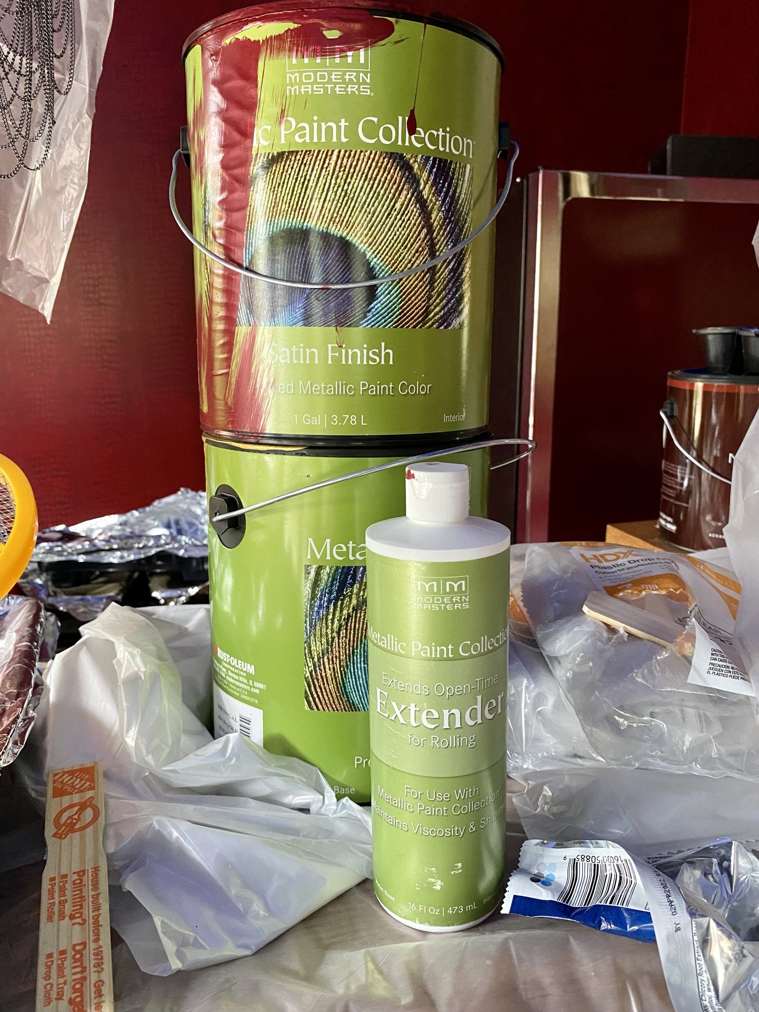
For the overcoat, I used my favorite red paint which is Modern Masters Ruby. We also mixed in some extender to increase the open time.
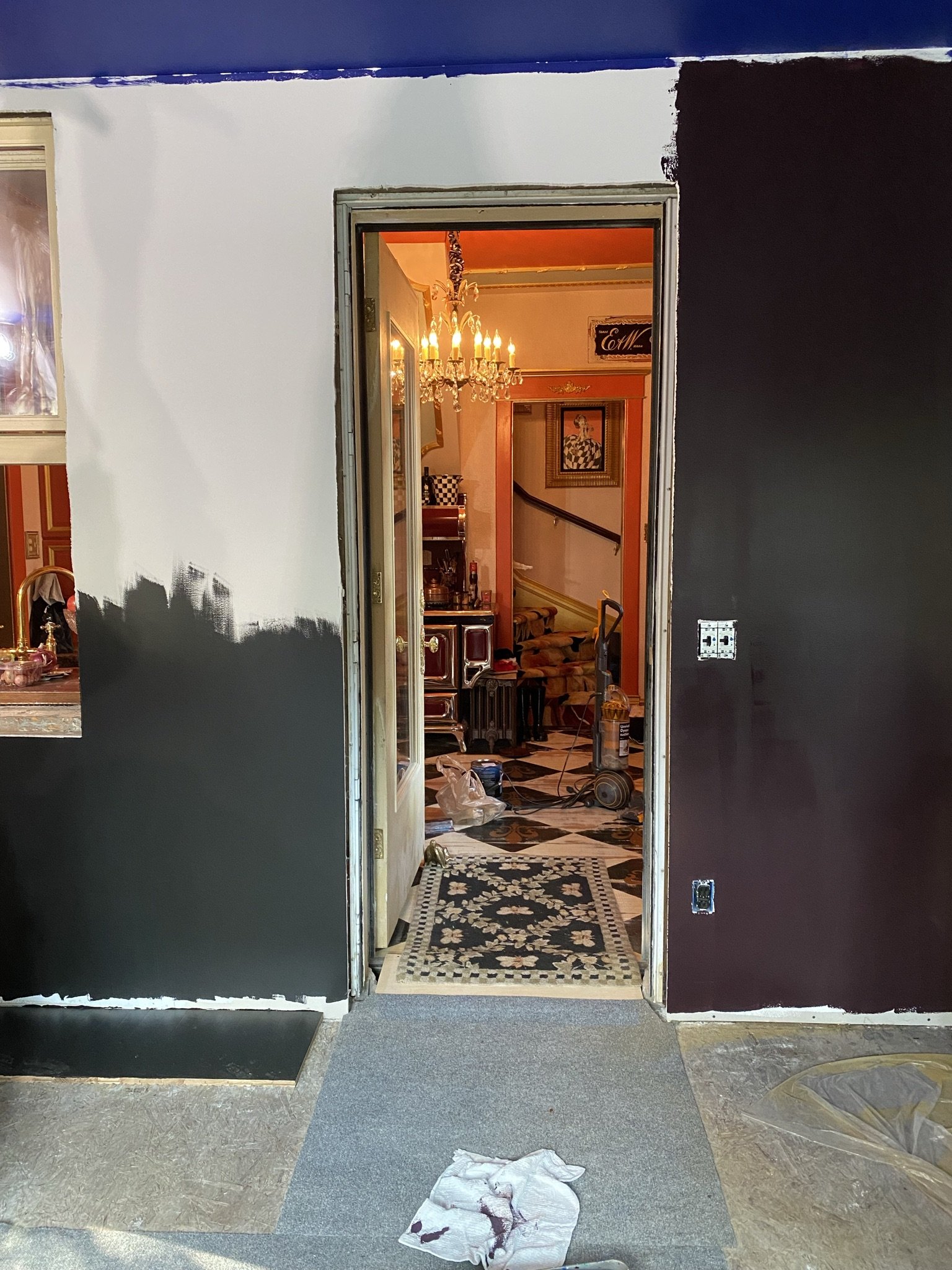
First step was to paint the eggplant undercoat, which you can see on the right (the left is black, as I originally was going in that direction before deciding on the eggplant color. Different story.).
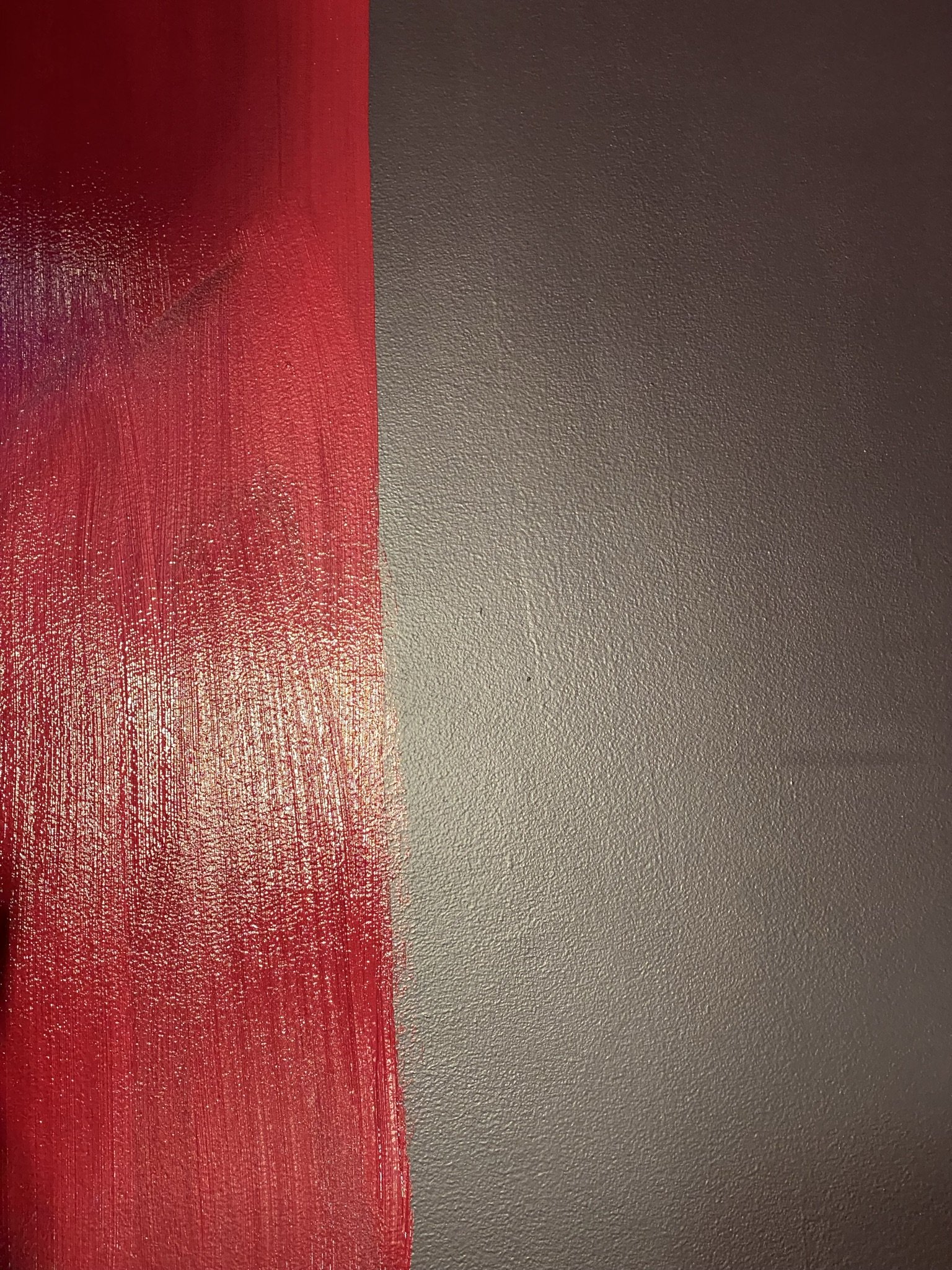
Mike helped me with this stage, because you have to work fast. Basically, to do the embossing, and after the undercoat dries, you brush thick with the overcoat in small sections and then immediately roll it with the embossing roller. If you make a mistake, while the paint is still wet, you can just re-roll it. It's very forgiving.
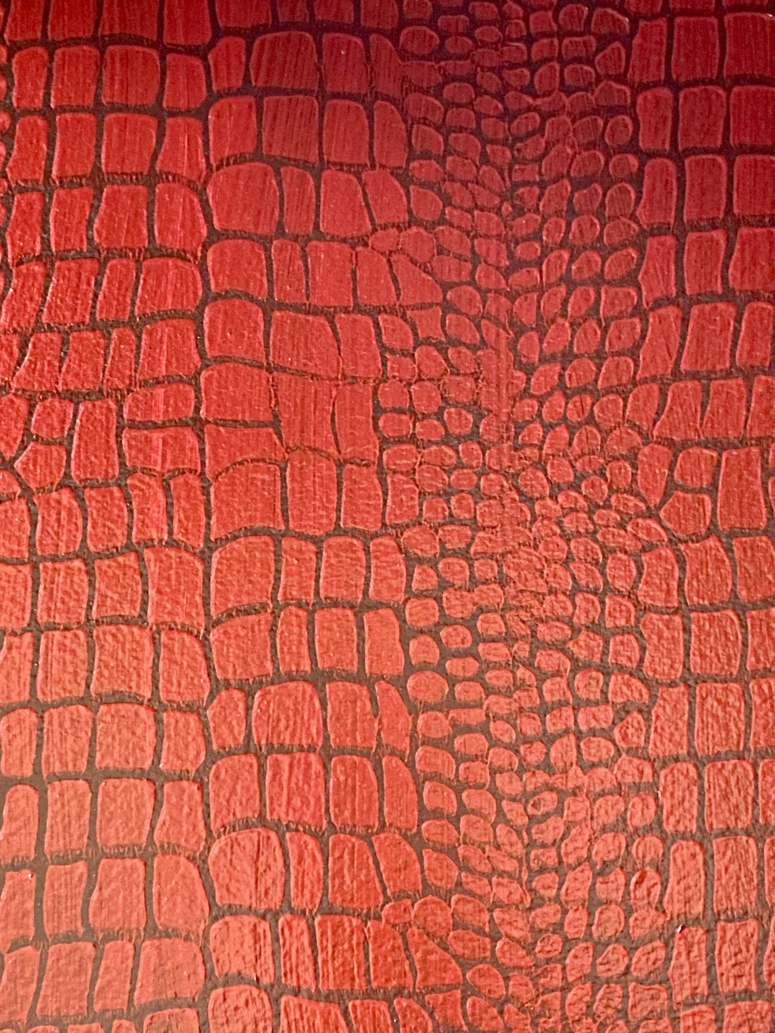
Here's how it looks when done. There's a definite texture to it, and it does have the appearance of wallpaper.
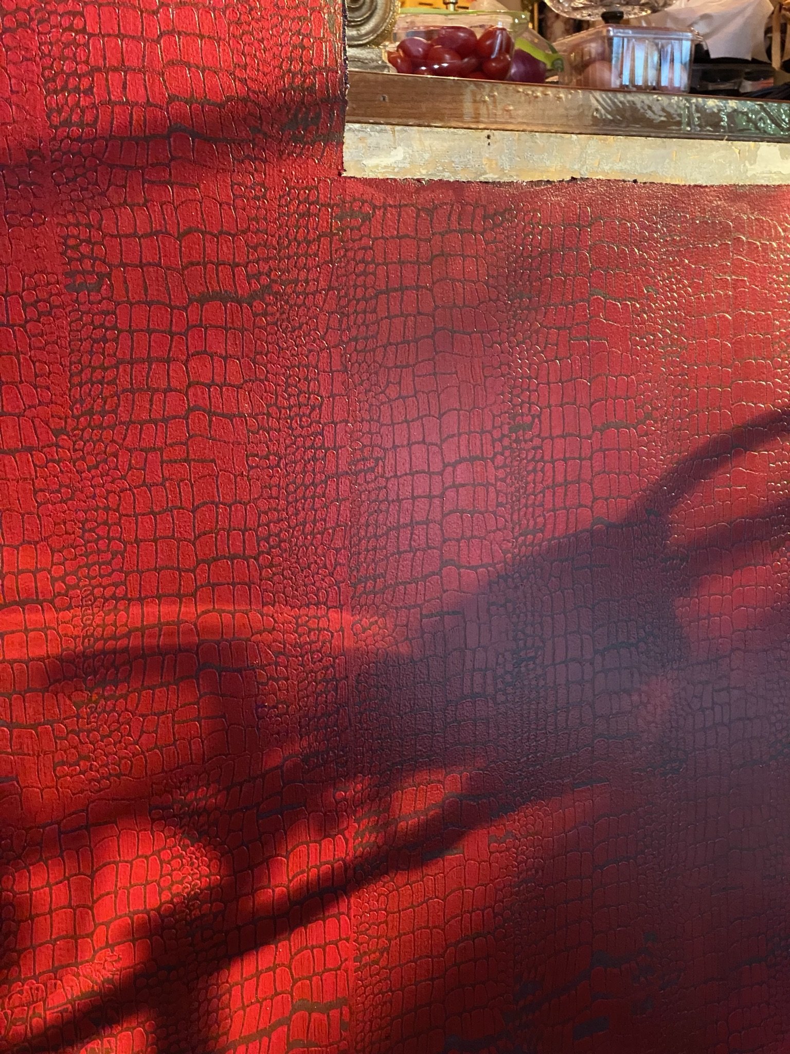
There are imperfections throughout, which I like, because nature isn't perfect.
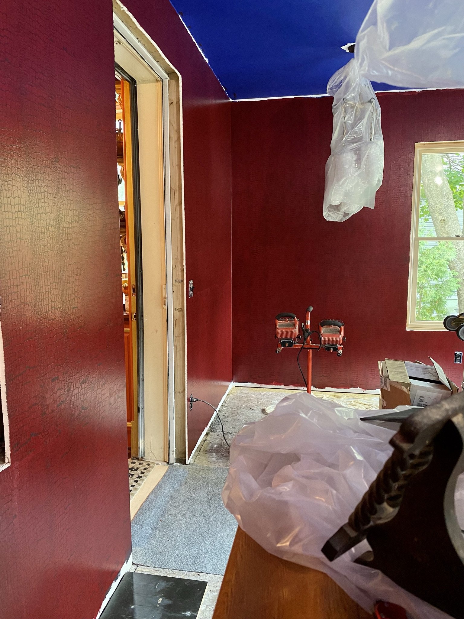
Even though the colors now were going in the direction of my original inspiration photo, I started to go in a different direction with the ceiling.
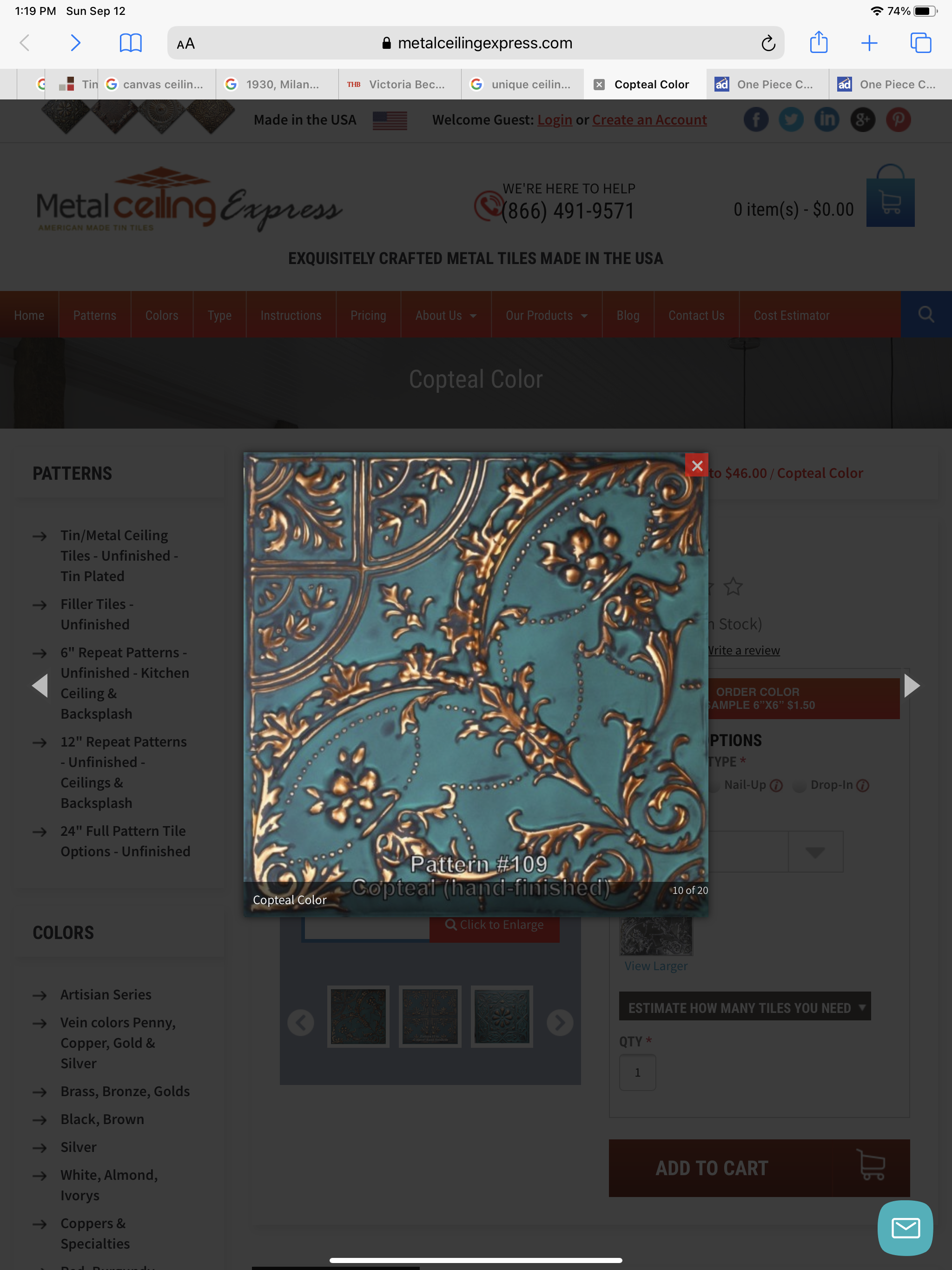
I found this artisan tin online, and while it was out of our budget for the room, the colors and texture gave me an idea.
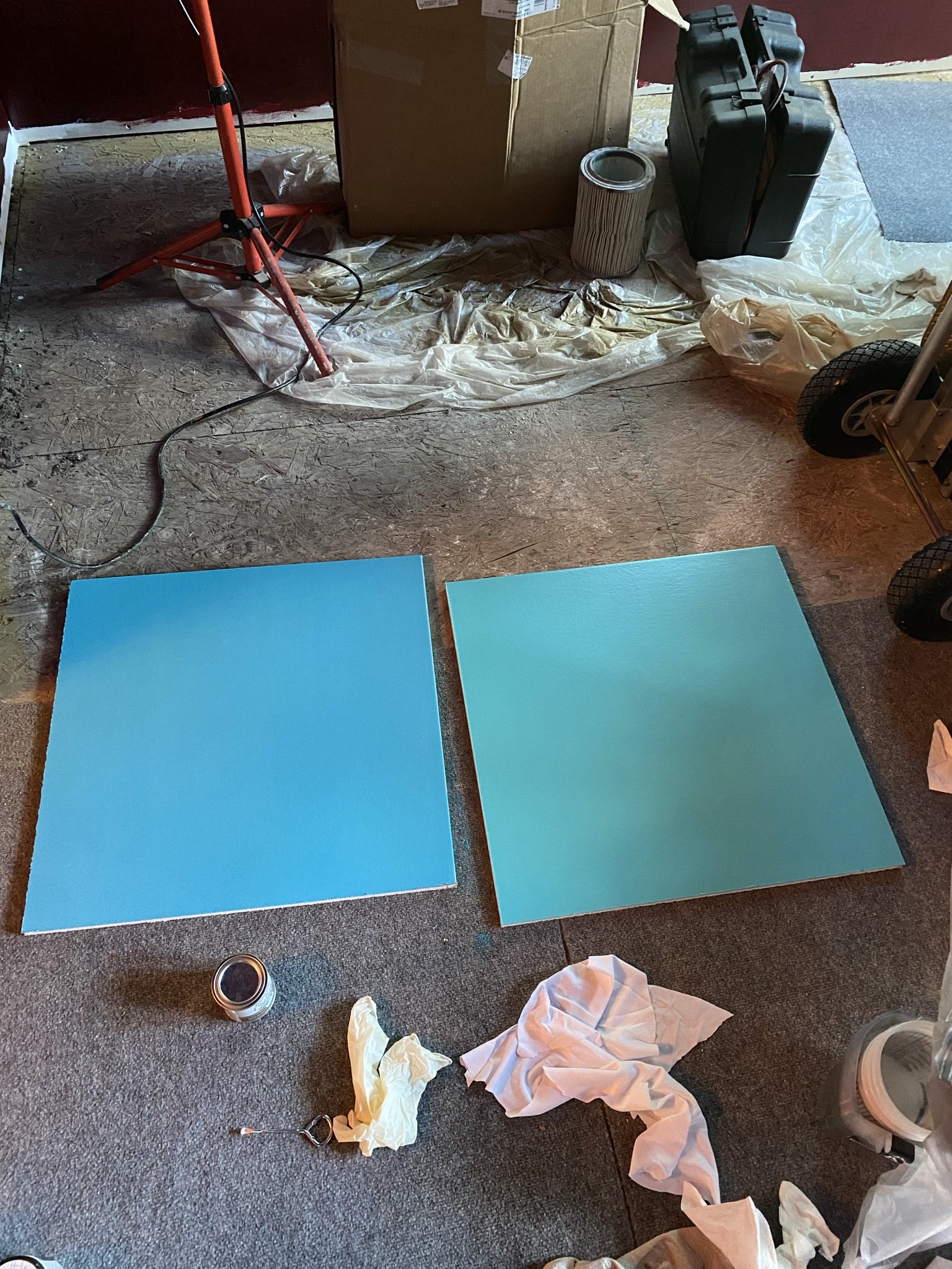
So I started sampling a few aqua colors from the Behr paint line.
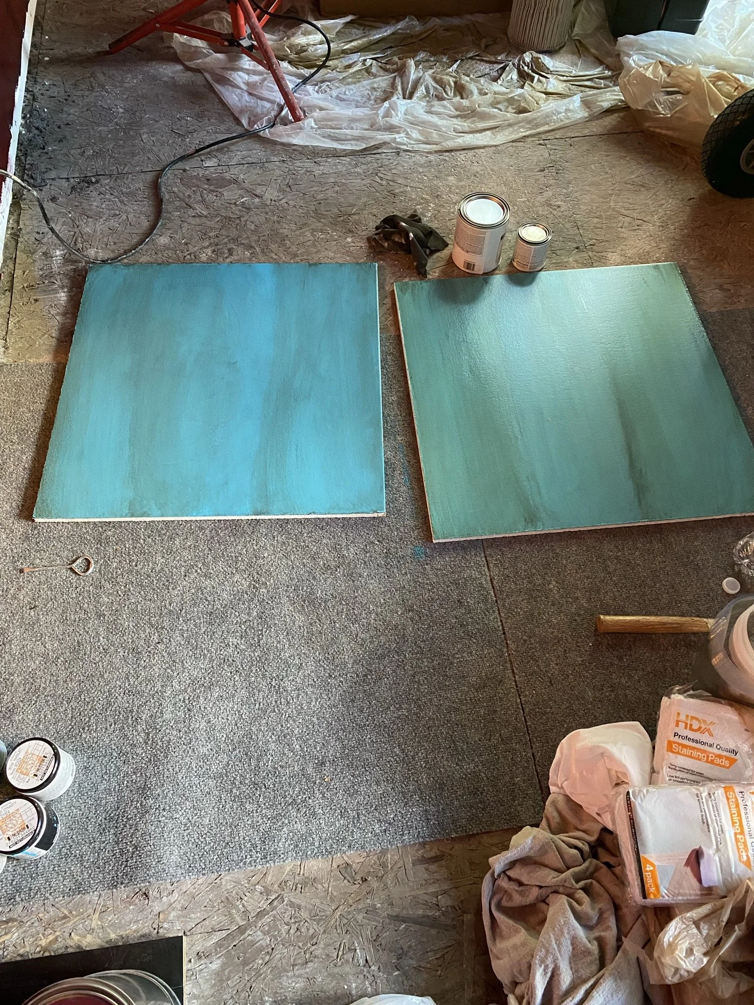
But in order to get the depth of the inspiration material, I ragged on a few different glazes until I found a color that gave the best effect.
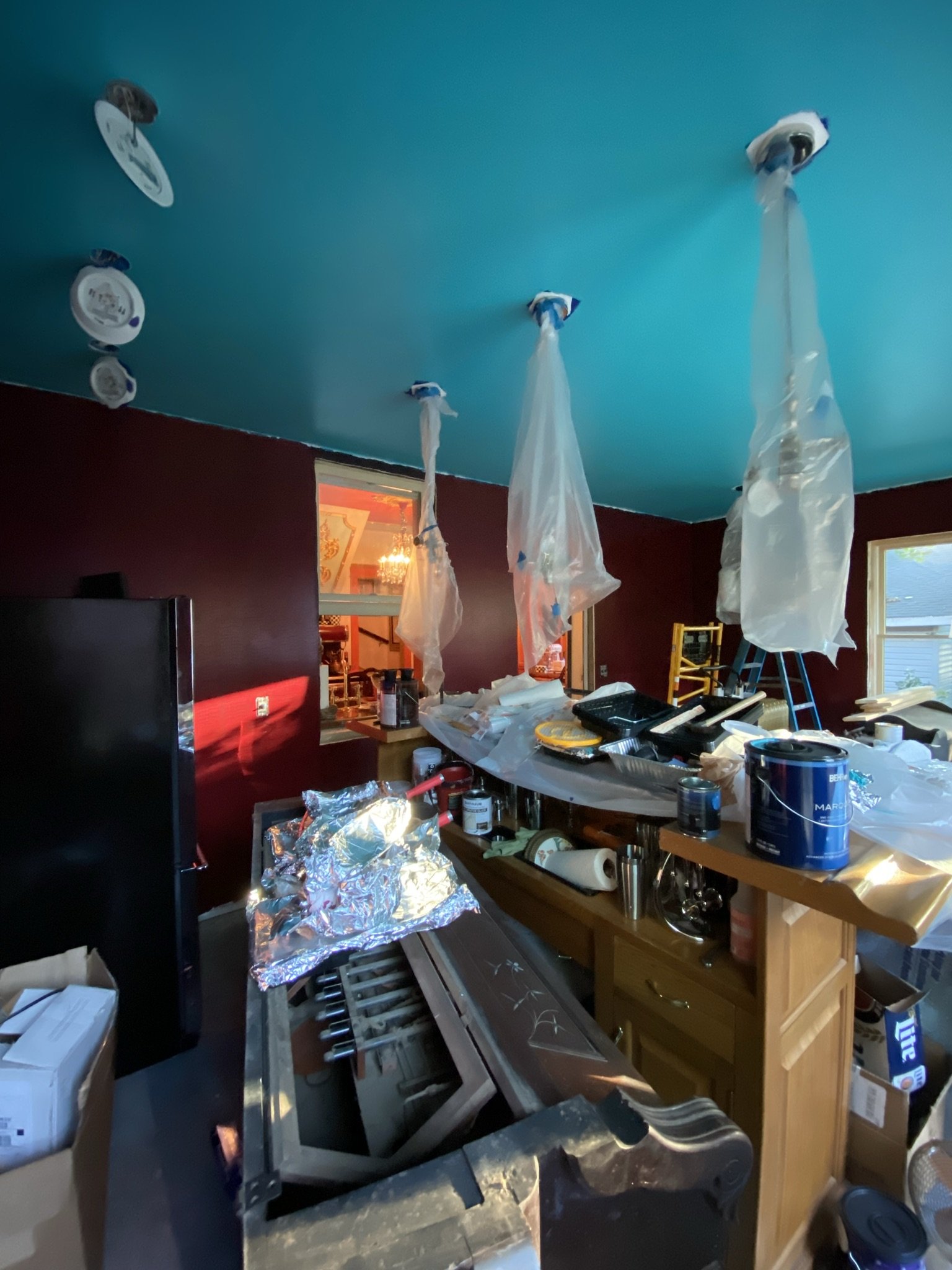
Next step was to paint the ceiling, yet again. I don't remember which color this is, but I don't think it matters. Lighting and angles change color so much that your best bet when trying to "get" a color you see in a photo is to compare the photo to paint samples and pick the closest one.
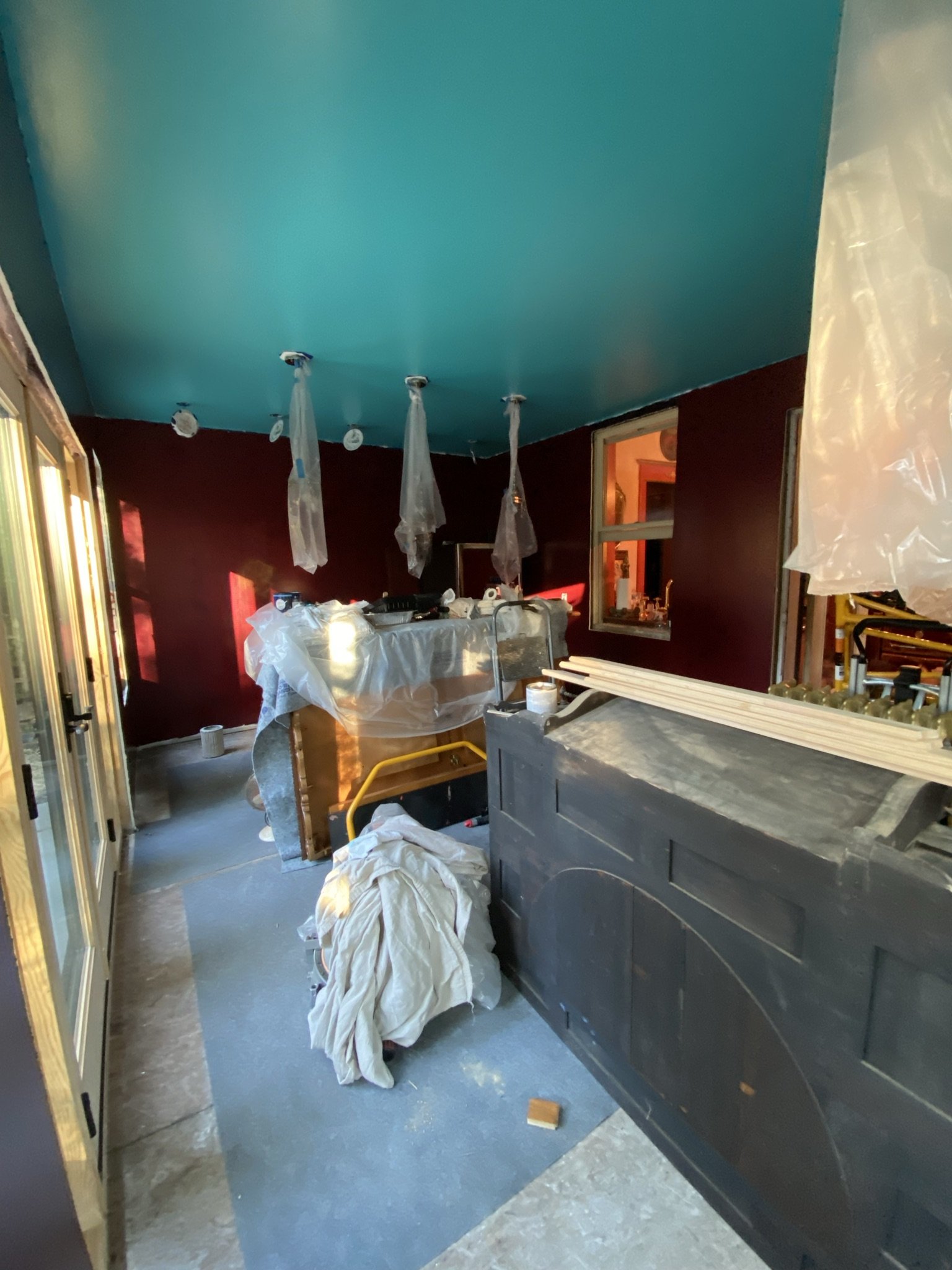
Here's a good example of what I'm talking about. This paint appears to have a lot more green in it when viewed, as it is here, in front of a westerly window. When it was viewed with a southern window behind me in the prior photo, the paint was much bluer.
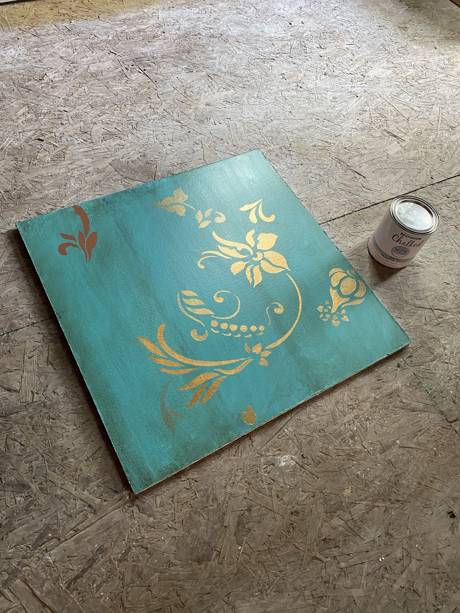
Here is my sample board with some stenciling. I used the Flourish design from Royal Design Studio. The paint is Folkart Treasure Gold in Copper.
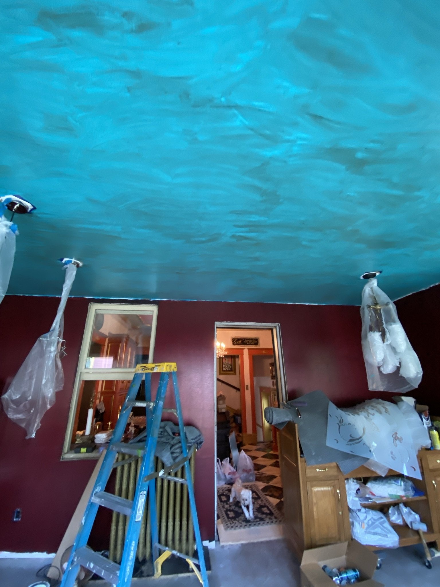
Next step was to glaze the ceiling using a rag and wipe technique (YouTube is a better source for how to do this than me).
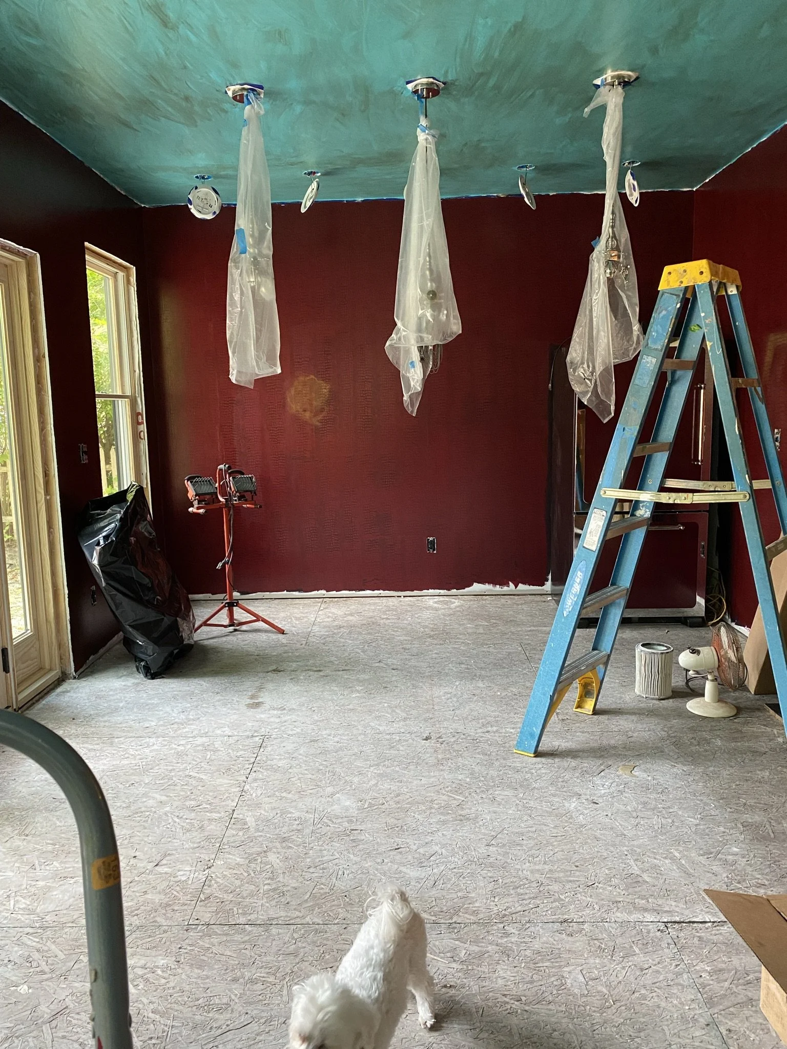
Again, the ceiling is SO much greener from this direction.
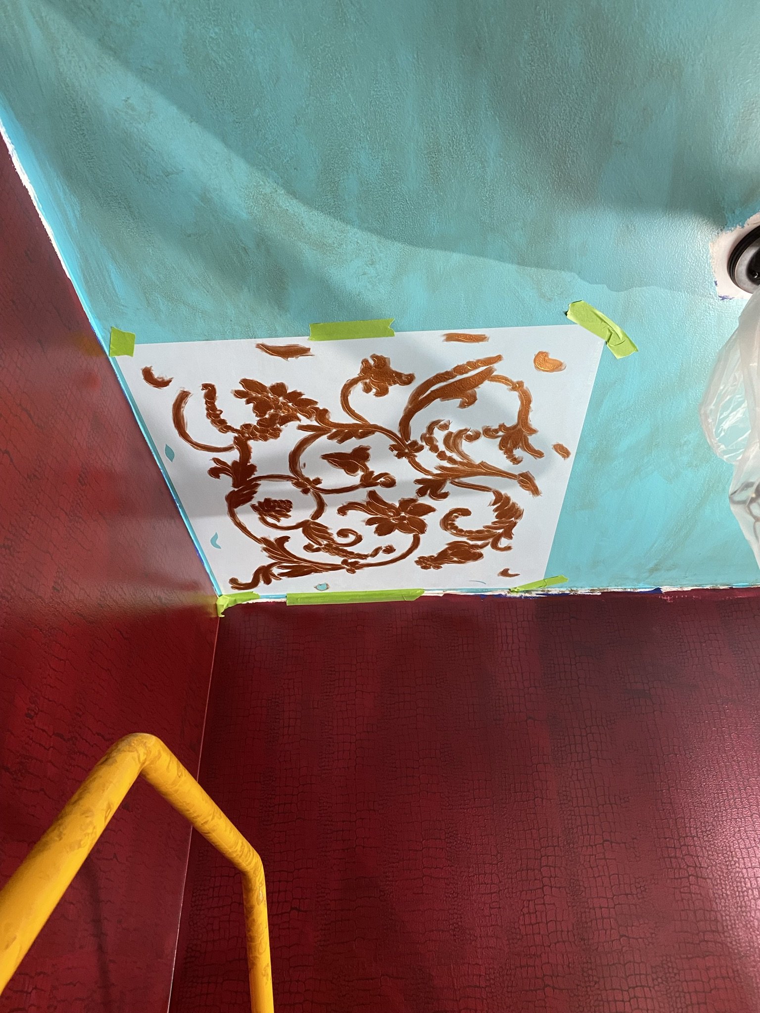
Now for the first stencil. Admittedly, this was a bleeping nightmare. I didn't want a "stenciled" look, so I hand painted the design rather than rolling or using a stippling technique. Because of this, I had to get a tight seal, which required me to spray the back of the stencil with 3M adhesive. The paint took 5 coats. Insane.
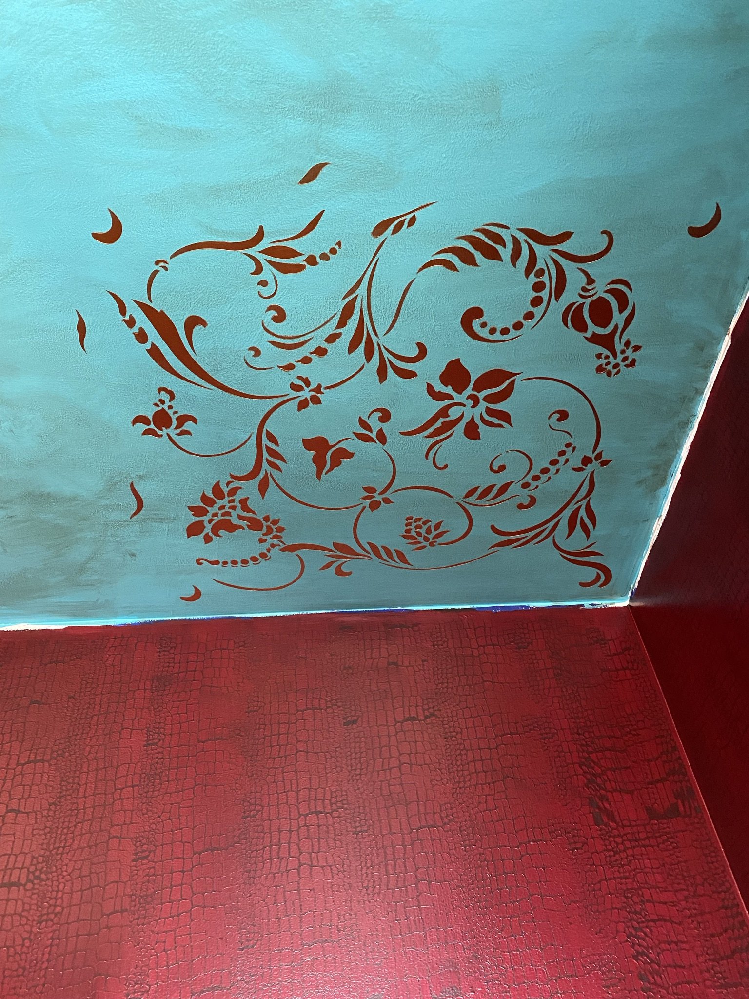
This took forever. I was doomed.
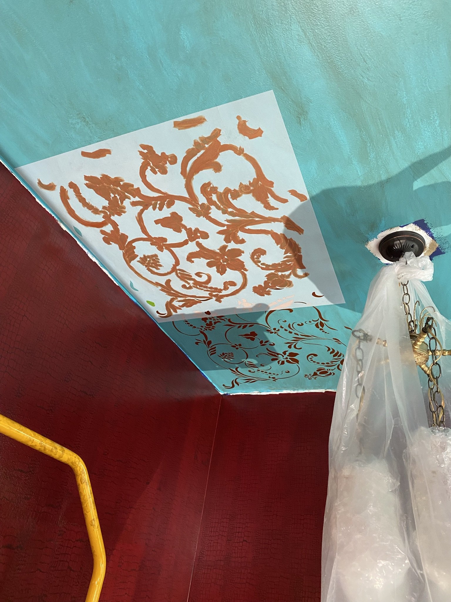
By the second stencil, I knew I needed to build a better mouse trap and therefore did the first coat of the design with a rust or copper colored chalk paint. Then I applied 2 coats of the copper metallic. Using chalk paint saved me two coats, which was a lot of time and work saved.
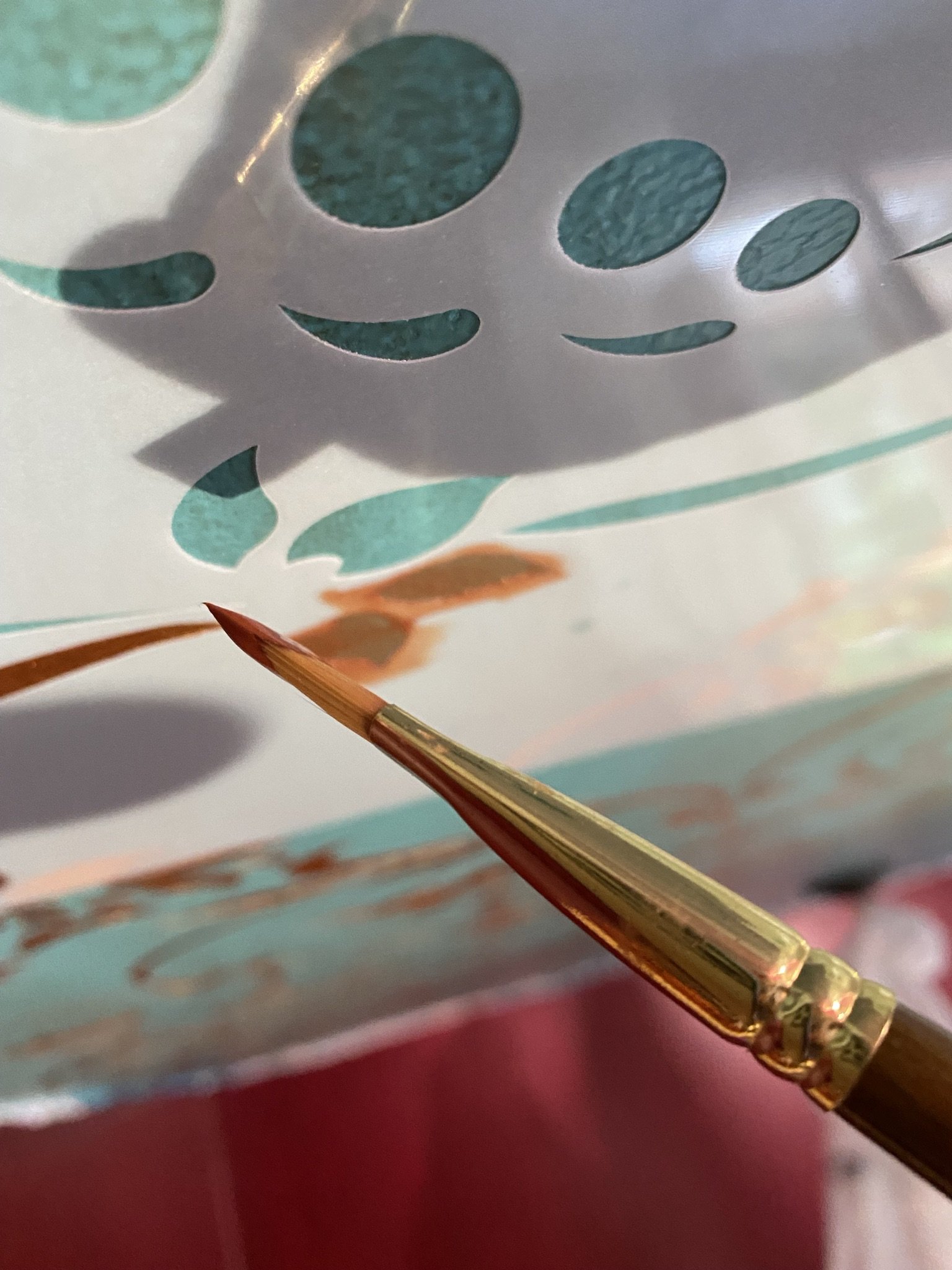
I prefer this technique using an artist brush. Even though it takes WAY longer, the result looks more opaque and like hand painted art than a stencil.
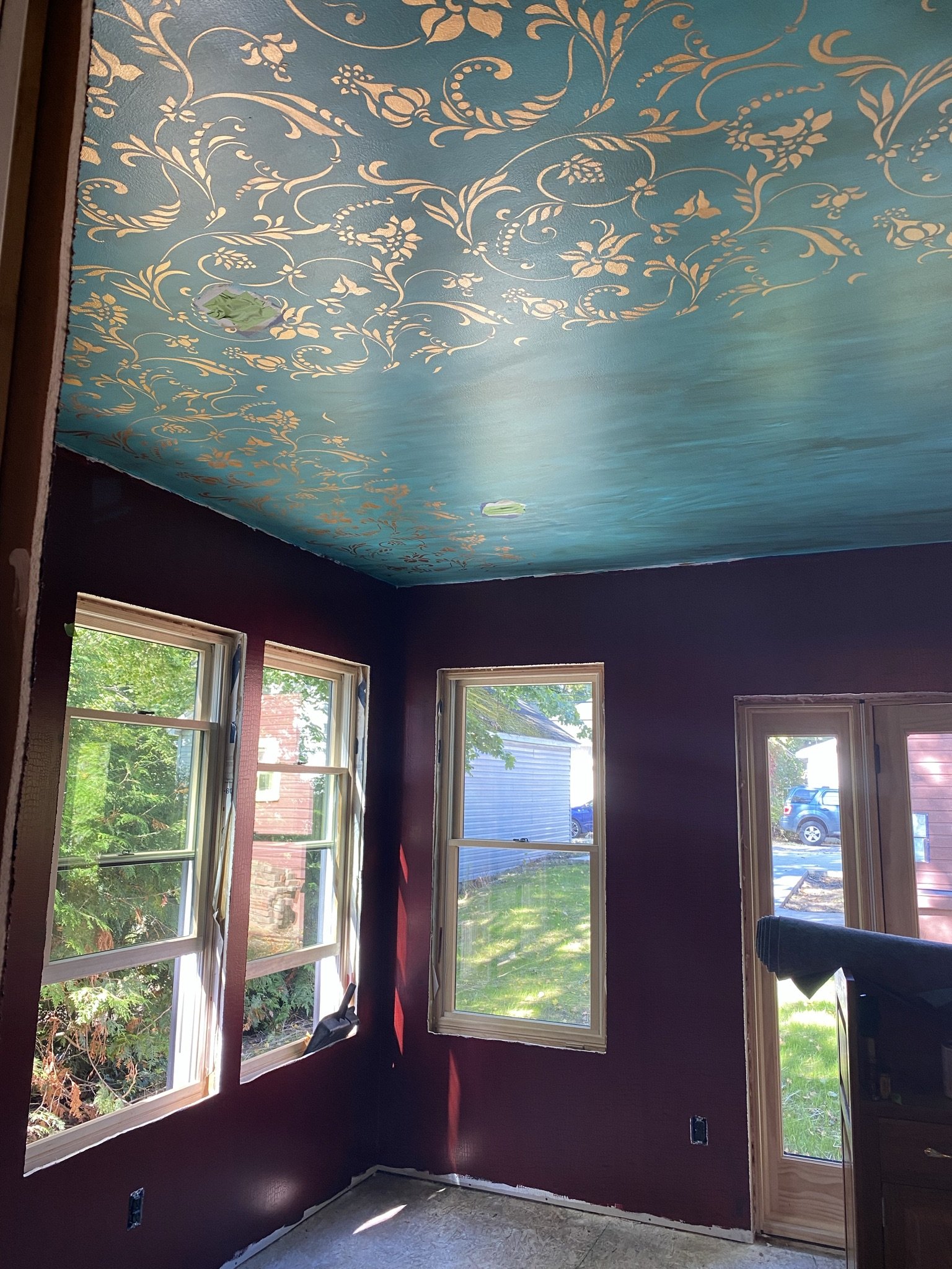
A week later, here I am at about the halfway mark ( I worked on this every day for 5-7 hours).
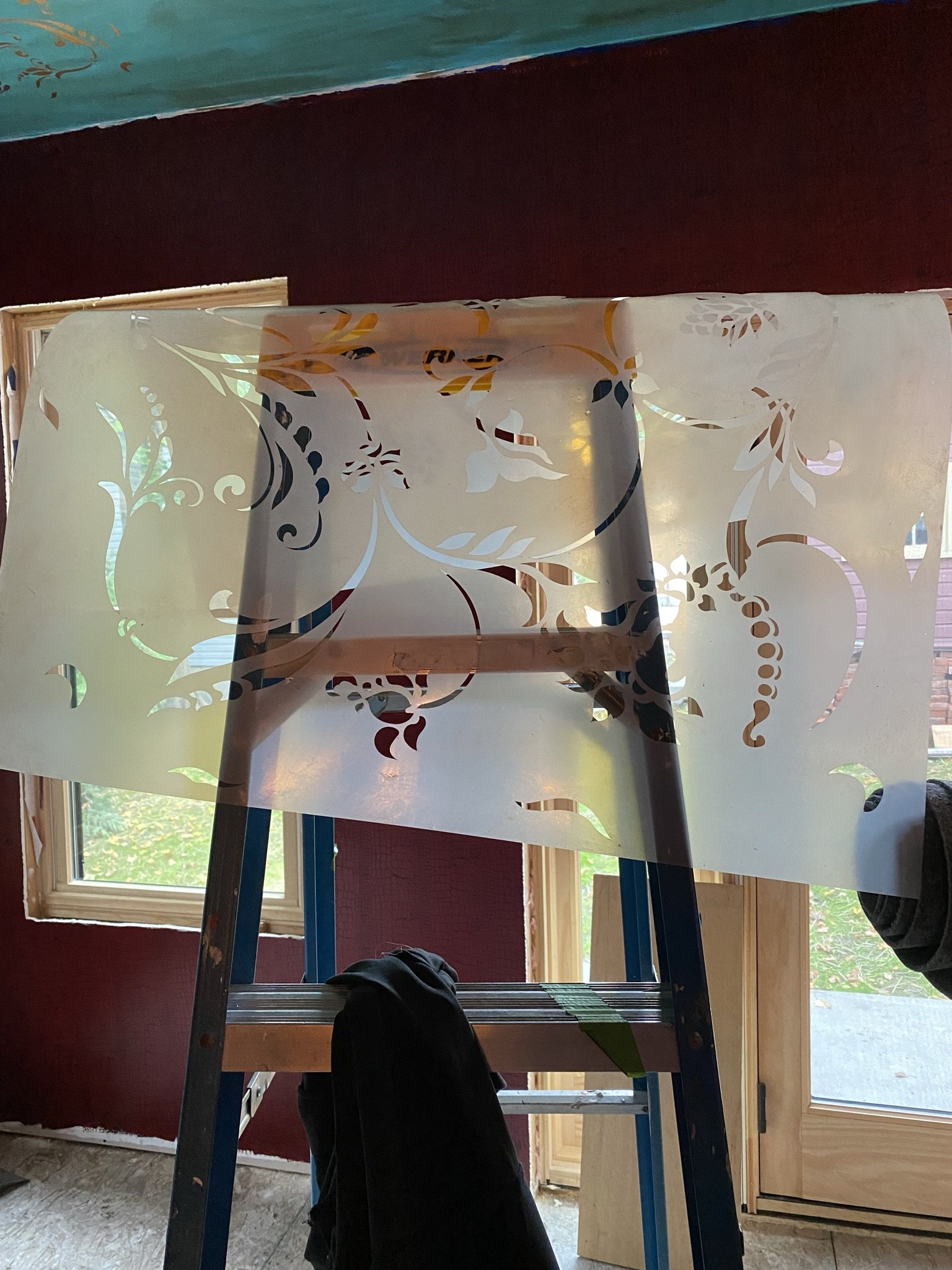
Not only is the painting tedious, but the stencils are not easy to line up when working overhead. Plus, I had to hold them up with my head while lining up due to their size before letting them adhere to the ceiling. So, of course, my hair was filled with adhesive for two-plus weeks. Also, these stencils are a drama to clean, and after spending an hour trying to clean paint and adhesive off three of them, I decided to order multiple stencils. The expense was worth my sanity.
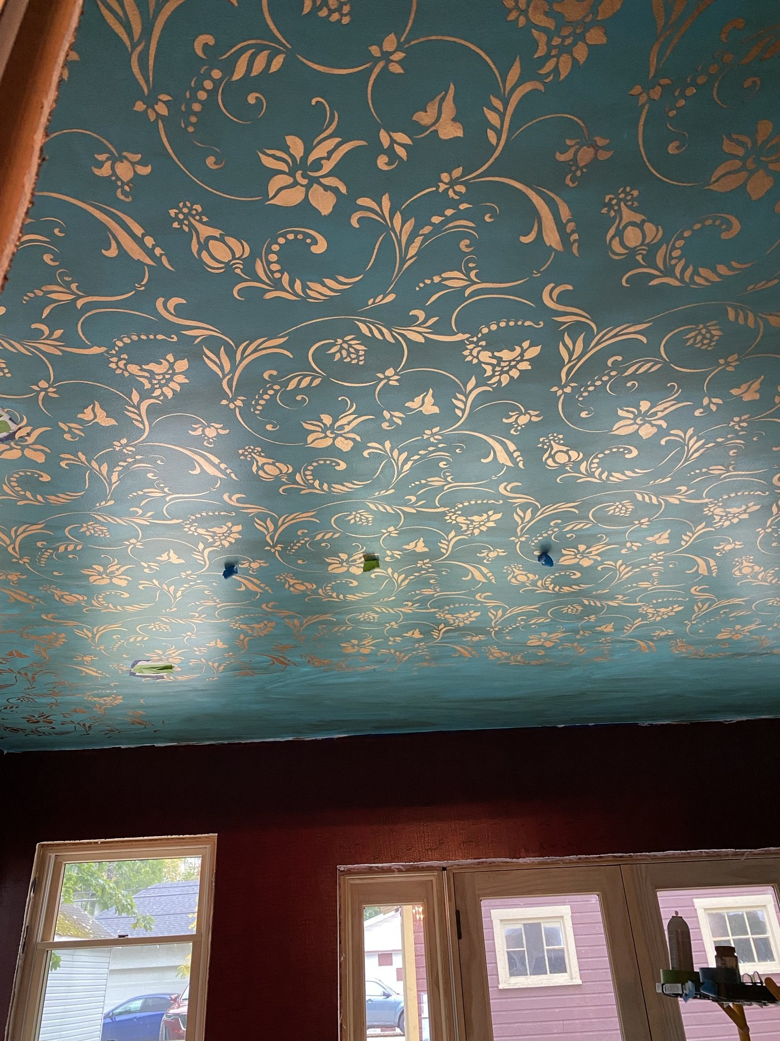
Finish line approacheth.
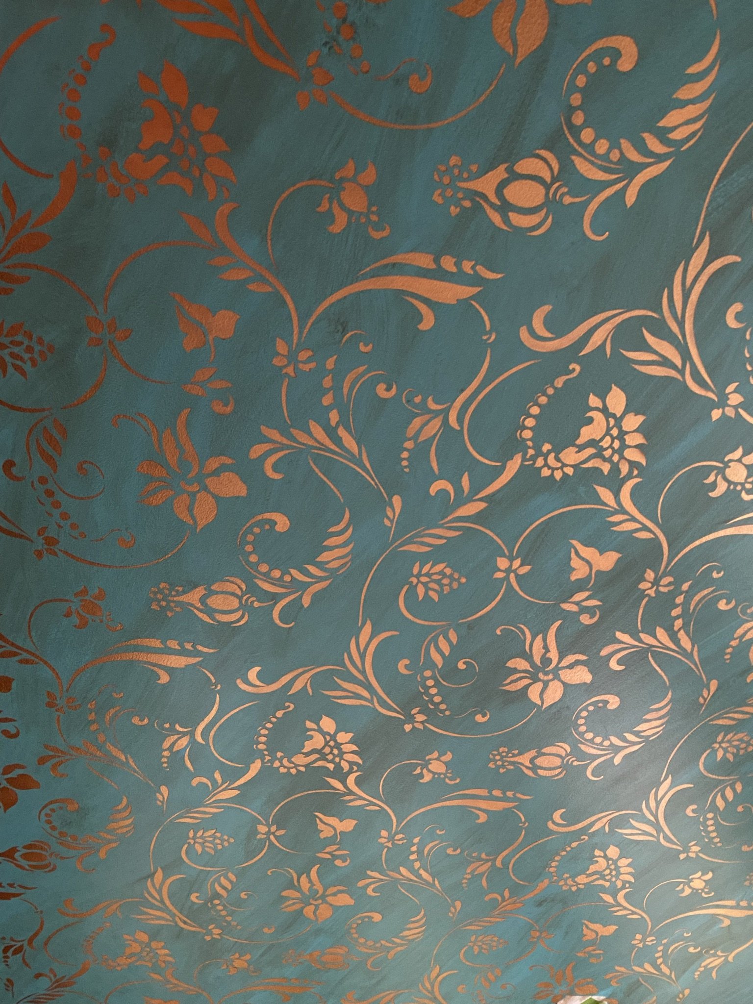
Despite the amount of swearing and complaining I did, I'm glad I took the time to do this right. It's very pretty. And because I used acrylics and because this isn't in a kitchen or bathroom, I didn't do a topcoat and feel that will be fine.
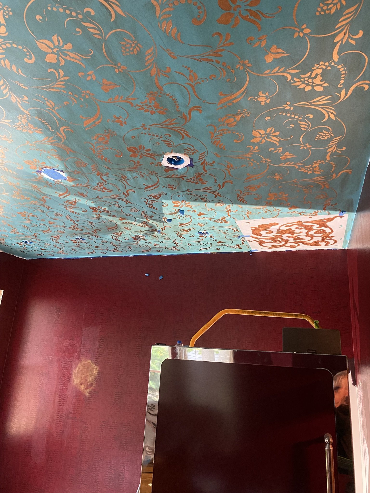
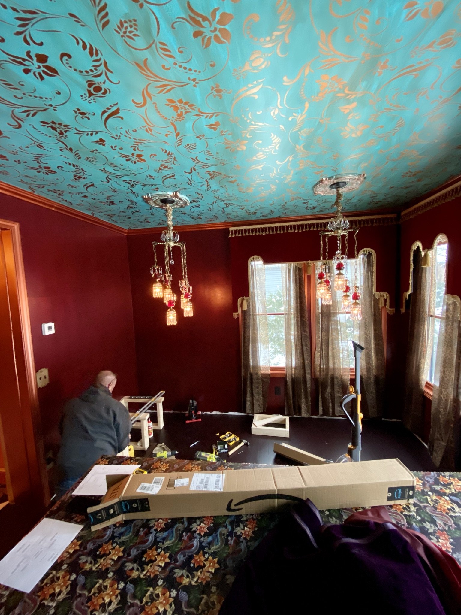
Here we are at the last square. Of course, for this one, I had to sit on top of the fridge. For the rest, I used scaffolding, which I highly recommend over a ladder for doing ceiling work.
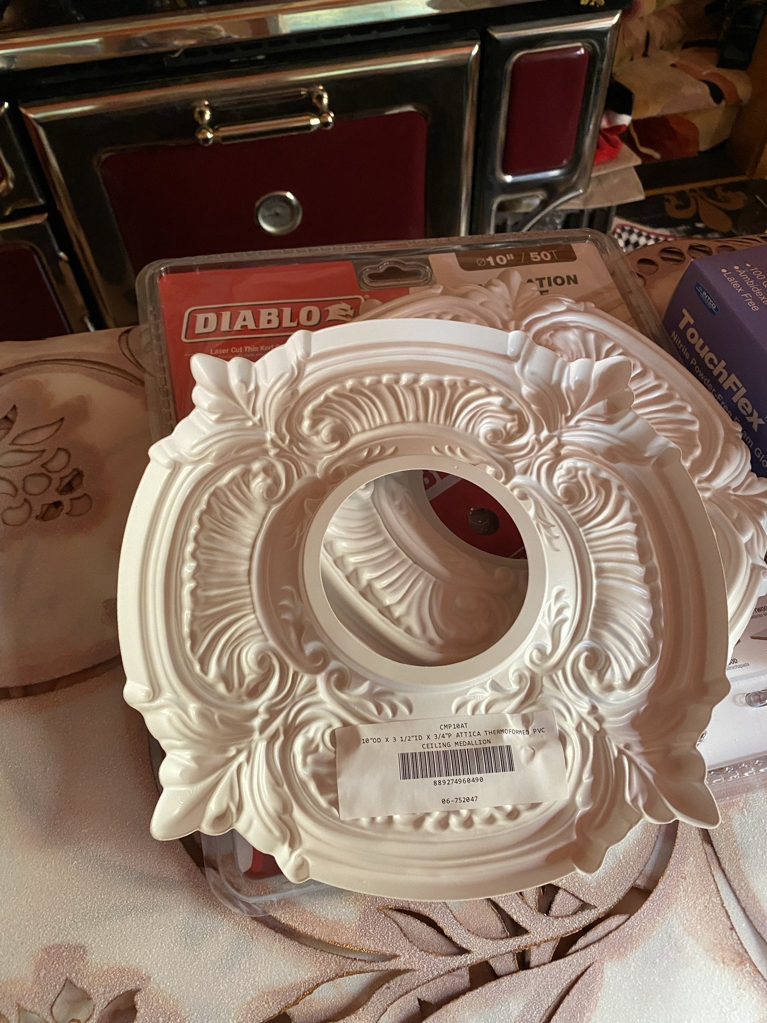
I wanted medallions for each of the light fixtures and found these on the Architectural Depot website for $8. You get what you pay for. They're cheap and wibbly, but redeemable if you apply an artistic finish.
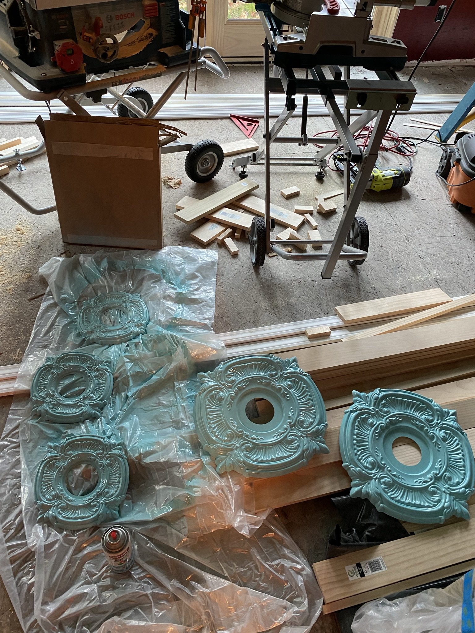
As seen here, despite being cheap and thin plastic, these painted up pretty nice. I sprayed them with an aqua paint as the first step.
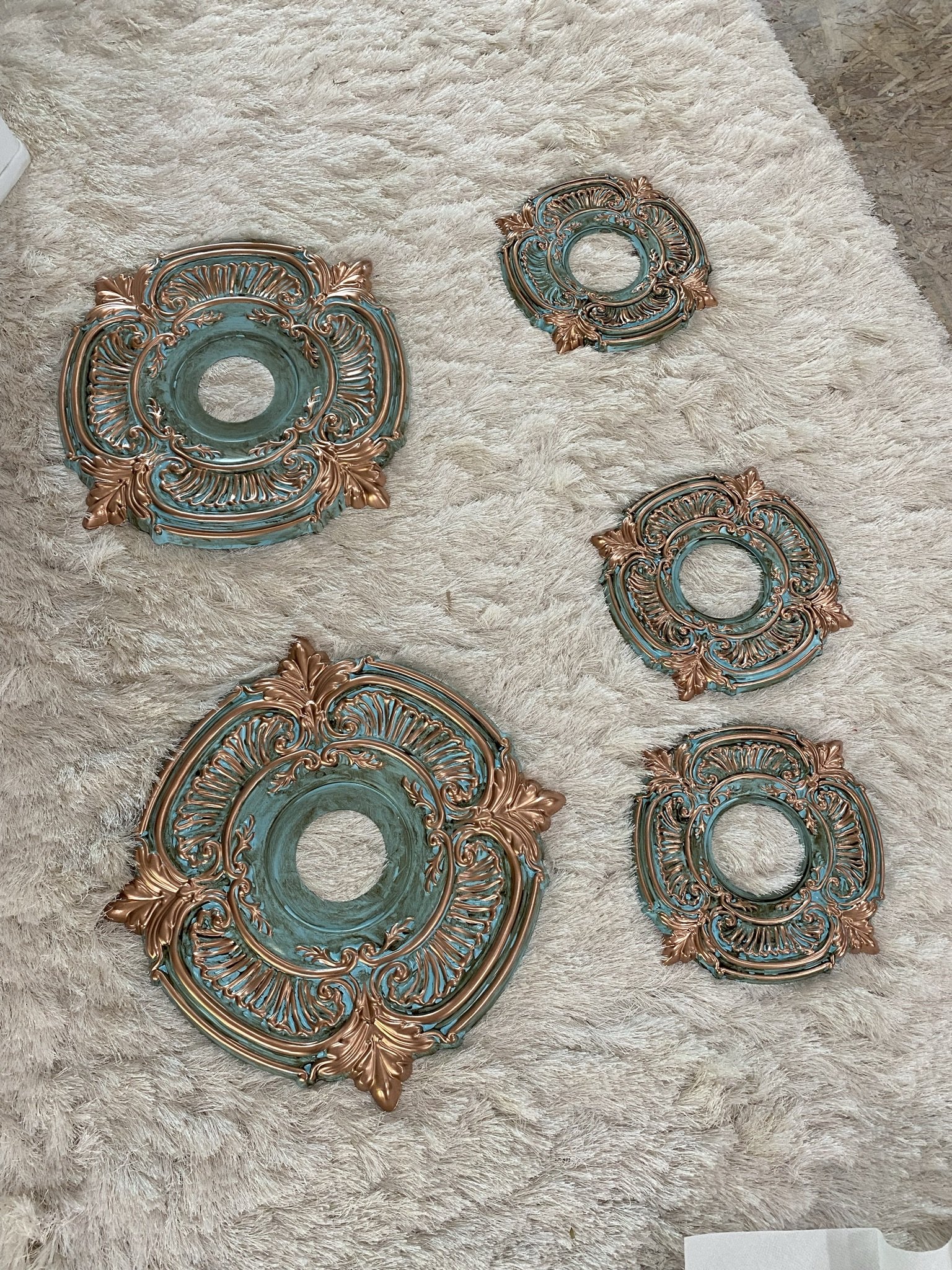
Then I painted the detail with oil based copper model car paint.
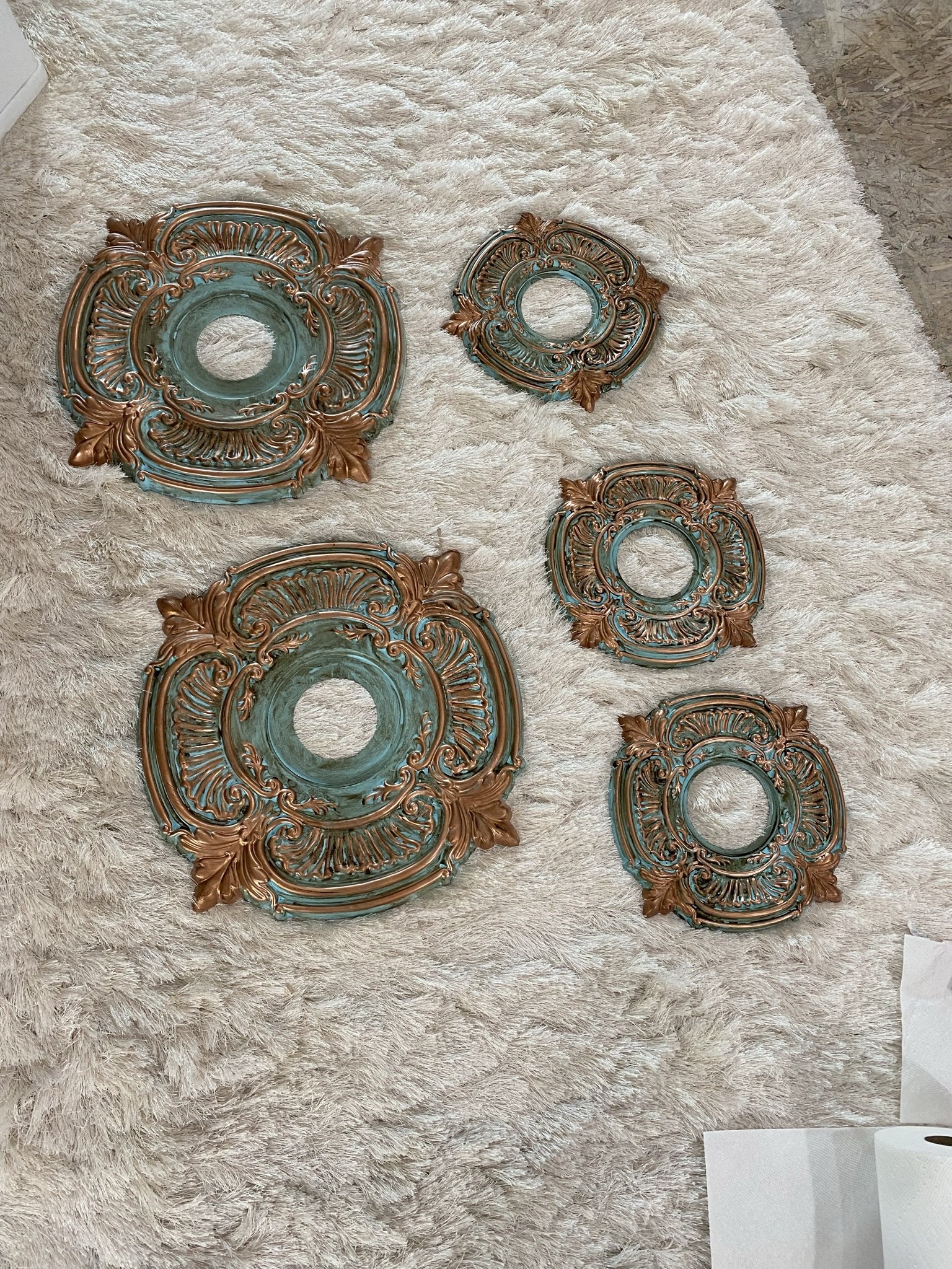
Then I buffed them with some antiquing waxed. They look far more high quality than they are.
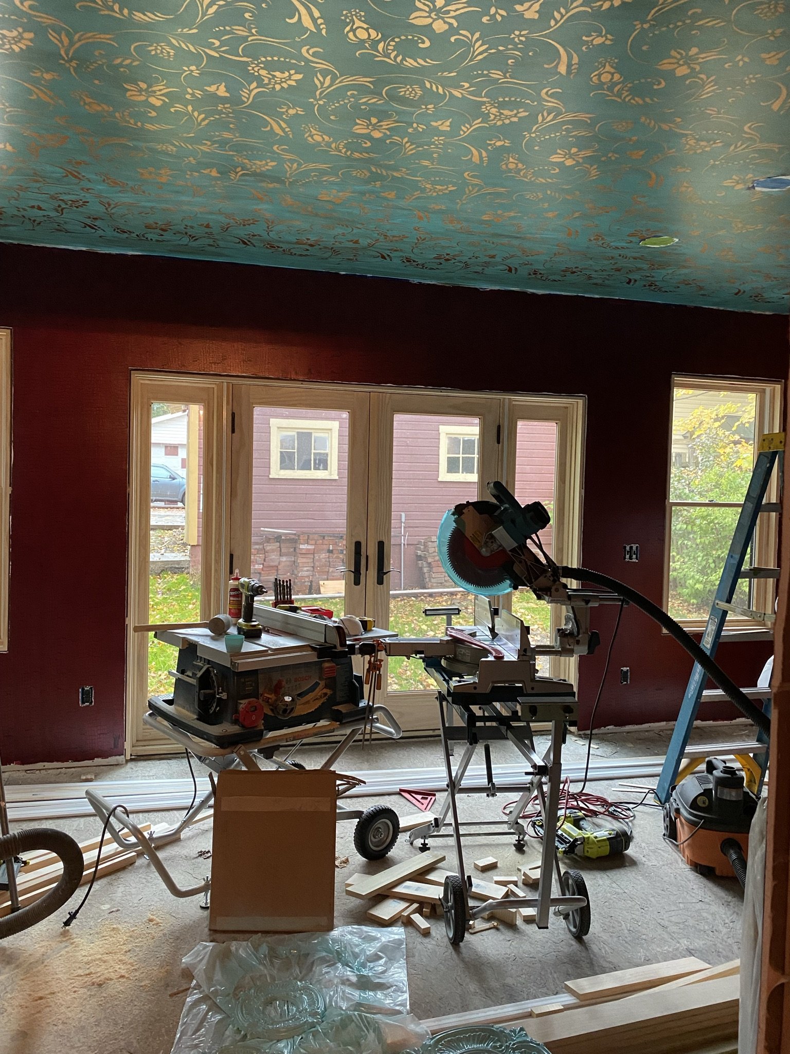
After completing the ceiling, we (Mike) turned to the trim work.
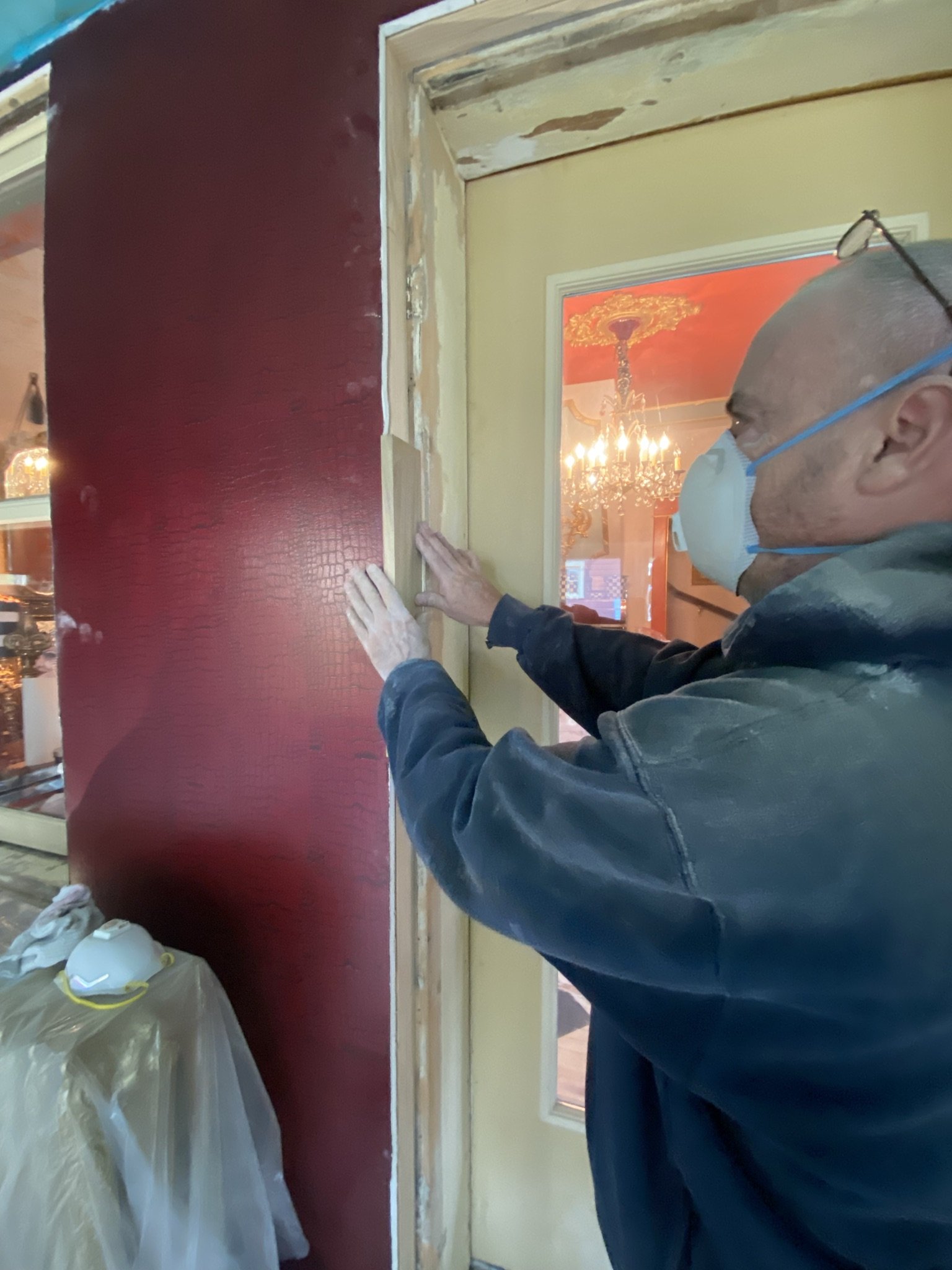
There was a lot of prep work around the door and window casings.
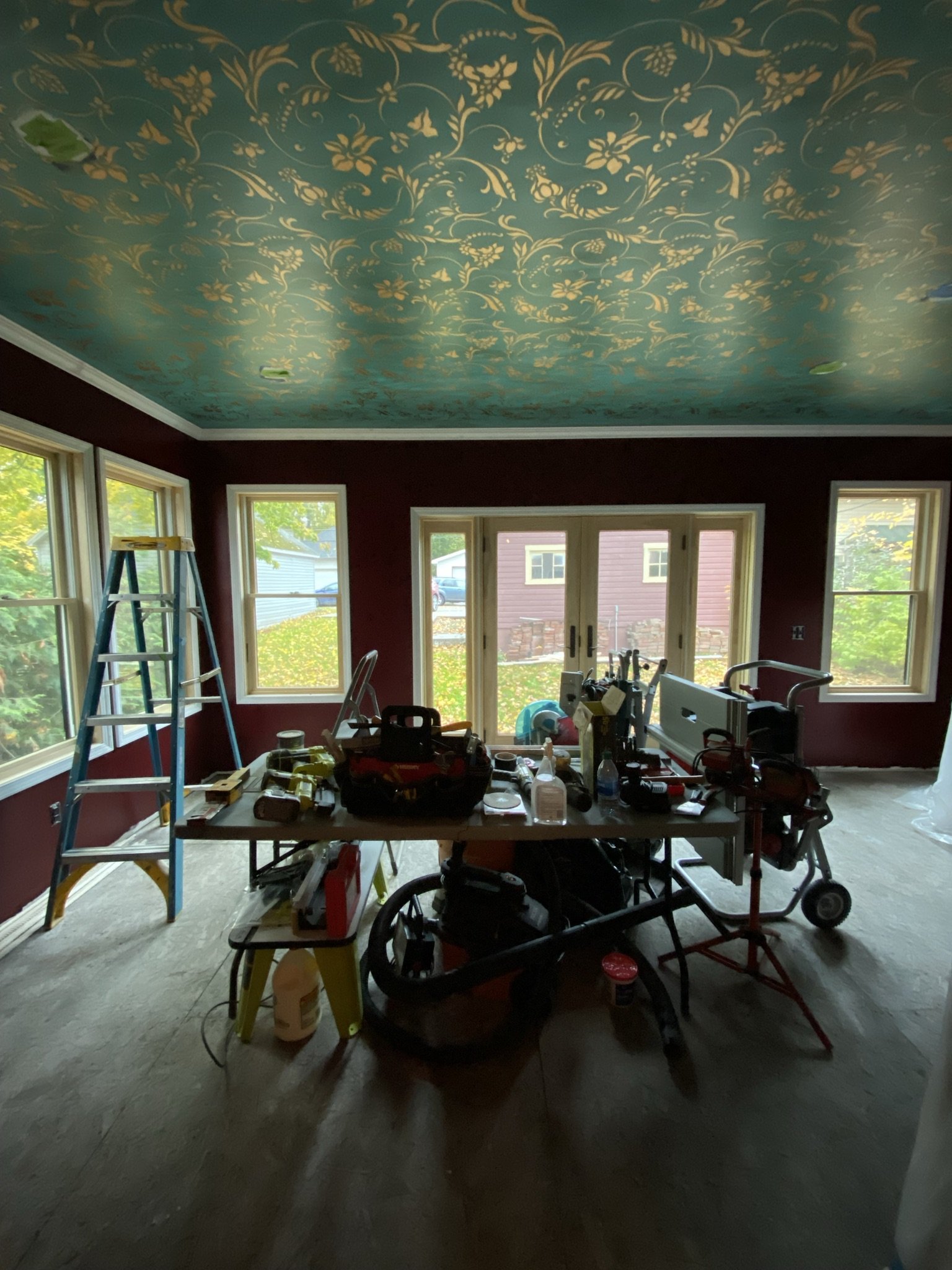
We went with a small crown due to the ceiling height (lower than the rest of the first floor) and because of complexities caused by the kitchen window.
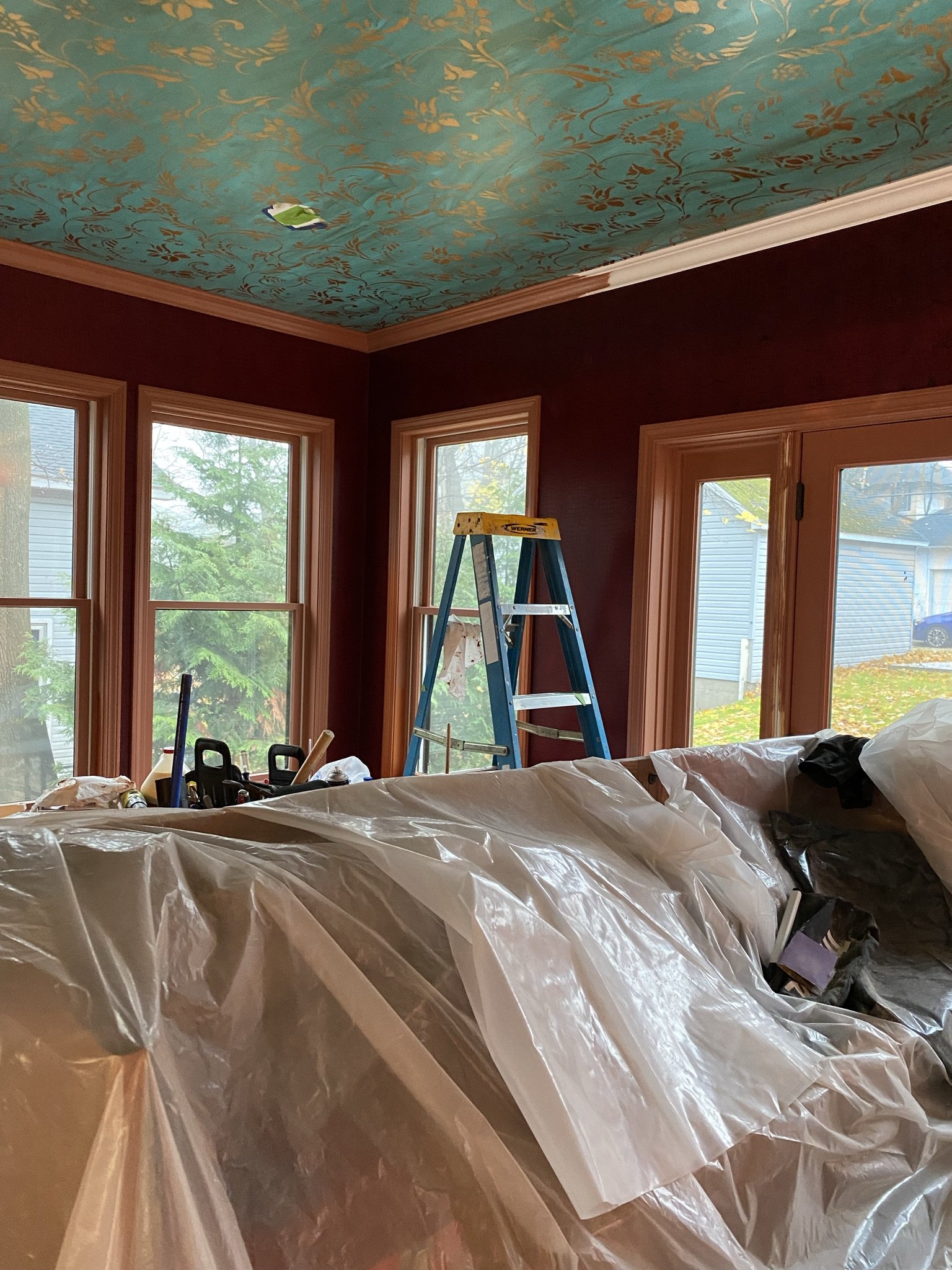
After Mike installed the trim, I painted it with Modern Masters Copper.
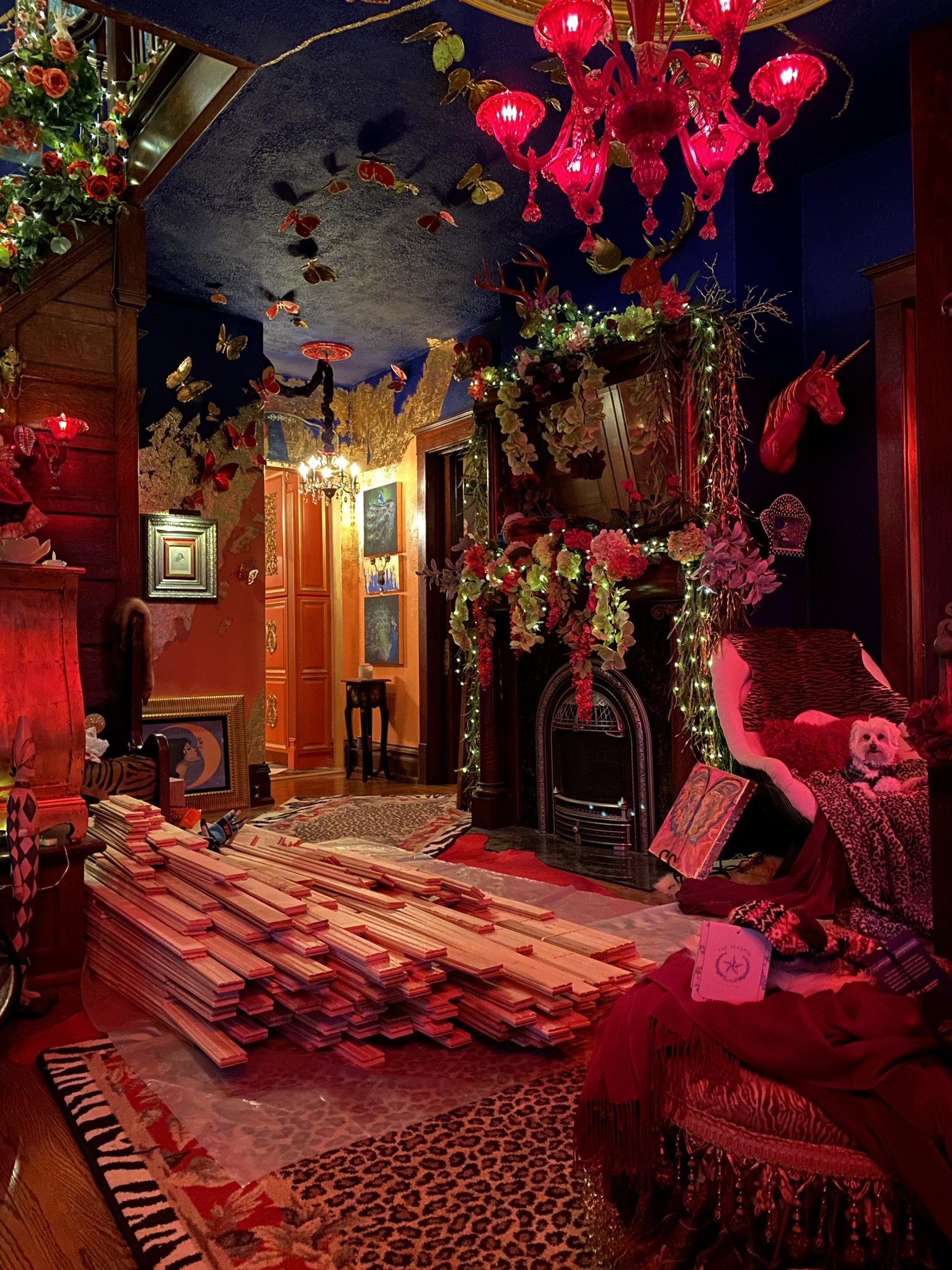
Flooring is the next step. Here it sits in our entry hall awaiting installation.
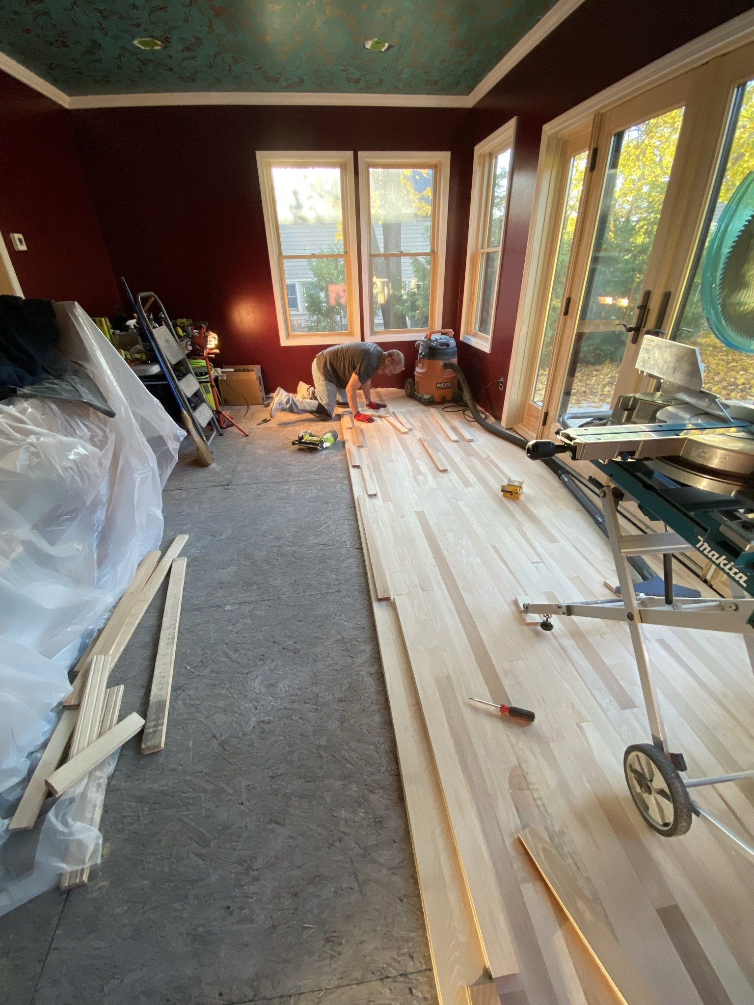
Mike installing the wood floor, which I would later paint.
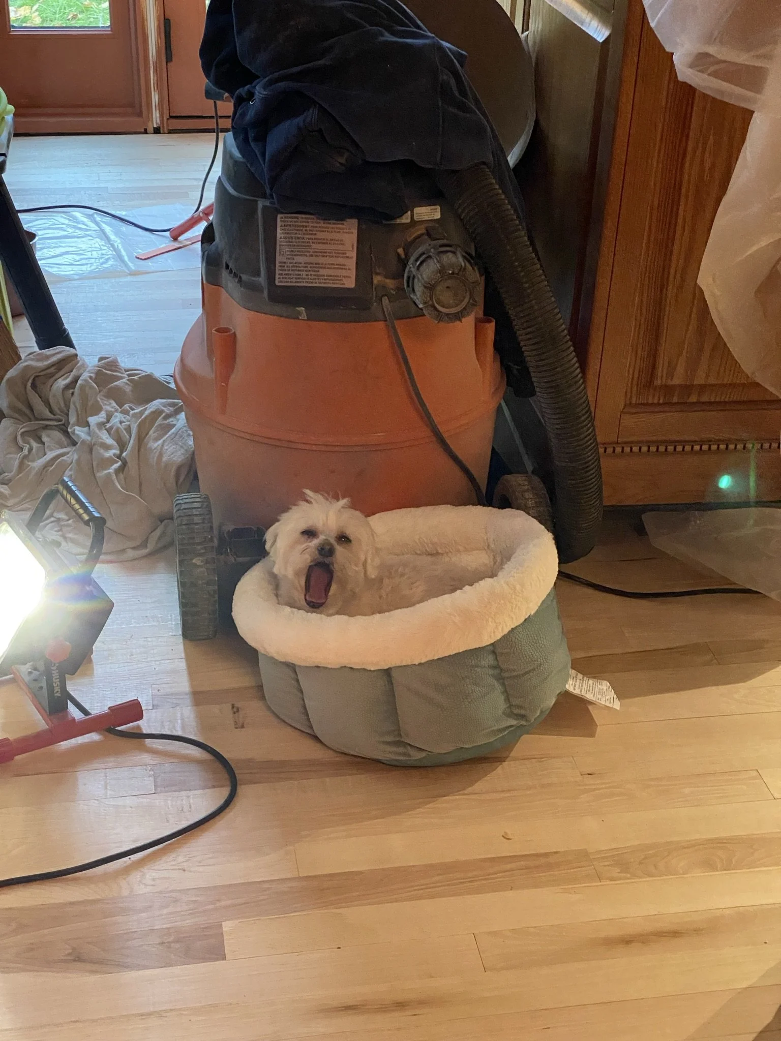
Floor's done. Dog's bored.
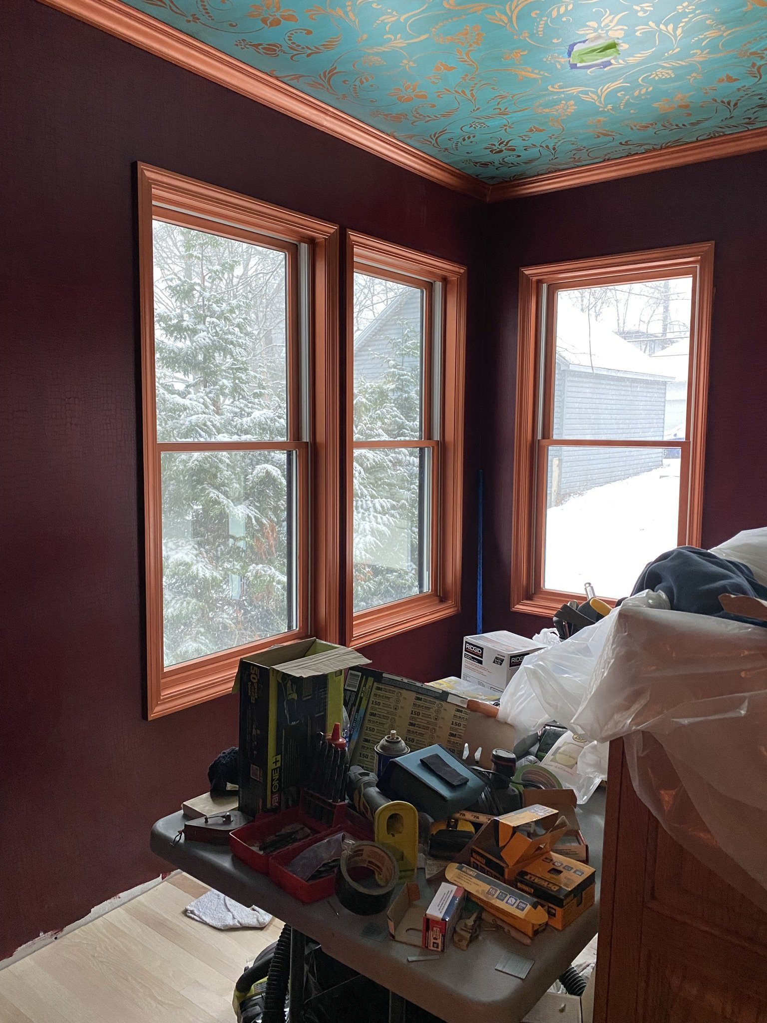
These colors work better than they should. I can't explain it, except to say the warmth of the copper, the richness of the red, and the coolness of the turquoise are a pleasing dynamic.
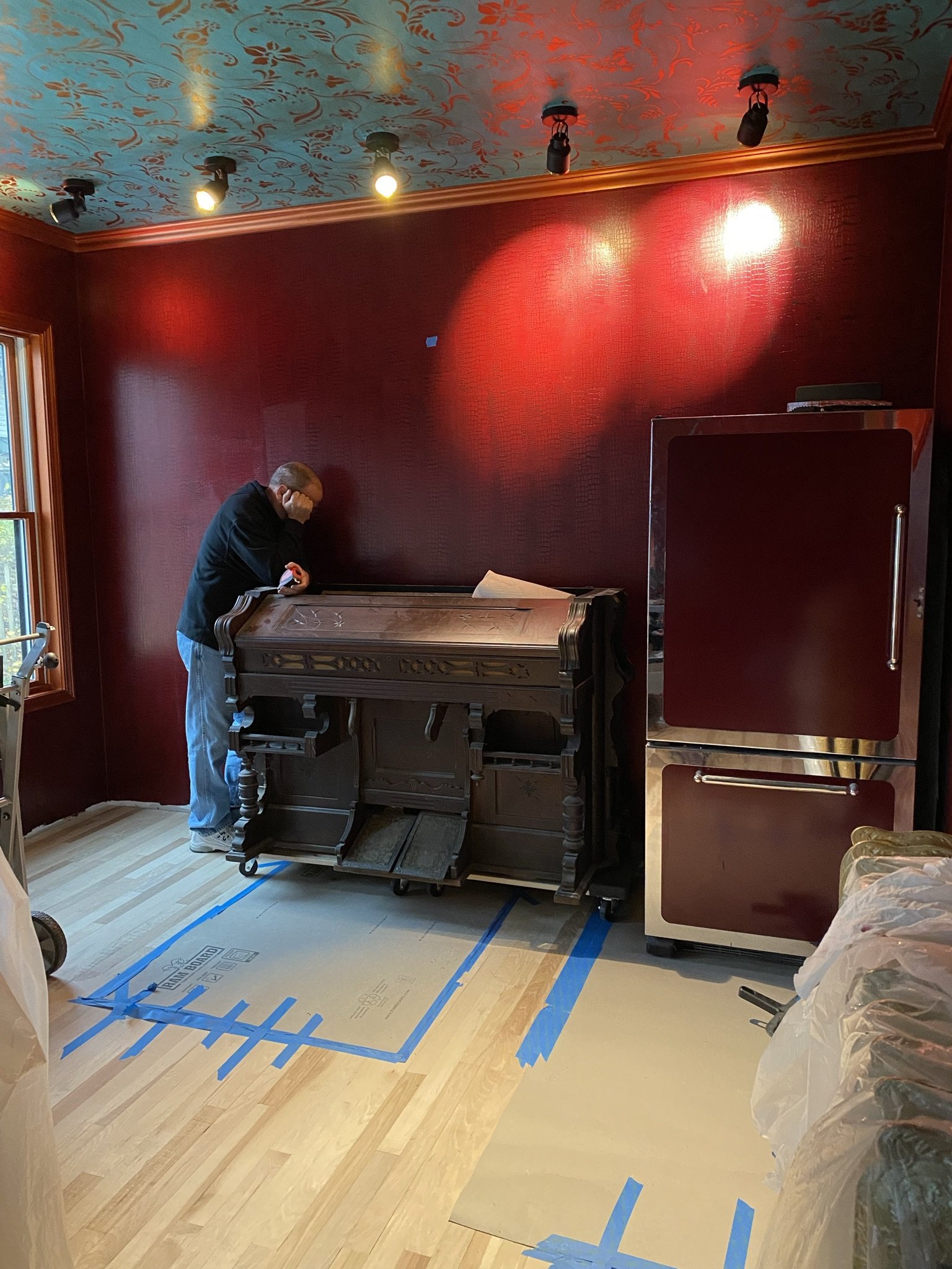
Here's Mike, trying to figure out what's next lol. We decided to drag up a bonus fridge that was in the basement and use it as a bar fridge. This was part of the kitchen suite we found on eBay. There wasn't enough room in the kitchen for a left and right-side refrigerator, so it lived in the basement before finding its new home in the bar.

To help Mike with the back bar design conundrum, I sketched out this diagram of my vision.
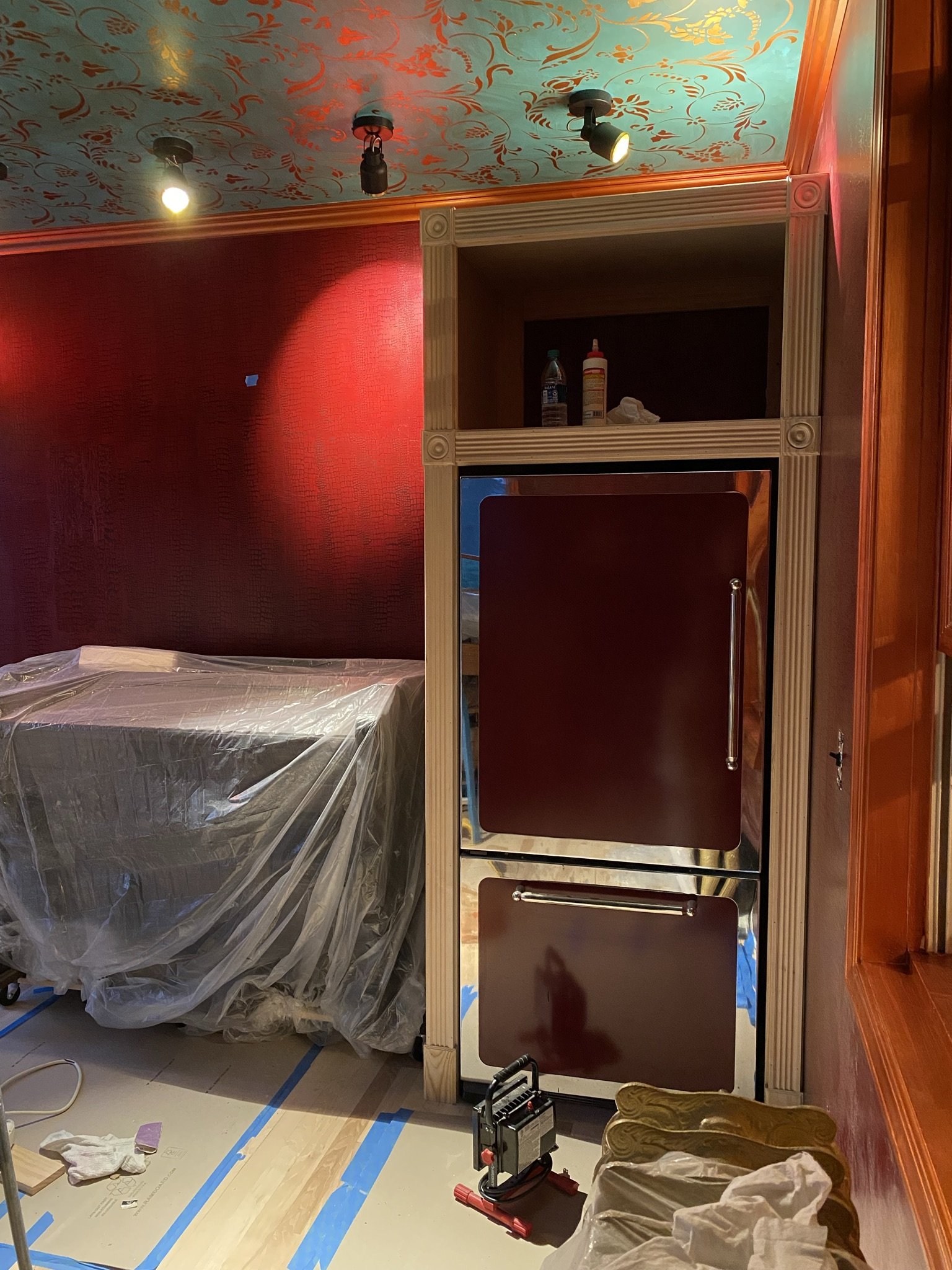
Armed with my vision, Mike first built out the refrigerator cabinet. I felt this was mandatory to give the back bar a more cohesive look.
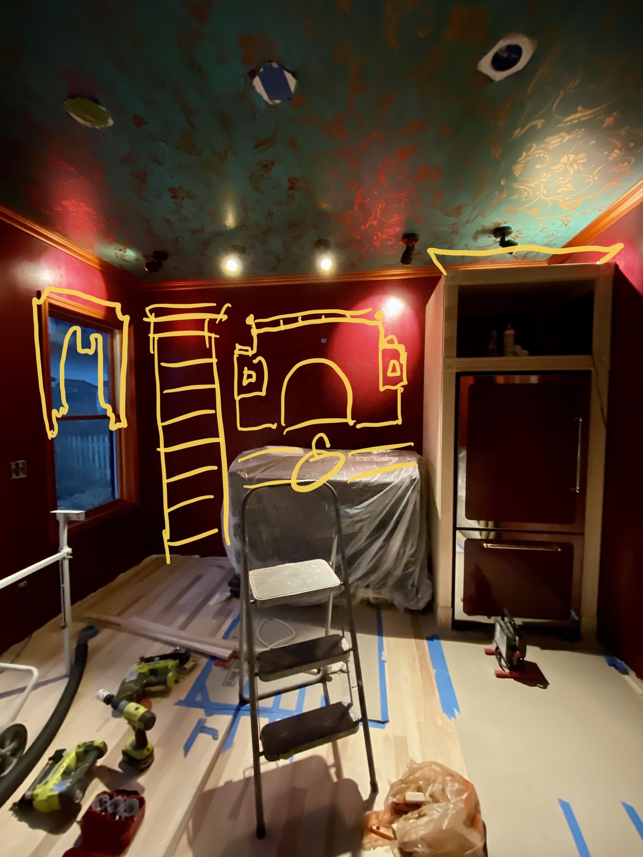
My vision also included cornices on the windows. I felt this would give the room more architectural detail, which it desperately needed.
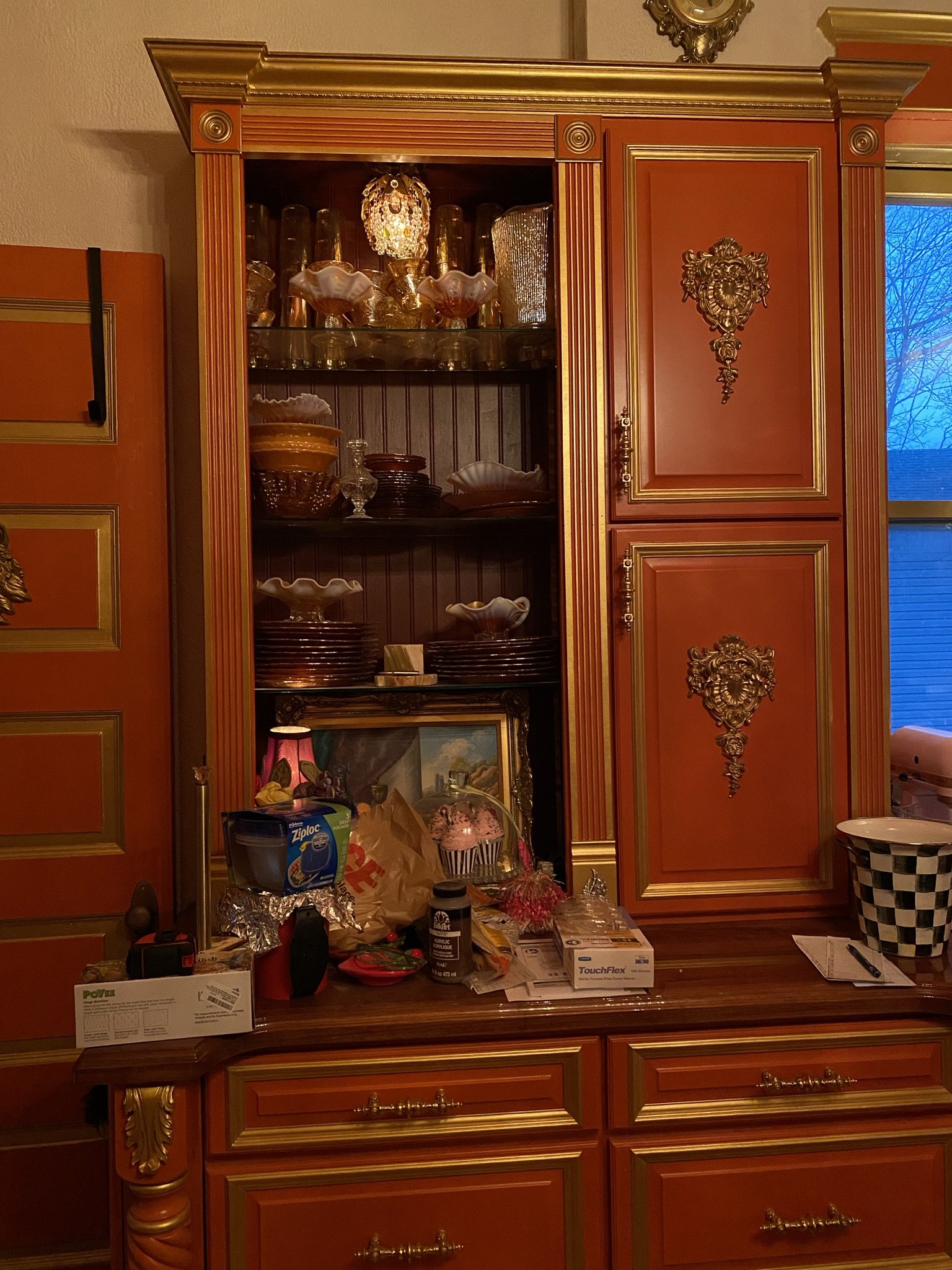
The inspiration for the liquor shelf that Mike would build next to the centerpiece parlor organ was the hutch he built in the kitchen.
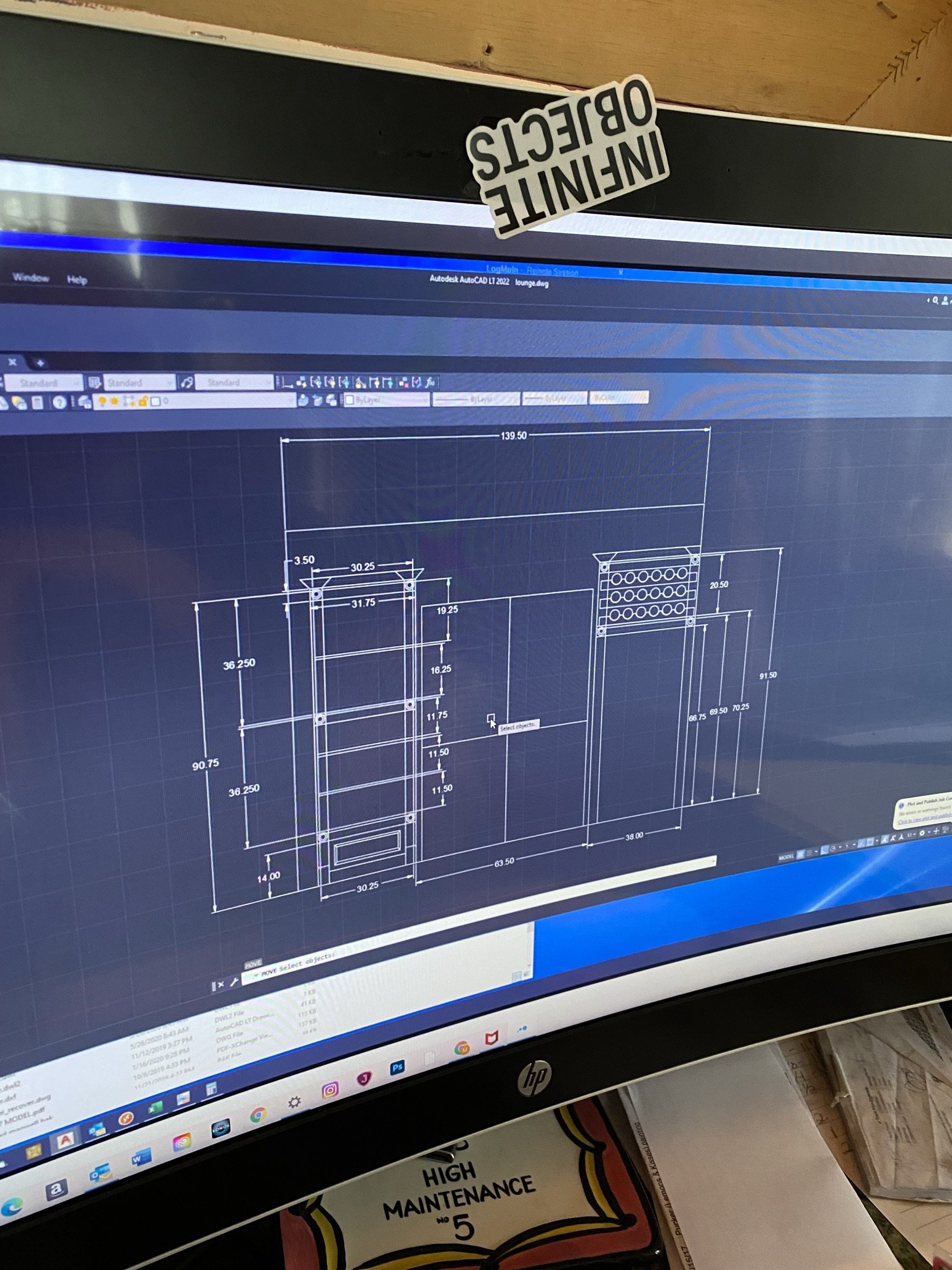
Of course, Mike puts all of my visions in AutoCAD before starting any project.
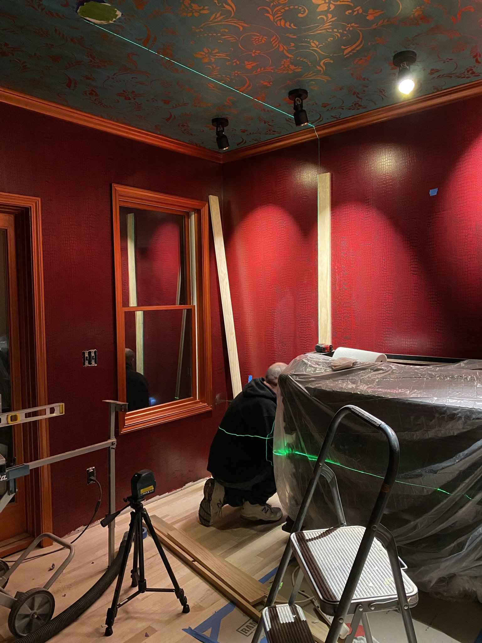
Next step is the liquor storage, which will be an open shelving unit.
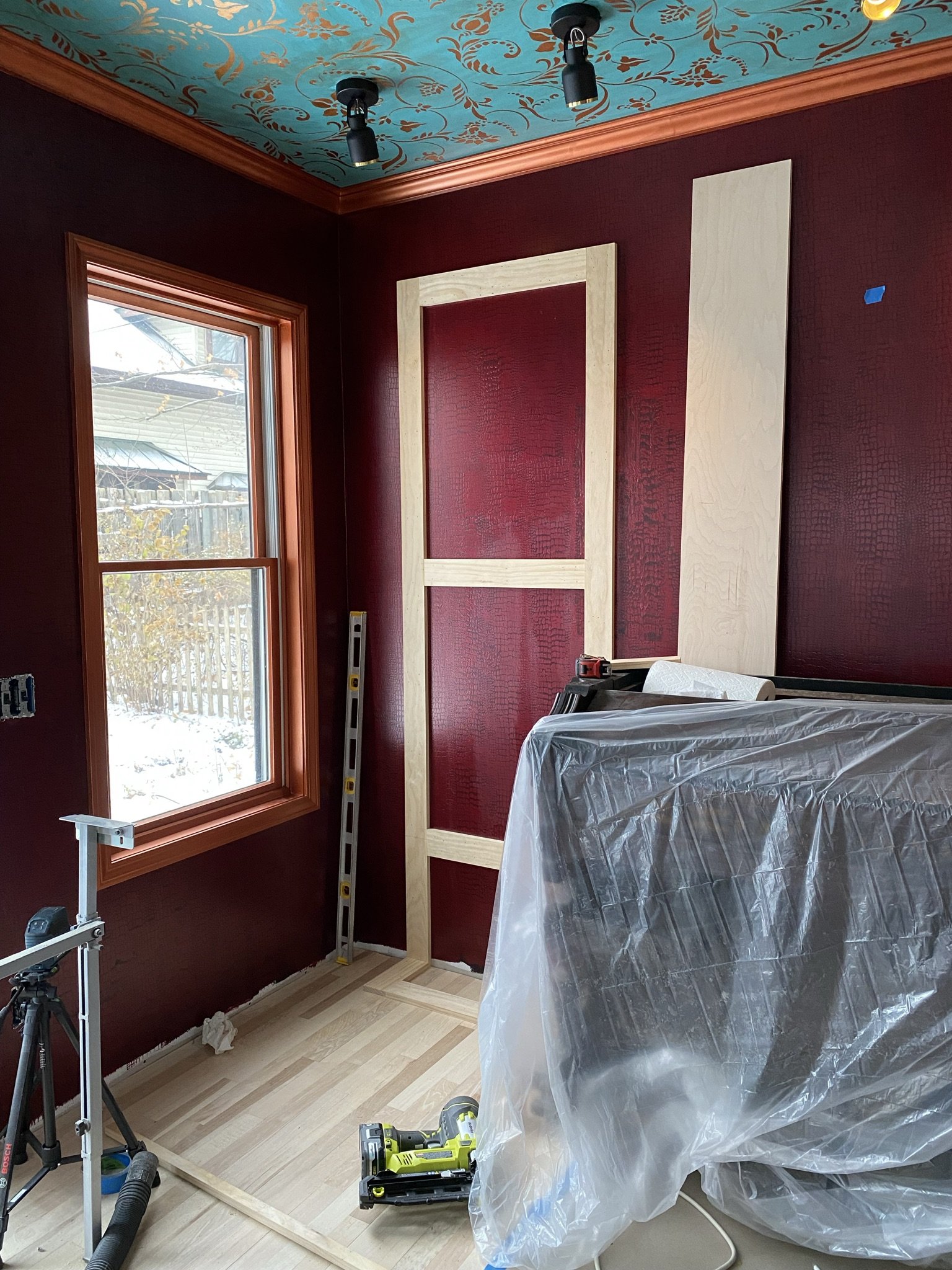
Here we have the beginning of the liquor cabinet.
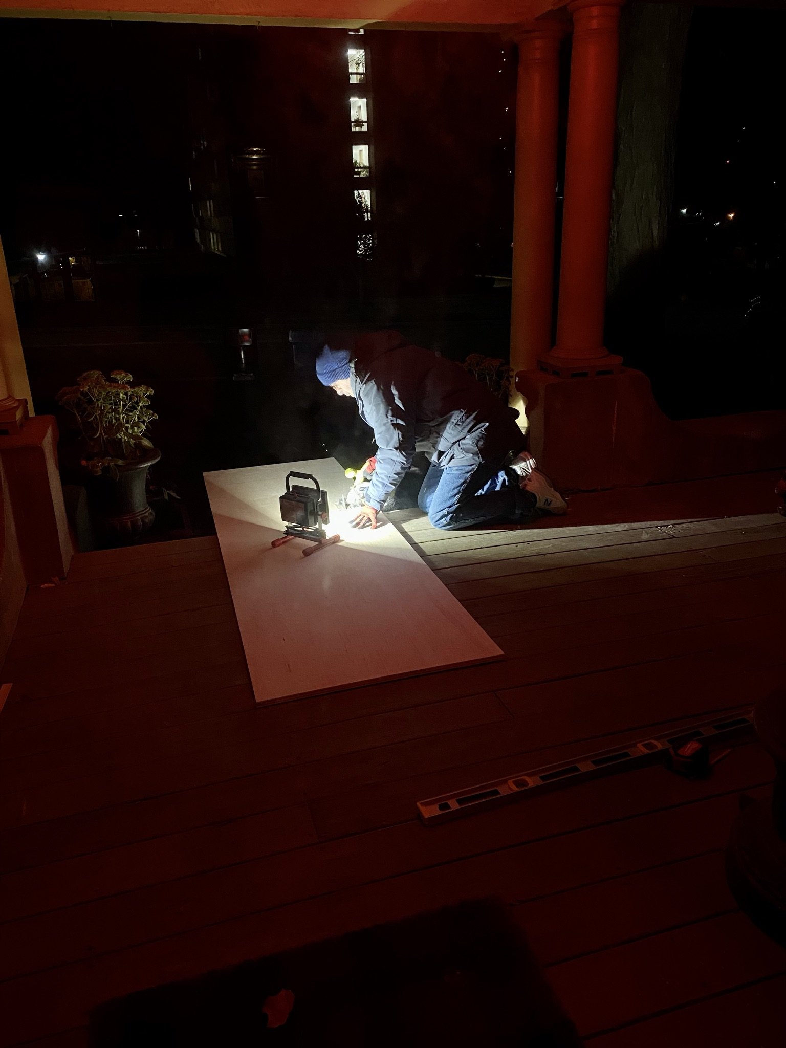
Mike on the front porch at work, after work, cutting cabinet pieces.
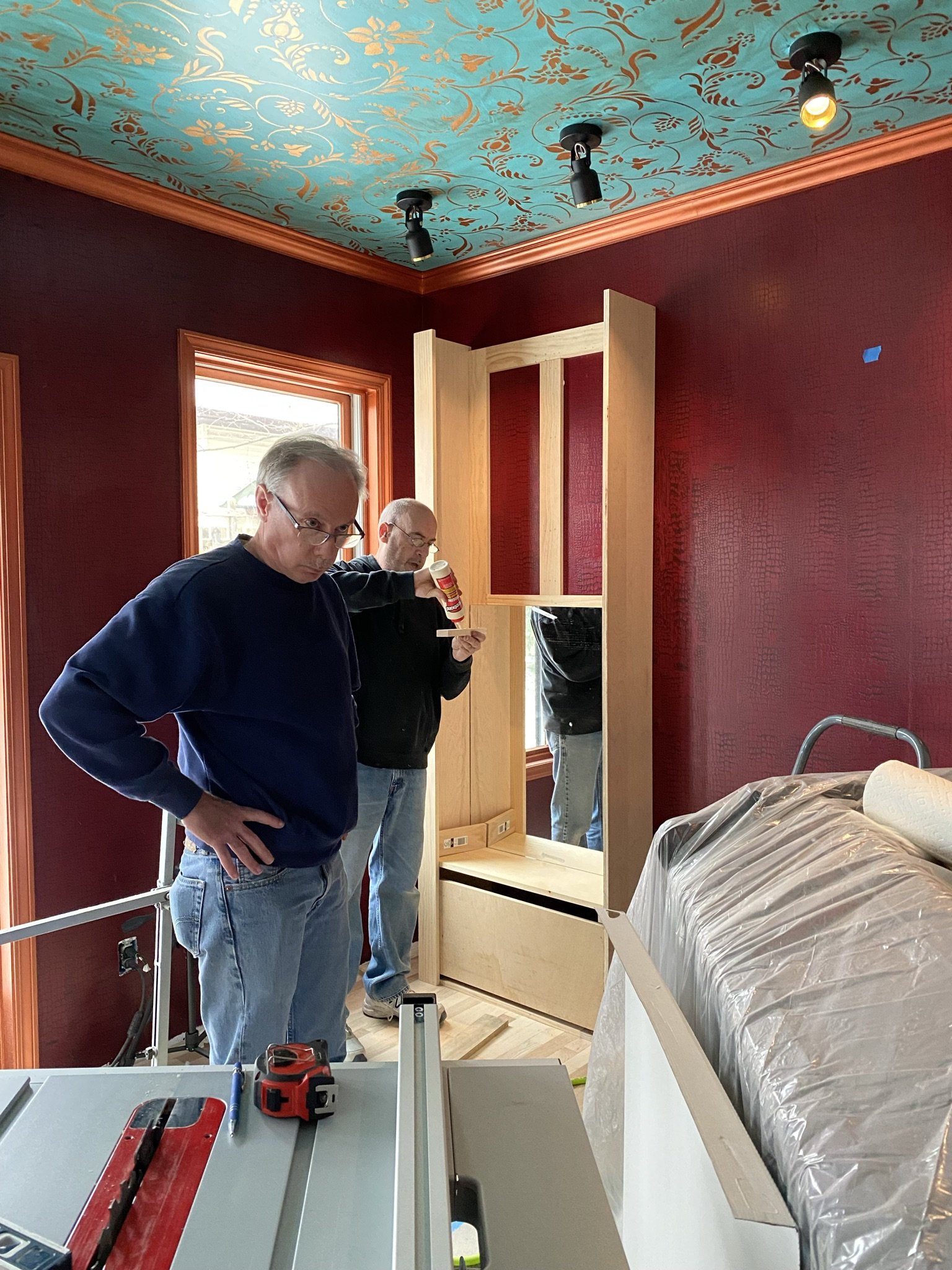
More framing is done, and as you can see, Mike installed mirrors in the back. That's Mike's brother, Greg, in the foreground.
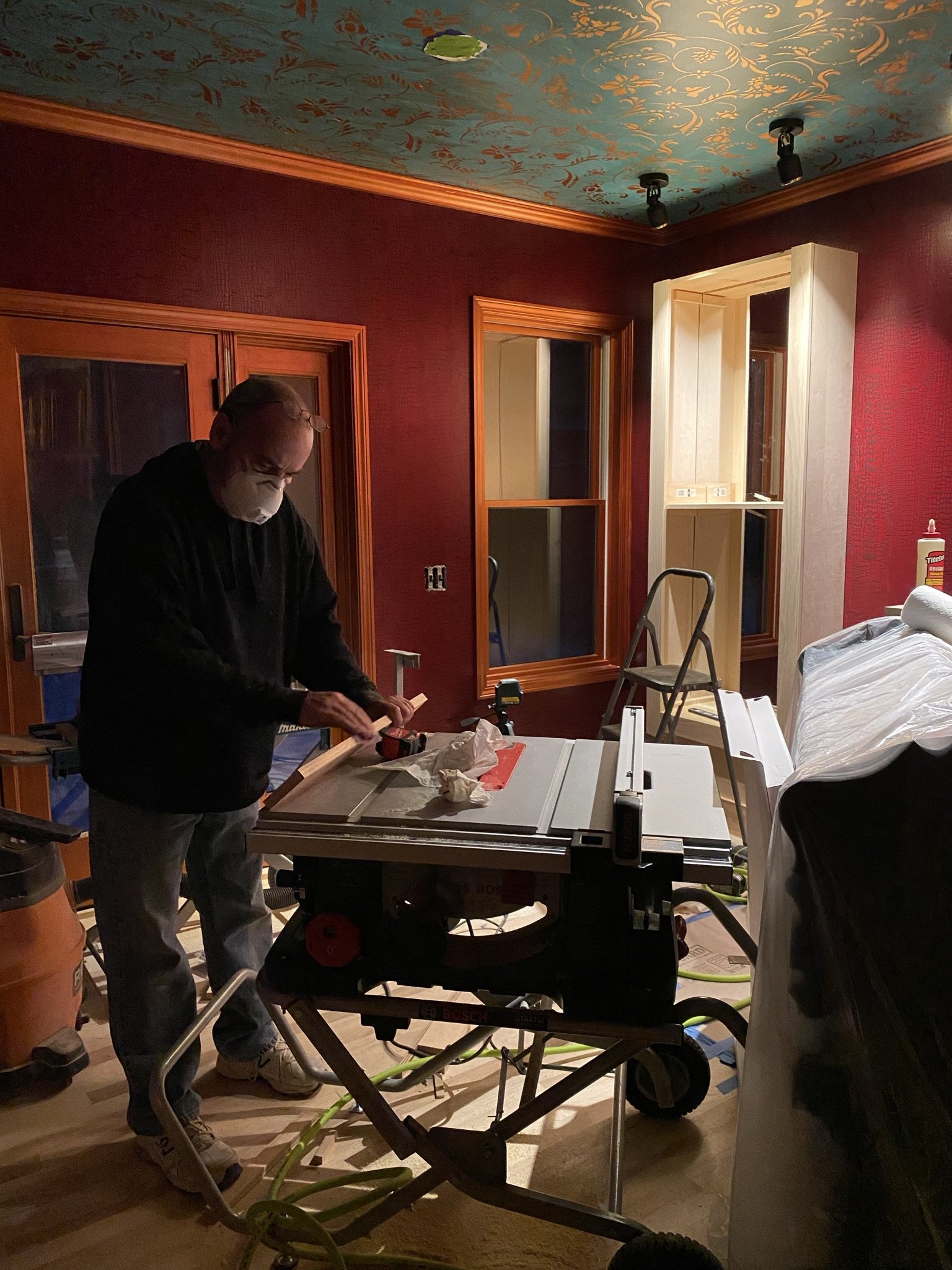
Burning the midnight oil. Again.
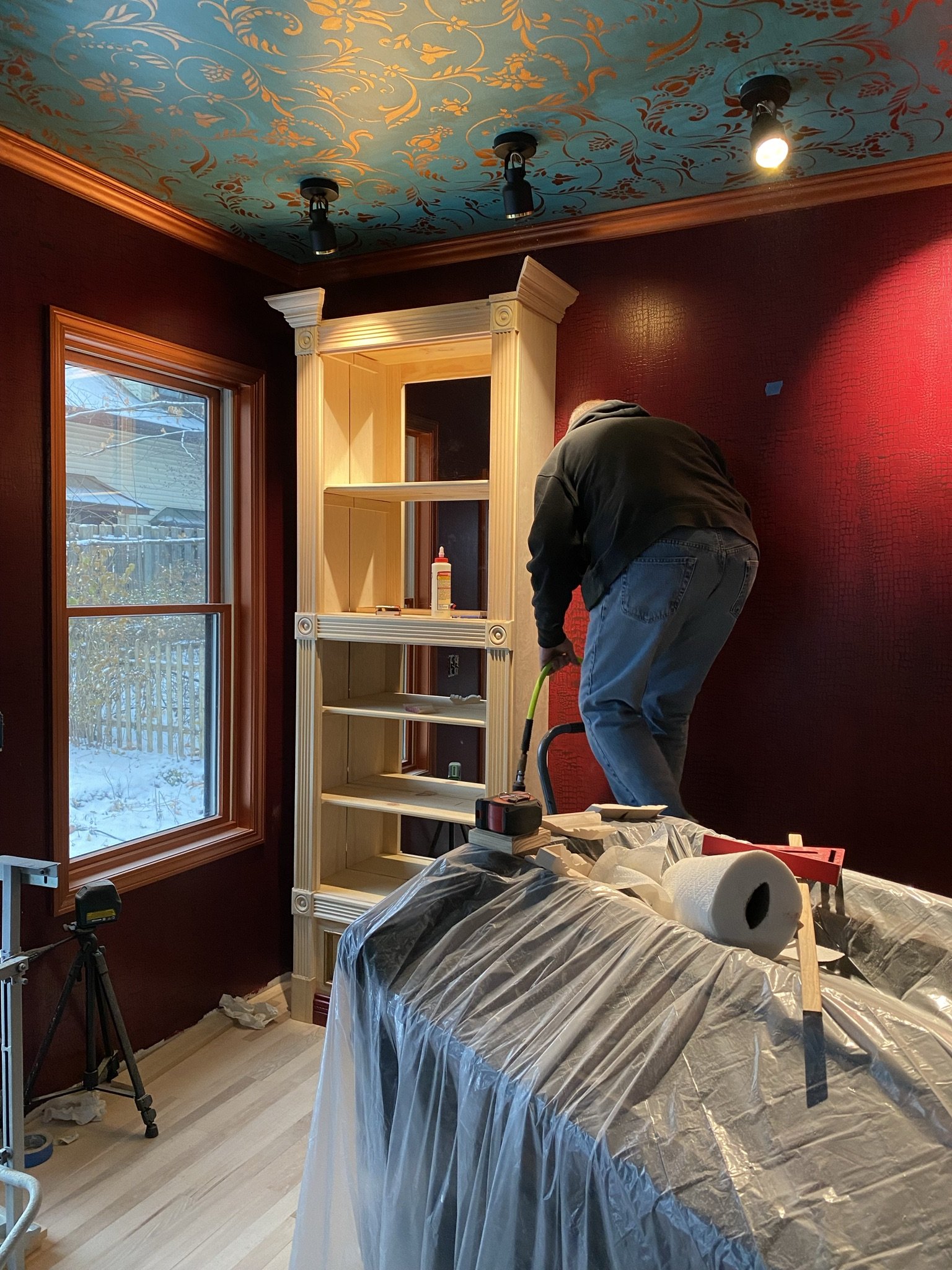
Trim work on the cabinet is almost complete.
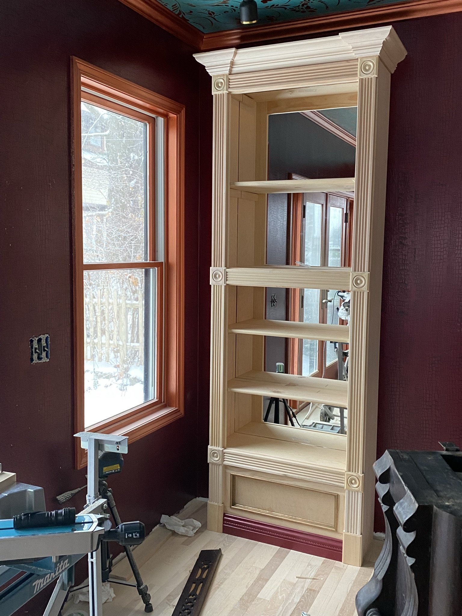
Now it's ready for me to prime and paint.
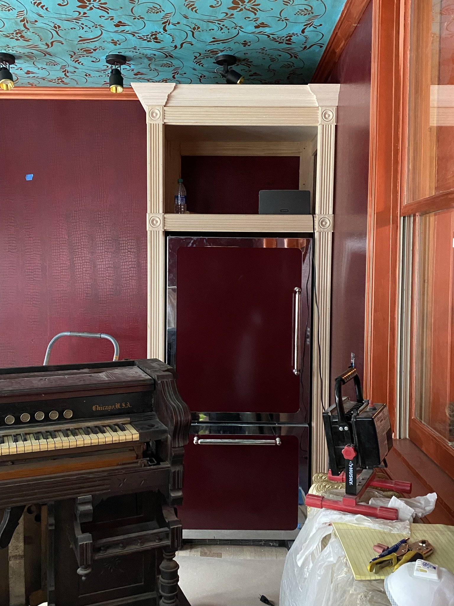
After finishing the liquor cabinet, Mike turned back to the fridge cabinet and trimmed it out.
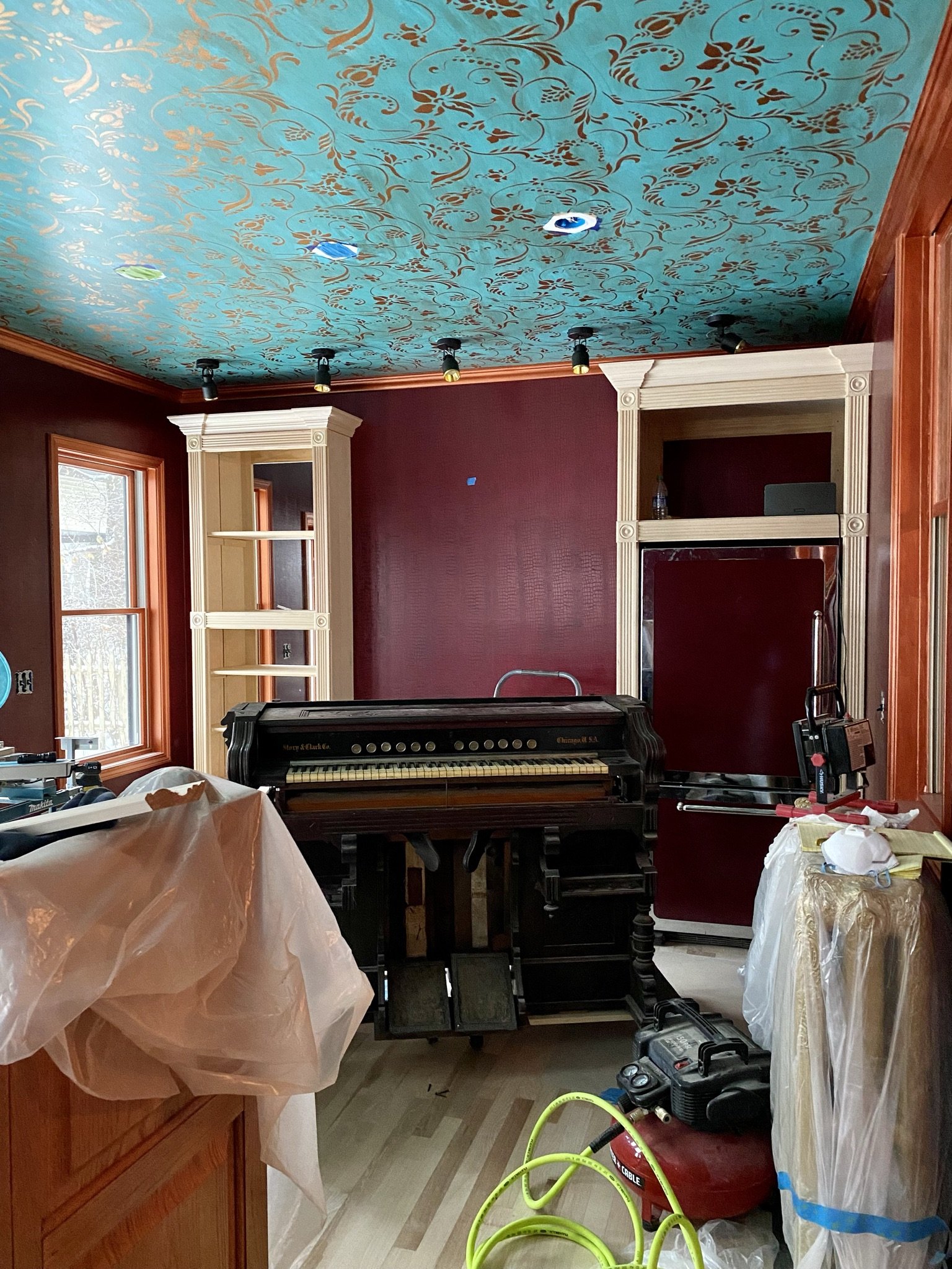
Here, you can see the back bar starting to take shape.
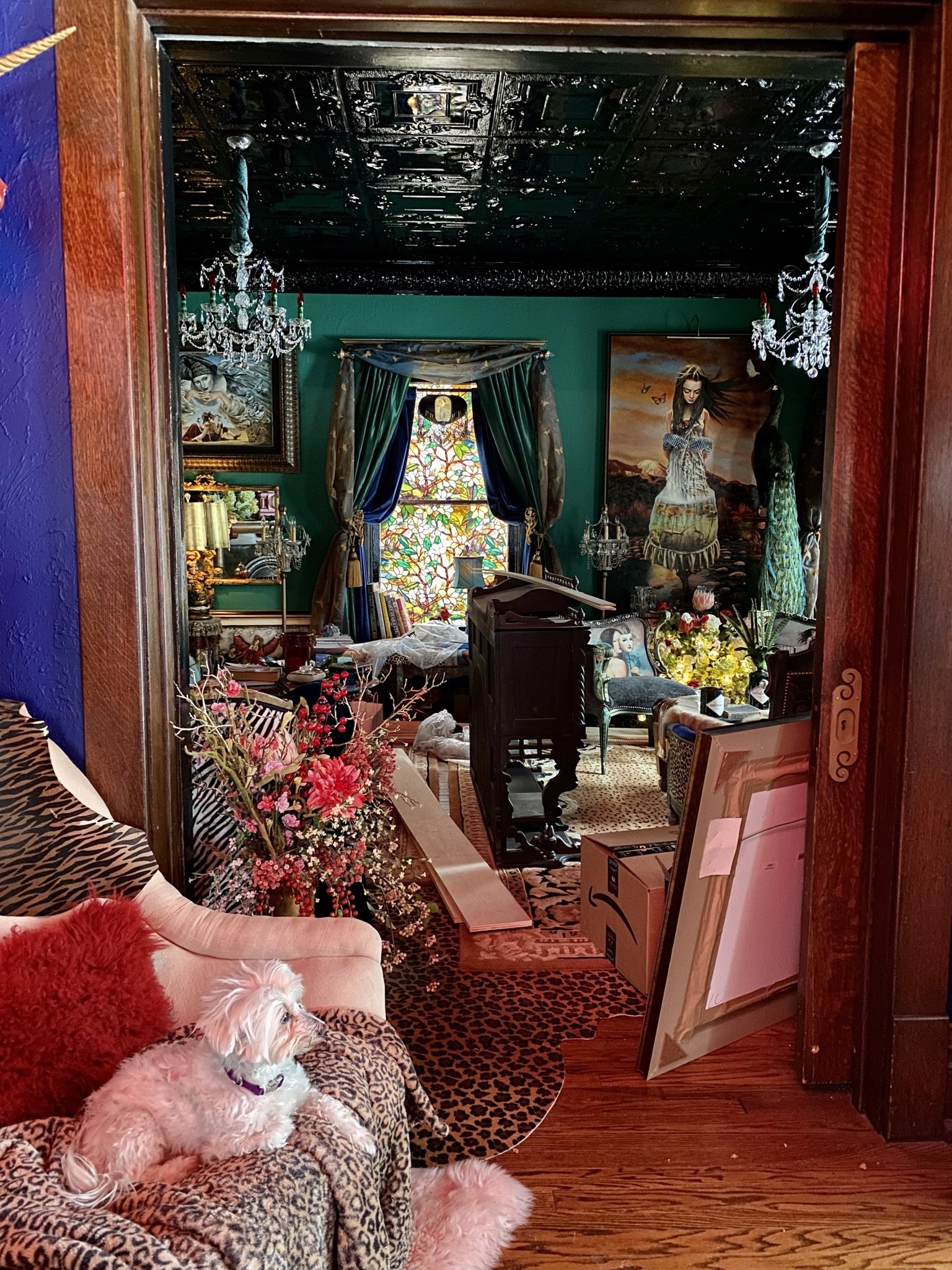
Meanwhile, the top of the front bar lived in our parlor along with construction debris.
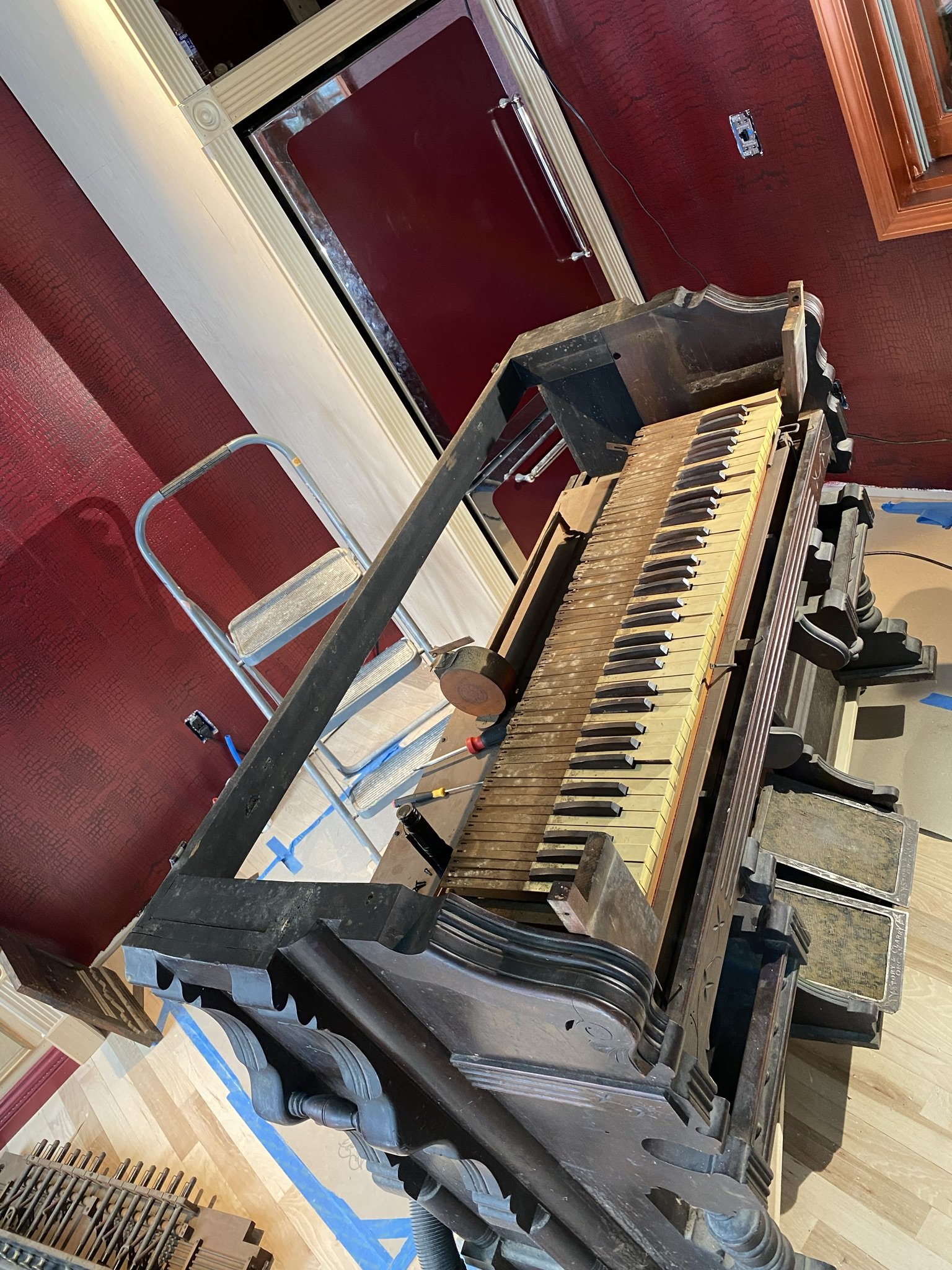
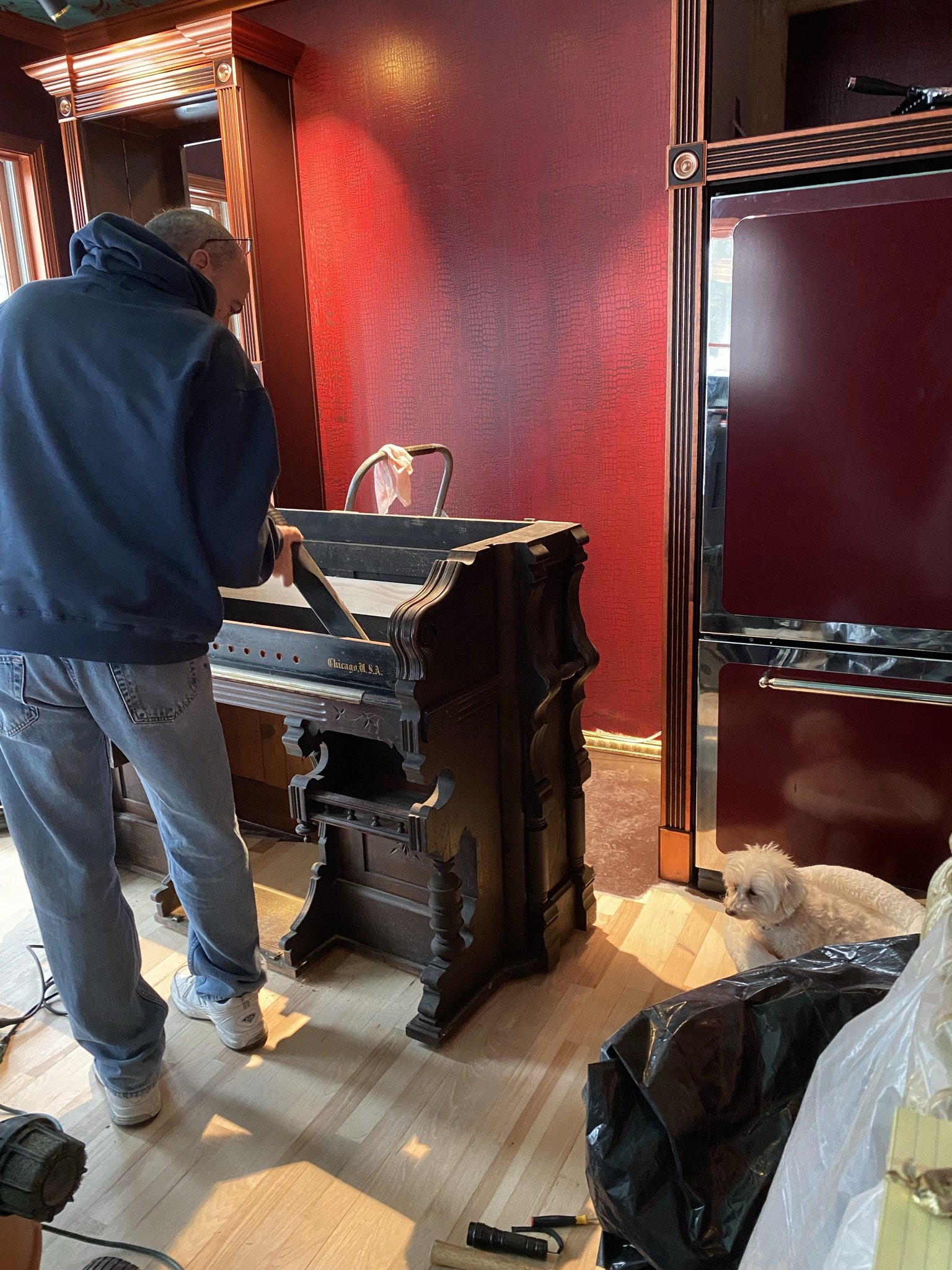
The lower part of the back bar lived in our kitchen for several months. Here it is, partially disassembled in preparation for its retrofit.
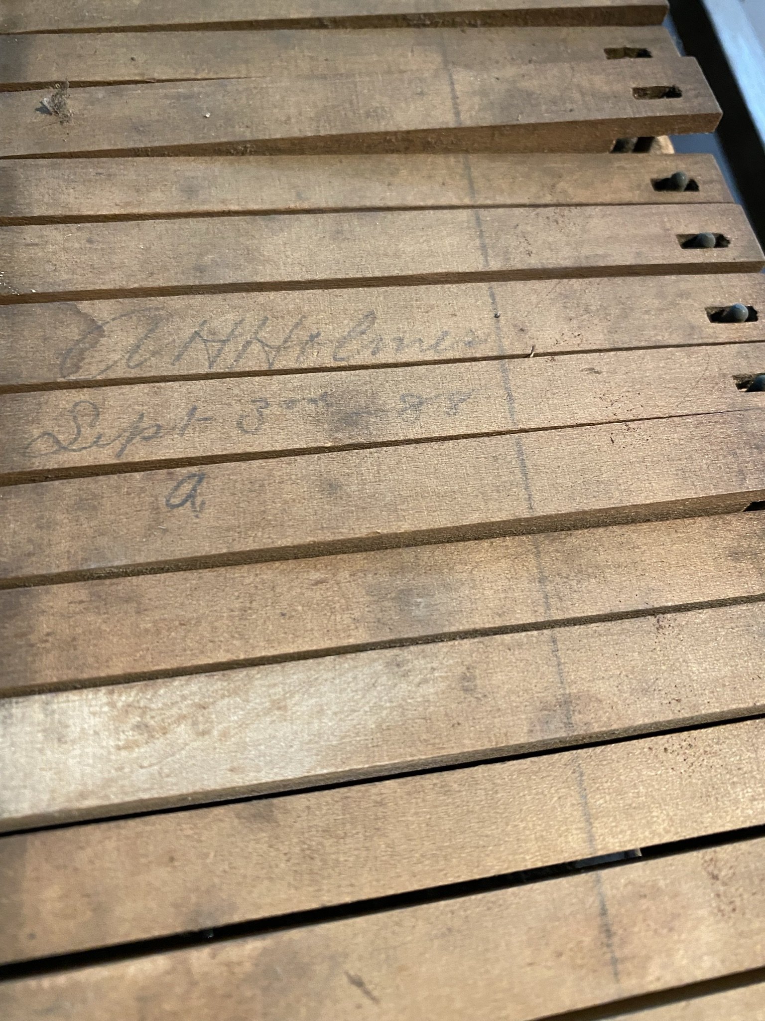
Based on this signature on the keys, the organ was finished on September 3, 1888 by AH Holmes (not to be confused with the notorious serial killer HH Holmes).
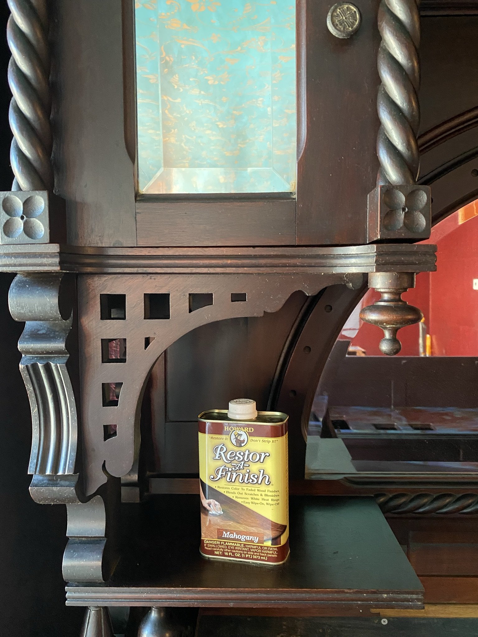
The back bar cleaned up nicely after using mineral spirits to remove the grime. Following that, I used Restor-A-Finish and then some orange wax. We liked this look better than a painted look, so we left it alone.
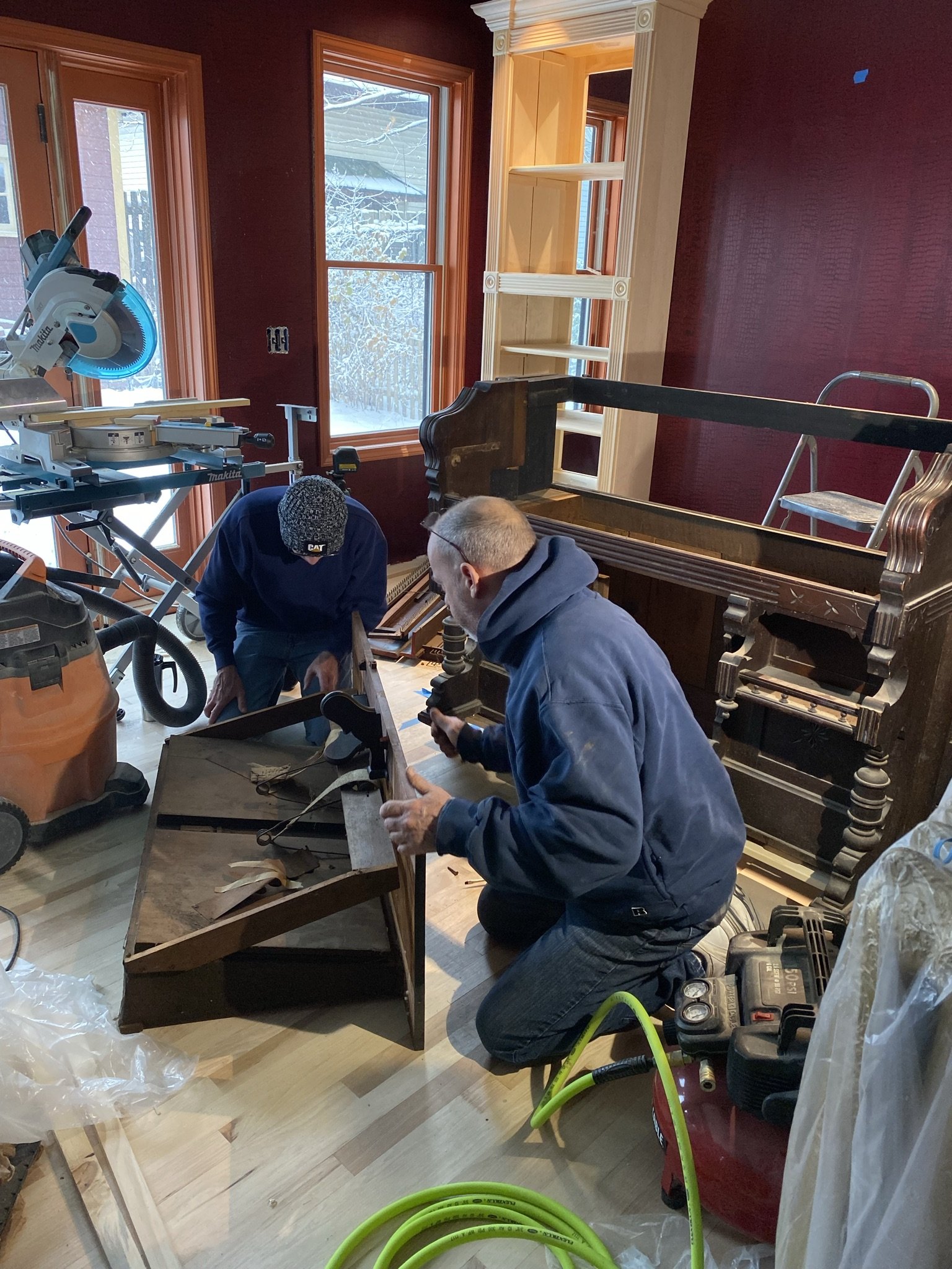
Mike at work retrofitting the bar.
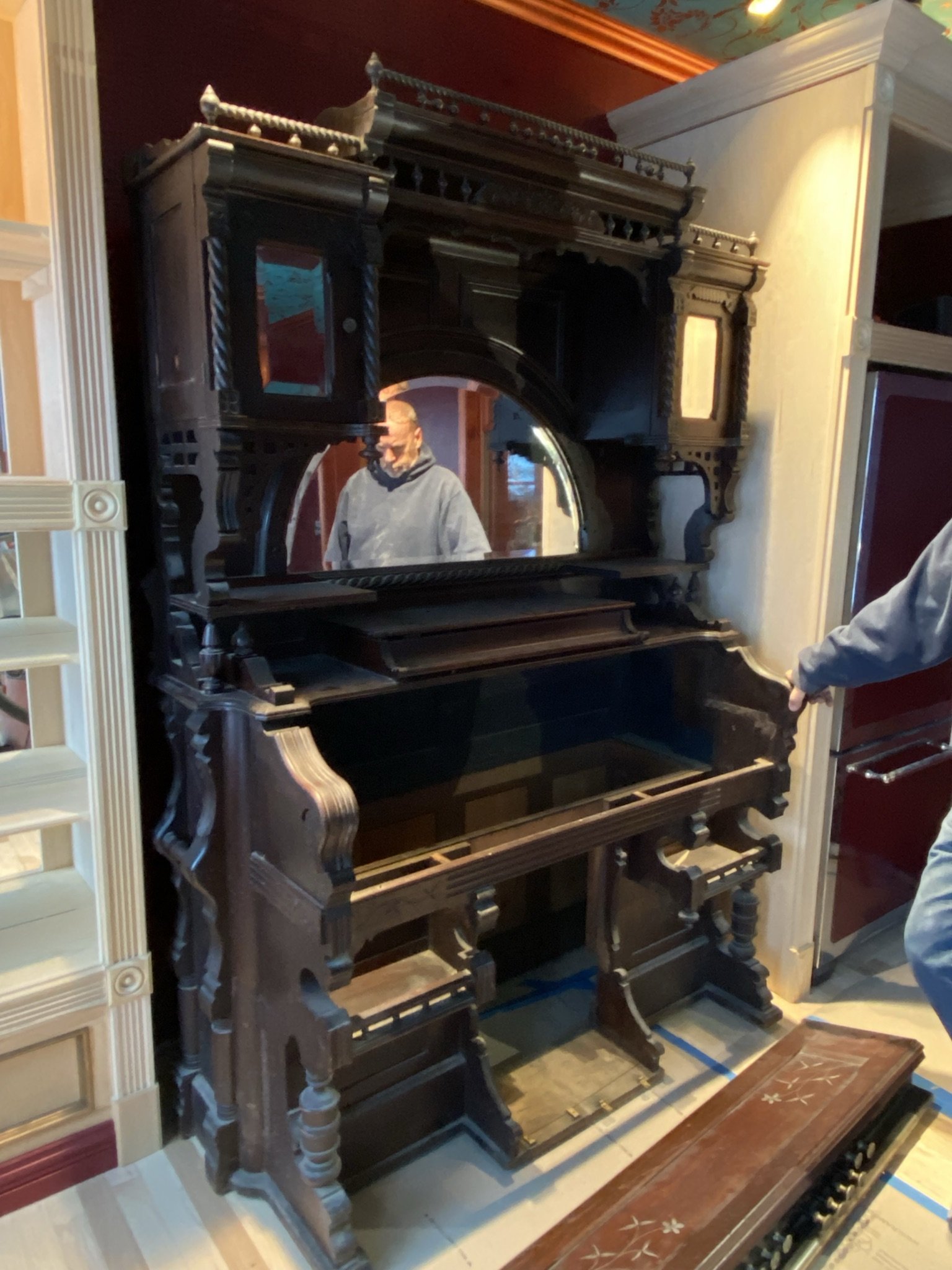
We put the top piece on temporarily so Mike could measure things in preparation for building the counter.
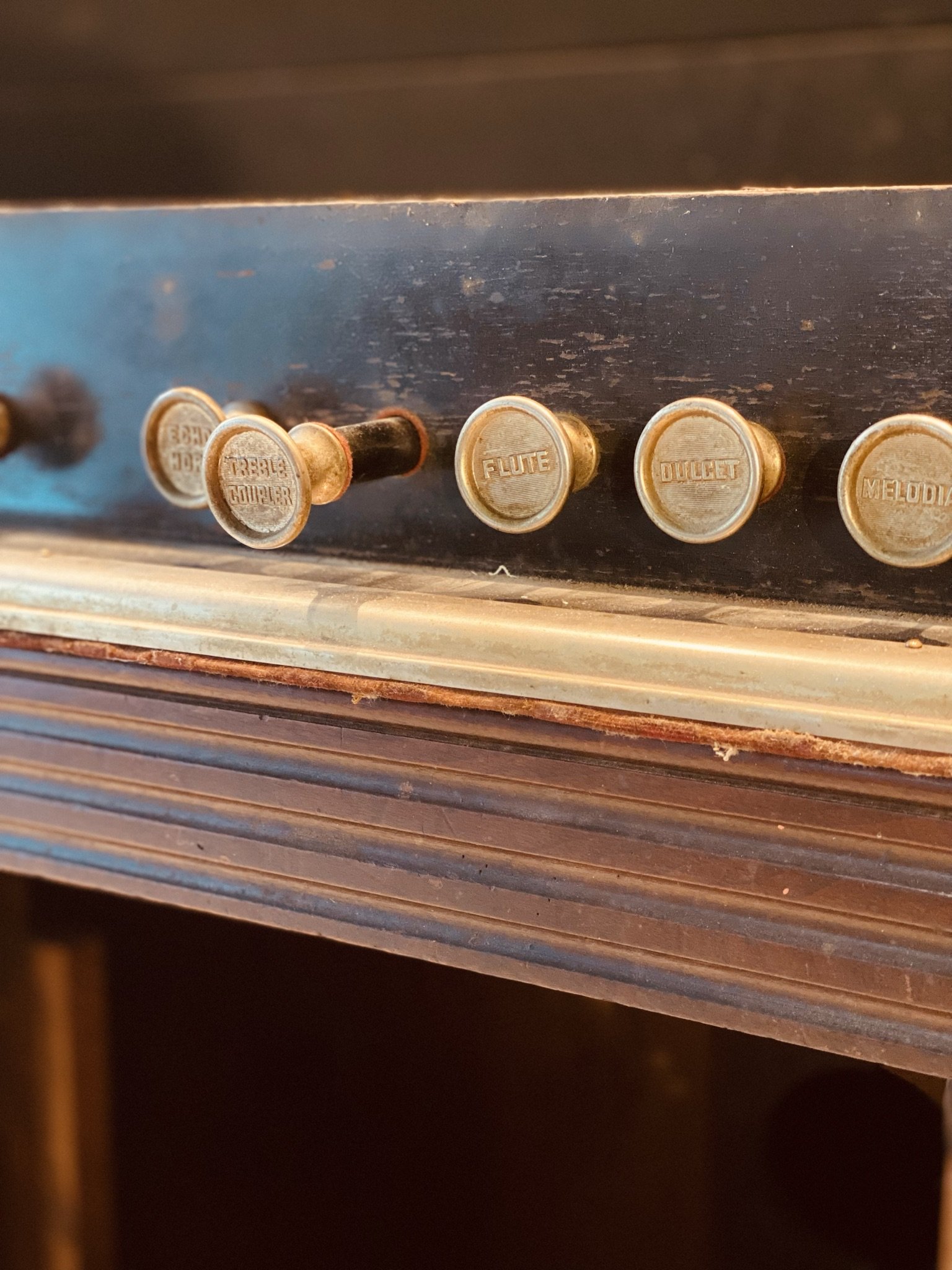
We salvaged as much as we could from the organ to repurpose it decoratively. I wanted the stops to remain, and we relocated the keyboard to the backsplash.
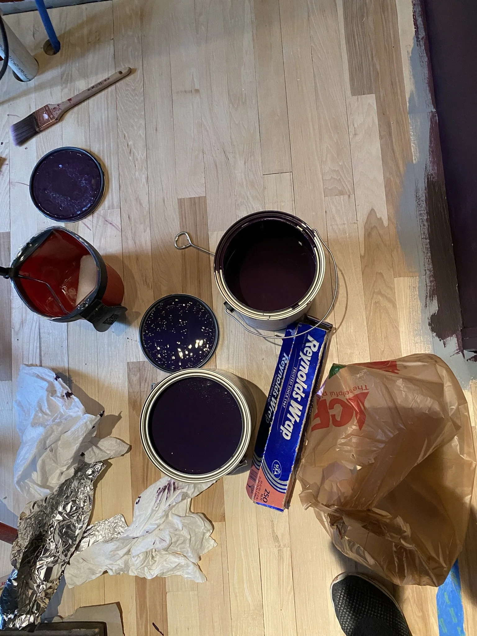
Next step is painting the cabinets. I went with Velvet Cloak, the same color I used for the wall undercoat (although I used the original version from Benjamin Moore rather than the more saturated/lighter version that I had mixed for the walls).
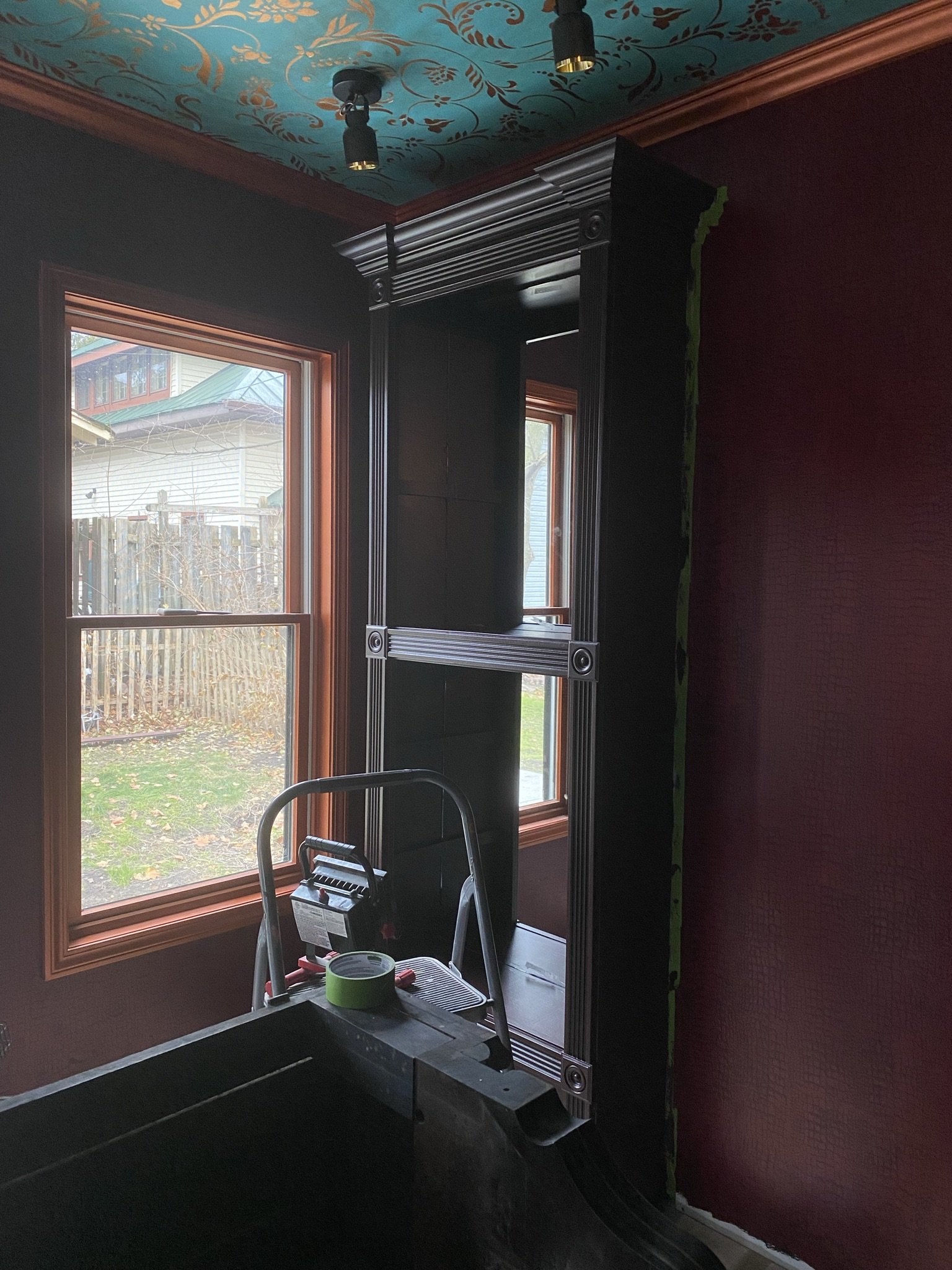
Mike was hella opposed to eggplant/purple on the cabinets, but once it was up, he liked it.
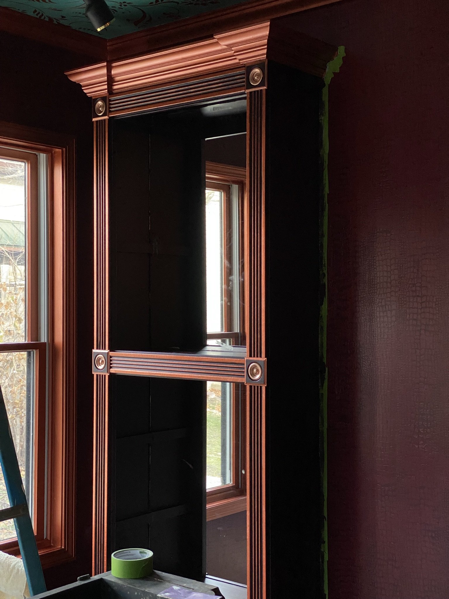
I painted out the detail with copper.
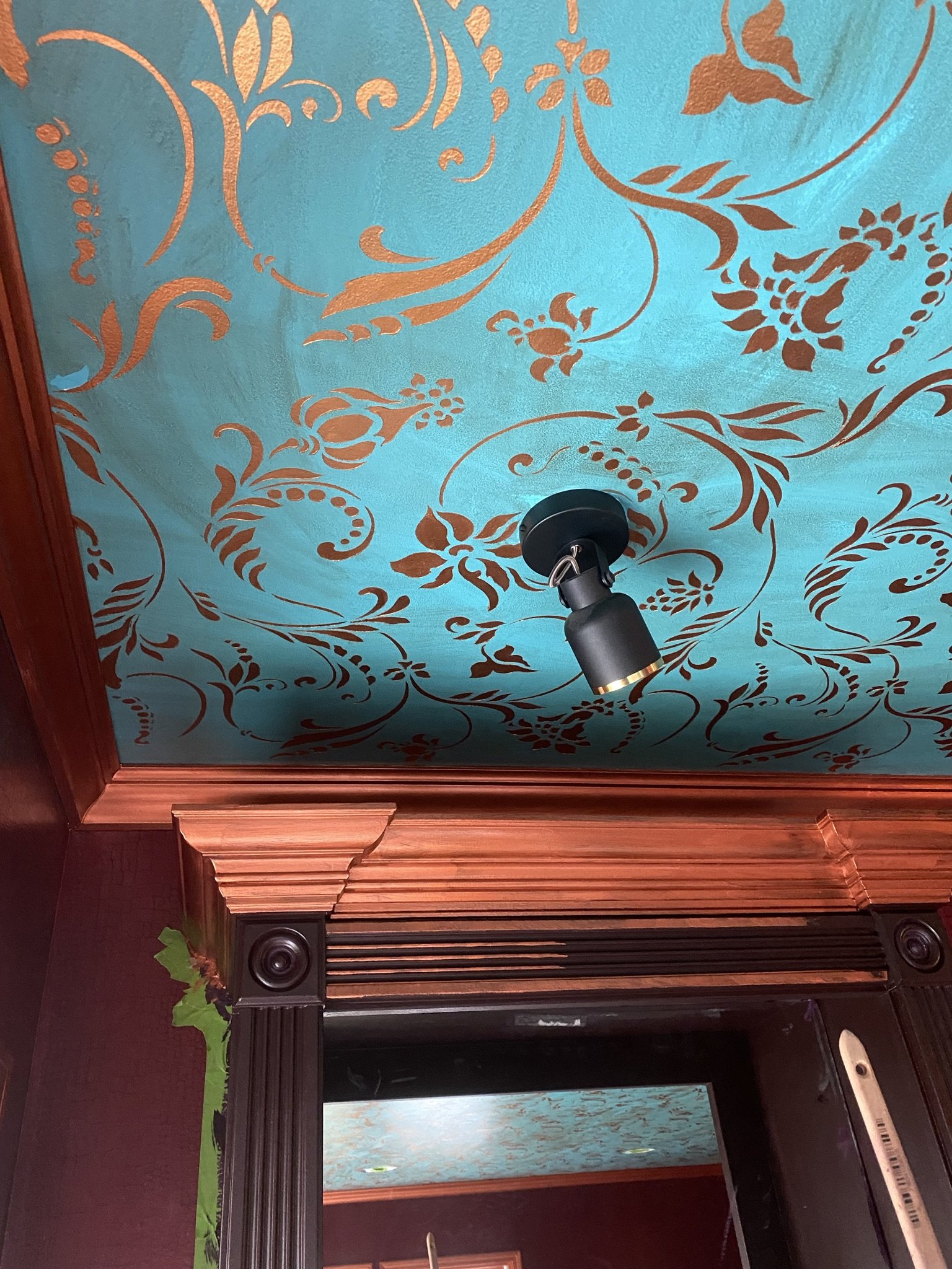
We also replaced the light fixtures installed by the electrician, which were gawdawful spectacles of cheap plastic crap that washed the room with the same deathly pallor seen in basement hospital morgues. Unacceptable. Obviously.
Here's Mike getting ready to build the counter. We originally were going to go with stone, but it was $800 for a small slab. That seemed ridiculous.
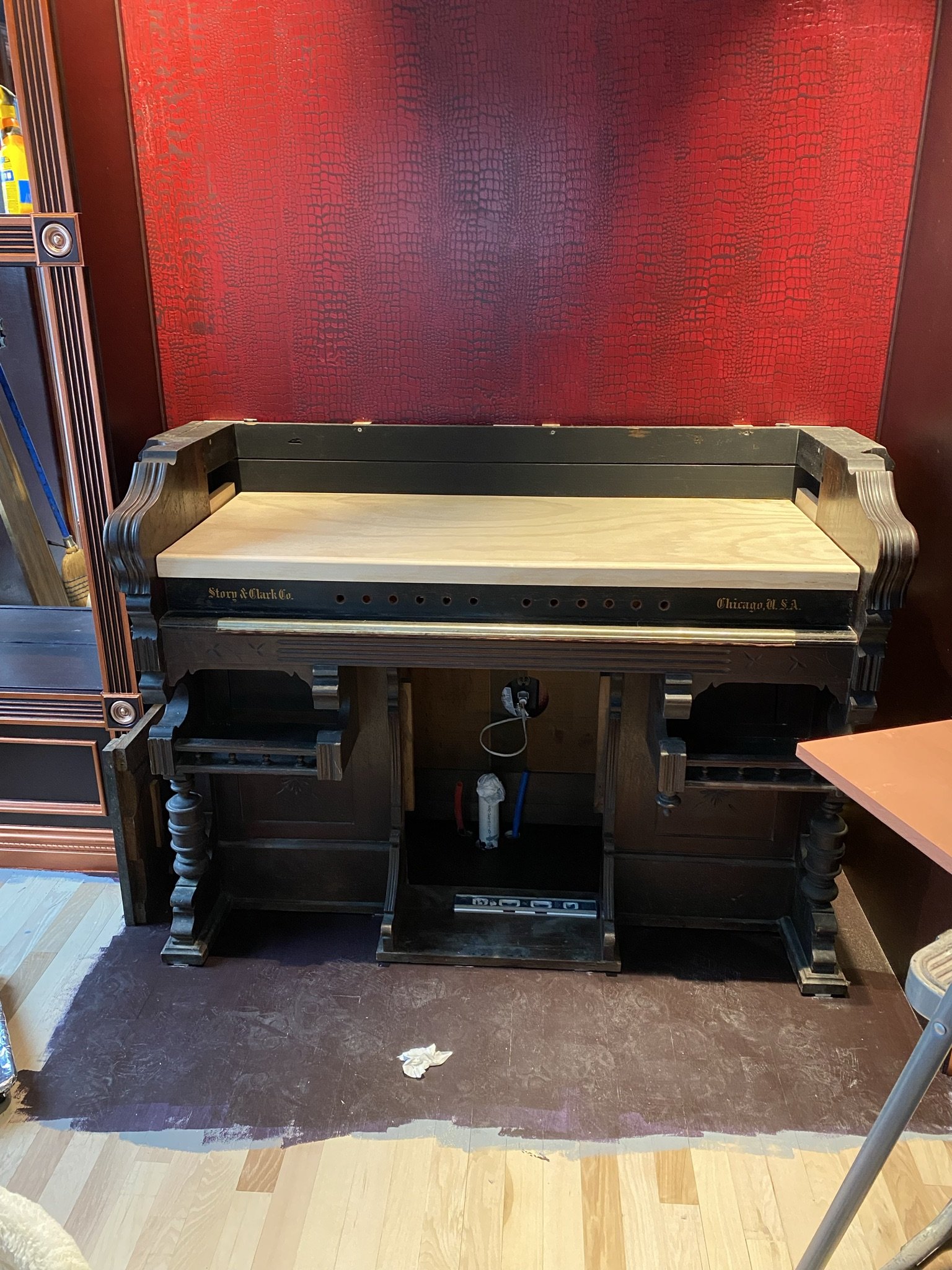
So instead, Mike found a scrap of wood in the garage and added a simple edge to it.
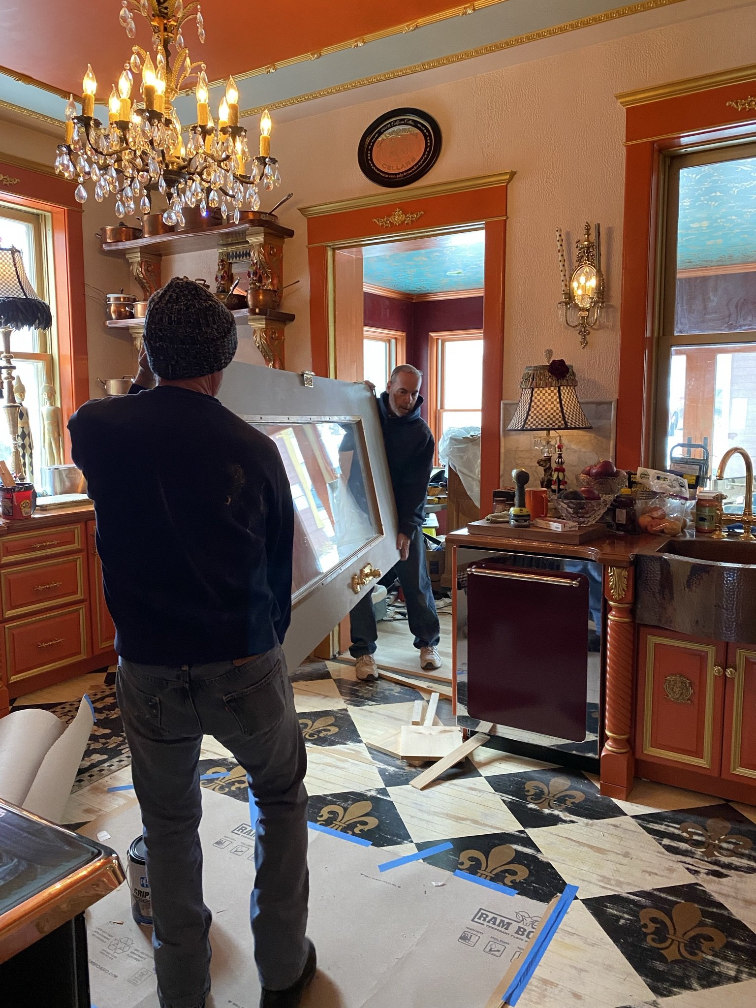
This was an exciting day. Mike had been wanting this door off for a year. This angle gives a sense of how the kitchen and lounge colors work together. Surprisingly, they are complimentary.
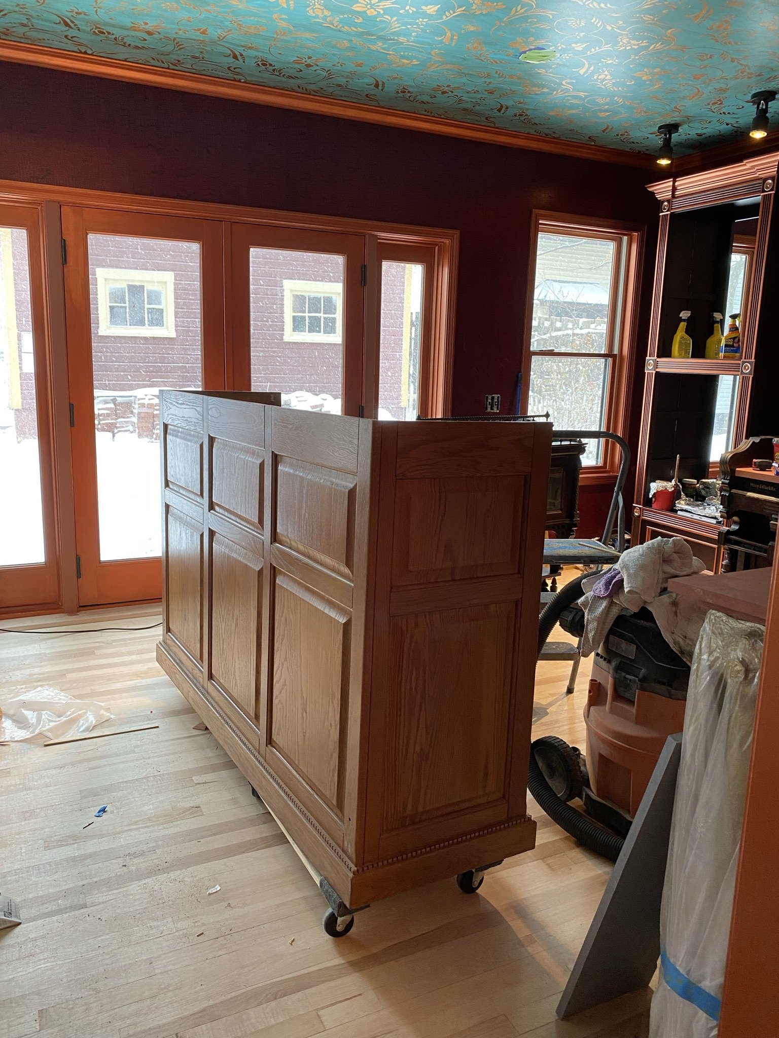
By December 6, 2021, I was ready to paint the front bar.
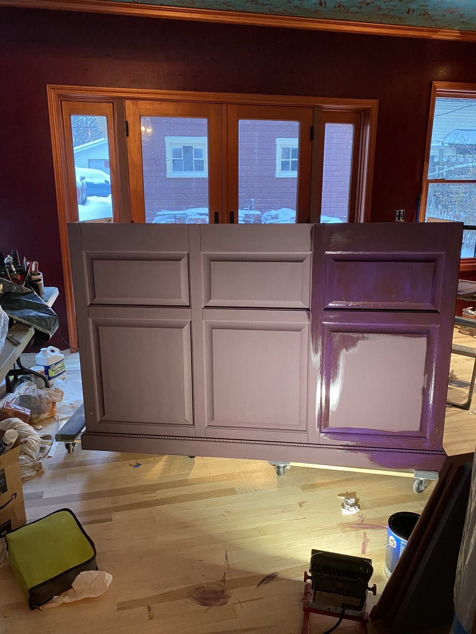
I used chalk paint as a basecoat then applied two coats of Velvet Cloak in satin. Chalk paint sticks as good or better than primer.
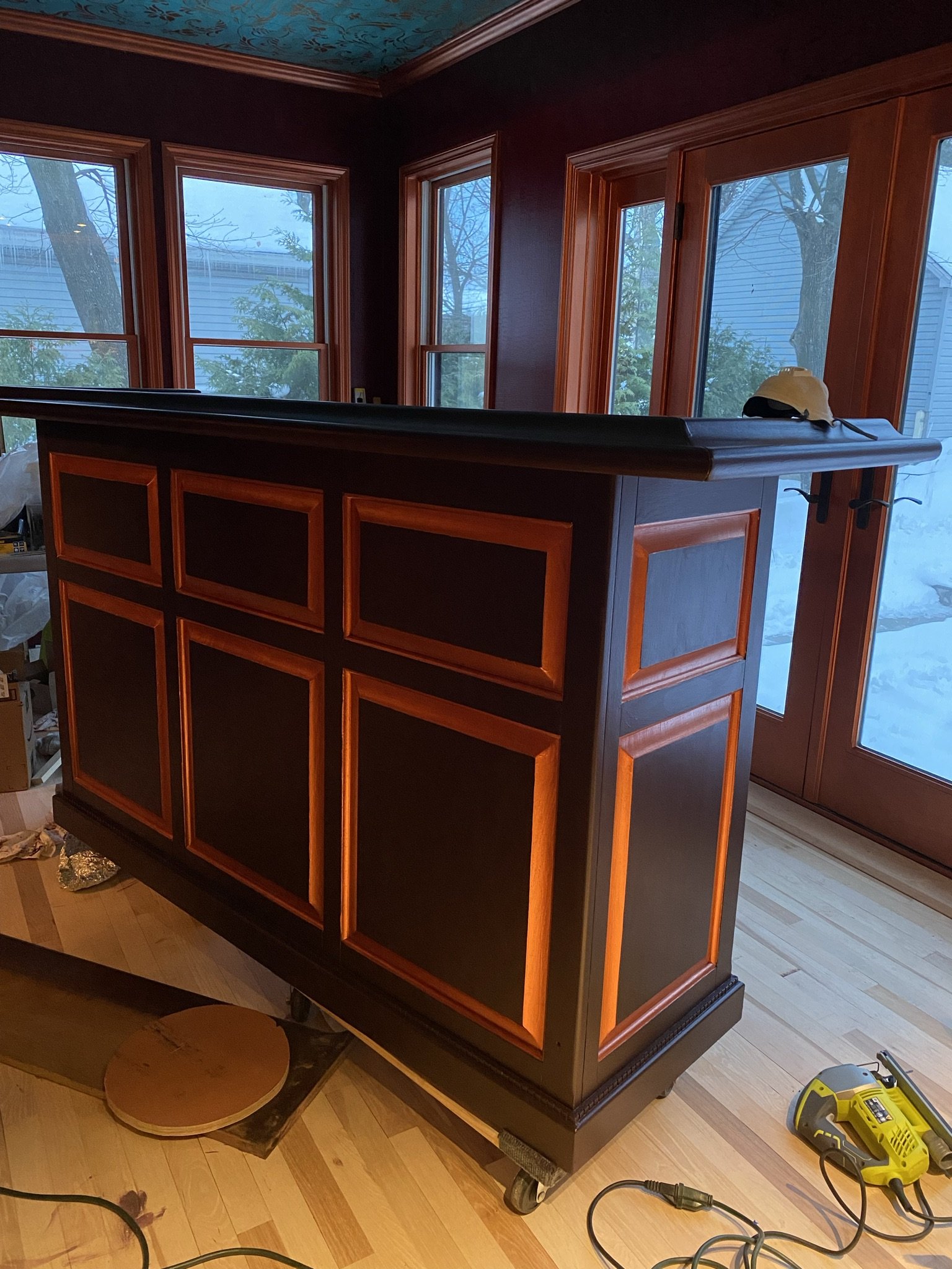
I also painted out detail with copper.
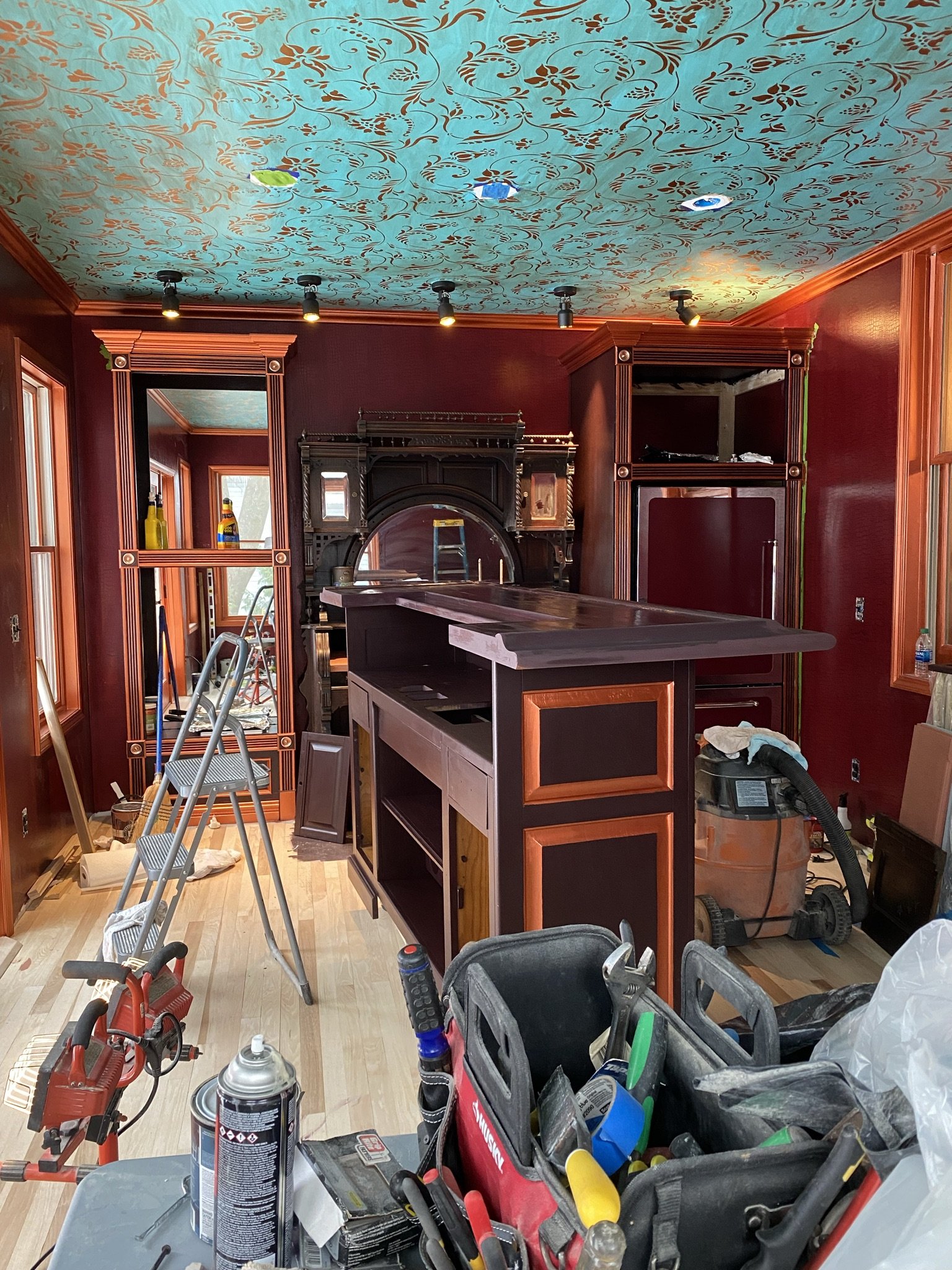
And then painted the counter using the same technique as the lower portion.
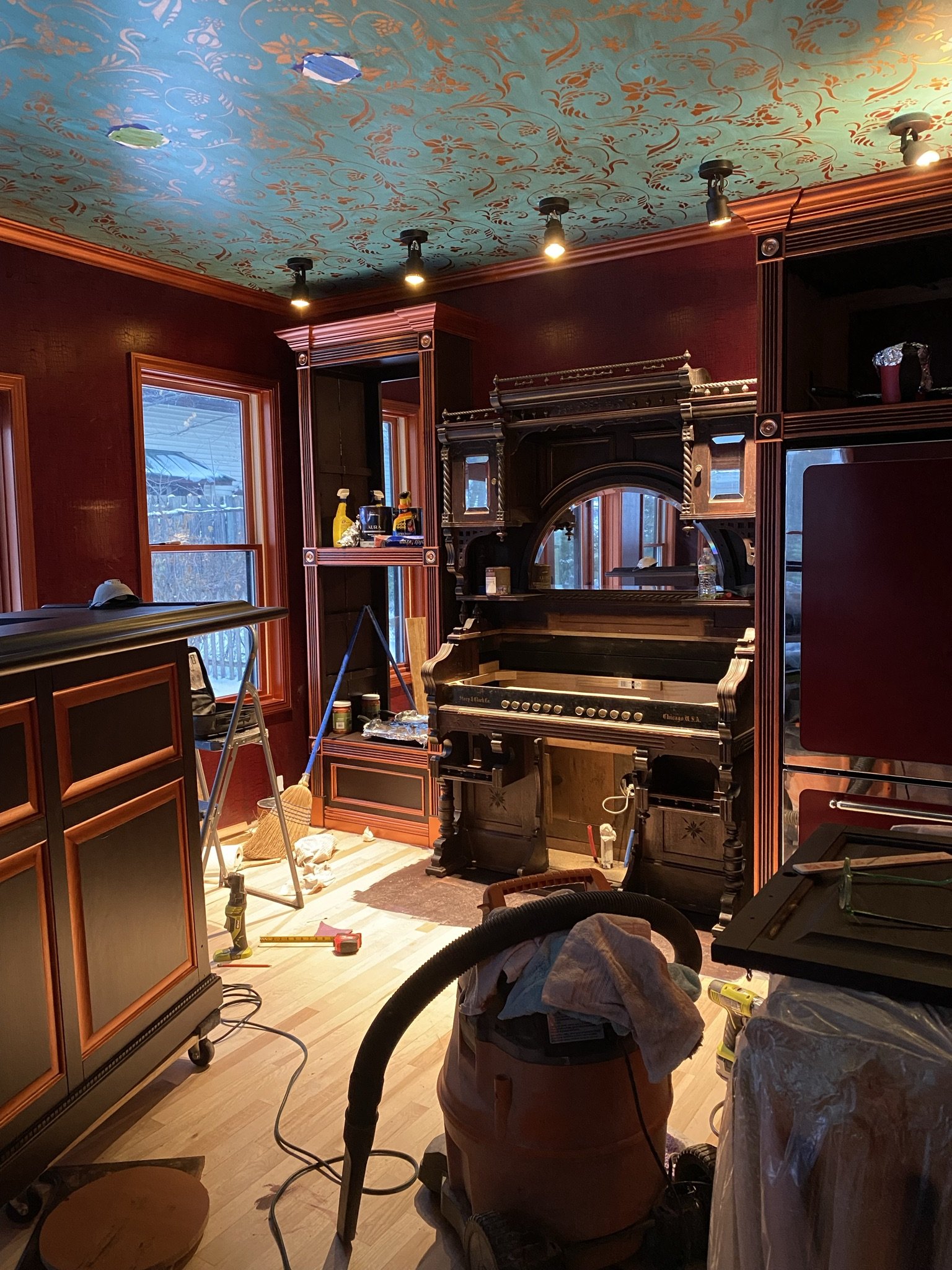
Now the back bar is in place and ready for counter work.
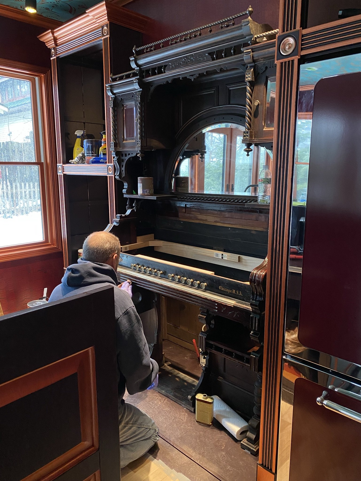
We love having this piece of history in our home.
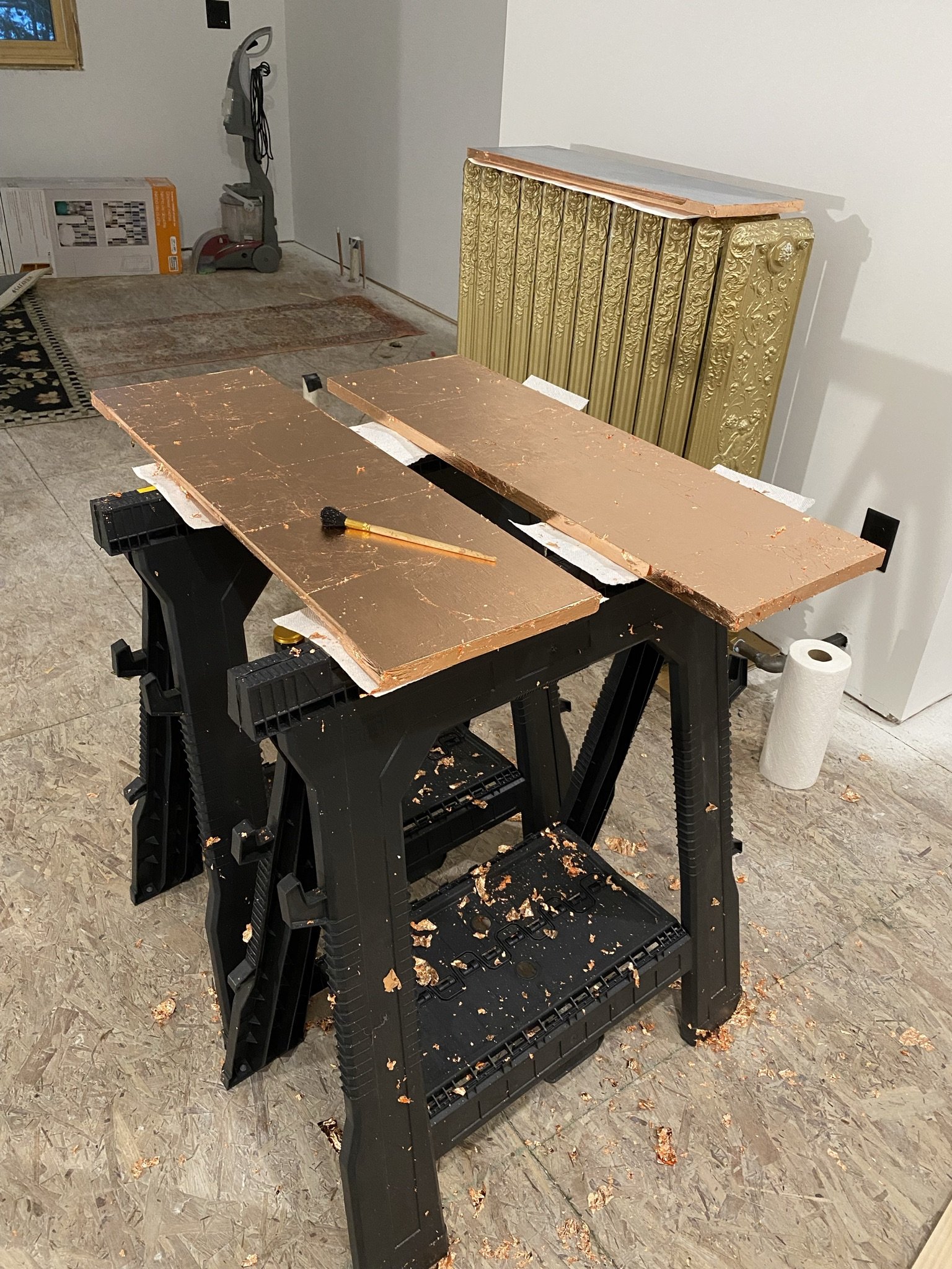
In the meantime, I copper leafed the shelves for the cabinet.
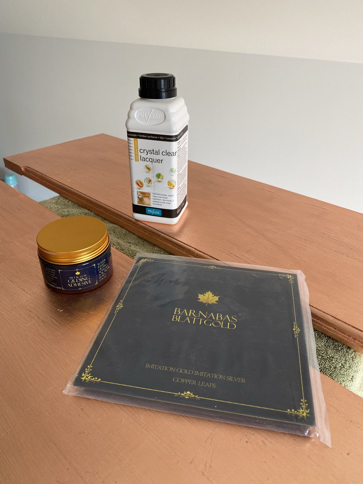
I used Barnabas Blattgold leaf purchased on Amazon. Then I applied three coats of Polyvine.
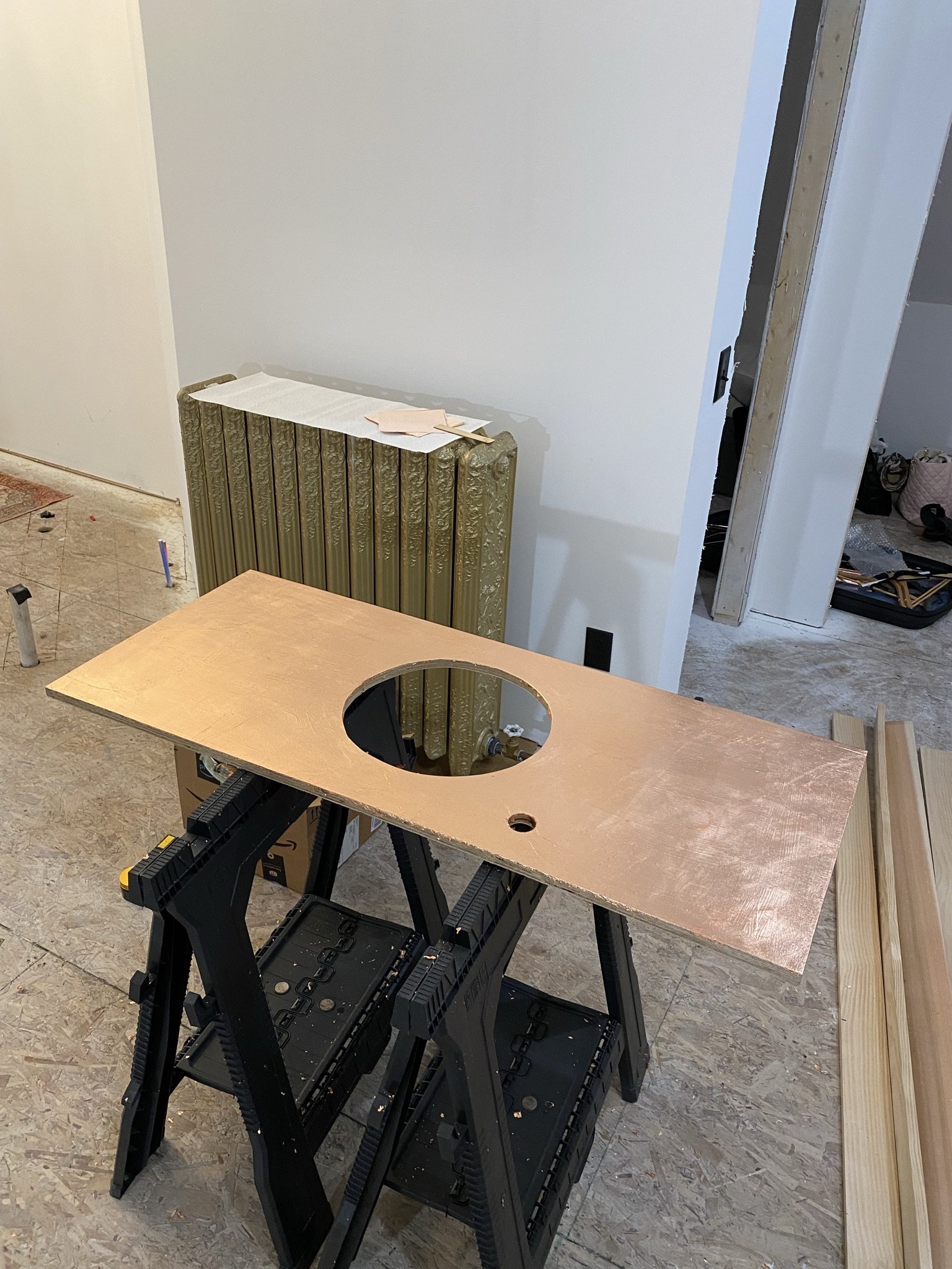
I did the same with the back bar counter after Mike cut holes for the sink and faucet.
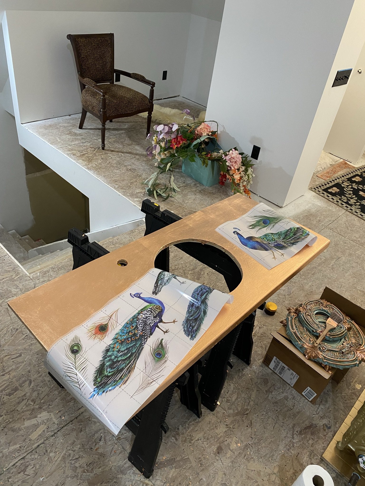
To give the counter an artistic feel, I used Redesign with Prima furniture transfers. I applied these before painting on the Polyvine.
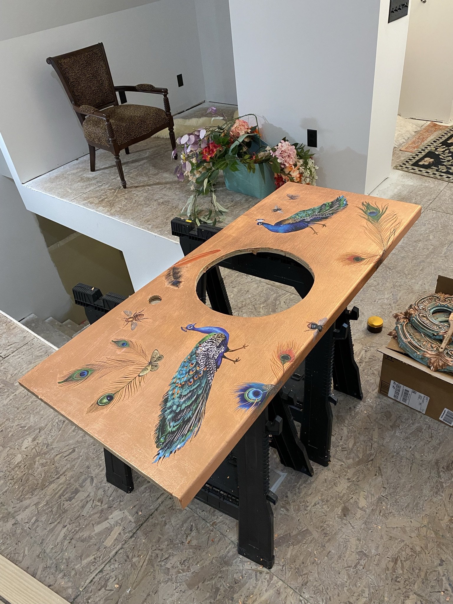
Here's how the counter looked before we coated it with epoxy/resin.
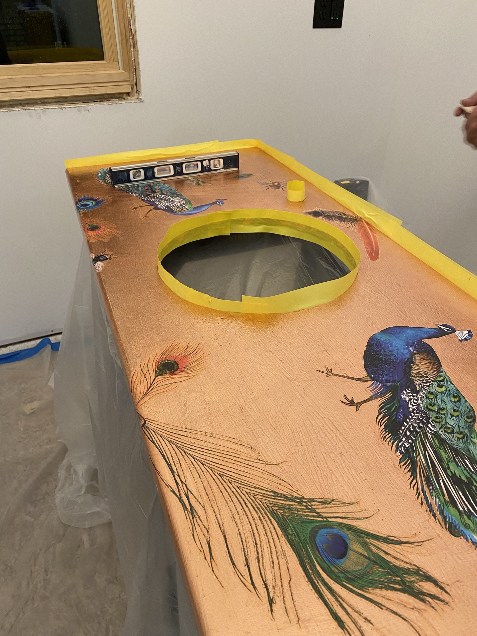
We used epoxy on our kitchen counters and didn't have a great experience with it, but used a different product for the counter and it worked great. I can't remember the brand, but it's whatever Ace Hardware sells.
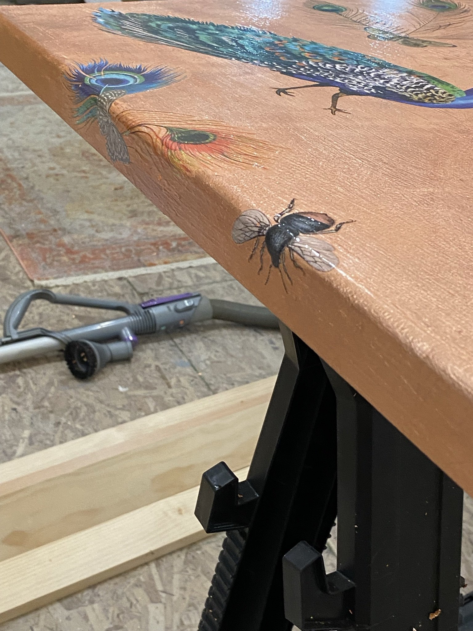
And here's how the counter looked after the epoxy pour.
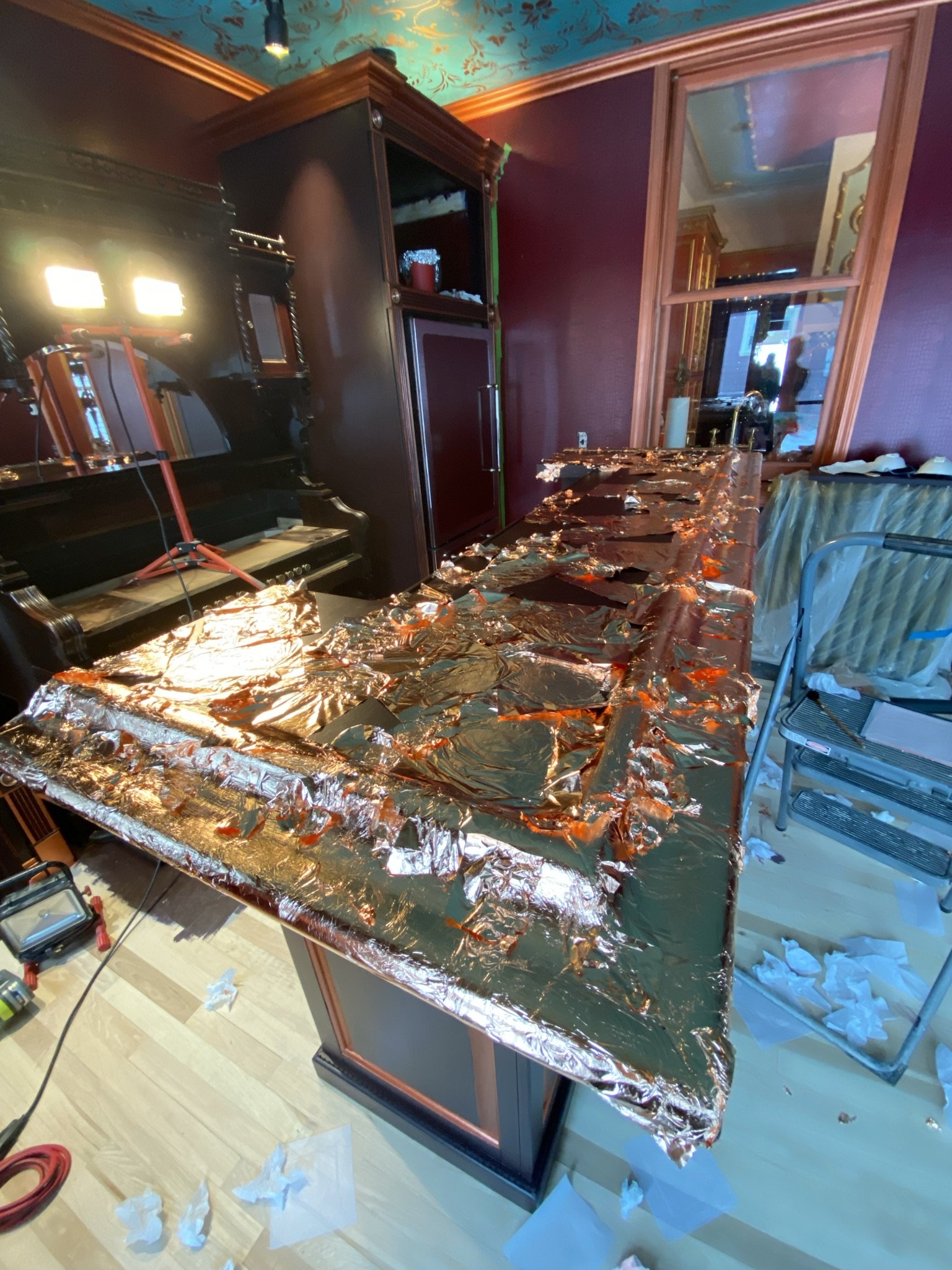
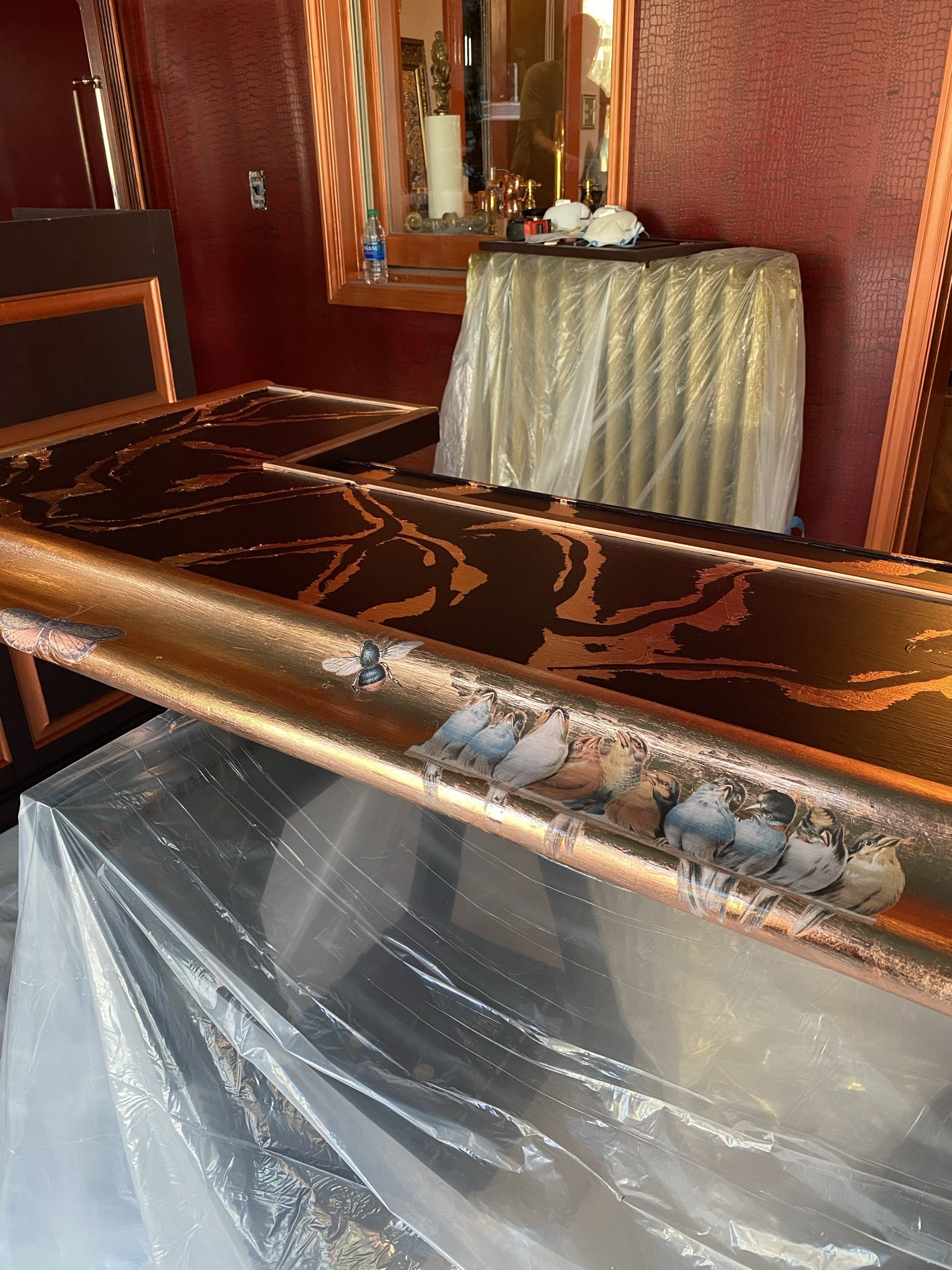
Next up was the front bar top. I decided to add some copper leaf over the paint before pouring epoxy.
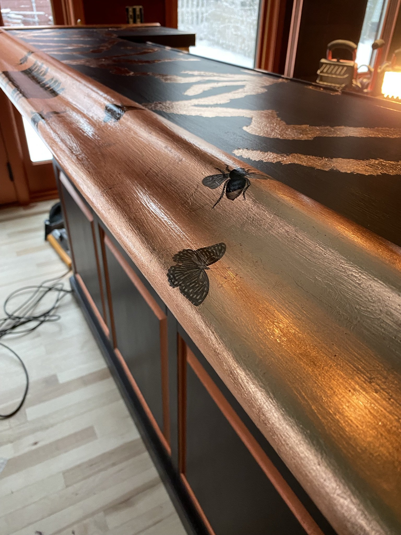
And then, as with the bar back counter, I added furniture transfers. These are from Iron Orchid Designs.
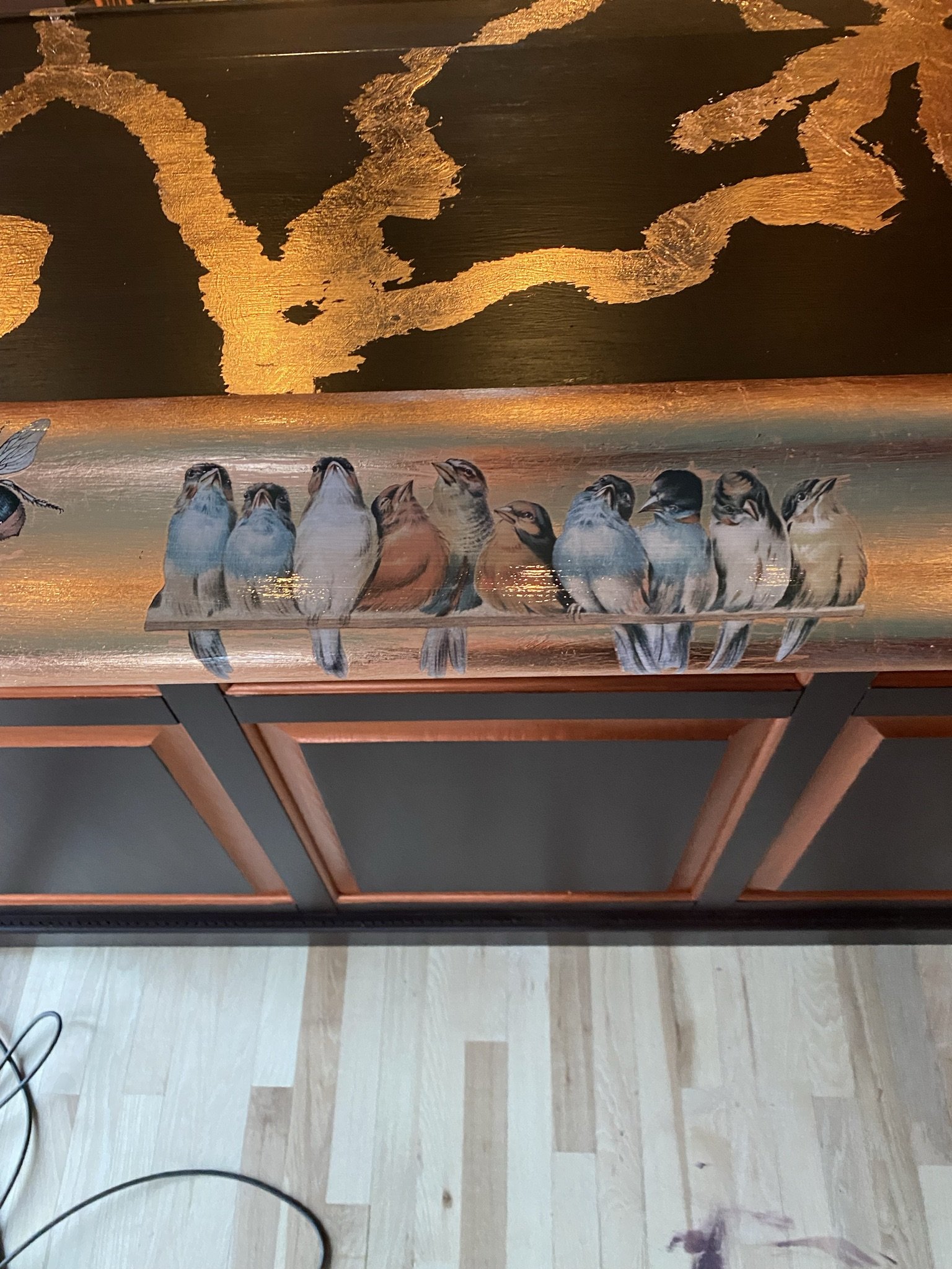
More transfers. Tweet tweet.
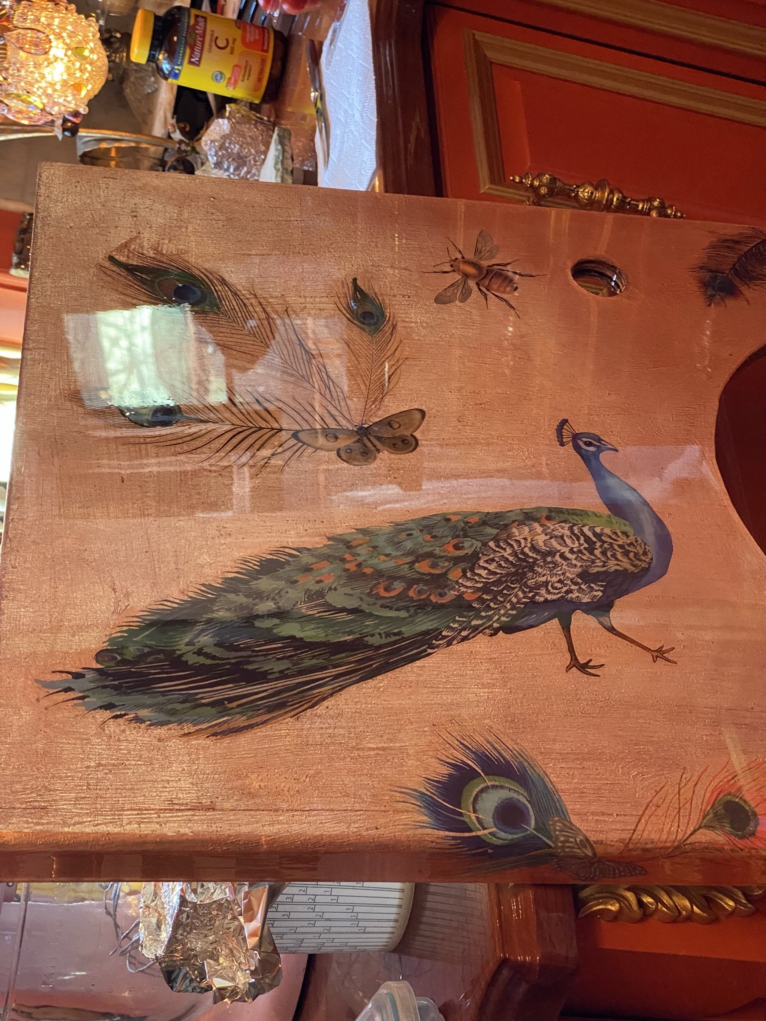
Another view of the counter before it's installed.
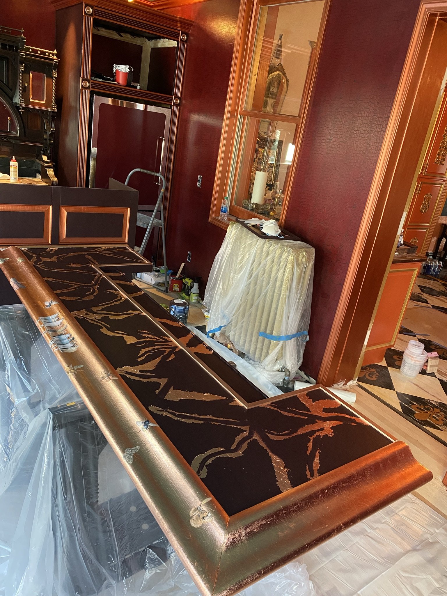
Here's the front bar, ready for the epoxy pour. We decided to be brave and do colored and glittery epoxy.
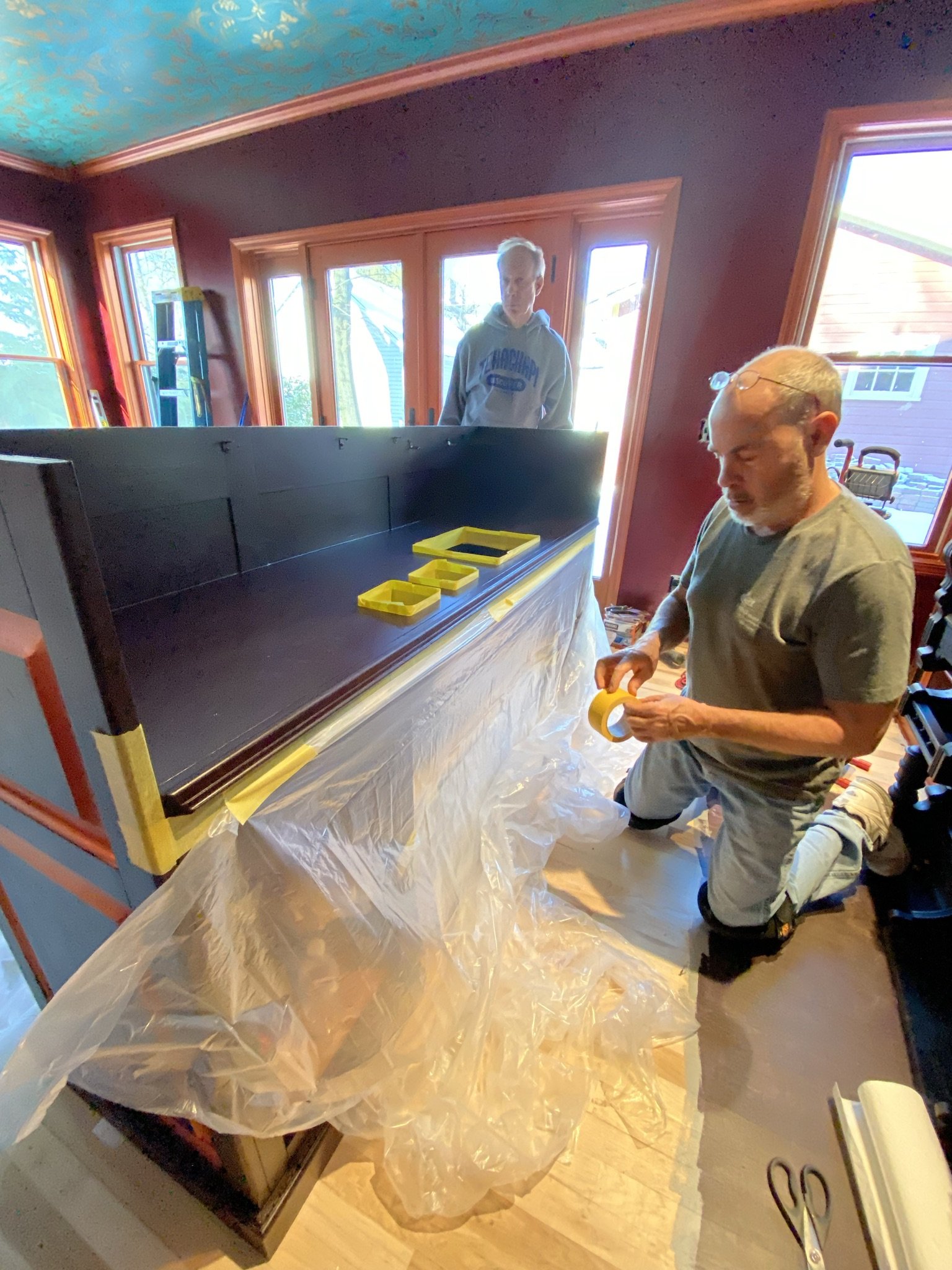
But first, we wanted to do the counter of the front bar, since we'd never done colored epoxy before and this was an area which, if we screwed it up, wouldn't be visible to anyone except the bartender (aka Mike).
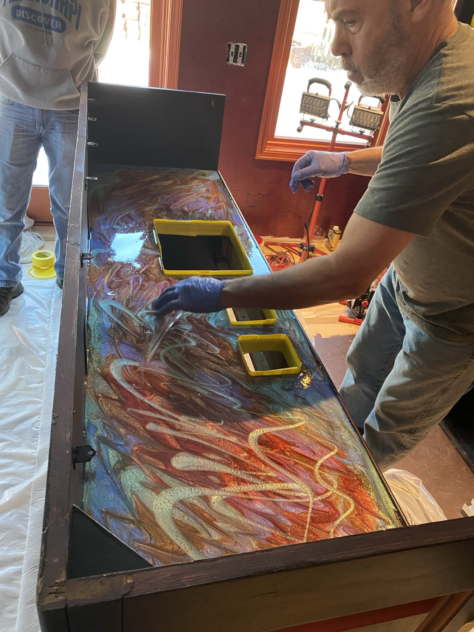
This was completely nerve-wracking. I would've taken more pictures of the stages (mixing, pouring etc.) if I hadn't been so stressed out. Despite all this, it turned out very pretty.
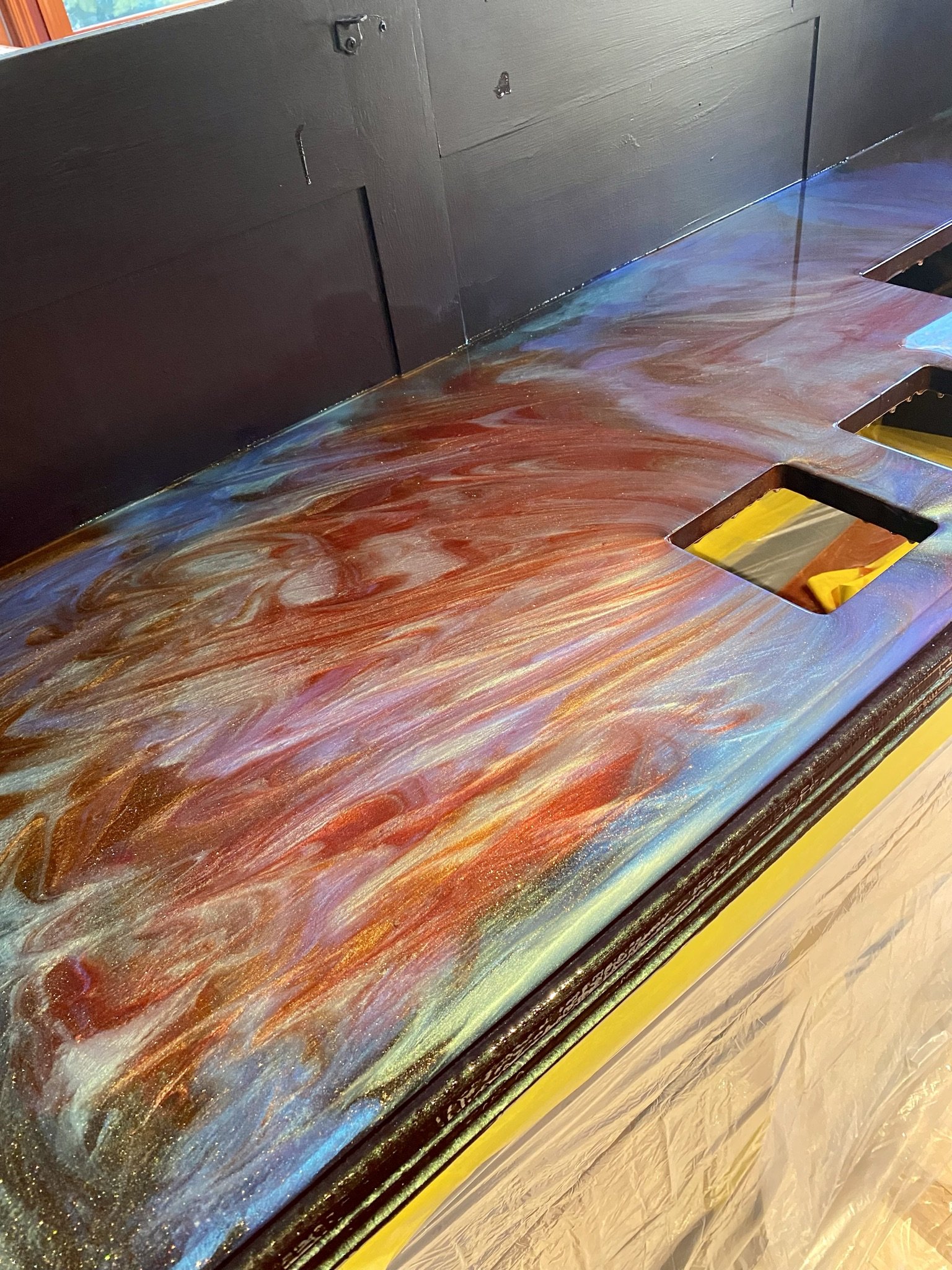
Beautiful!
For the front bar, we decided to use colors that would bring in the blues of the ceiling.
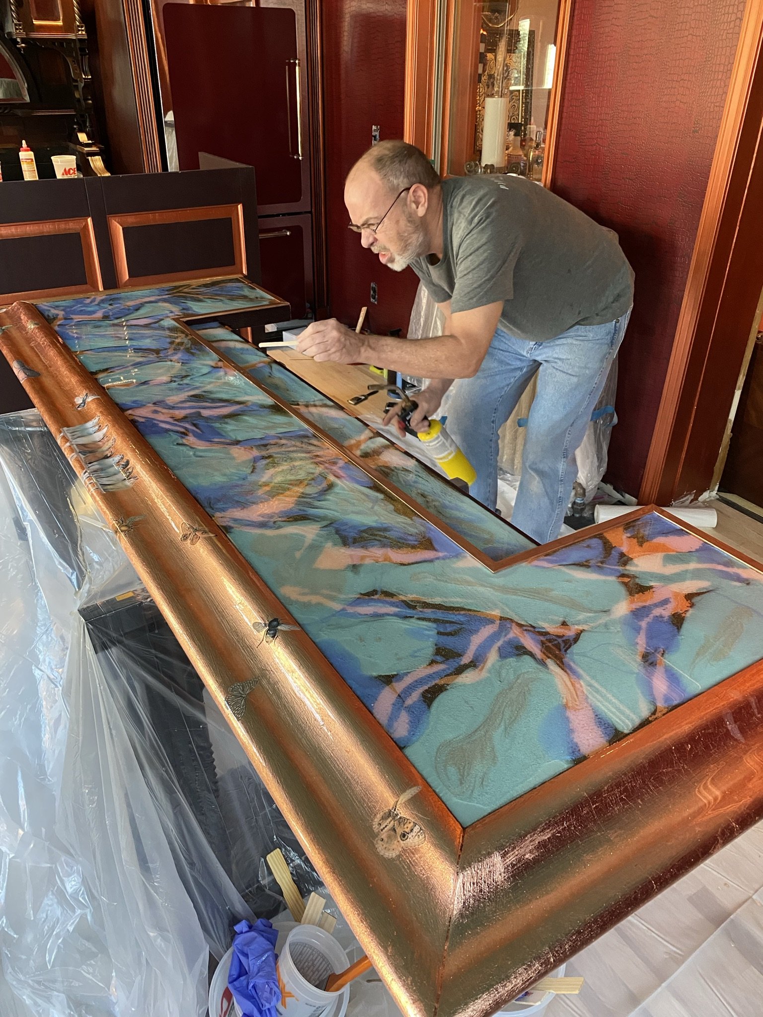
Again, I was too flustered to document the process, but it turned out pretty good. Here's Mike poking at the air bubbles.

More pokes.
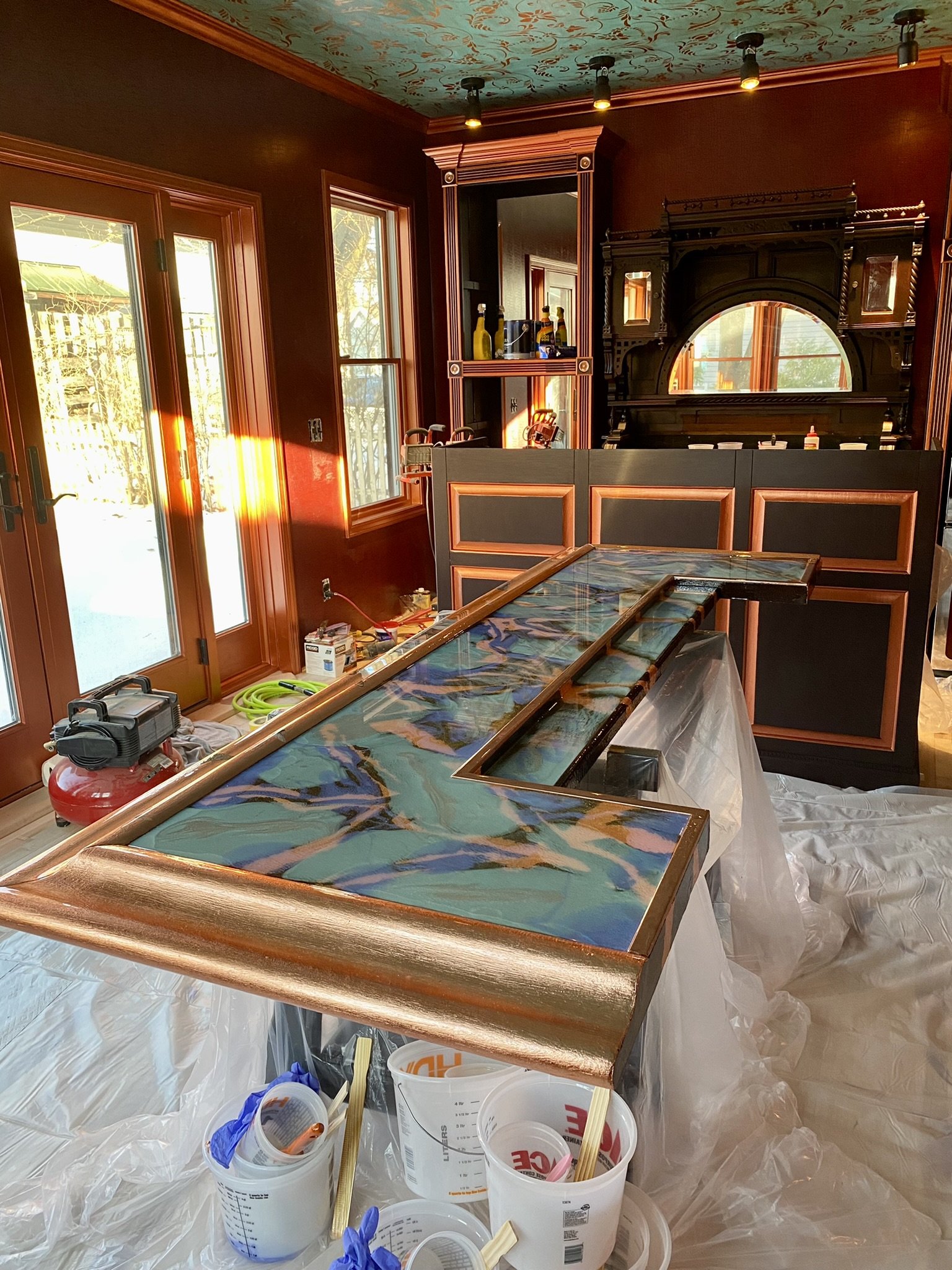
What's not to love about this?
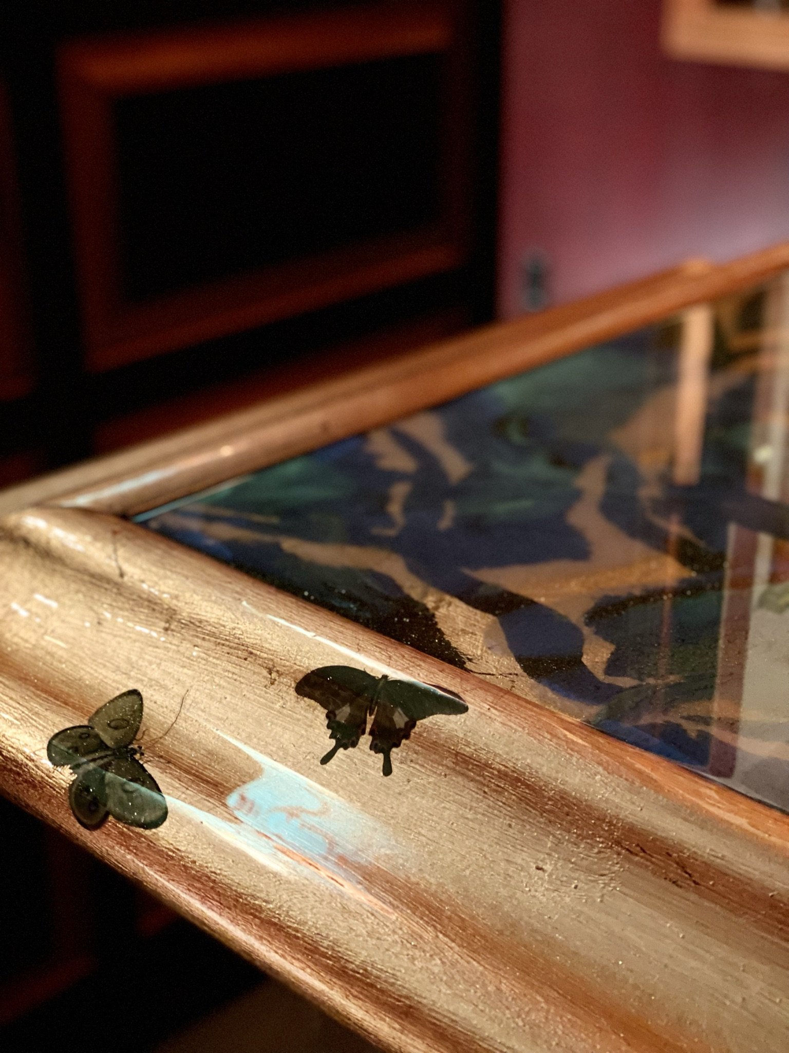
Details are mandatory.
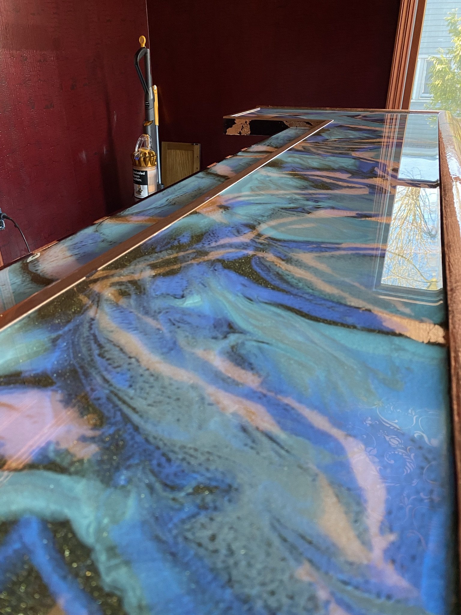
It's sooooo pretty!
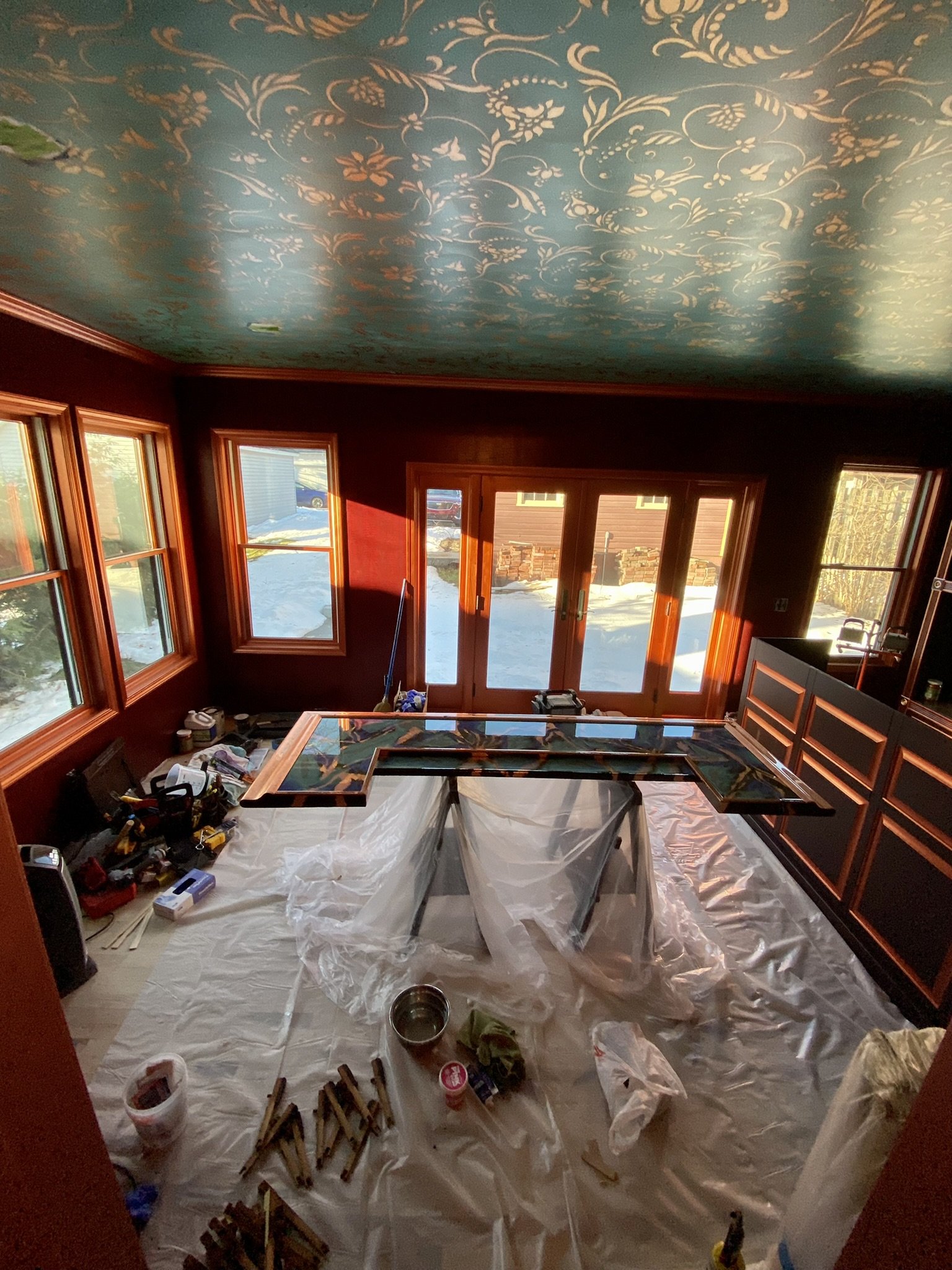
By the end of the day on December 13, 2021, this is how the room looked. We still had a lot to do in preparation for a photo shoot of the back bar area in connection with work I was doing with Hendrick's Gin.
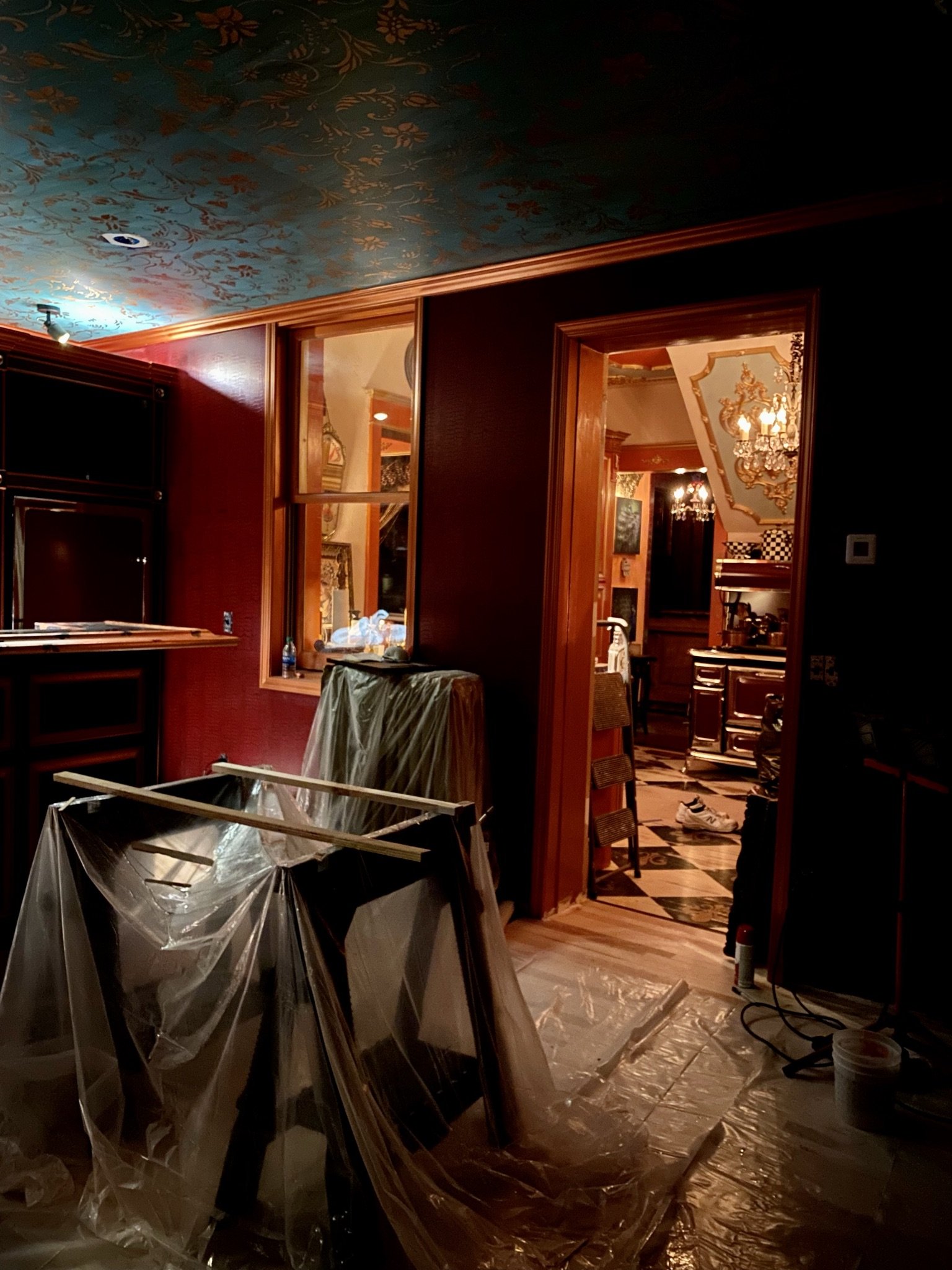
Night views into the kitchen.
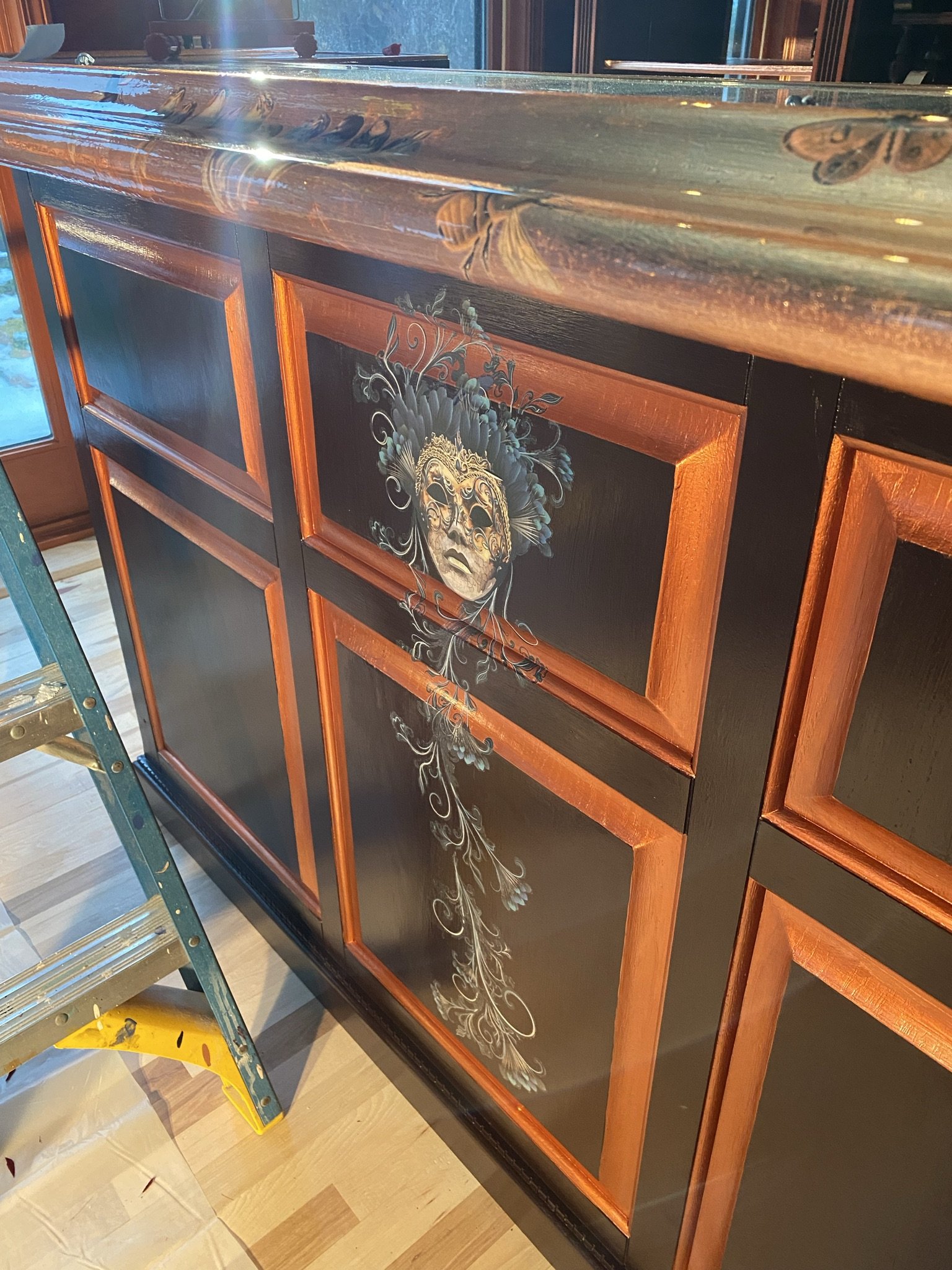
I added furniture transfers to the face of the front bar. I can't remember the brand, but it wasn't a great quality and is already peeling off even with a clear coat. I've never had that kind of issue with Redesign with Prima or Iron Orchid Designs.
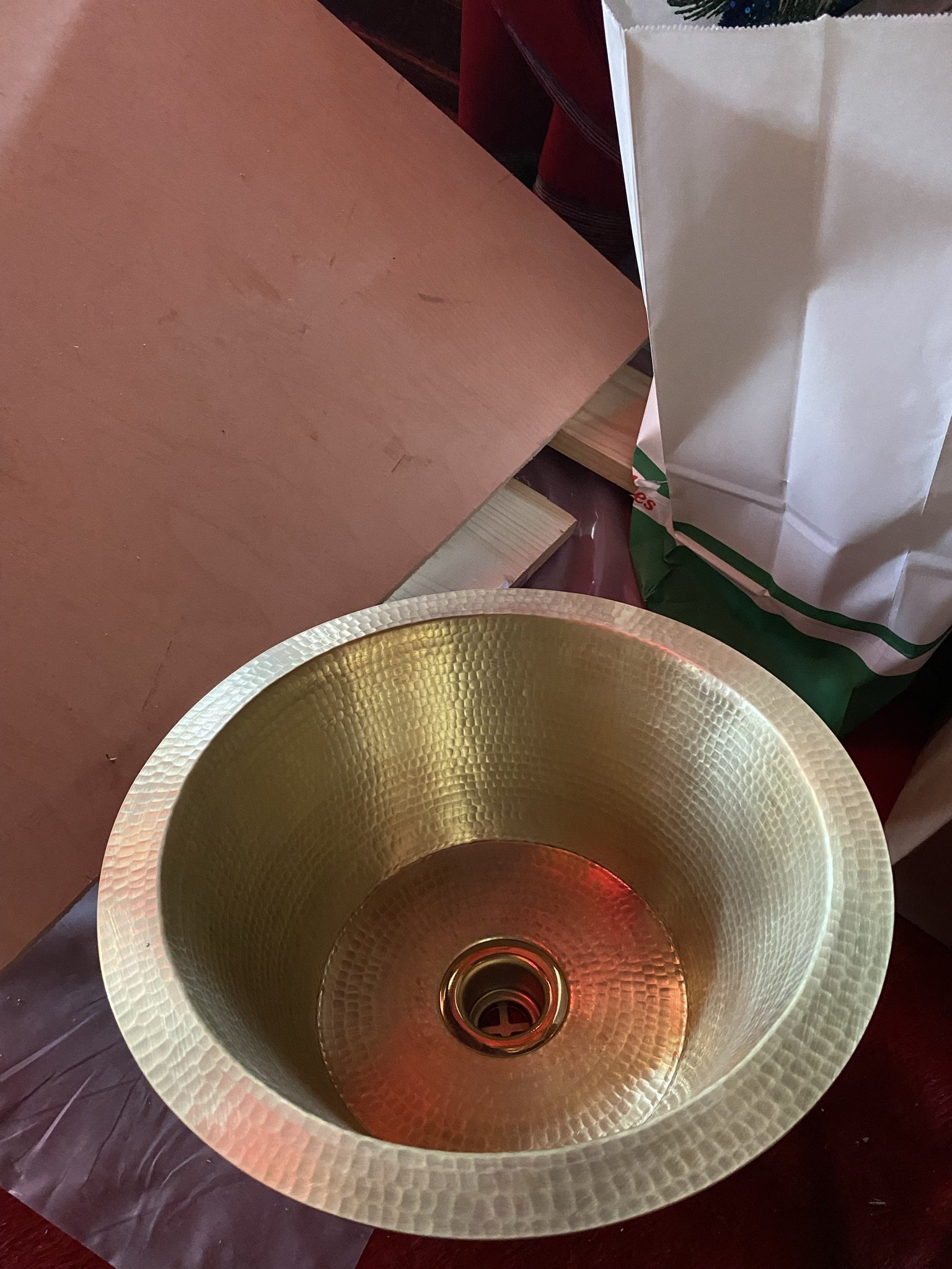
For the back bar sink, we went with brass.
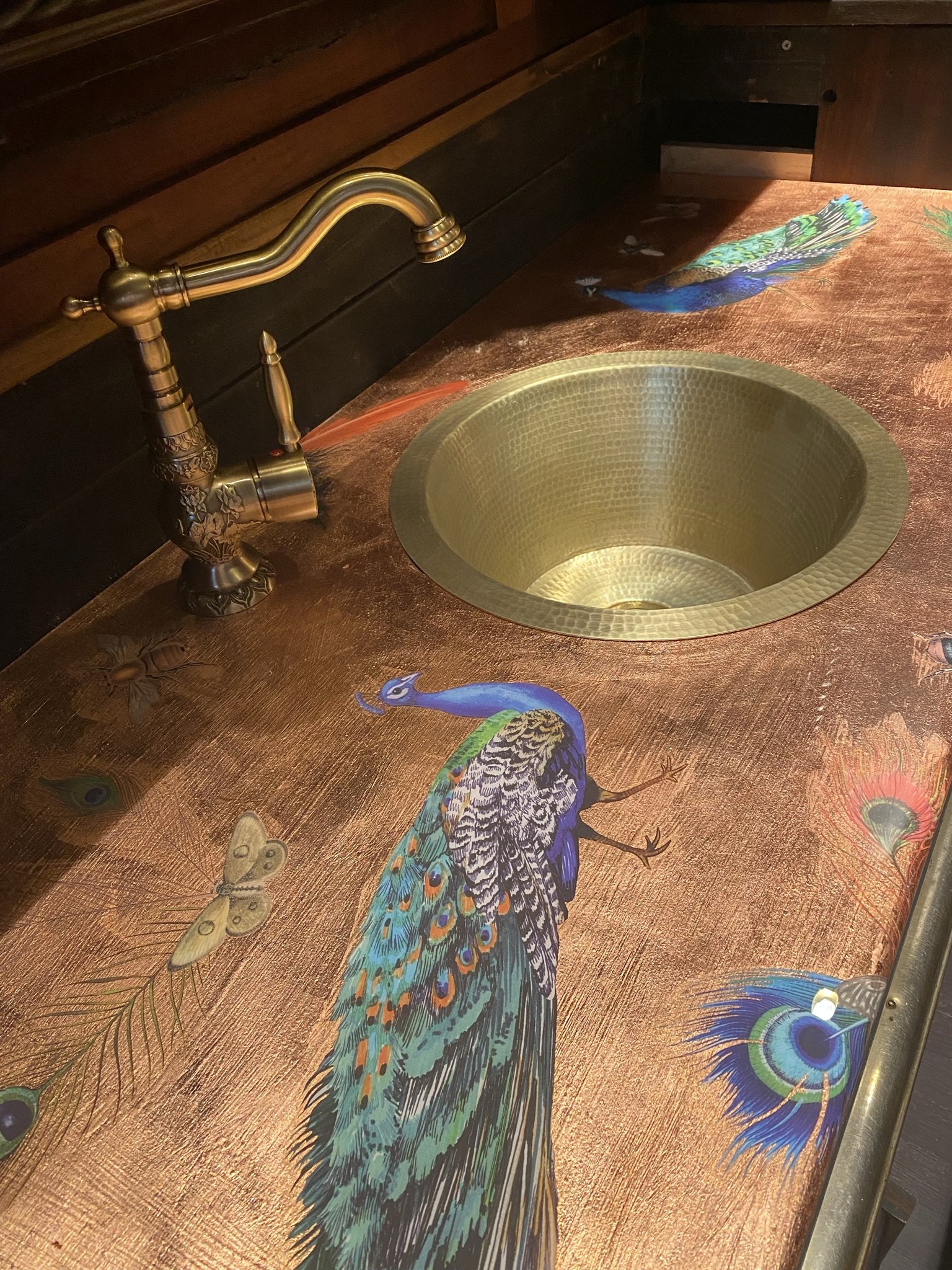
Here it is in place, before installation and before Mike put in the backsplash. The faucet is from Amazon and was inexpensive given the quality, which is pretty good.
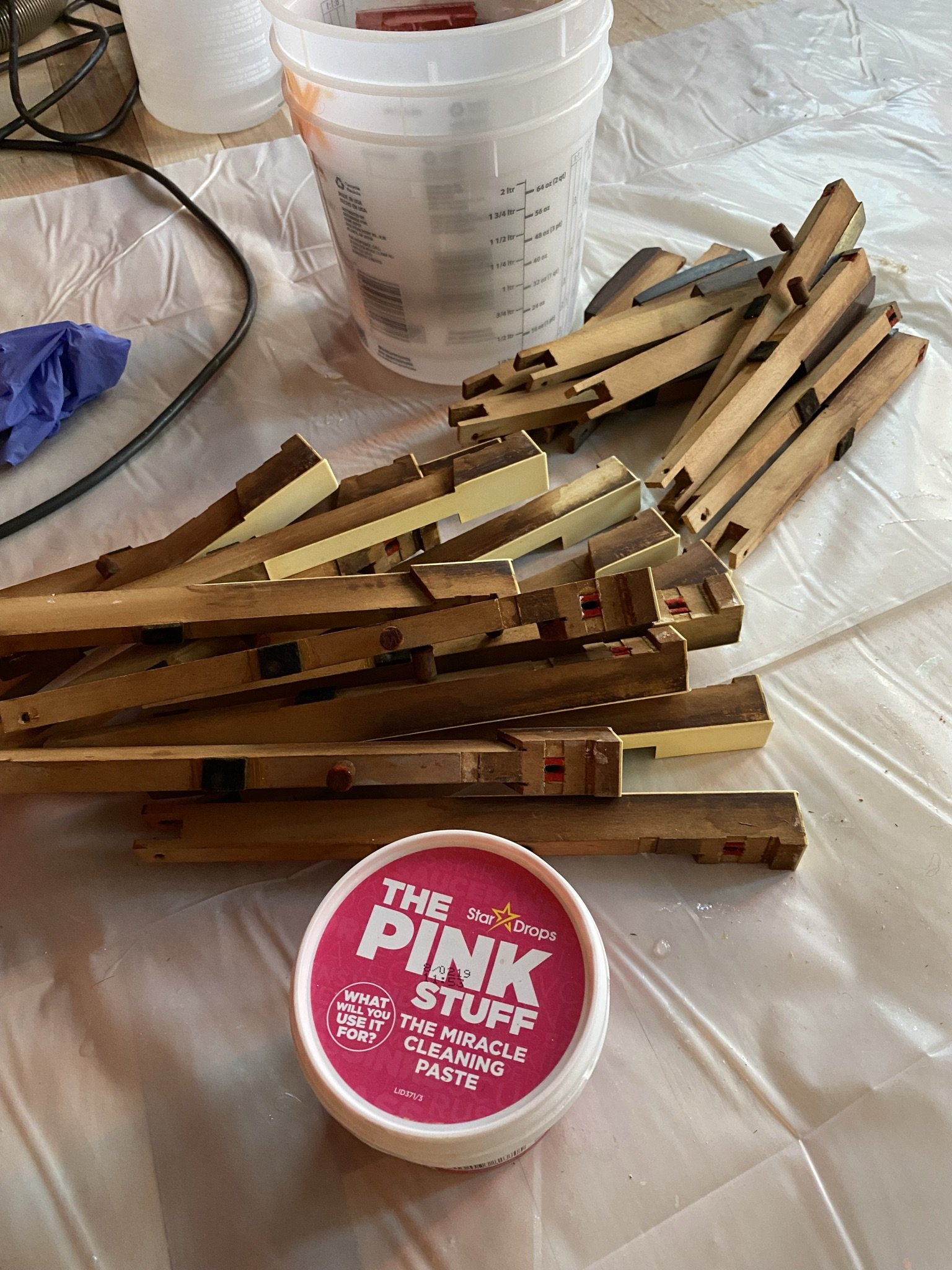
I cleaned the keys with The Pink Stuff. Love The Pink Stuff!
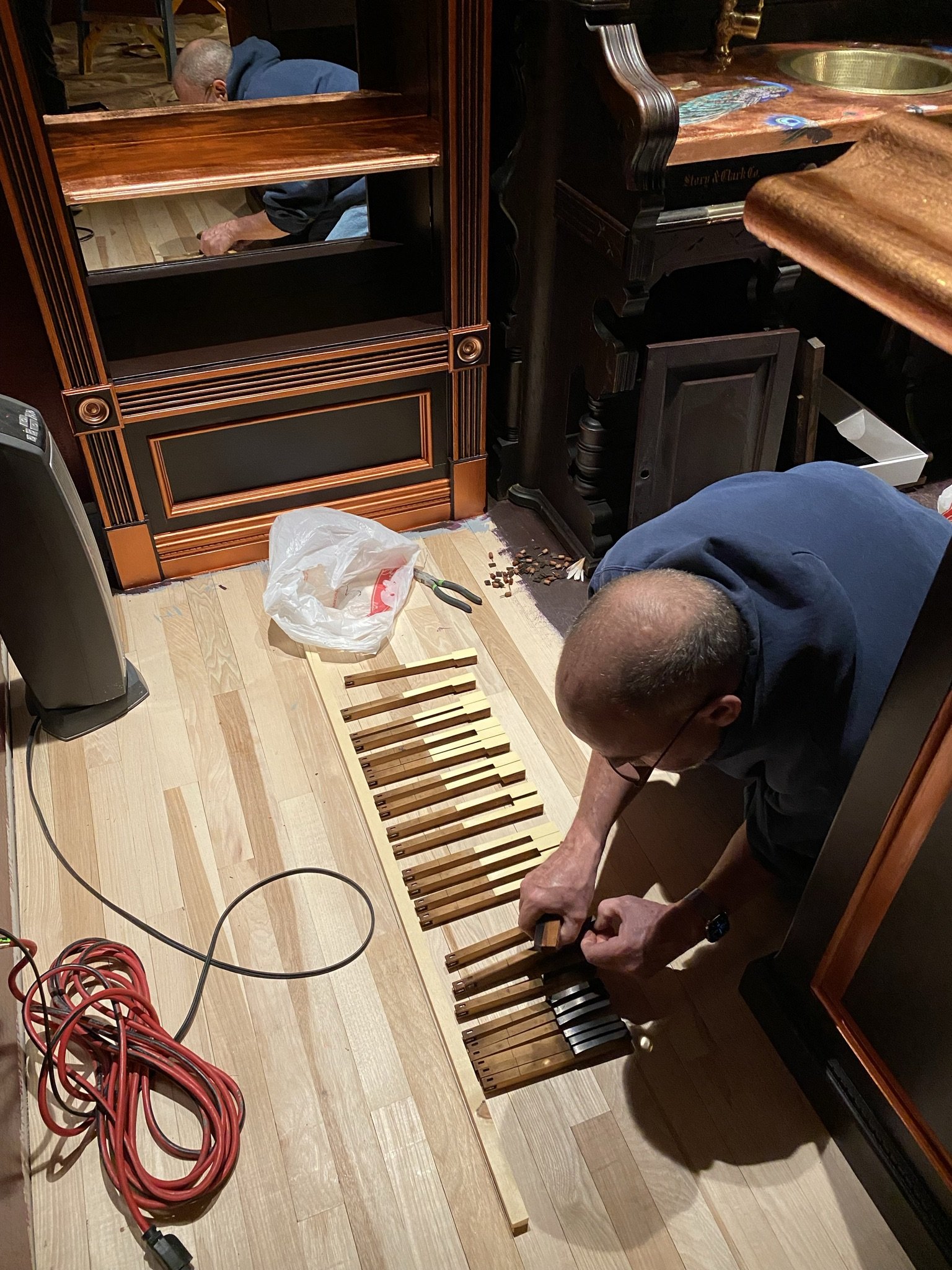
Mike putting the keys in order.
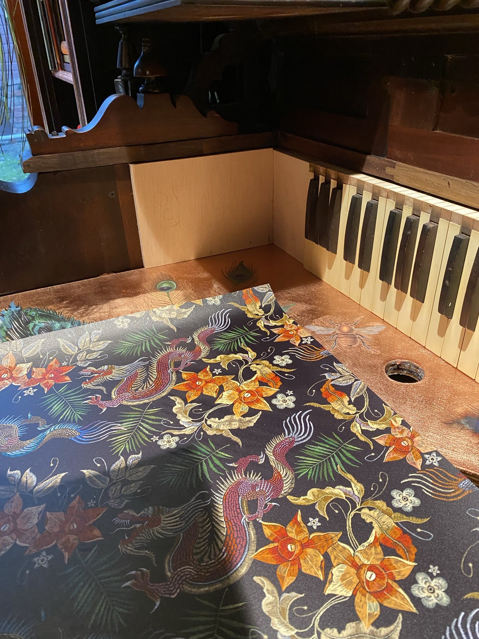
As mentioned before, we repurposed the keys as a backsplash. There was a problem area you can see in the corner which we solved by wallpapering pieces of wood fitted to the open space.
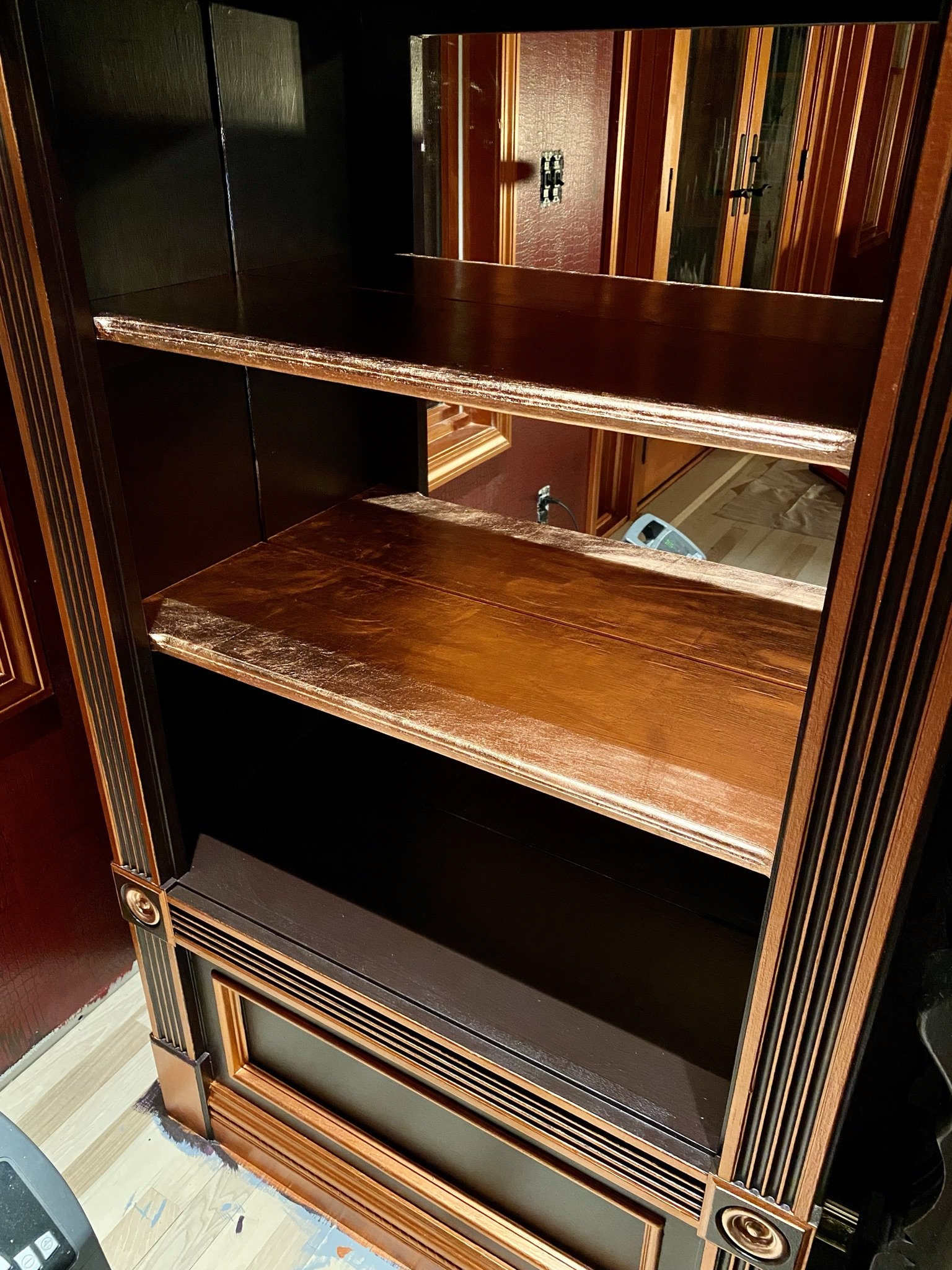
The copper leafed shelves are installed. BTW, they have held up well so far.
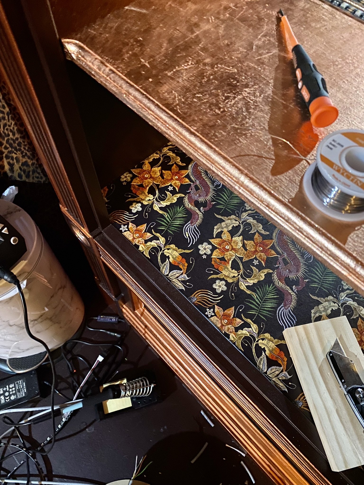
We also added wallpaper to the lower shelves. This is the same wallpaper we put on the dining table.
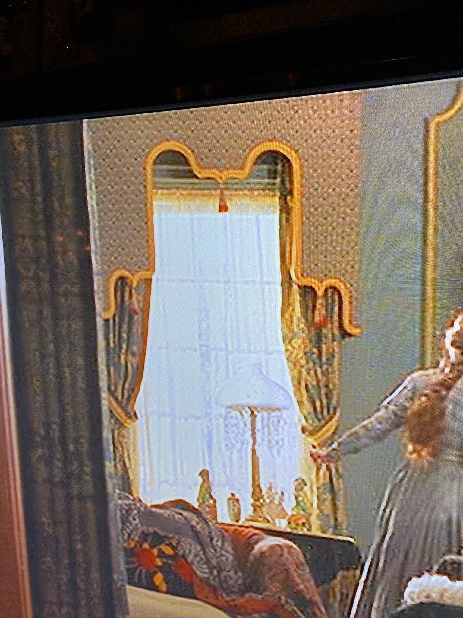
Mike and I were watching Little Women (one of our favorite Christmas movies) and when we got to the first scene in Aunt March's house, I said, "that's the design I want!"
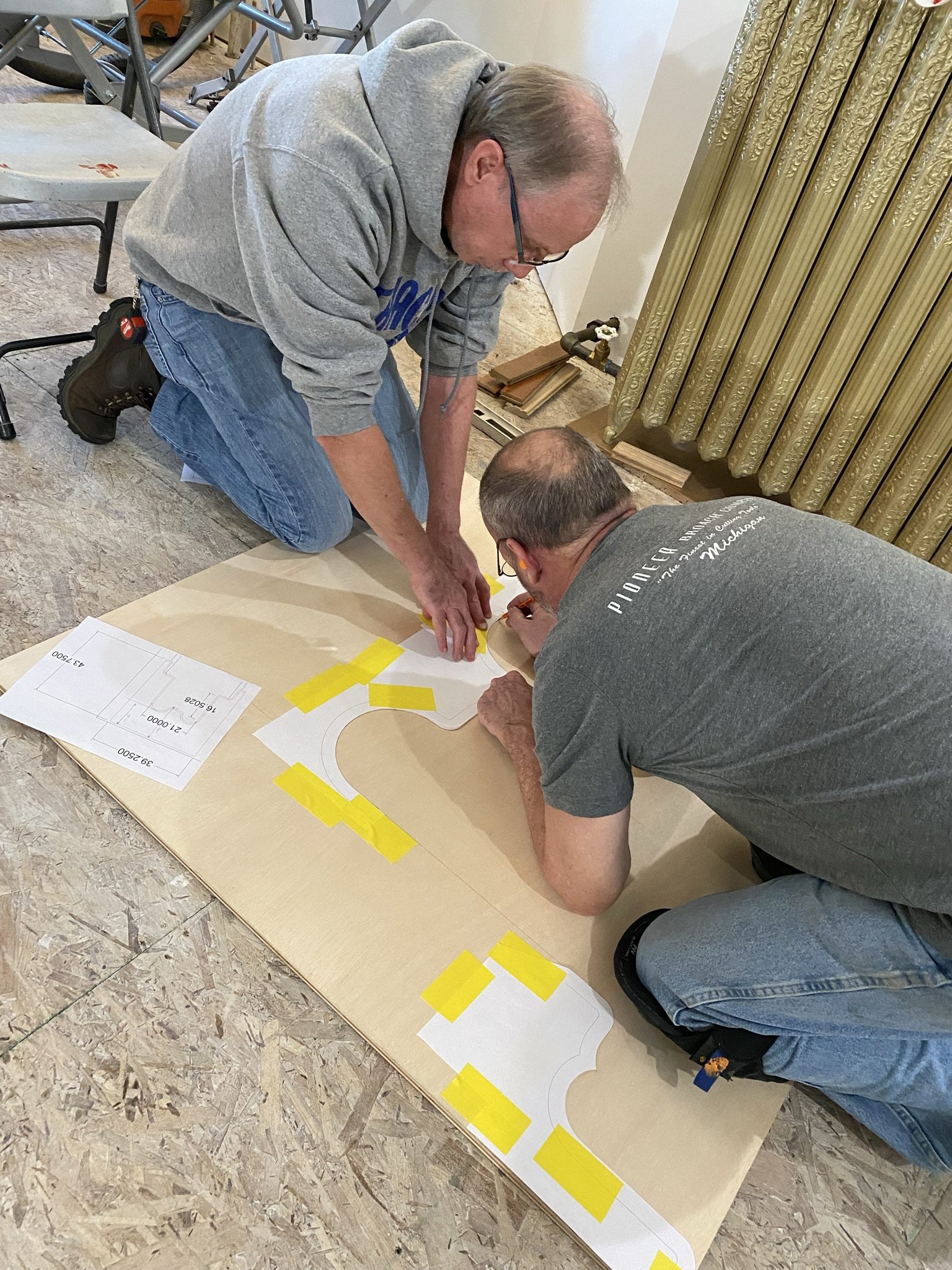
Here's Mike and his brother tracing out the design (which he first laid out on AutoCAD) onto plywood.

After tracing, he cut the cornice faces with his fancy saw.
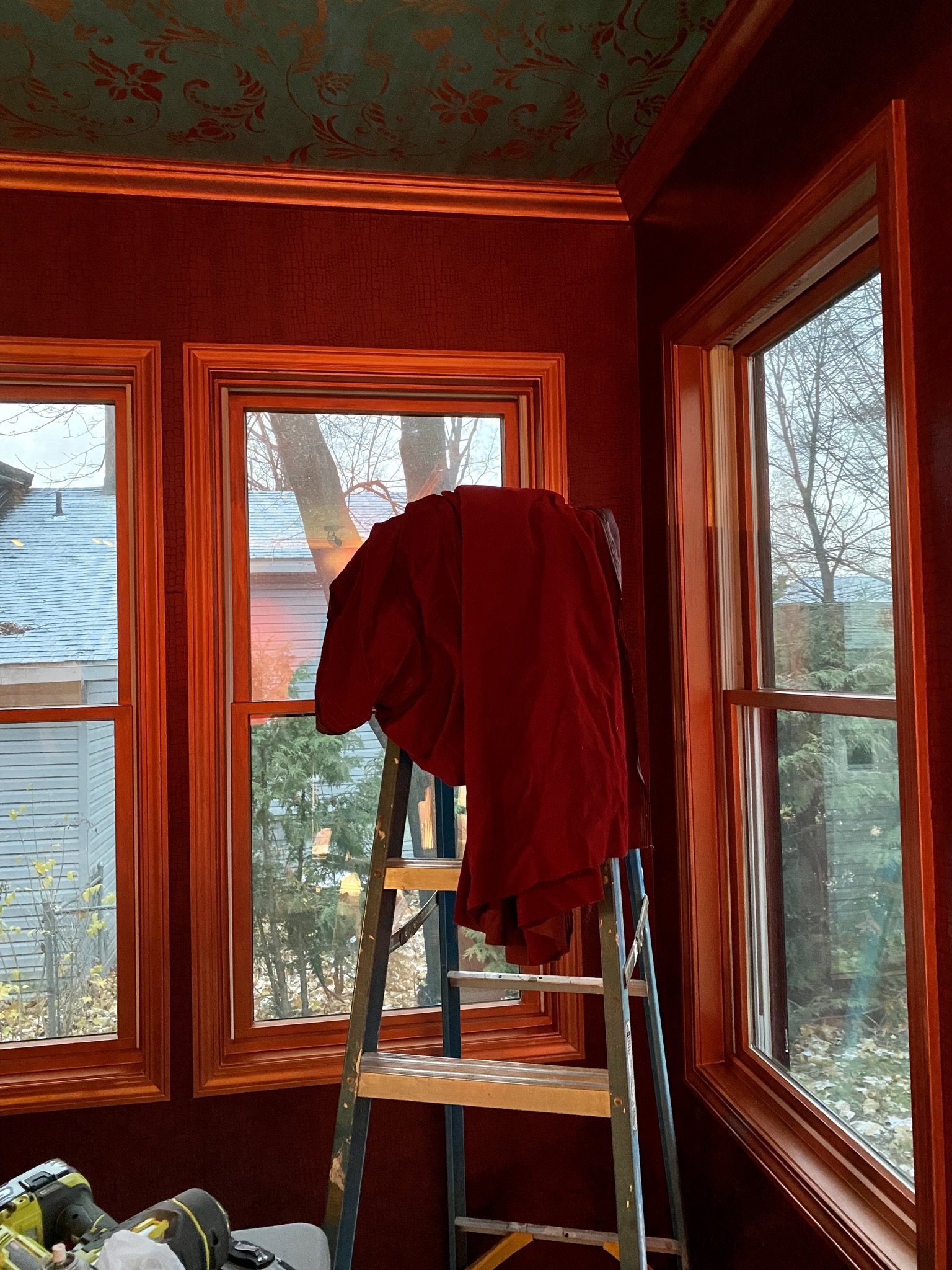
This red velvet from Hobby Lobby was the perfect color, plus I love the opulence of velvet.
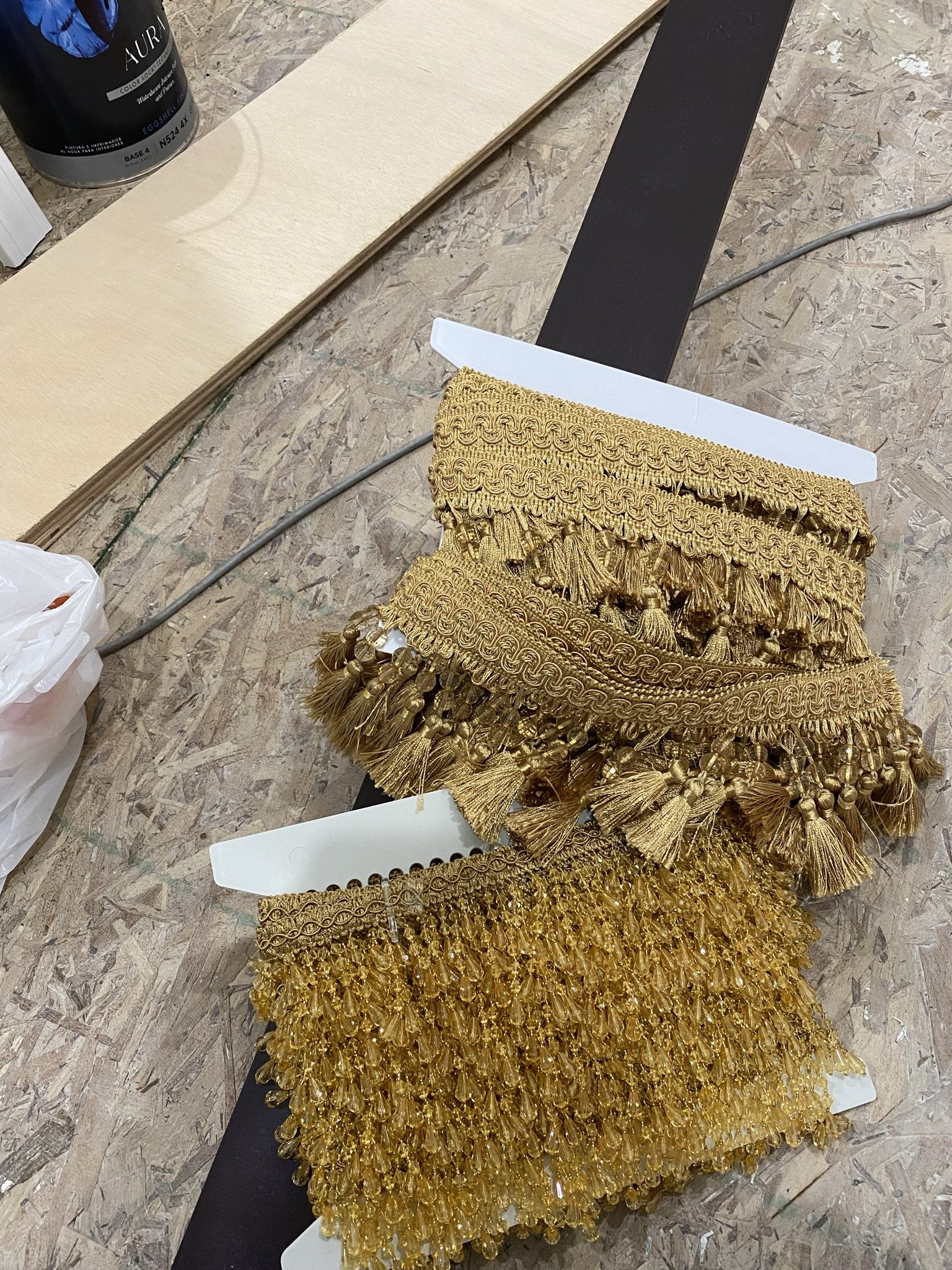
I used several types of trim, all of which was from Hobby Lobby. Our local Hobby Lobby stopped selling trim recently and I'm BUMMED.
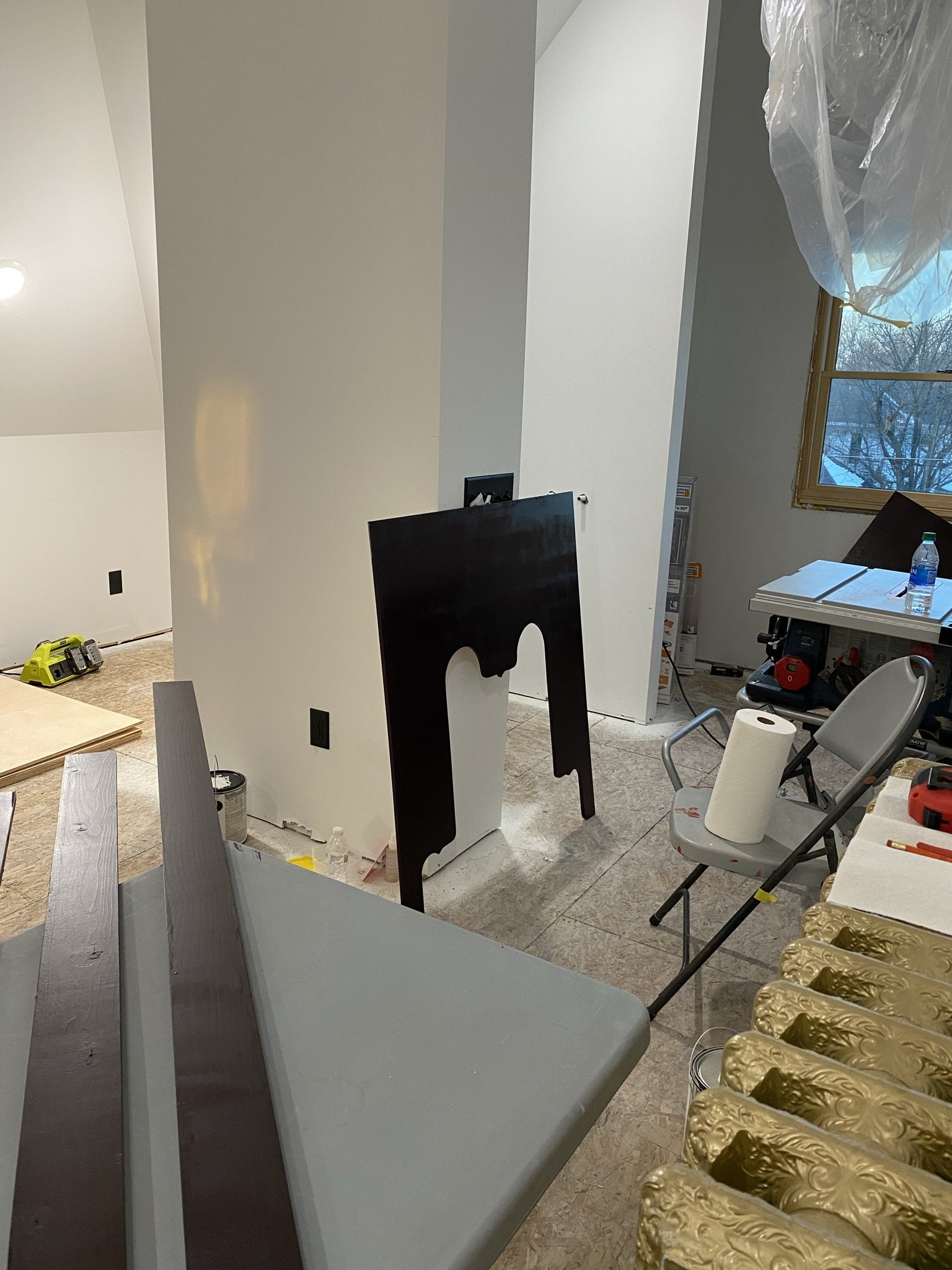
I painted the backs and any part of the cornices which could be seen from the exterior looking through the windows.
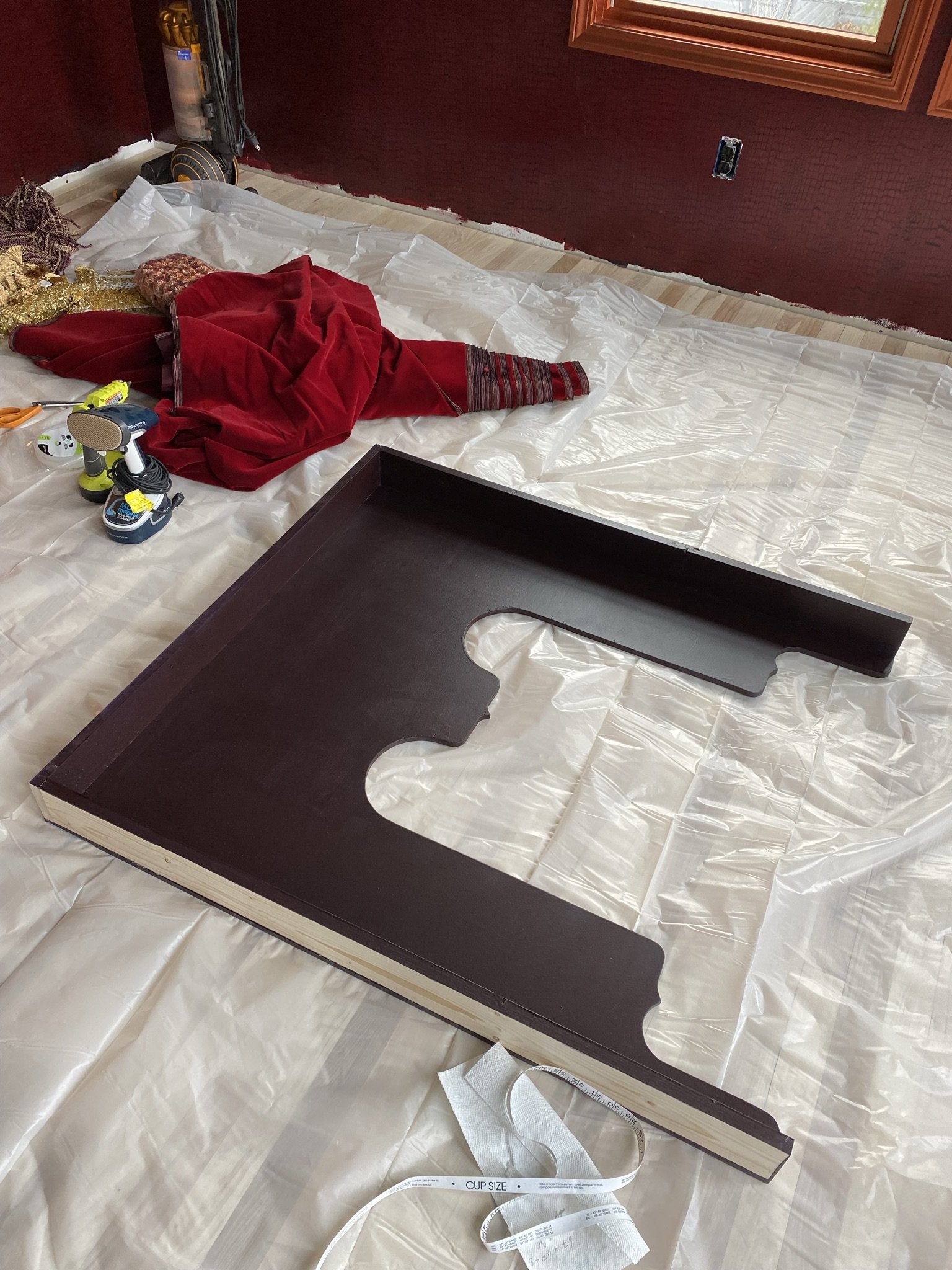
Here is the cornice box complete and ready for fabric. I originally used hot glue to affix the fabric and then switched to spray adhesive. Strangely, the cornices look great in the cooler months, but in the warmer months, the velvet doesn't lie smoothly on the wood. Then it goes back to being fin in the cooler weather. Weird. I may address this down the road. They may have required batting.
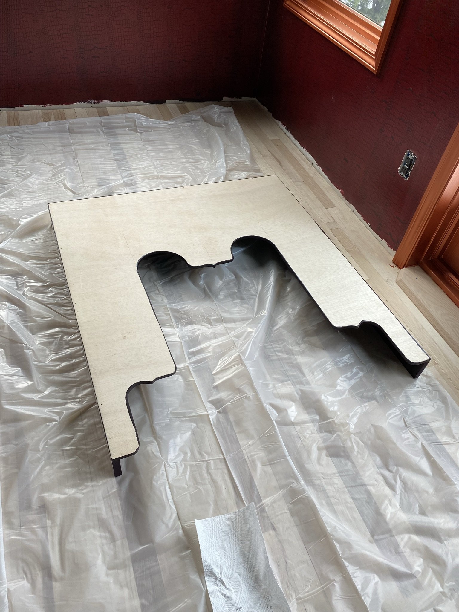
Here's the front of the first cornice box.
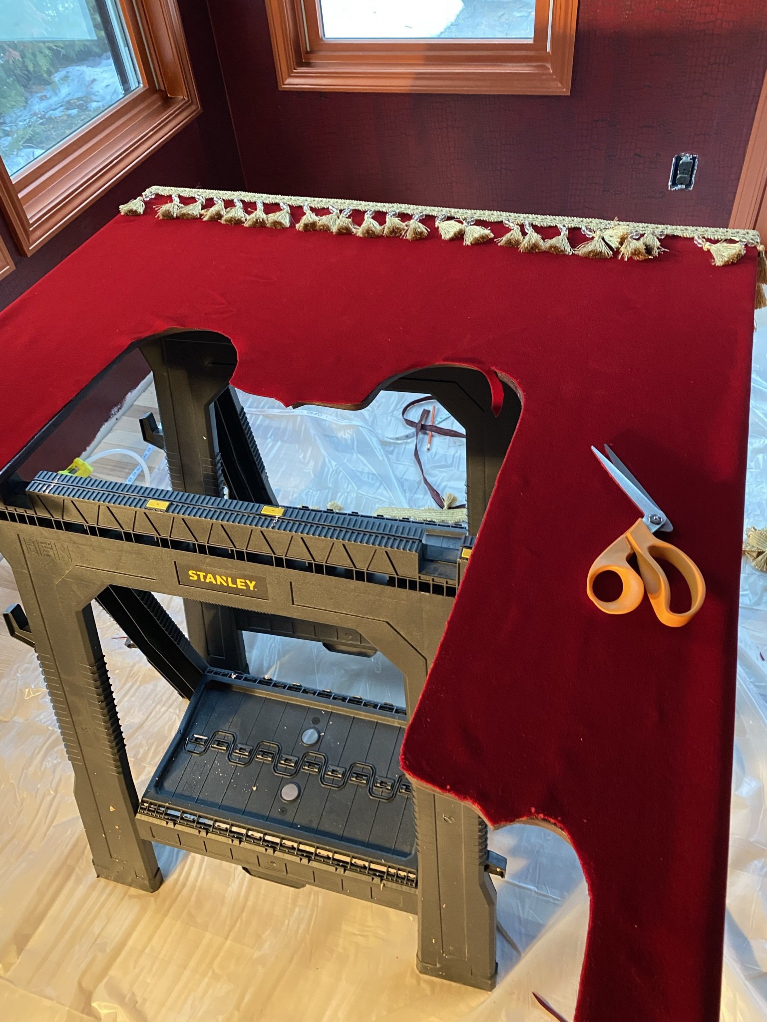
The technique that worked in the end involved laying the yardage over the box then trimming to size.
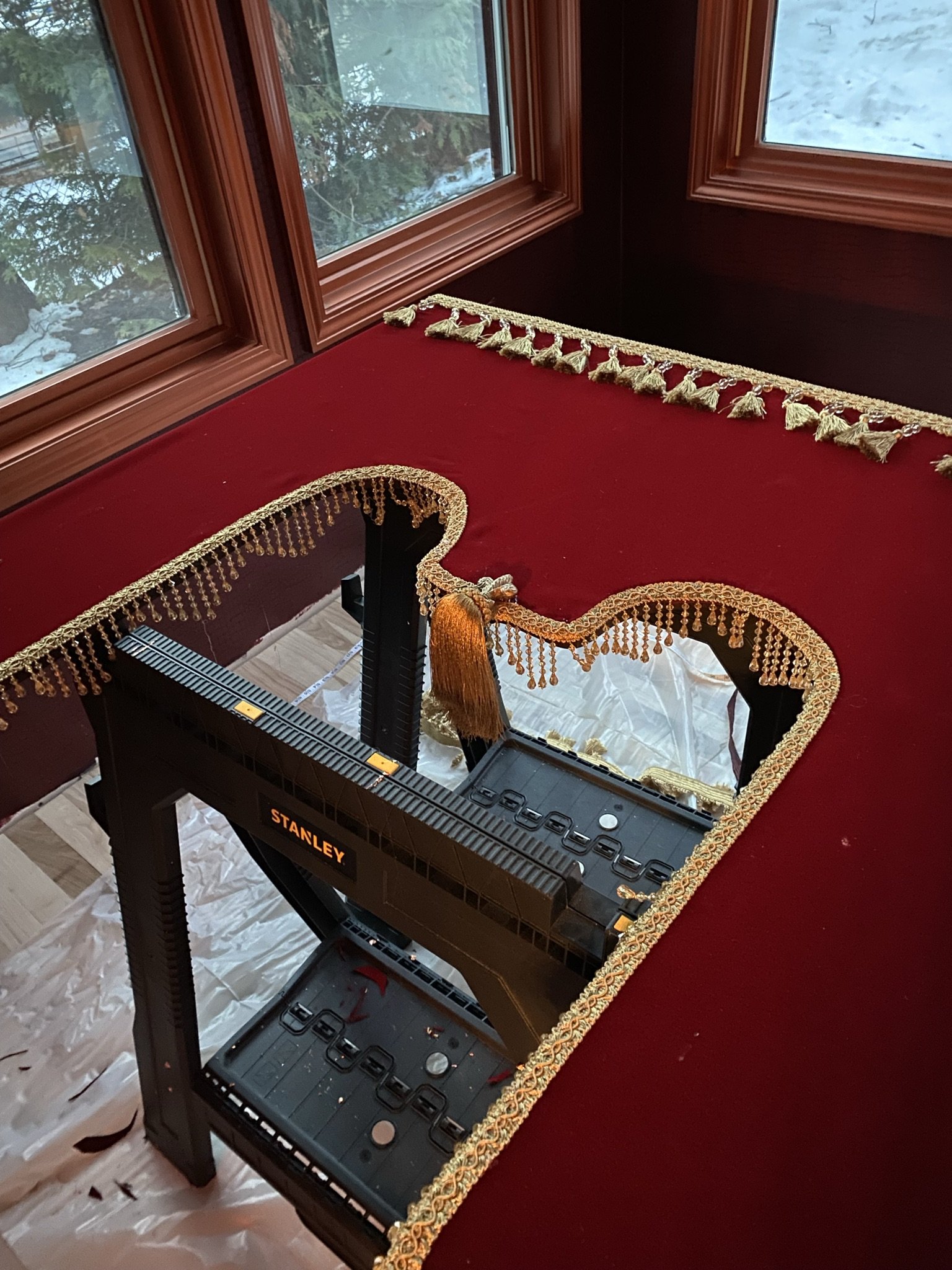
I used hot glue for the trim.
Here's the second box installed, which covered two windows.
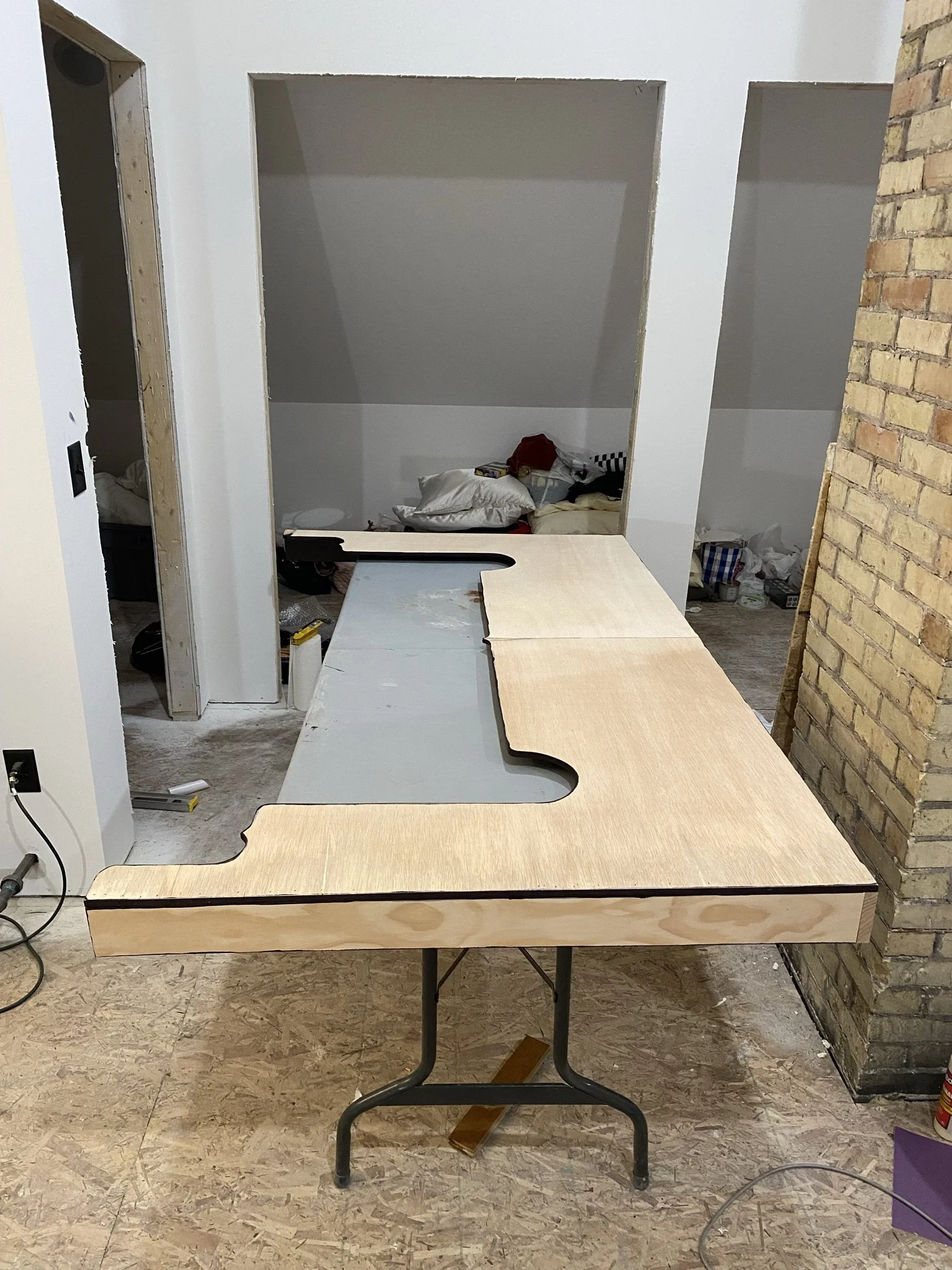
Here is the final box ready for fabric. This one will go across the French doors and side lights.
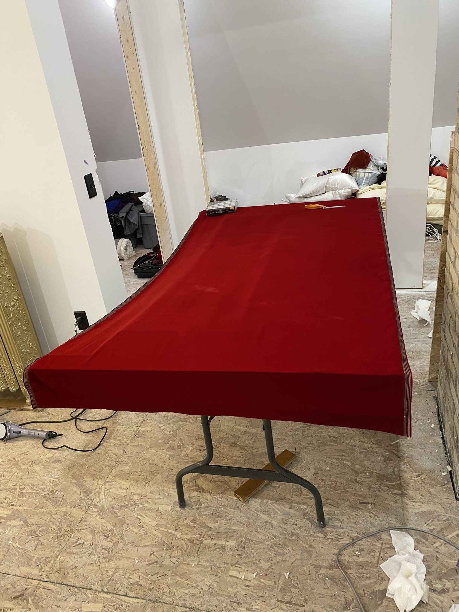
Fabric is down.
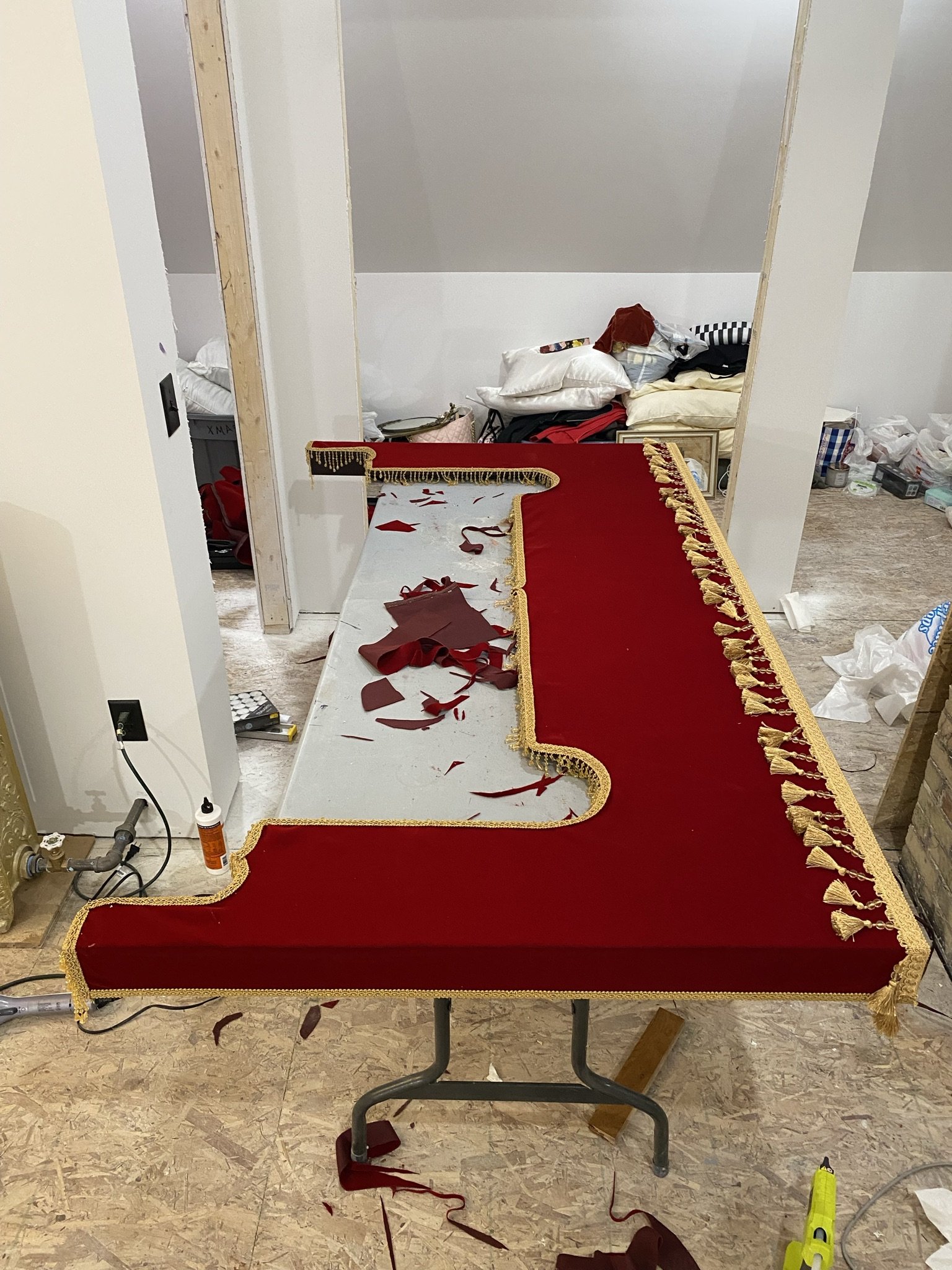
And done.
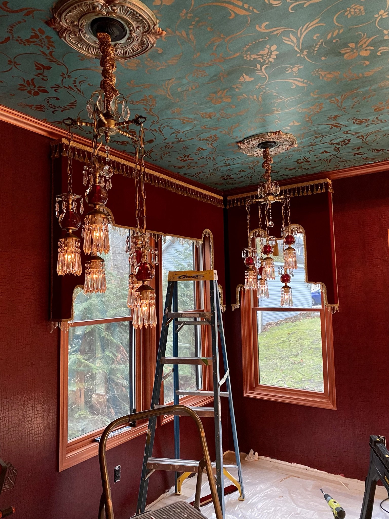
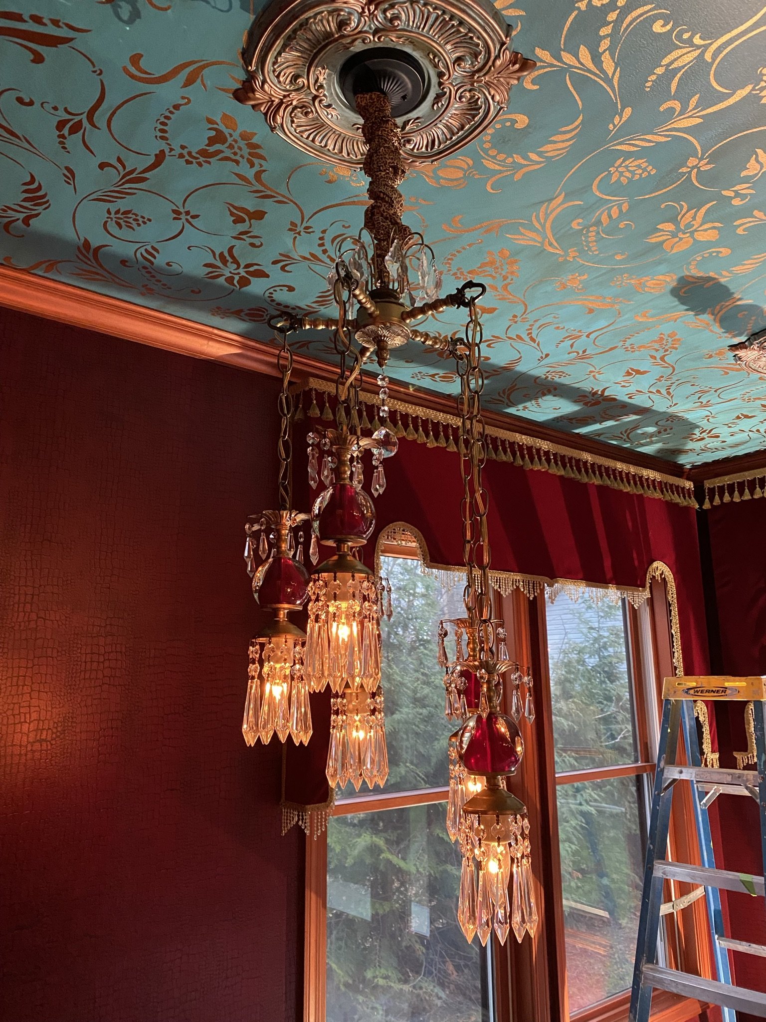
Cornice corner. As mentioned, I wanted cornices for the architectural interest they add, but also because I didn't want heavy drapery, as we already were losing light in the kitchen due to the room addition. Yet, the lounge needed some sort of layering to build character and warmth. At this point in time, I was still trying to figure out what sheers I would hang behind the cornices. The lights are vintage Hollywood Regency which we bought from an Etsy shop.
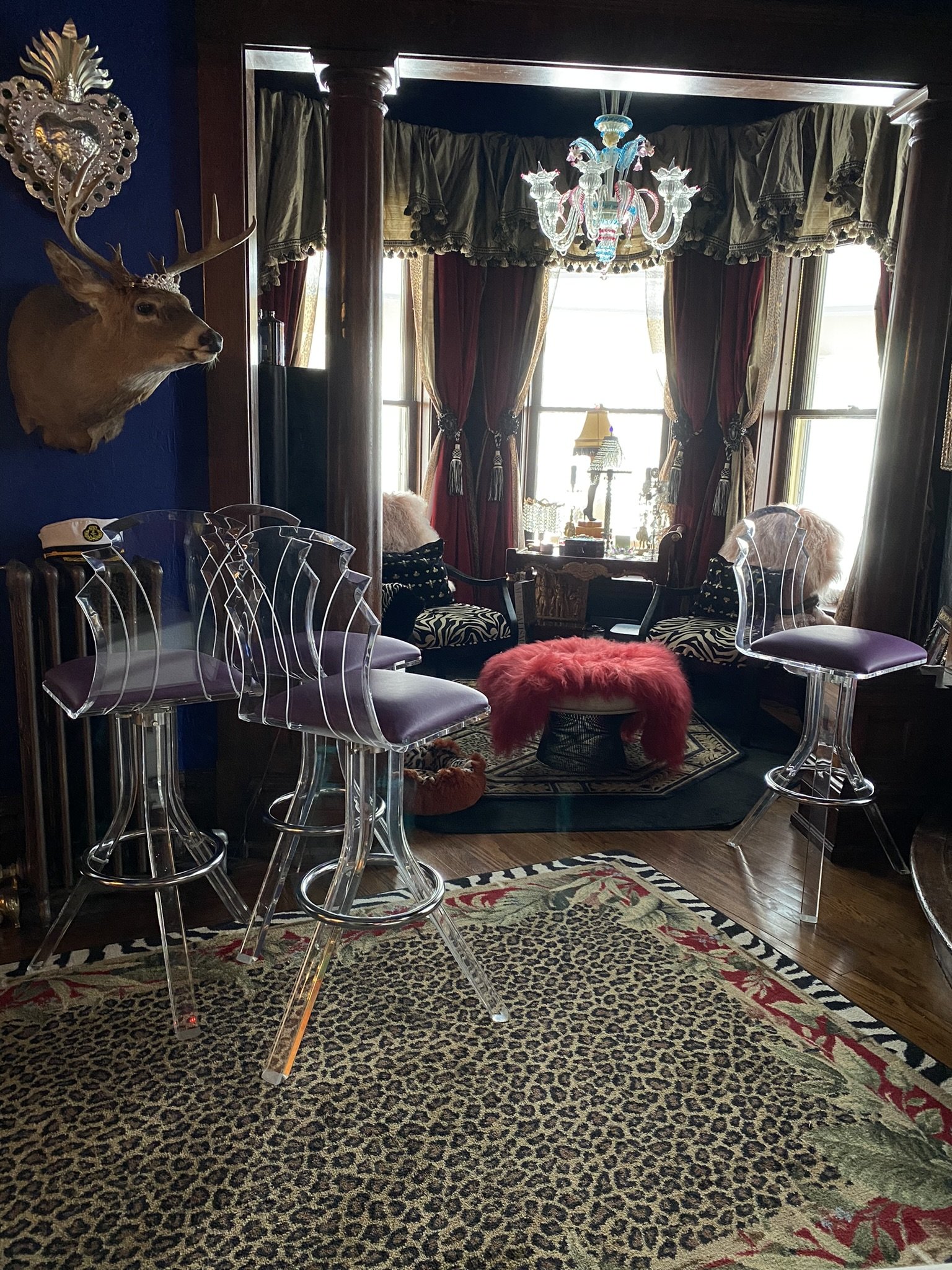
We found these Lucite bar stools on eBay. There are five in total and they were in perfect condition.
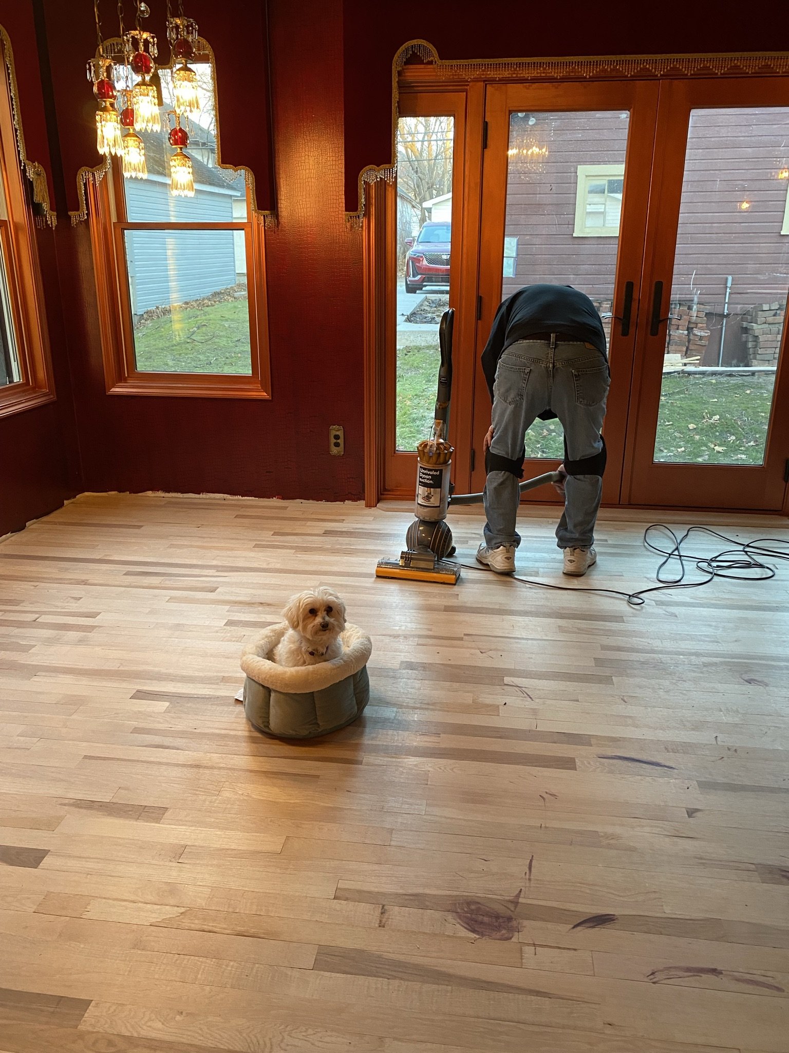
Here's Mike cleaning the floor before we began priming and painting it. I didn't get pictures of the process because we were in a hurry to get it done.
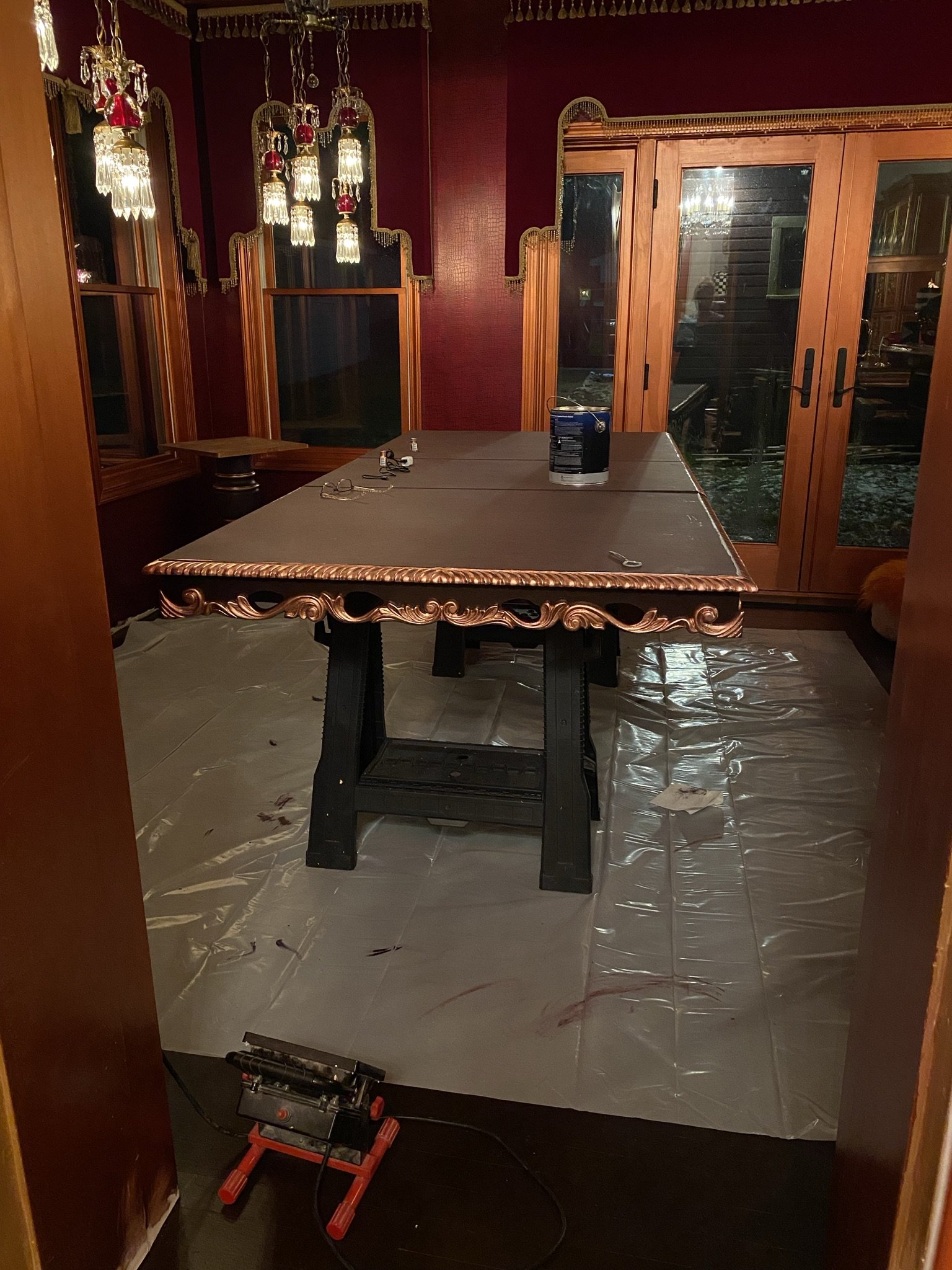
Here, the floor is painted (with the same color I used for the bar cabinets) and the dining tabletop is on sawhorses while I paint it.
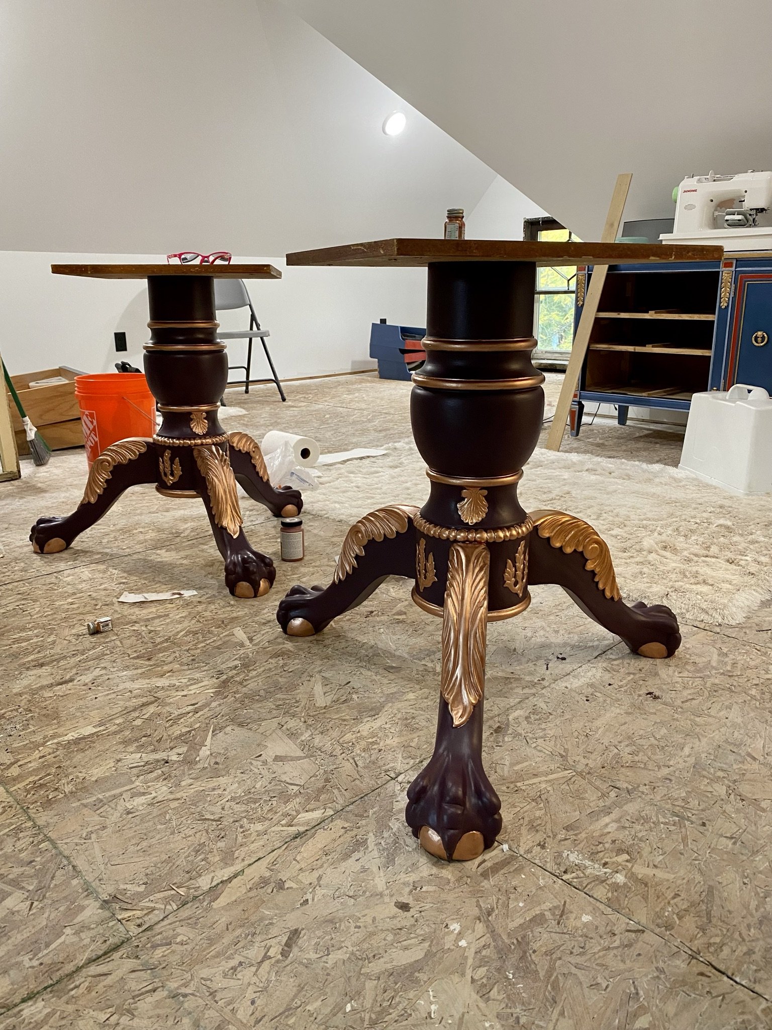
These are the pedestals for the dining table, which I painted out. We found the table on Facebook Marketplace, but I think eventually we may take these pedestals and put two smaller, separate table tops on them. It will allow people to more easily access the banquette seating.
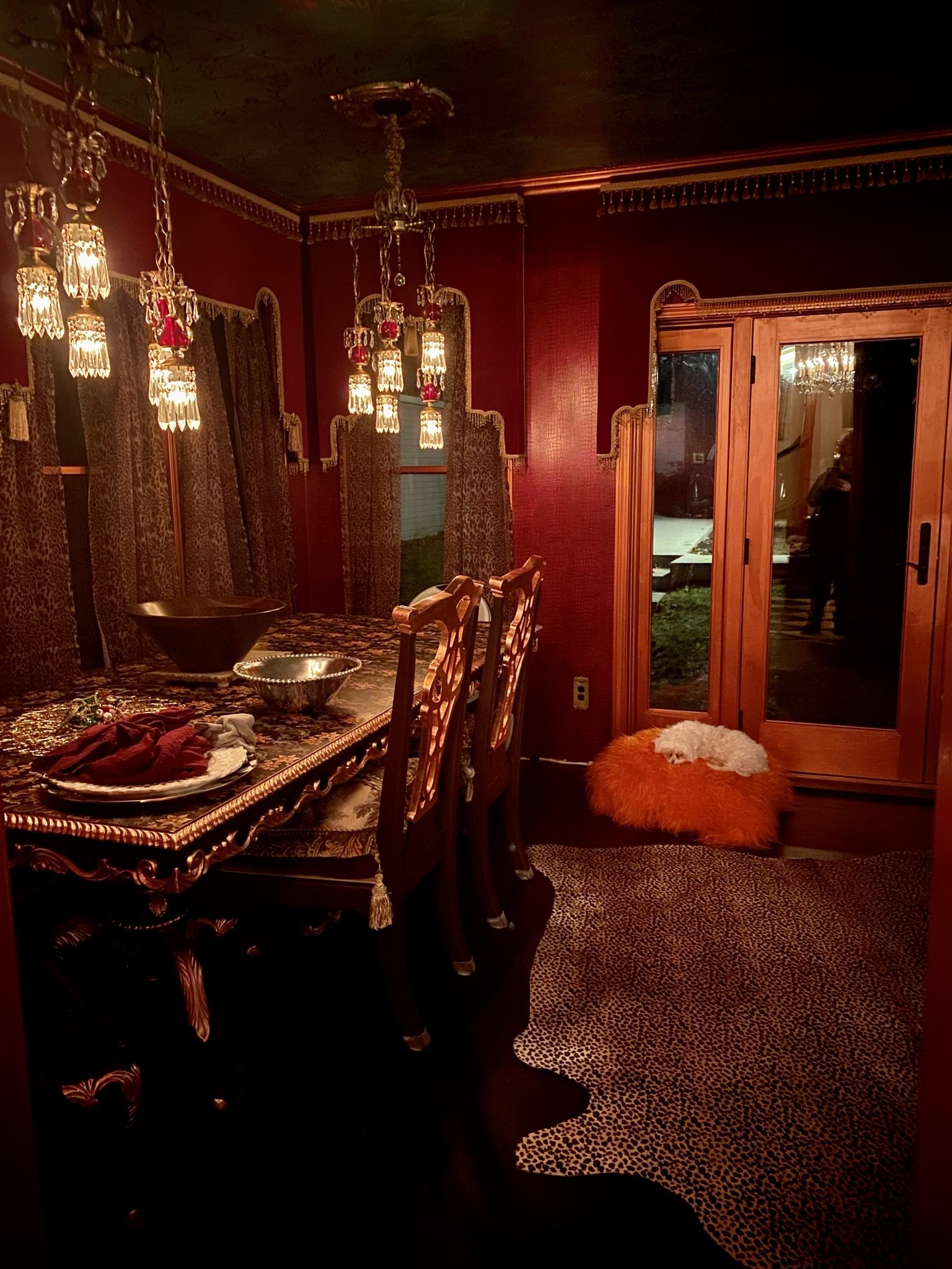
Dining table is in place and the top is wallpapered with peel and stick.
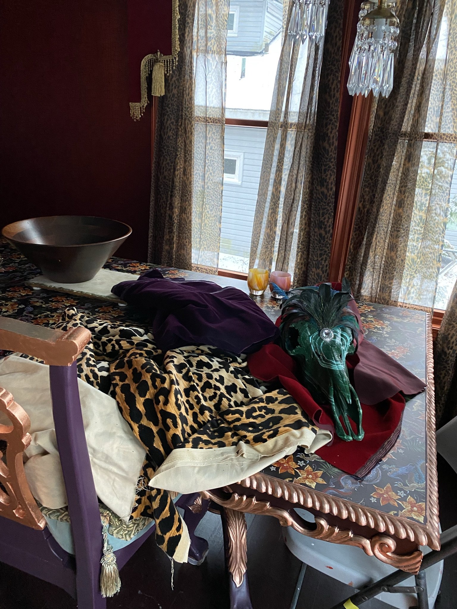
As mentioned, we planned to build a banquette for dining. Here's my inspiration pile. The taxidermy, which I scavenged from my office, would go on the wall.
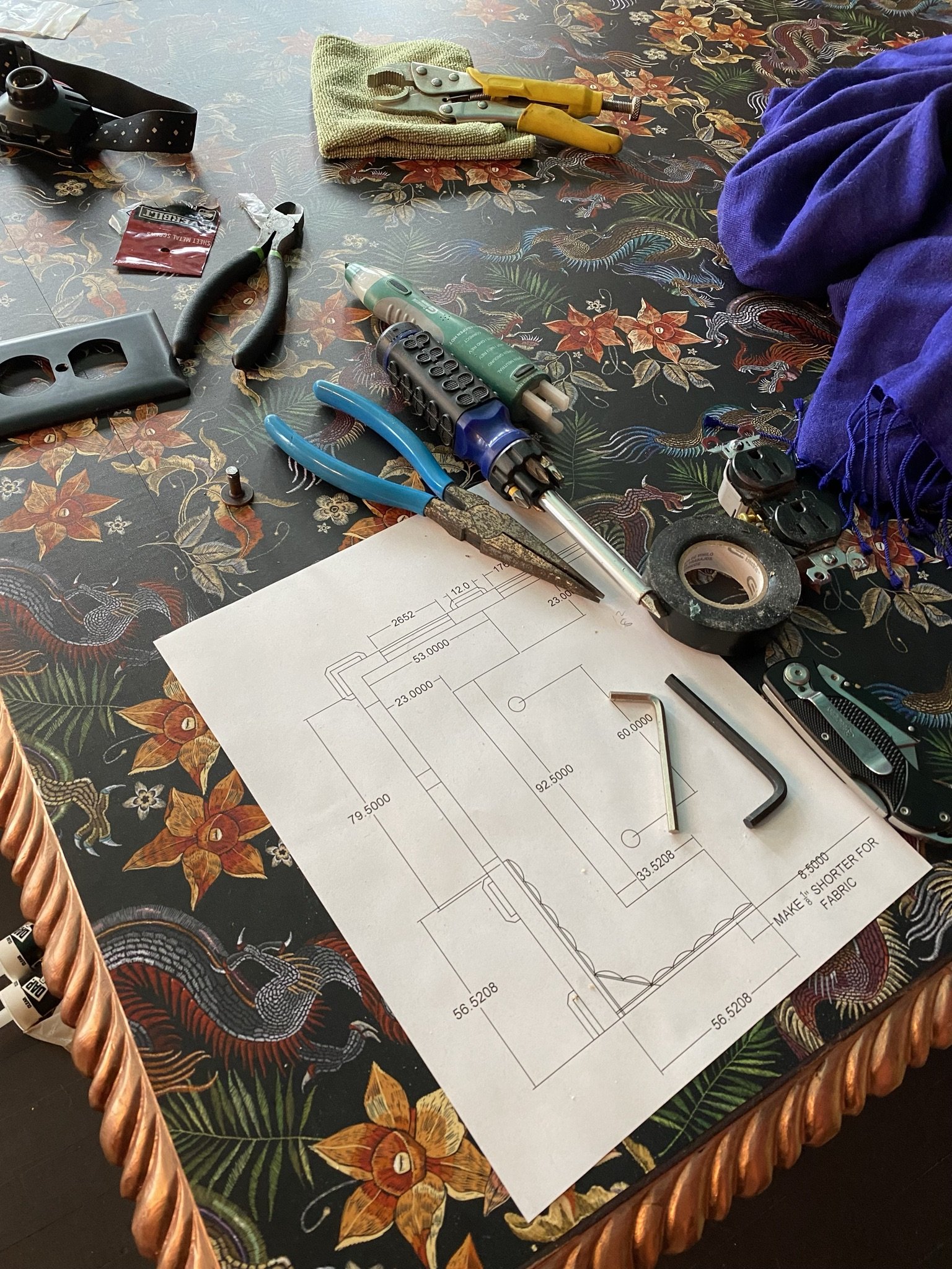
Here's a close up of the wallpaper on the tabletop and also Mike's drawing of the banquette.
Mike begins building the banquette seat.
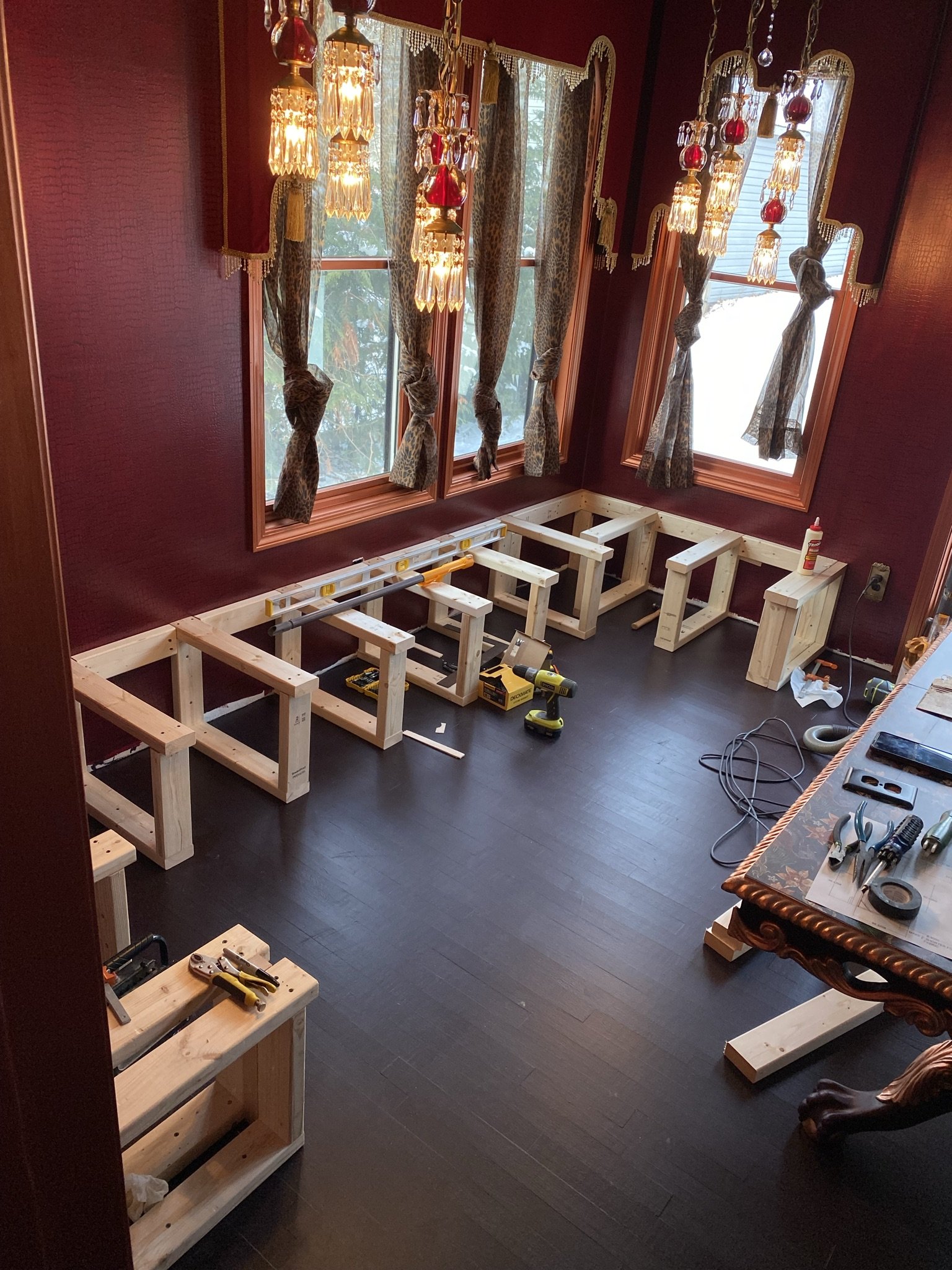
Banquette progress.
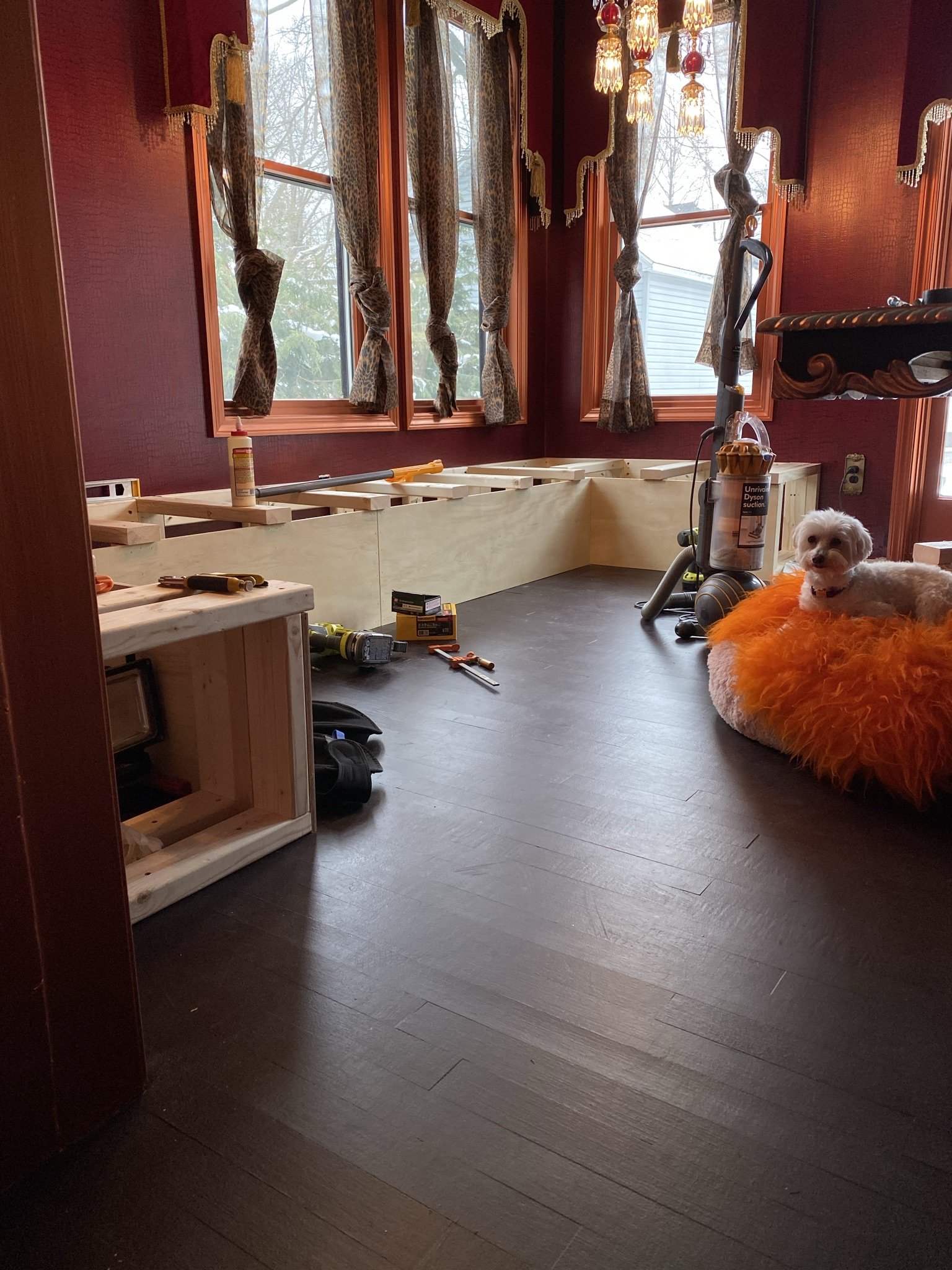
More progress, and as you can see, Mike's adding drawers under the seat. More storage!
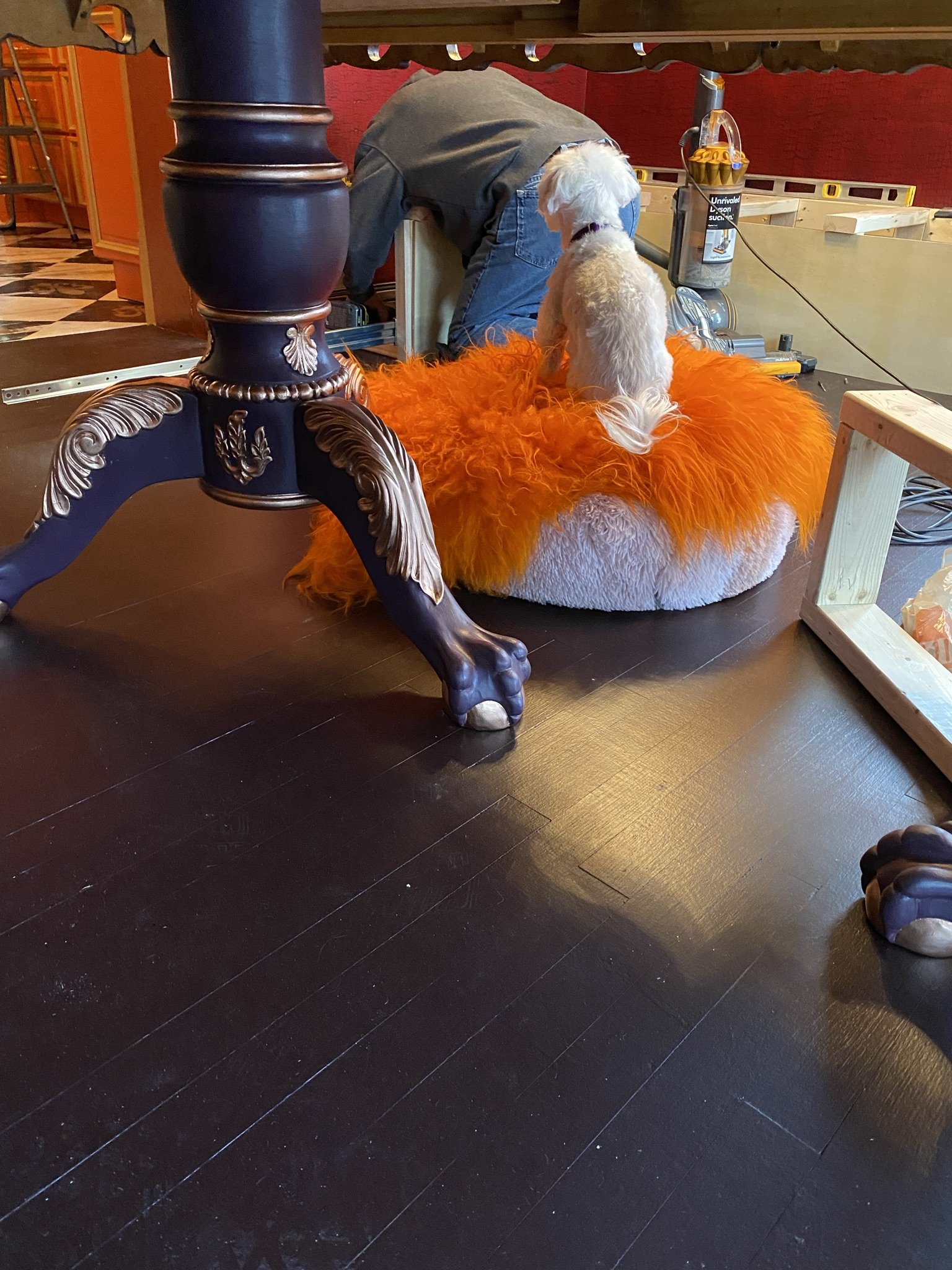
Mike's shadow.
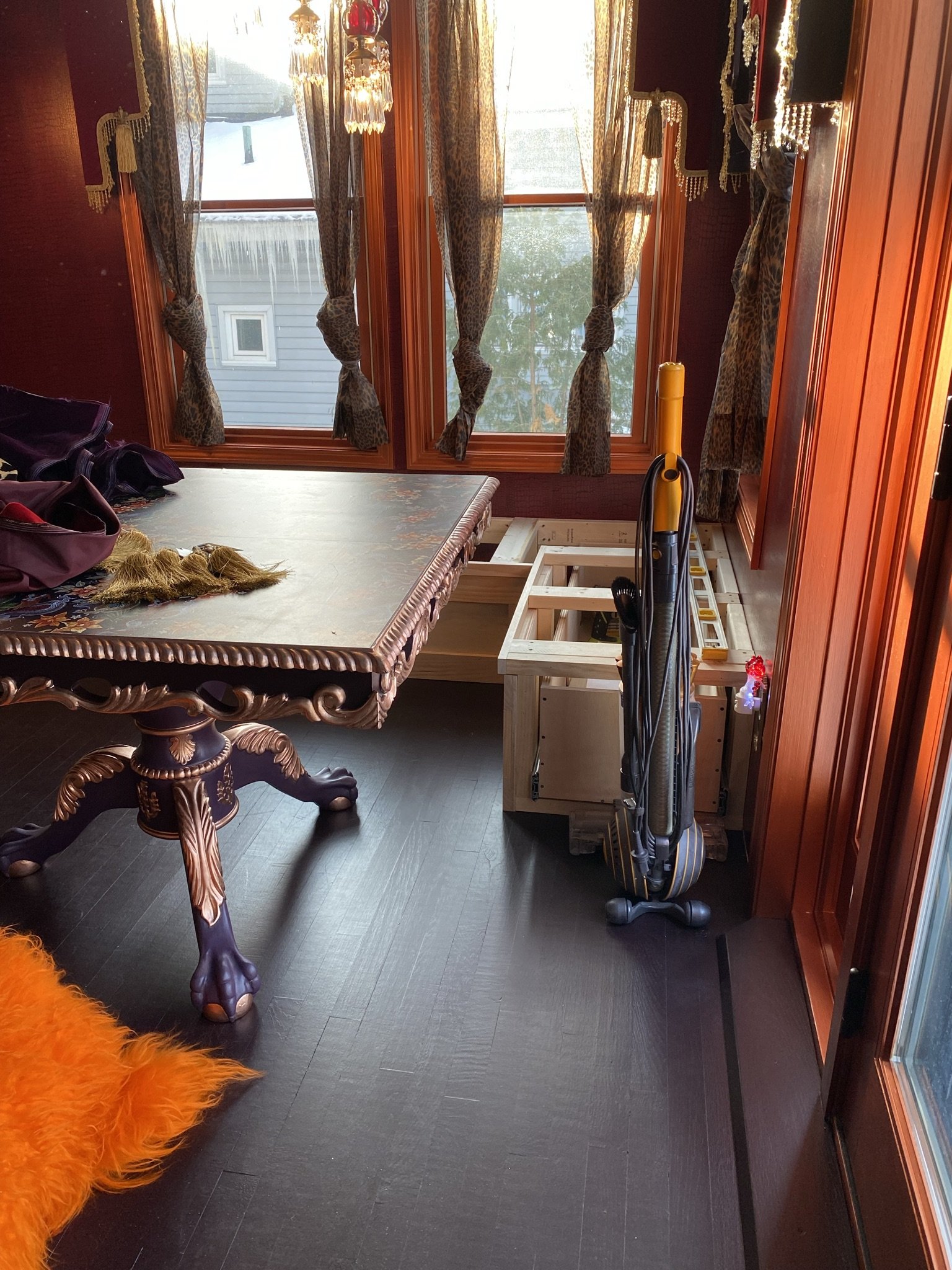
Closer to completion.
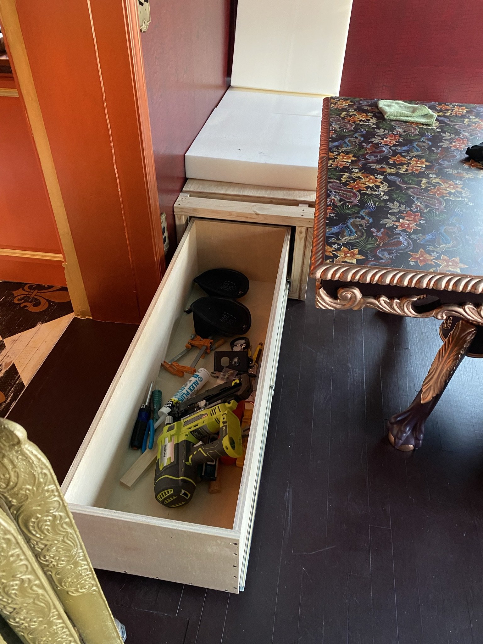
I said under-seat storage, but what I should've said was under-seat coffins. These pull outs are HUGE. And stable. The slides are massive.
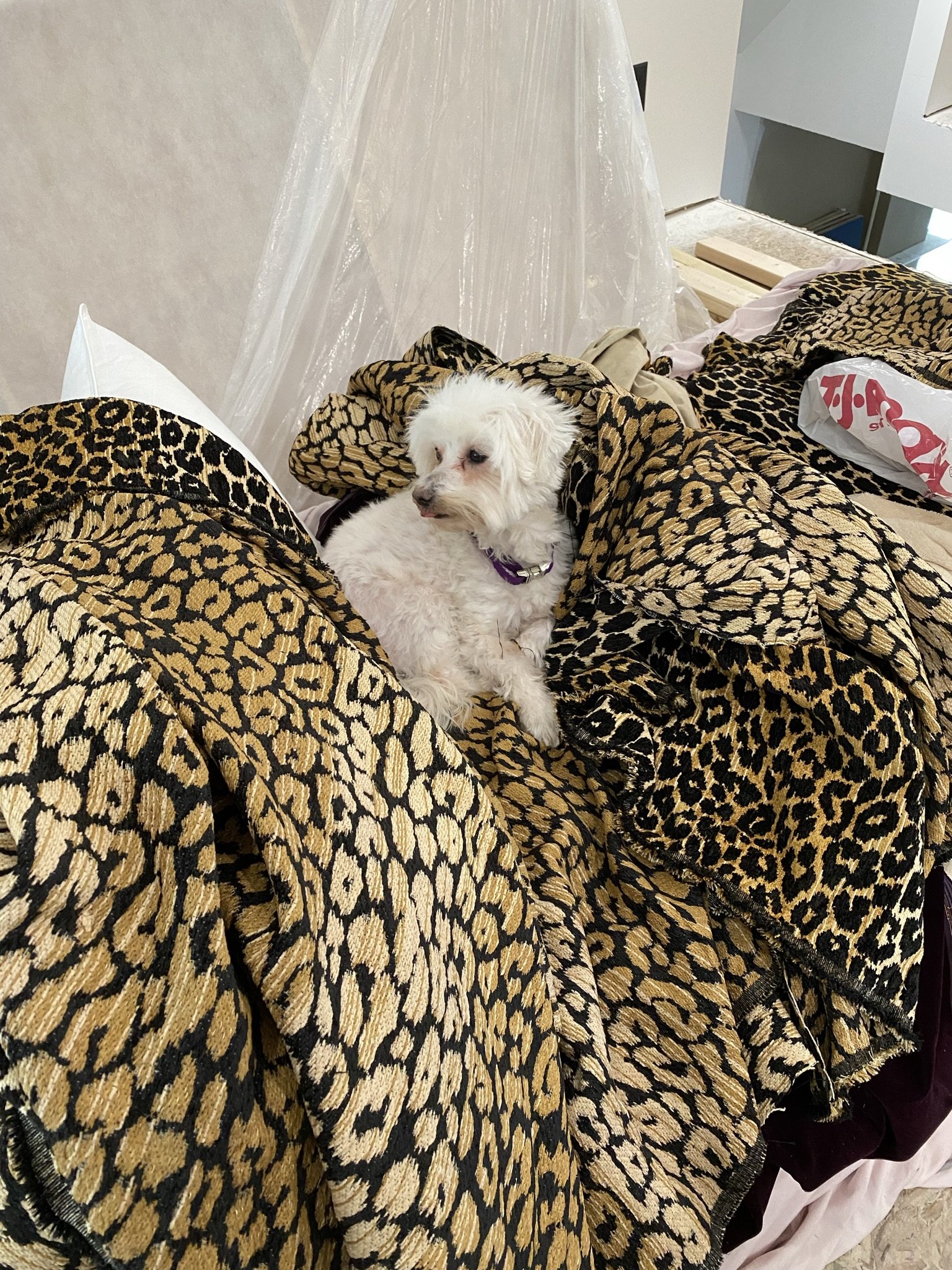
Now it's time to build the banquette seat back. I had this fabric, which I bought from Hobby Lobby and converted into no sew valances. It's great fabric and I found prettier valances, so I took these down and repurposed the fabric for the seat backs.
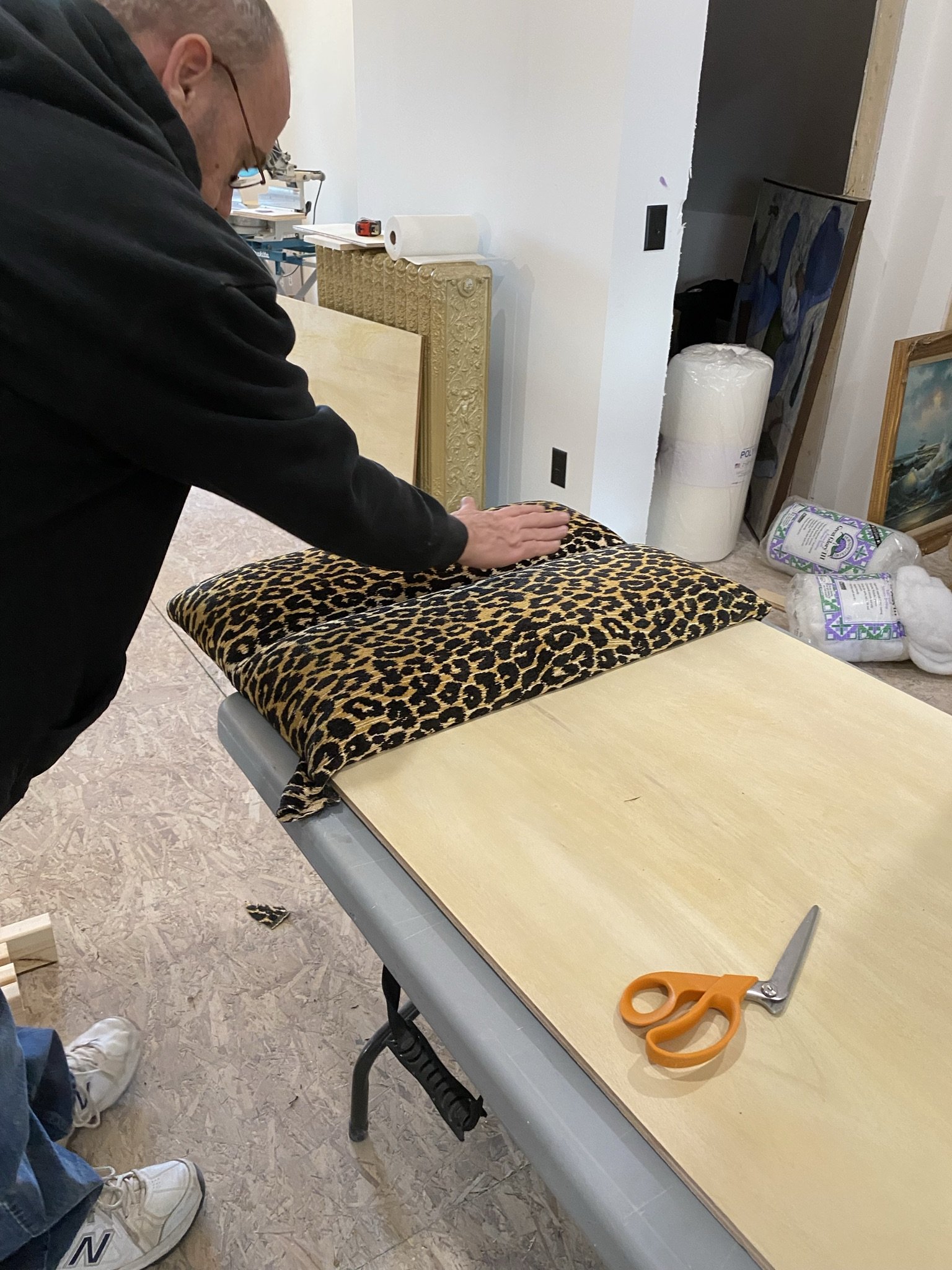
Here's Mike constructing them. Again, there are YouTube videos on how to do this which are better than any description I could give (and are what we use, in any event).
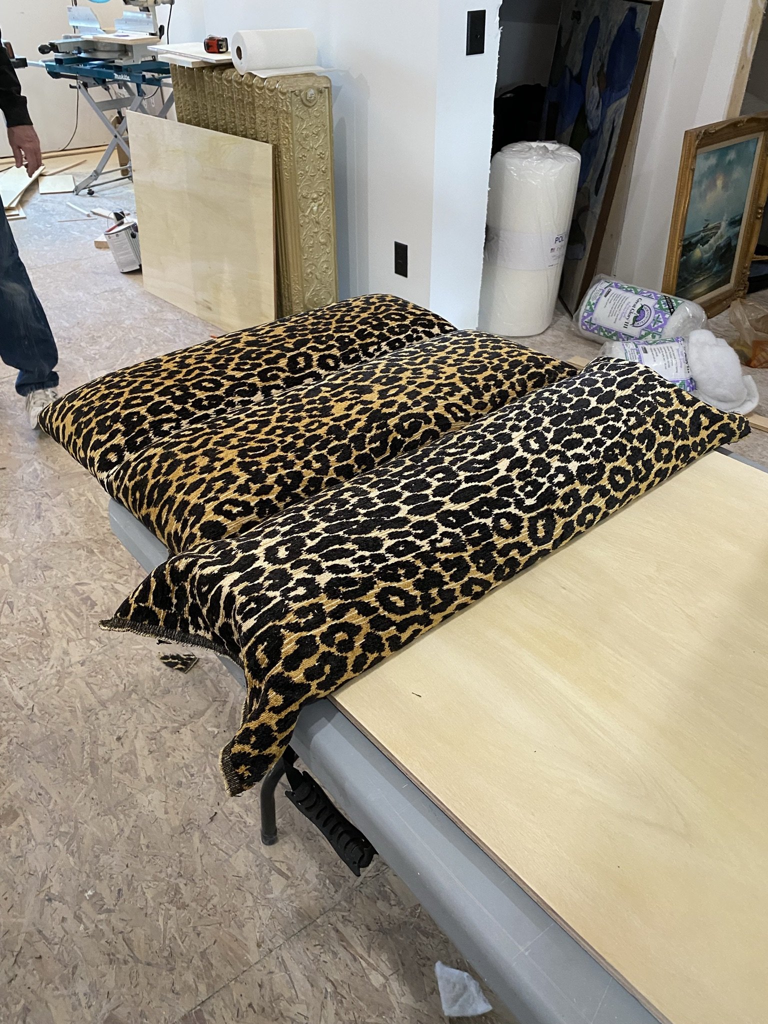
One of the reasons Mike agreed to upholster these himself is he wanted to practice because he intended to DIY reupholster our boat a few months later.
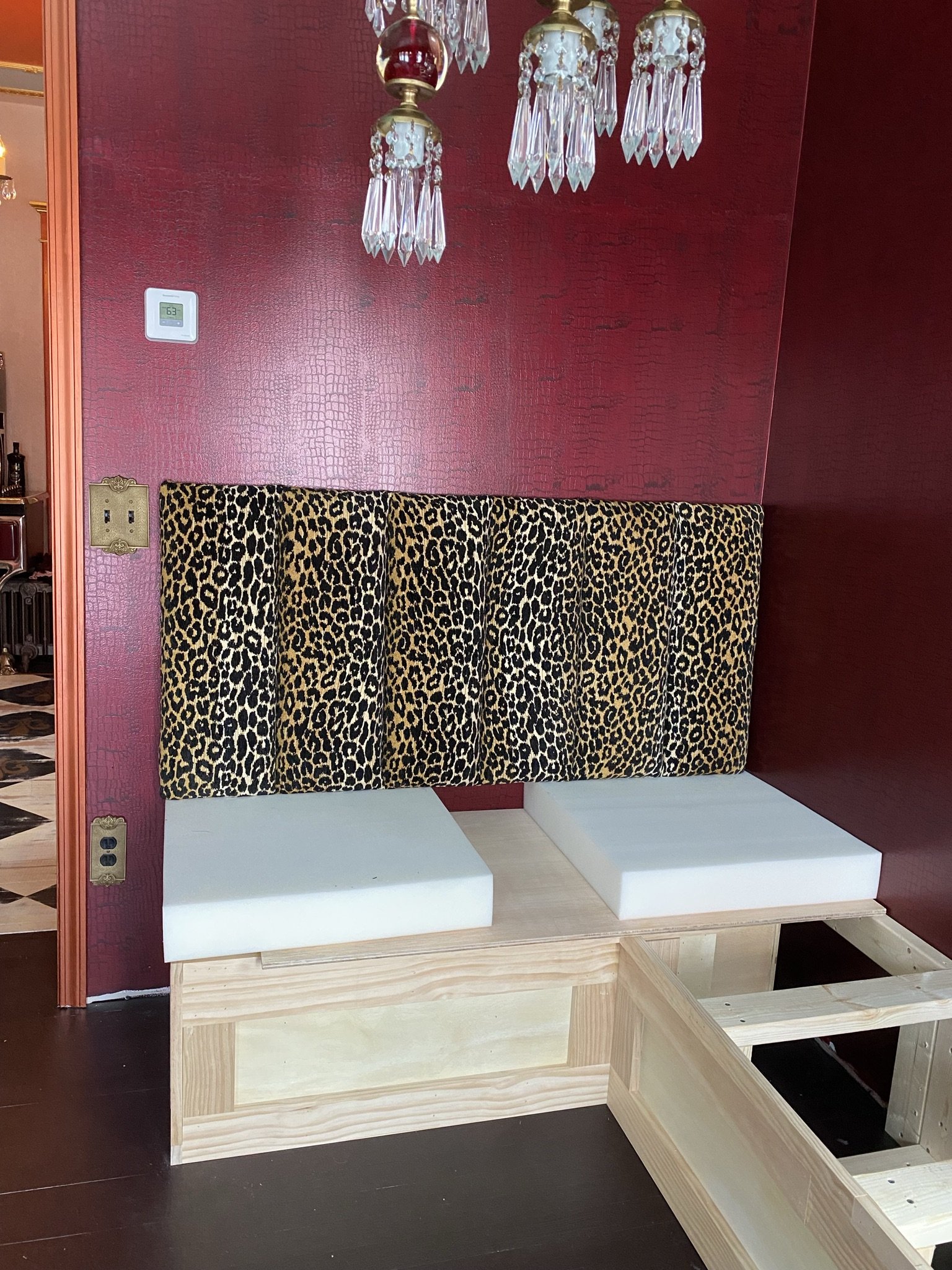
And it's in place! Perfect.
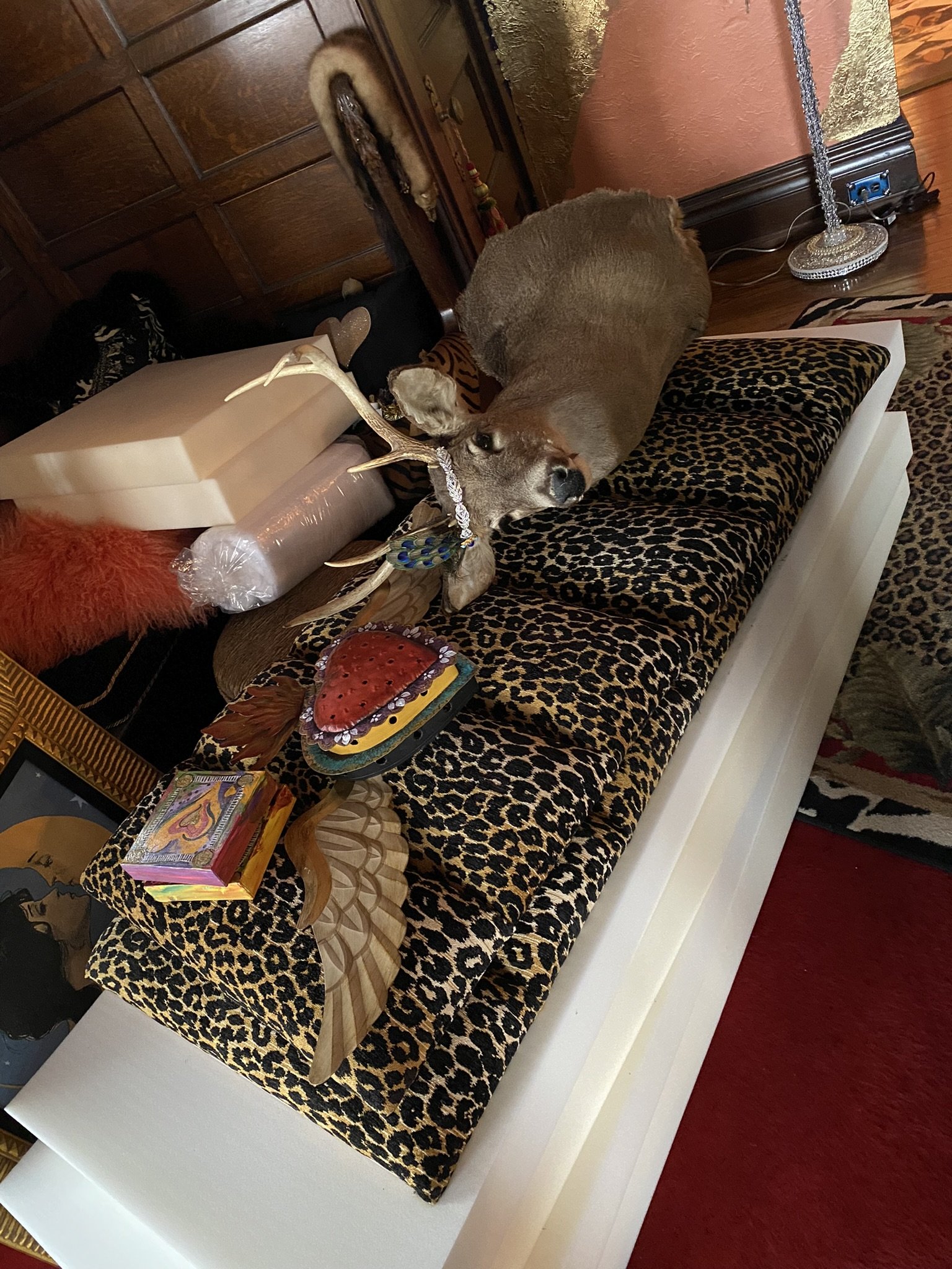
Here I've gathered some of the decor for the dining area. Taxidermy scavenged from my office, small art pieces scavenged from the upper hall, and a Milagro heart I found on Etsy.
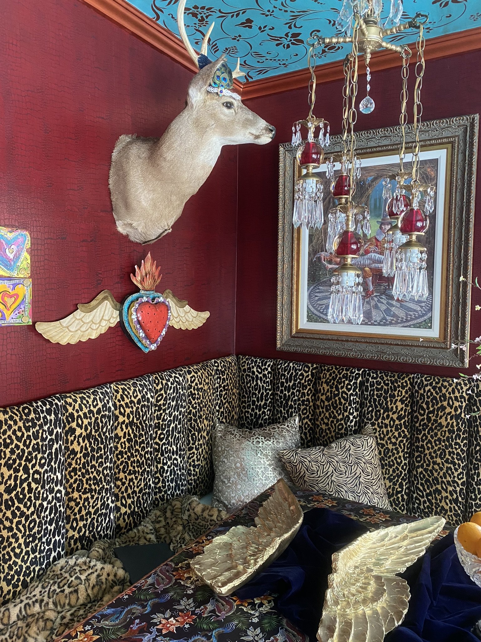
Tah dah! Now the deer needs his wings.
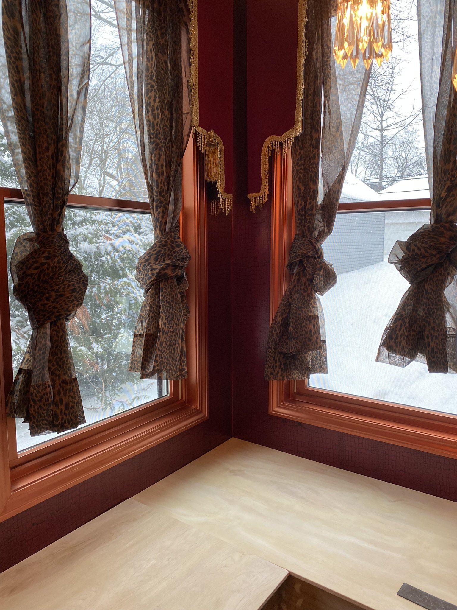
Short term, I used these leopard sheers which I have in most rooms of the house.
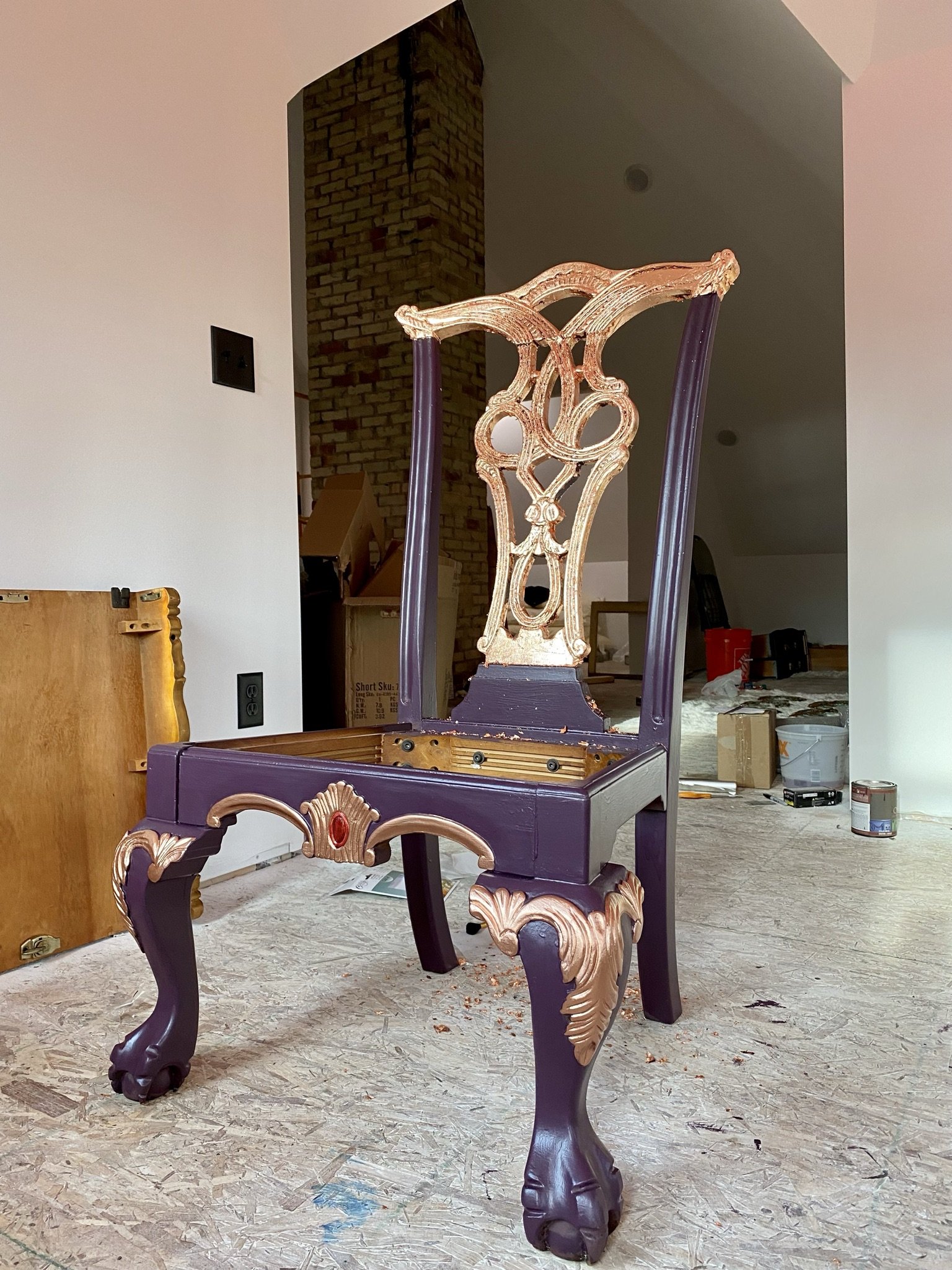
Originally, we were going to use these dining chairs which were part of the set we found on Facebook Marketplace (and which I painted).
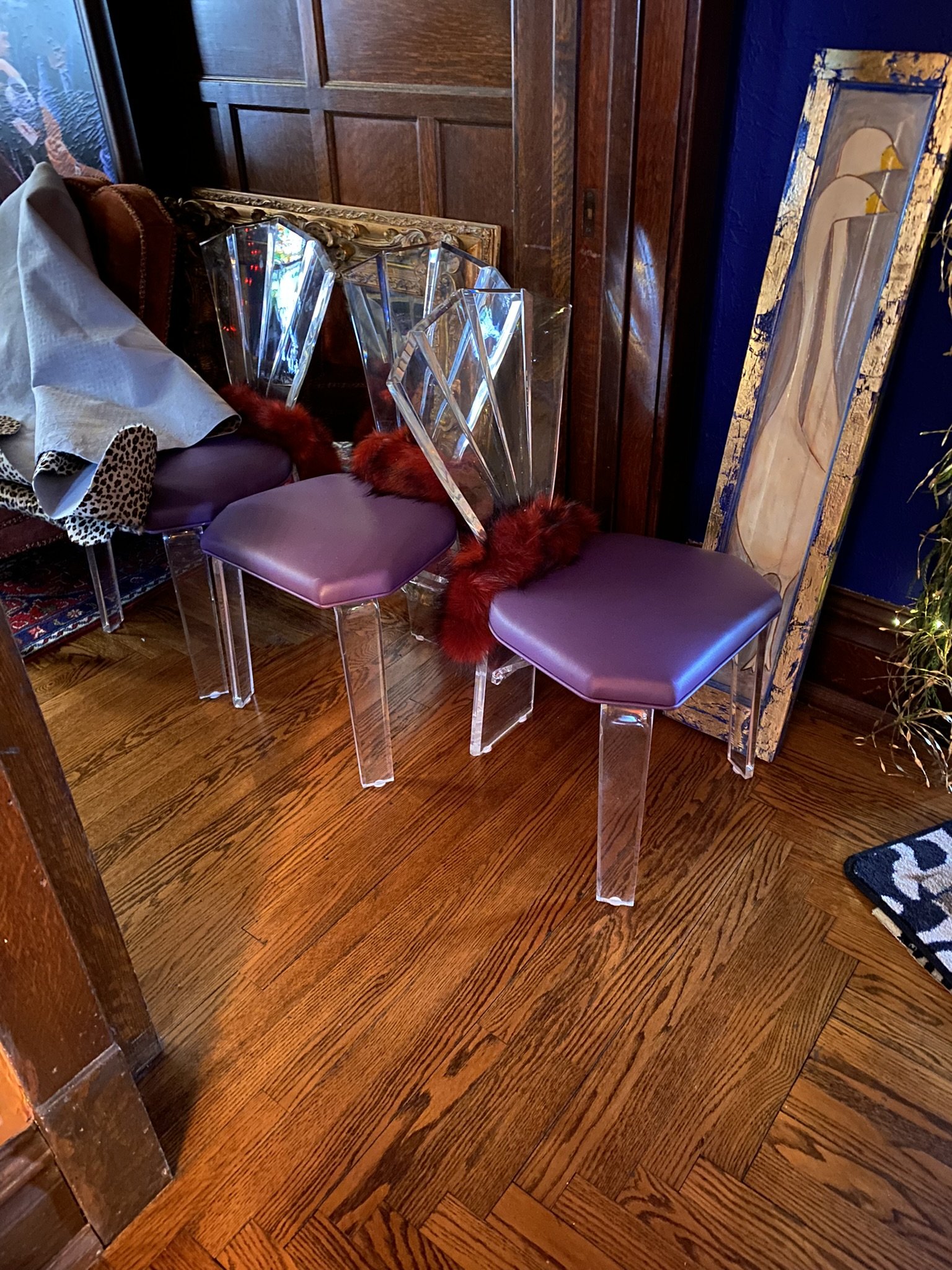
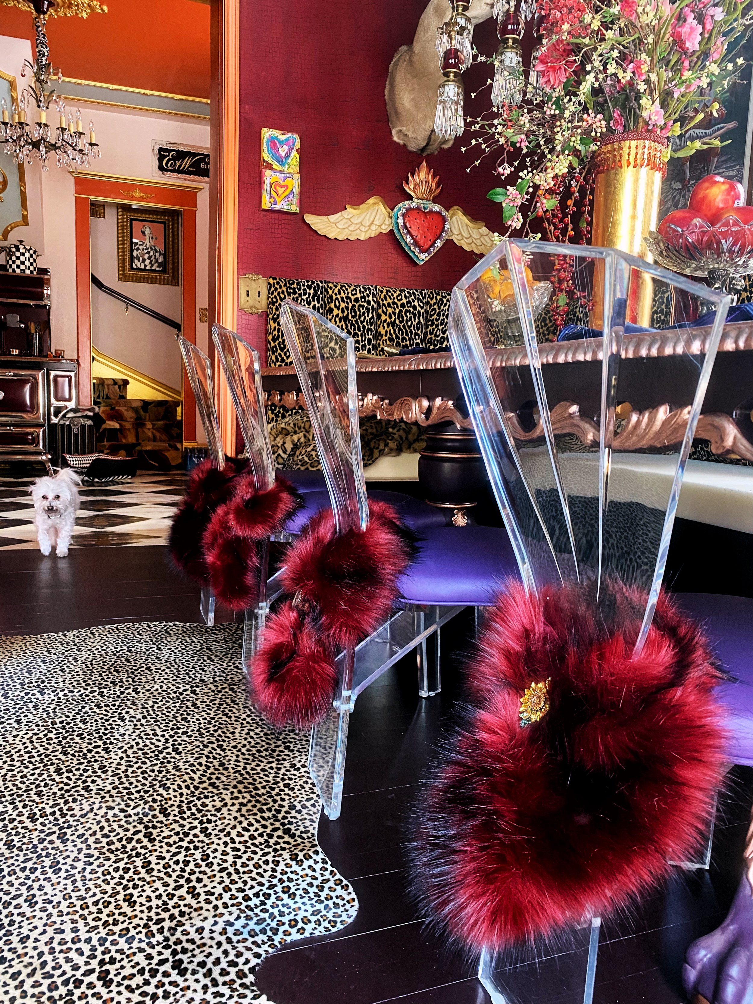
But we found these Lucite dining chairs (which "match" the bar stools) on eBay, although they aren't in nearly as good condition. Both sets are vintage, probably from the 80's.
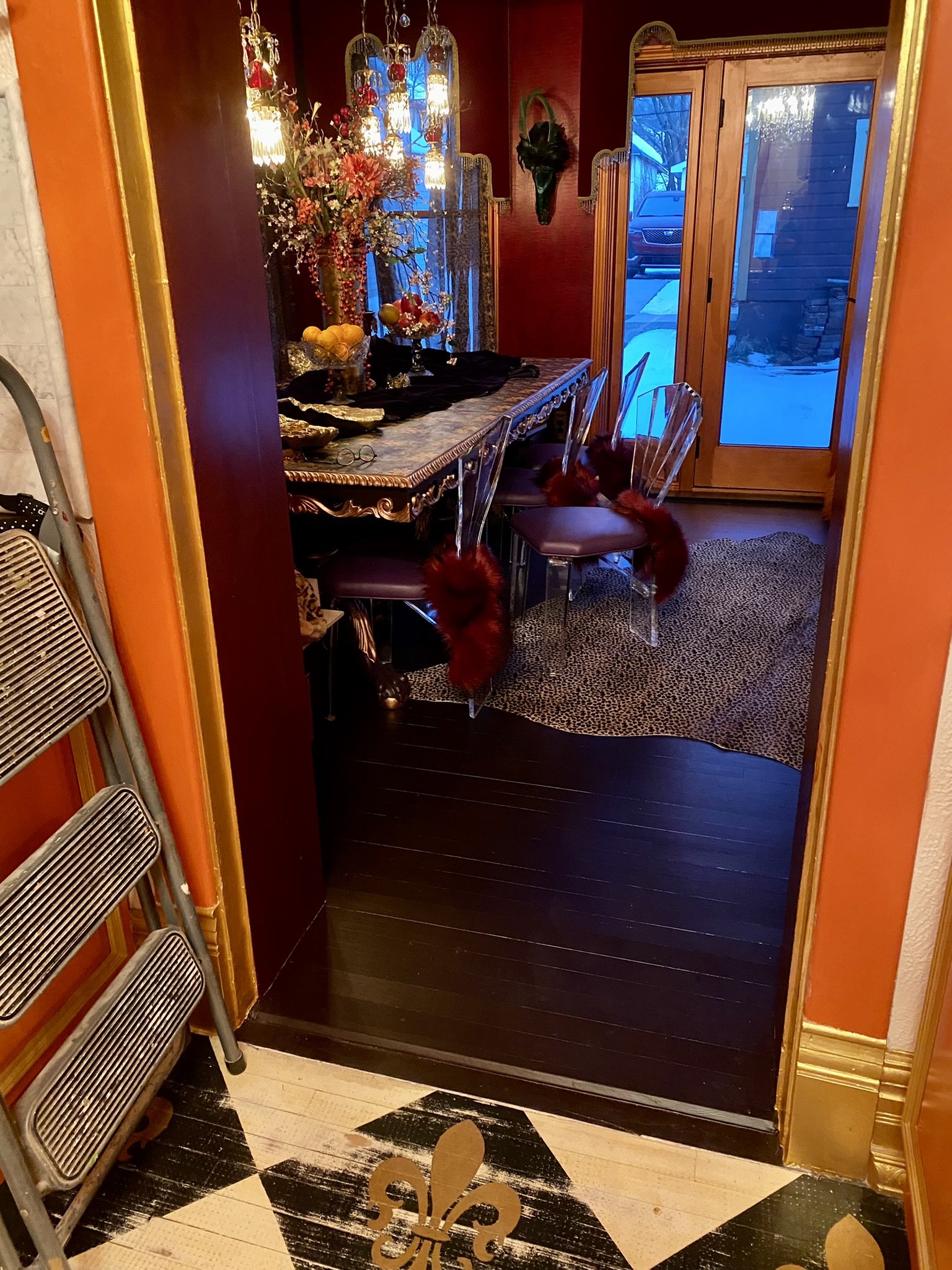
Here's the view from the kitchen with the new dining chairs in place. I wrapped the backs with faux fur collars, which added more layering to the room.
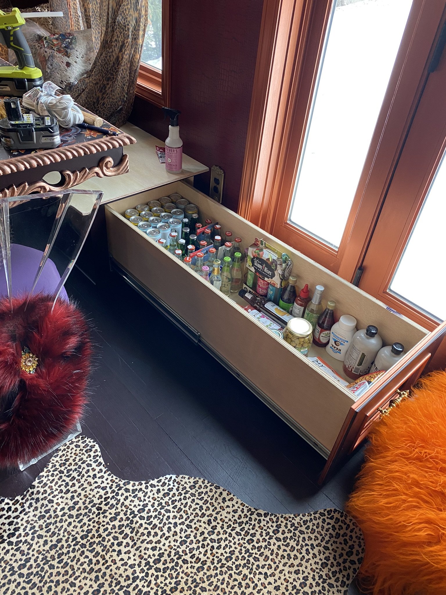
And the drawers are filled! (They aren't this organized anymore lol).
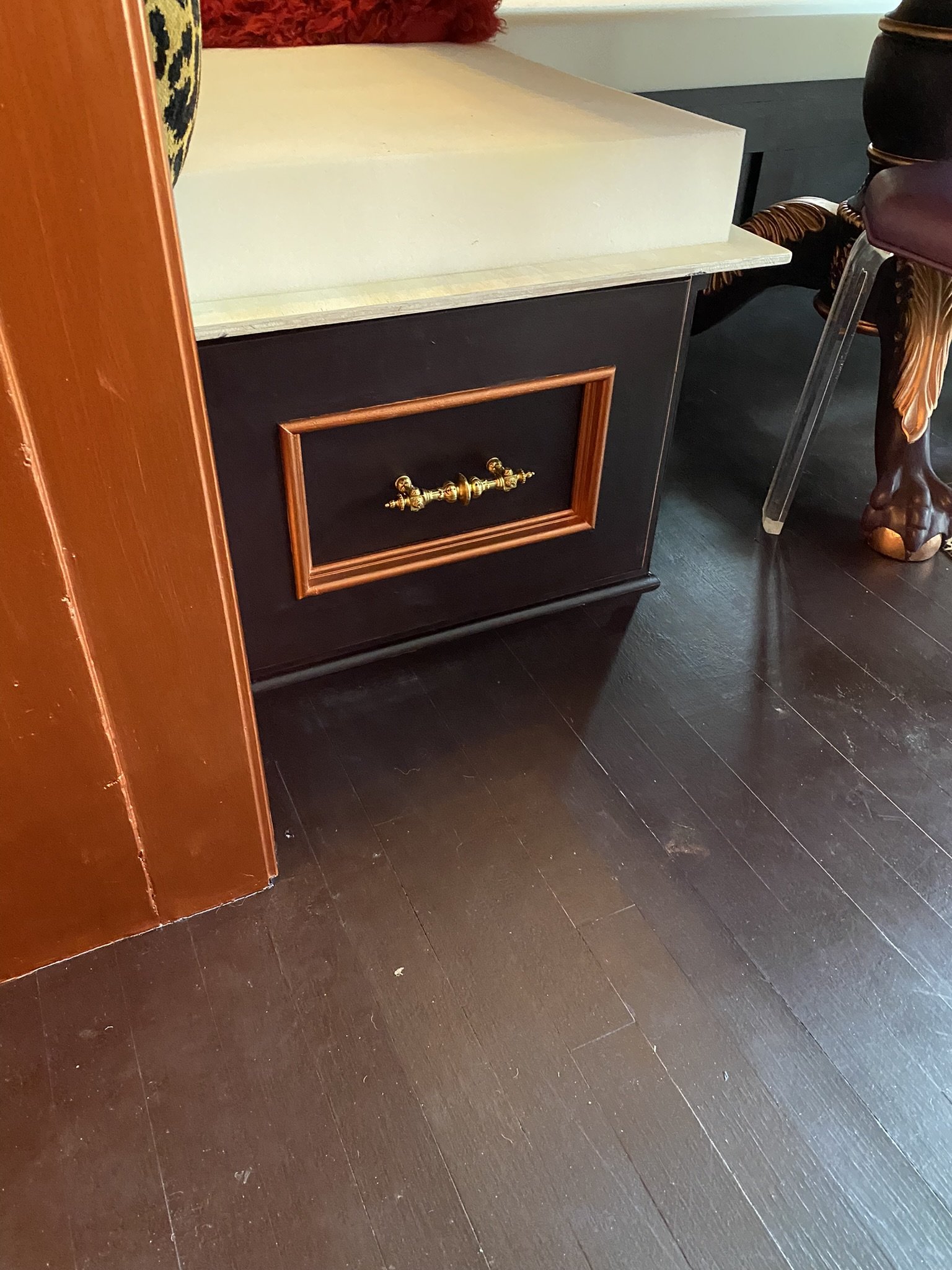
The pulls are leftover from our kitchen remodel.
Getting closer to completion! We still had to finish the banquette seat upholstery and, at this time, I wanted to have an artist paint a firebird on the floor.
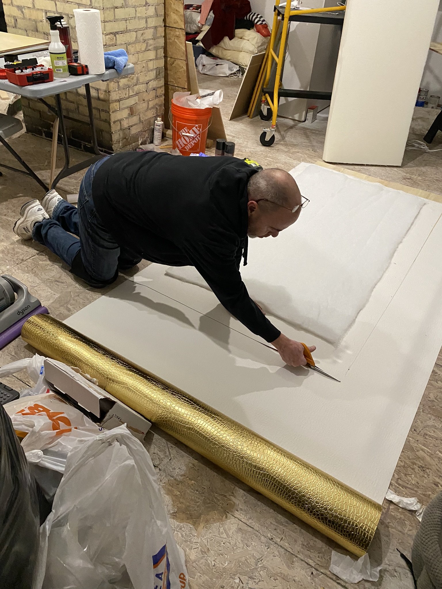
Mike begins the seat upholstery, which is a gold crocodile metallic I found either on Amazon or eBay.
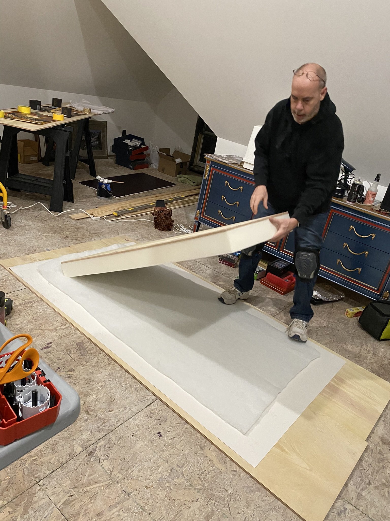
He used spray adhesive on the foam to attach the wood.
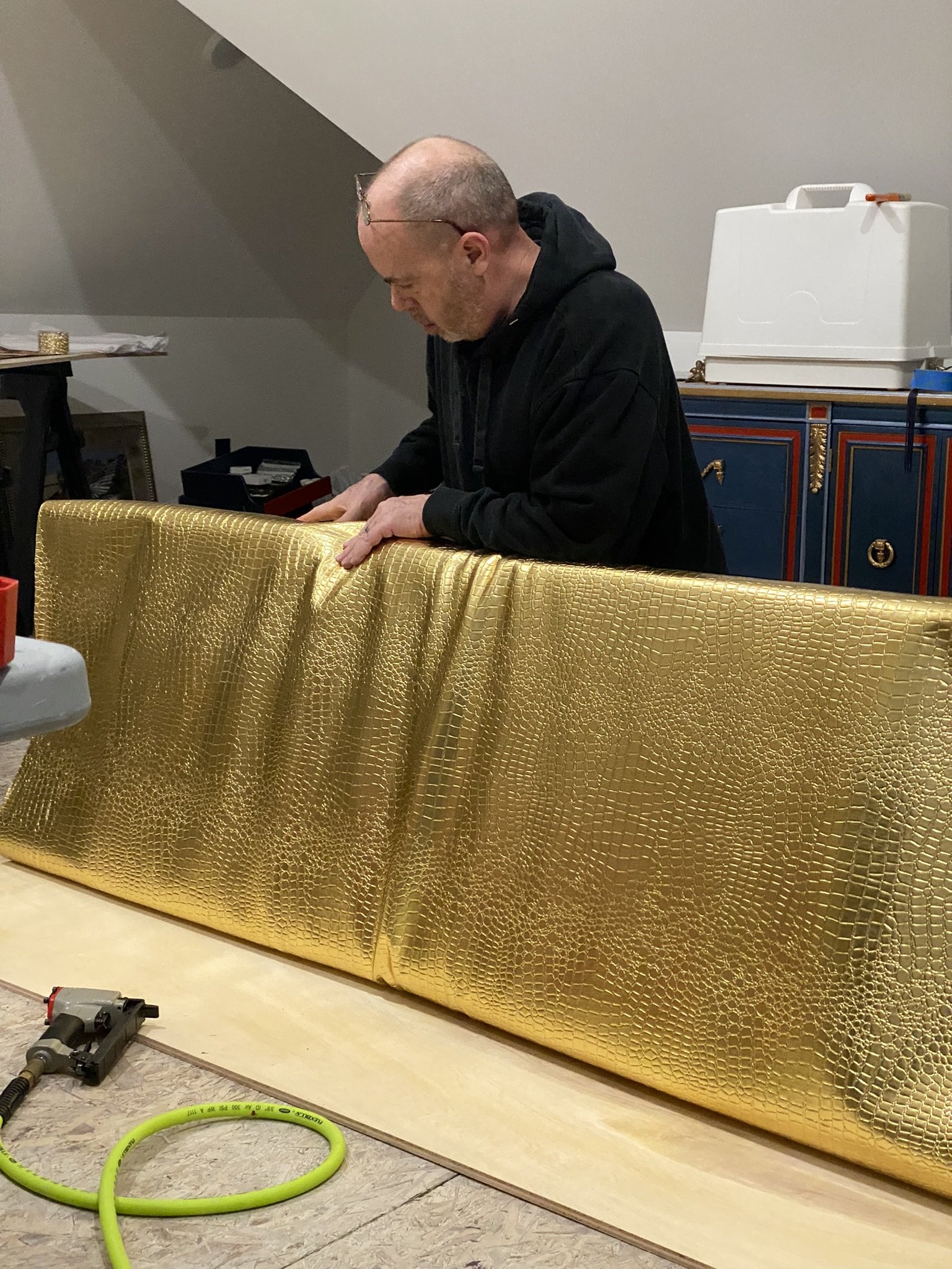
Here he is working on the fabric. This, he stapled (again, YouTube is your best source for this).

This is the firebird (which I found somewhere online) that I wanted to have painted on the floor, but the artist quote I received wasn't in our budget. However, after finishing the mural on our attic tower ceiling, I believe I'm capable of painting something similar to this (in my own style) and I may eventually undertake this project.
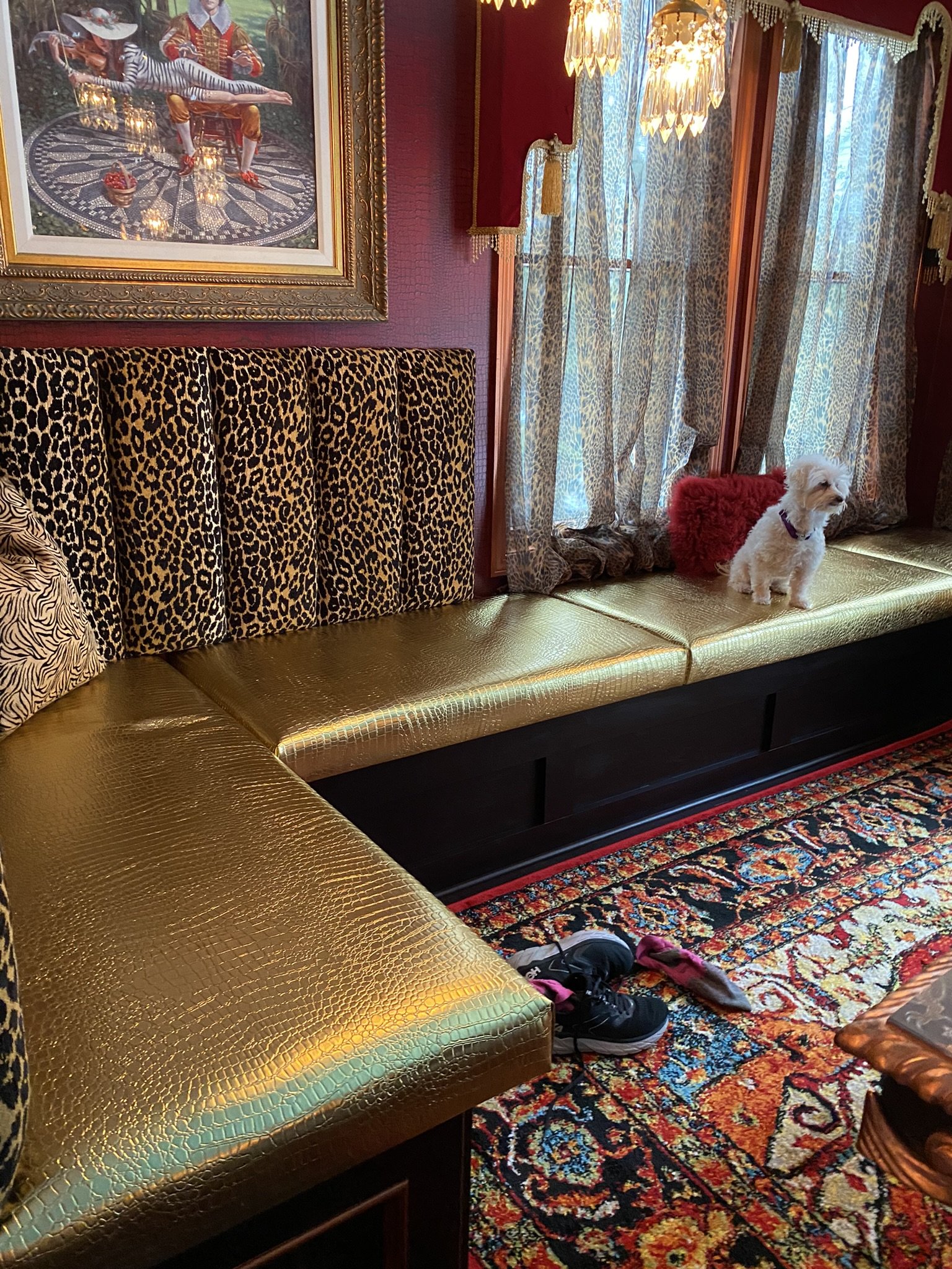
In the meantime, I found this rug which fits the space perfectly. Oh, and the banquette seat is done!
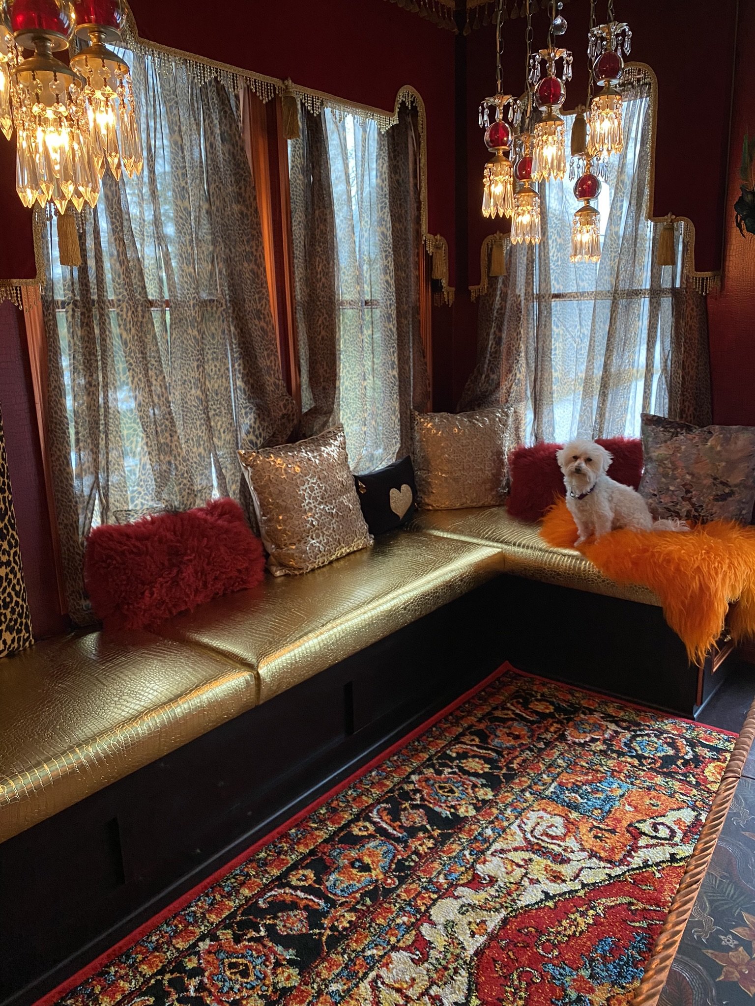
Playing with throw pillows.
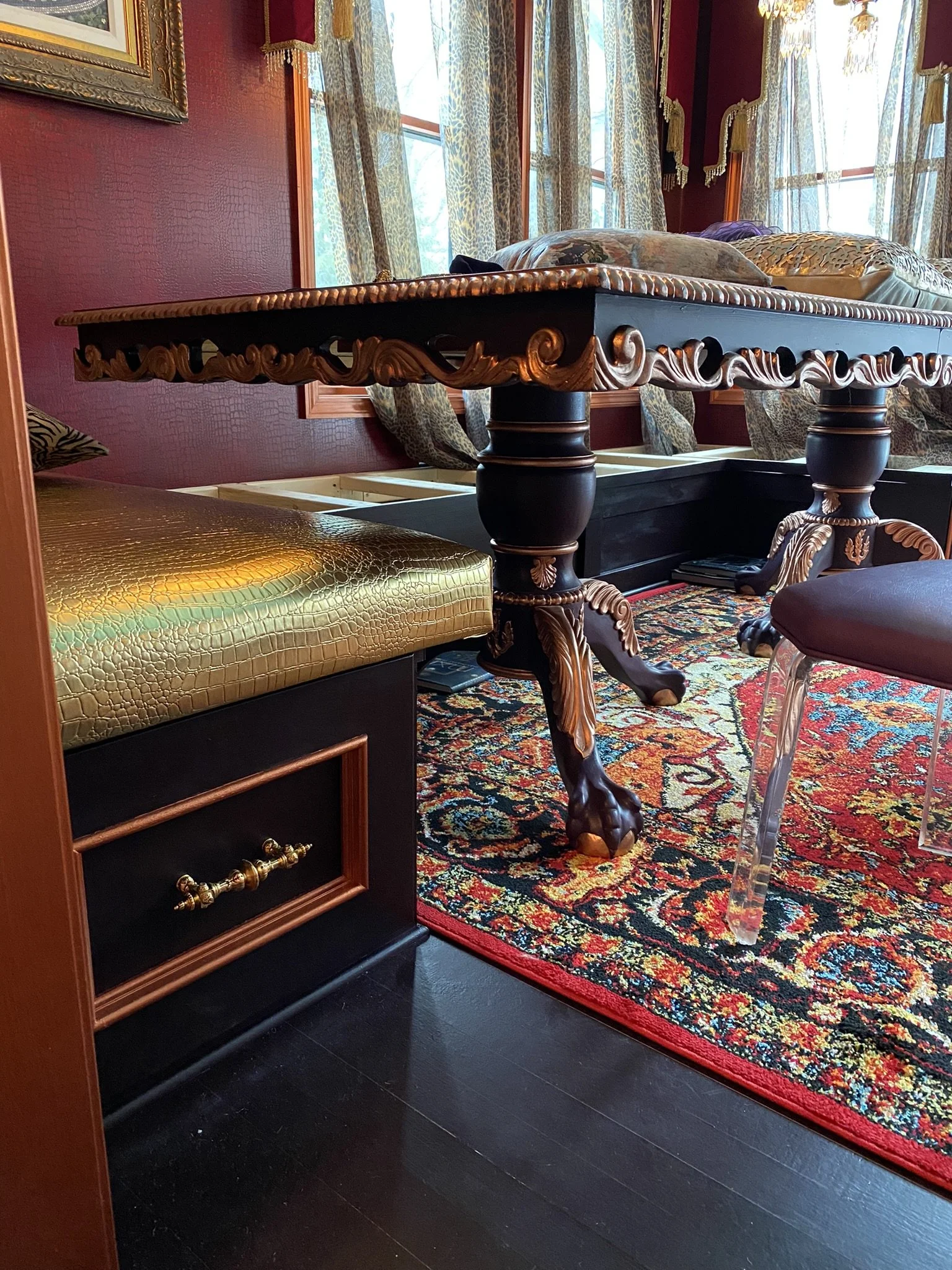
We love the banquette, but as mentioned previously, may change the table layout so seating can be more easily accessed. Having two tables won't be "traditional" for a dining space, but that's okay with us.
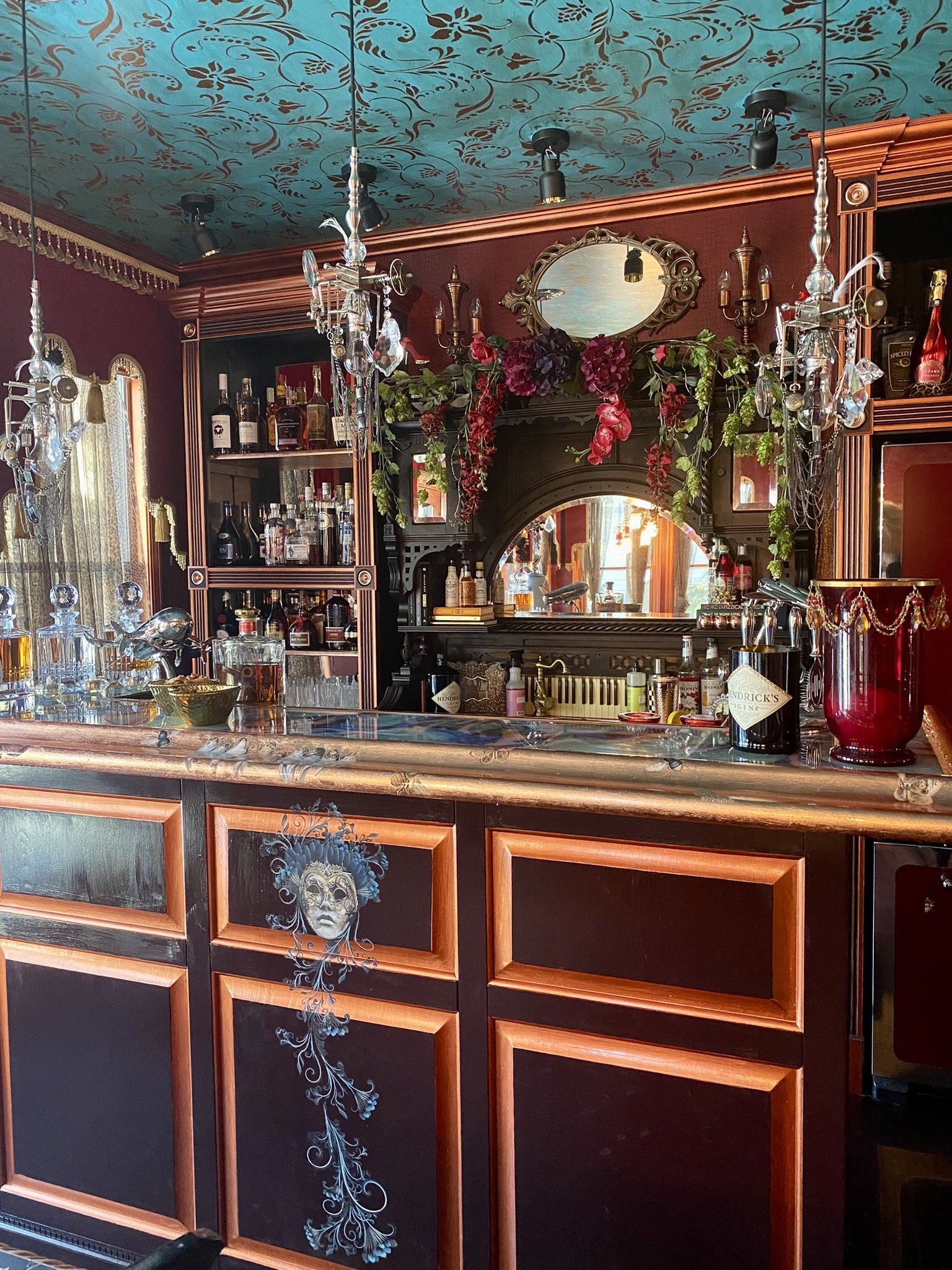
We LOVE the home bar. Having a designated place for stashing and serving the spirits is such a luxury for us, as we enjoy entertaining and do it frequently. I think we have the best bar in town (including the restaurants), and so do our friends.
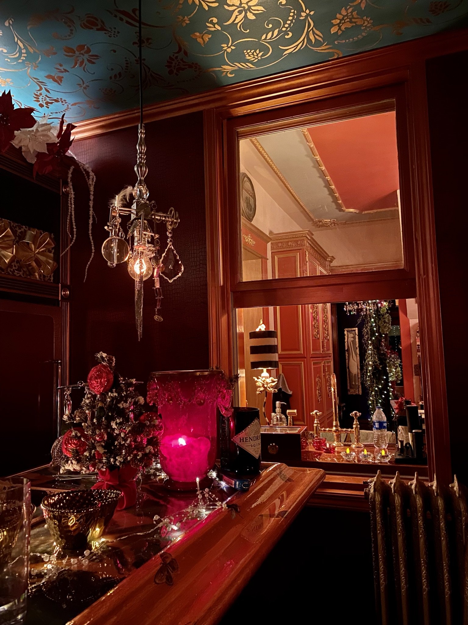
The view into the kitchen area at night.
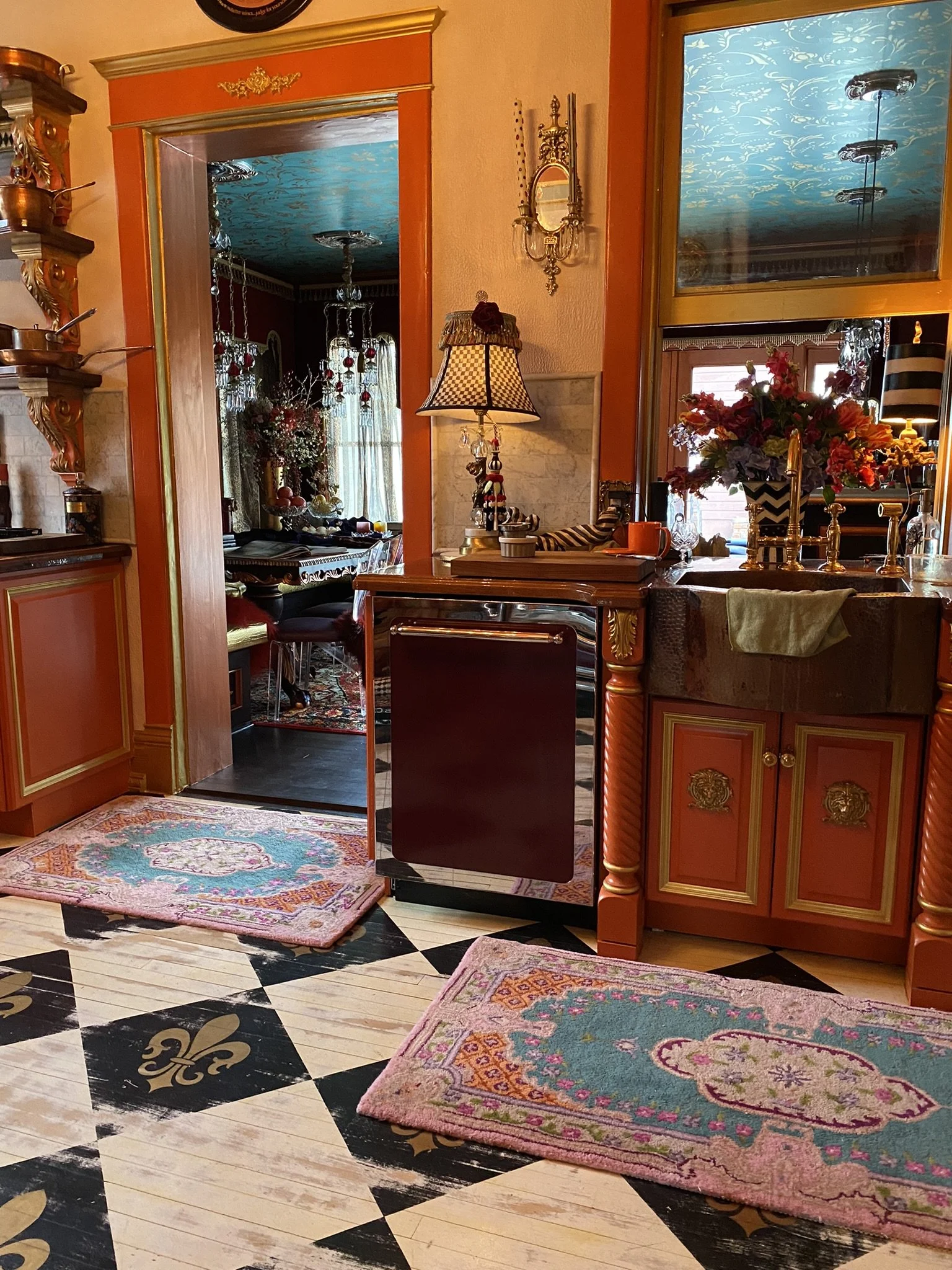
And the view into the dining side of the room during the day.
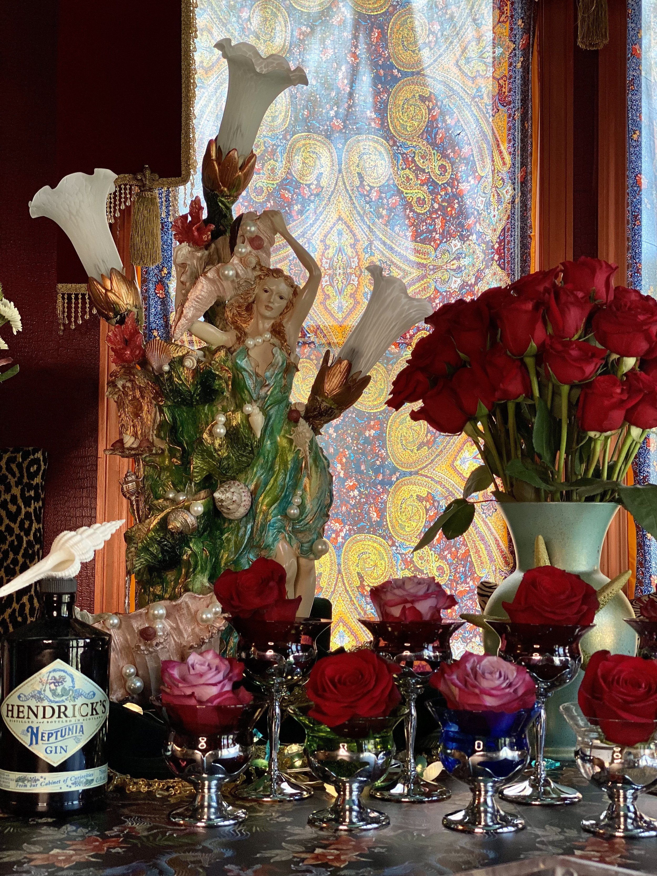
I bought some inexpensive scarves via Amazon to wear myself and ended up hanging them in the windows. The fairy light here (which also is a fountain) we found at an antique store and I used it for a photoshoot I did for Hendrick's. It may eventually live in the attic after we complete that room, but for now, the sounds of the water feature add to the magic of our new dining and home bar space.