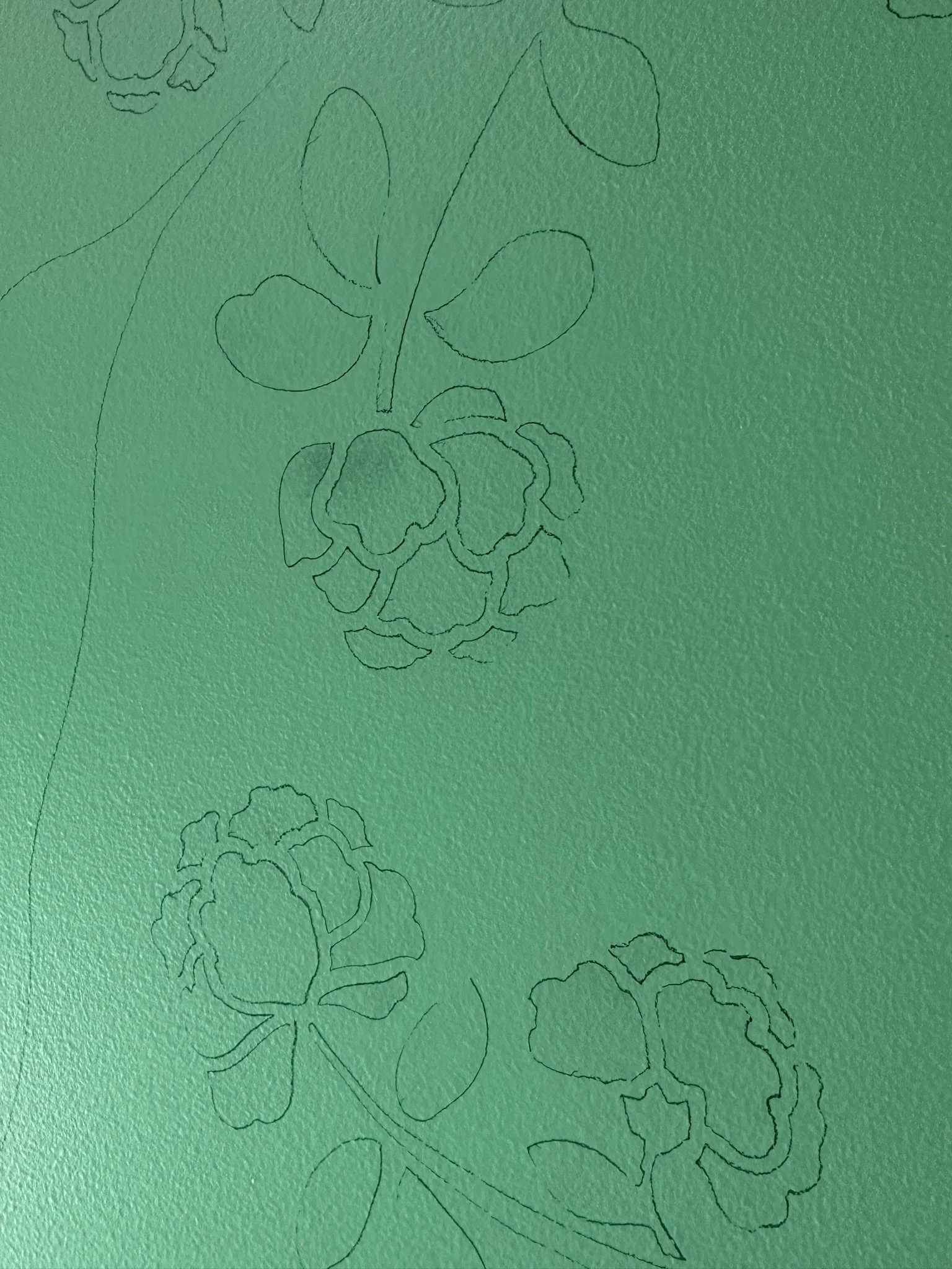
attic conversion: BEFORE

Here we are in the original "maid's room" looking towards the entrance to the attic on the left and a small closet on the right. In order for the city to issue permits for the attic conversion, we would need to tear out the stairs and closet and rebuild code-compliant stairs. Which is fine, as the stairs were hazardous and useless for bringing anything except small items into the space.

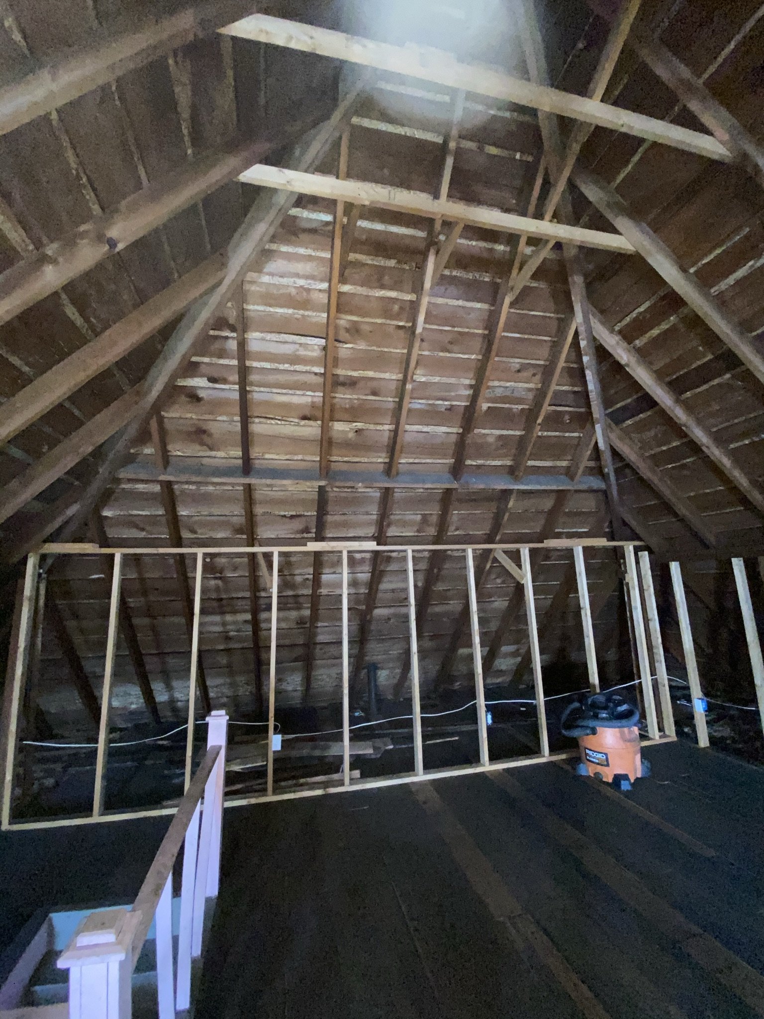
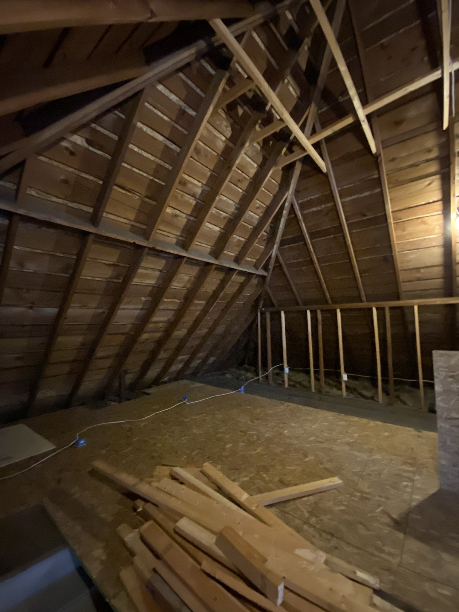
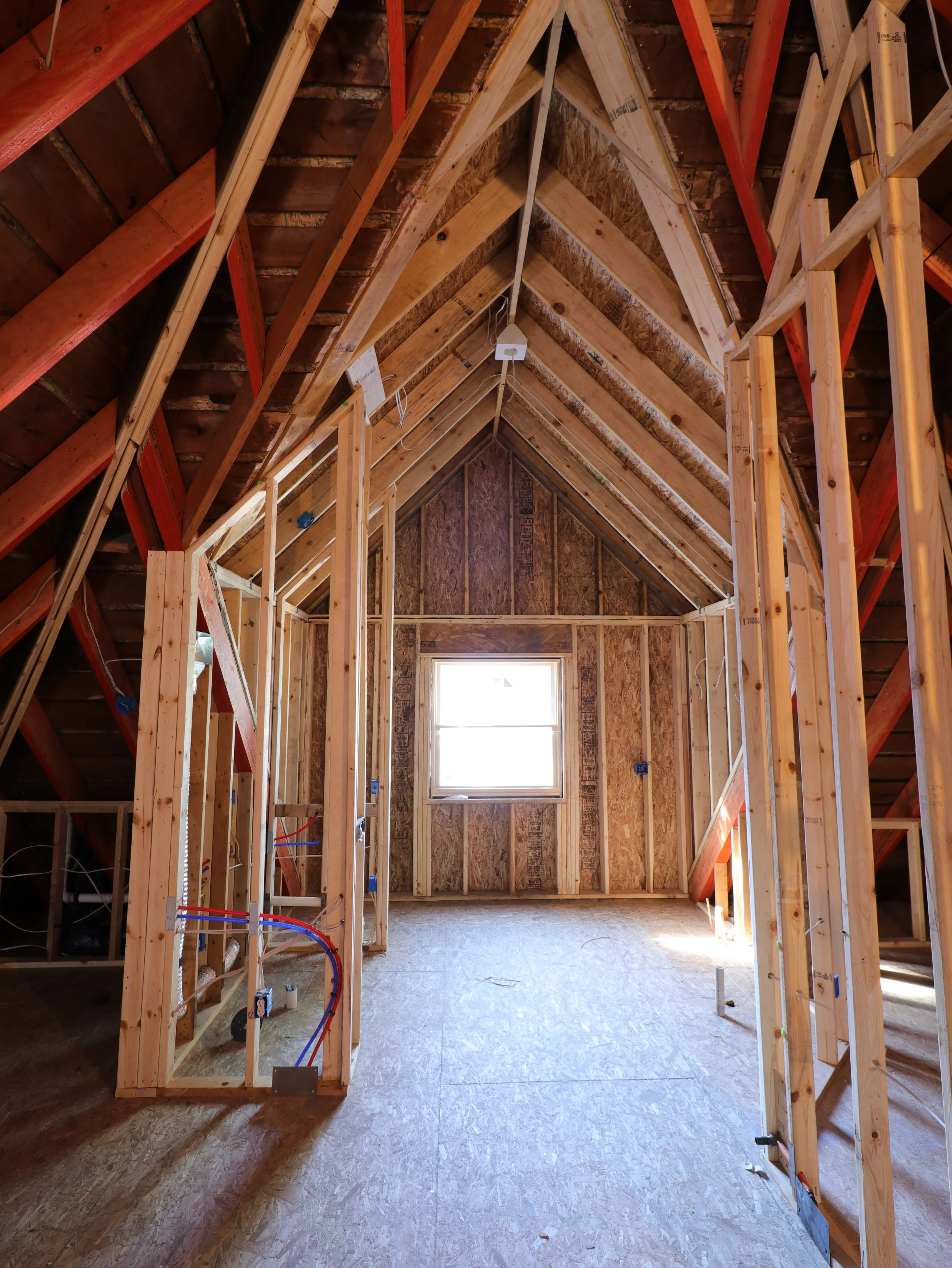
This is the view into the attic from the base of the staircase.

And this is the view from close to the top of the stairs. The plan for this space was a bedroom, bathroom, and several sitting areas in one large open room.

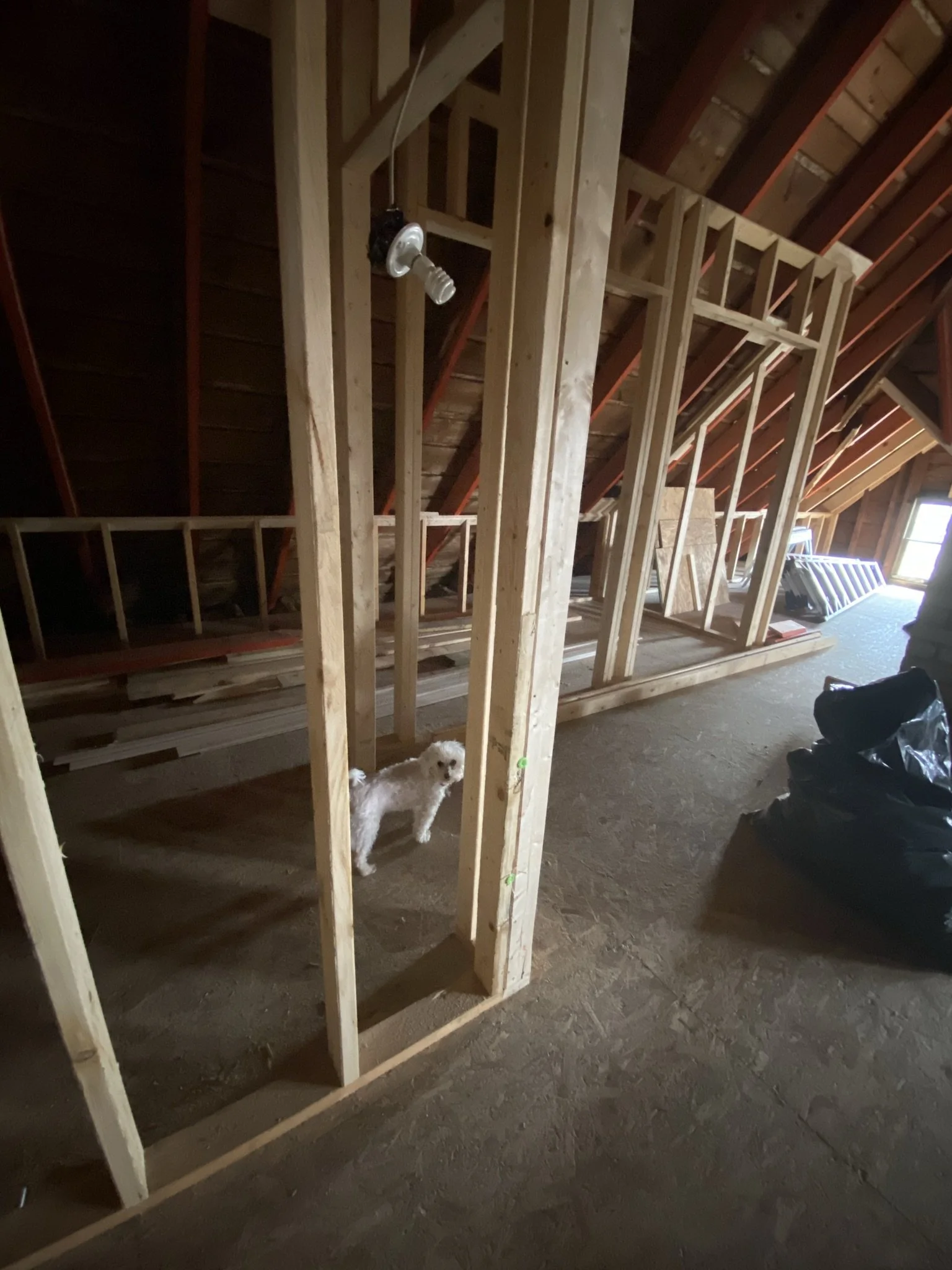
Someone in the recent past had started some work up here, consisting of numerous electrical outlets and some framing. All of this would need to come out.

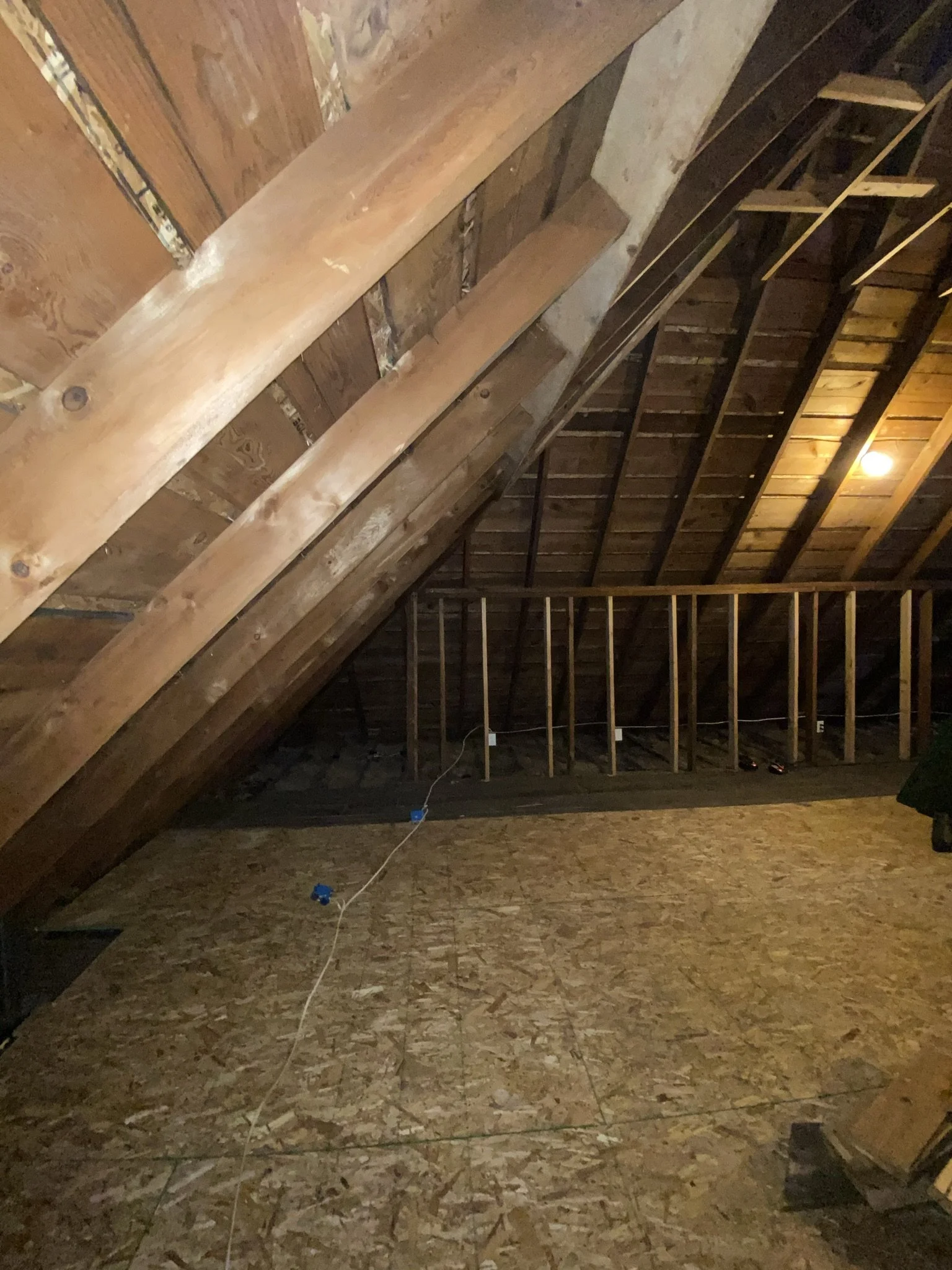
The bathroom will go to the left of this photo, and the closet will be straight ahead.

Here we are looking towards the front dormer.

This will be the closet.

And this will be the bathroom. We wanted an open-concept bathroom, mostly because I was envisioning a kind of magical space you would want to view from a tub full of bubbles.
In order to increase usable floor space in the bathroom, we would need to add a dormer.

This view looks towards the front dormer from the area which eventually would be the main entrance to the closet.

Same view, from what will be the back of the closet and also taking in more of the view into the tower room.

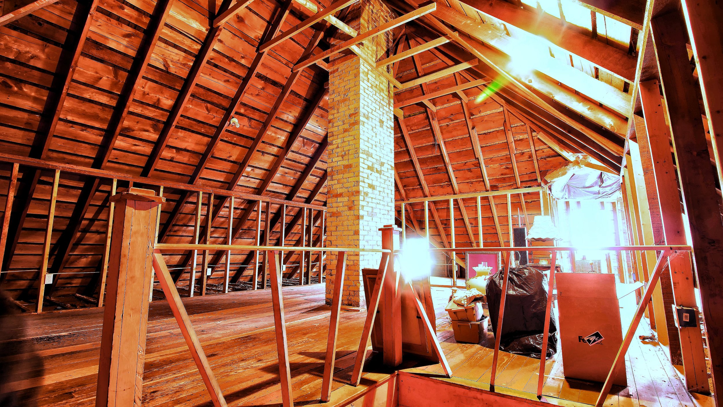
This is the tower room, which is the most magical room in the house.
The plan for the attic conversion was to have contractors do the framing, drywall, and rough electrical and plumbing. Most of the contractors who looked at the space wanted to do flat ceilings throughout, thereby losing the cathedral elegance of the space, which I thought was absolutely preposterous.
This view is from within the tower room. The windows here are only storm windows, so the space invited many insects, bats, and cold drafts.

From the back of the tower room looking into the main part of the attic.

I spent years mulling over what I'd do with this ceiling. Most of my ideas centered around lighting, as I never expected to be painting a mural in here.

An arty morning shot of the space.
More arty-ness. I didn't spend a lot of time up here before the conversion, because the bats creeped me out.

Because the bats freaked me out, I looked at pictures of the attic rather than spending time in the space.

I did drag the dog and the faux bird up here once for a photo opportunity.
ATTIC CONVERSION: CONSTRUCTION

Remember what I said about the storm windows and cold drafts? That was an understatement. Here's what they looked like in the winter lol. Basically, the temperature inside matched the temperature outside.

This is the design Mike and I came up with for the space and provided to the contractors to implement. Mike laid it out on AutoCAD. The only real change we would make from this plan in terms of the use of the room would be to move the bed.

Work on the attic started in January of 2021, in connection with re-roofing the house and adding the lounge addition. Here, the contractors have laid tarps to collect roof debris and tear off.

They used this giant lift for 7-8 months, as almost everything used in the attic conversion had to come through the windows.

More roof work, looking towards Lake Cadillac.

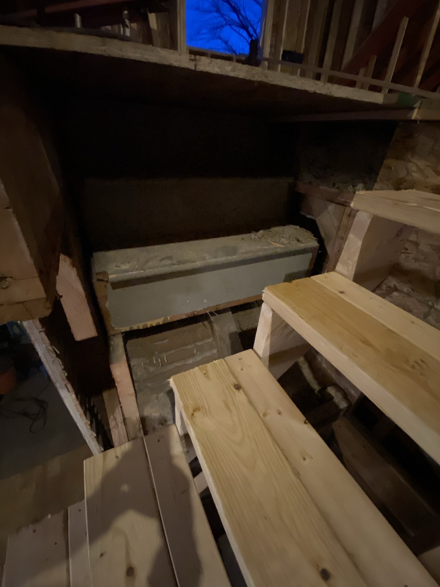
The house is four stories, with the basement level being about 1/2 underground. Best estimate is the house, to the top of the chimney, is about 60 feet. The ceiling height in the attic alone, even after drywall, is 17 feet.

The giant roll-away would live here for the better part of a year.

Notice the icicles on the neighbor's house? This roofer isn't even wearing a coat lol.

And it was as cold as it looks.

During construction, this was the typical front yard view during the week.

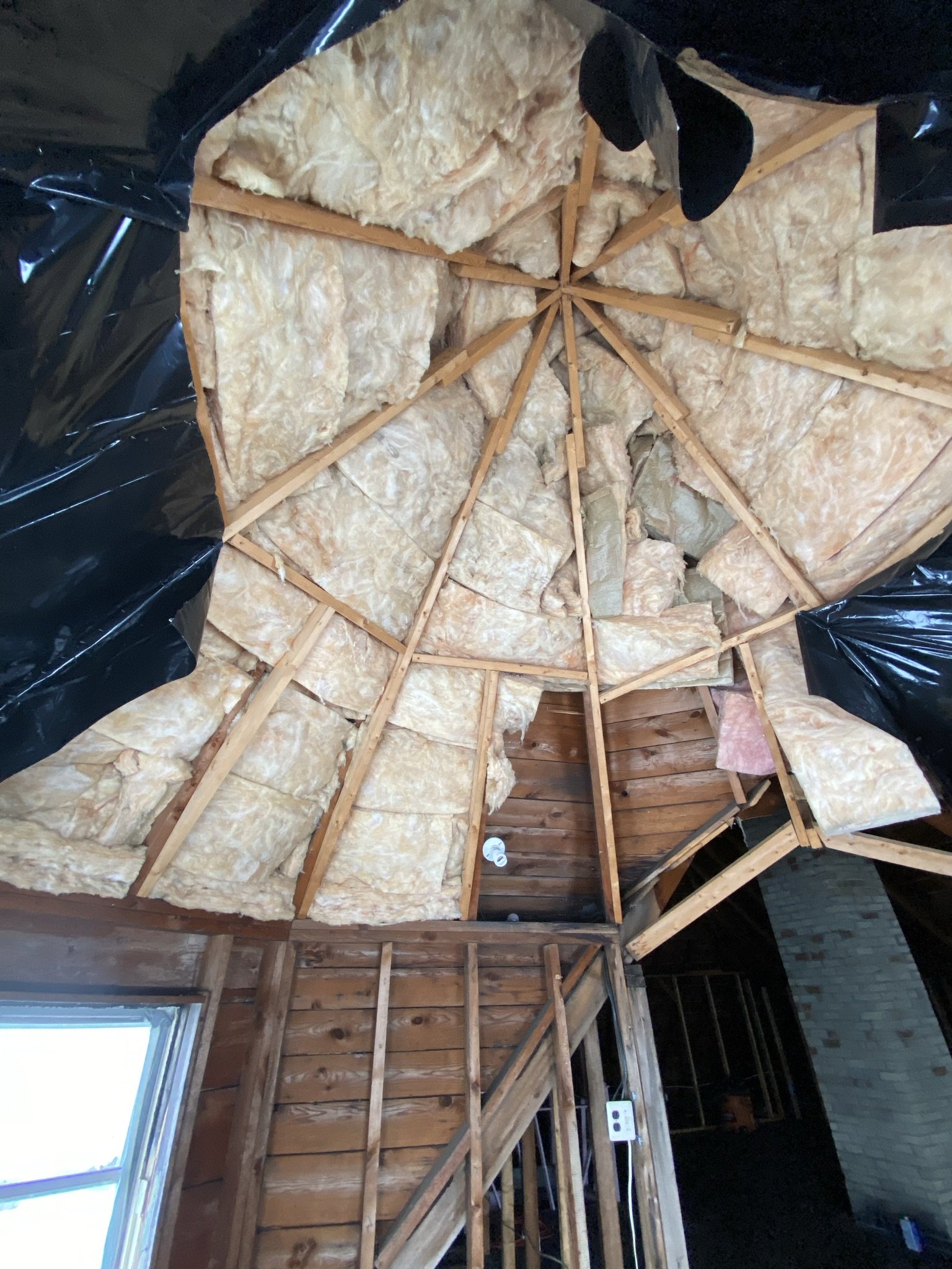
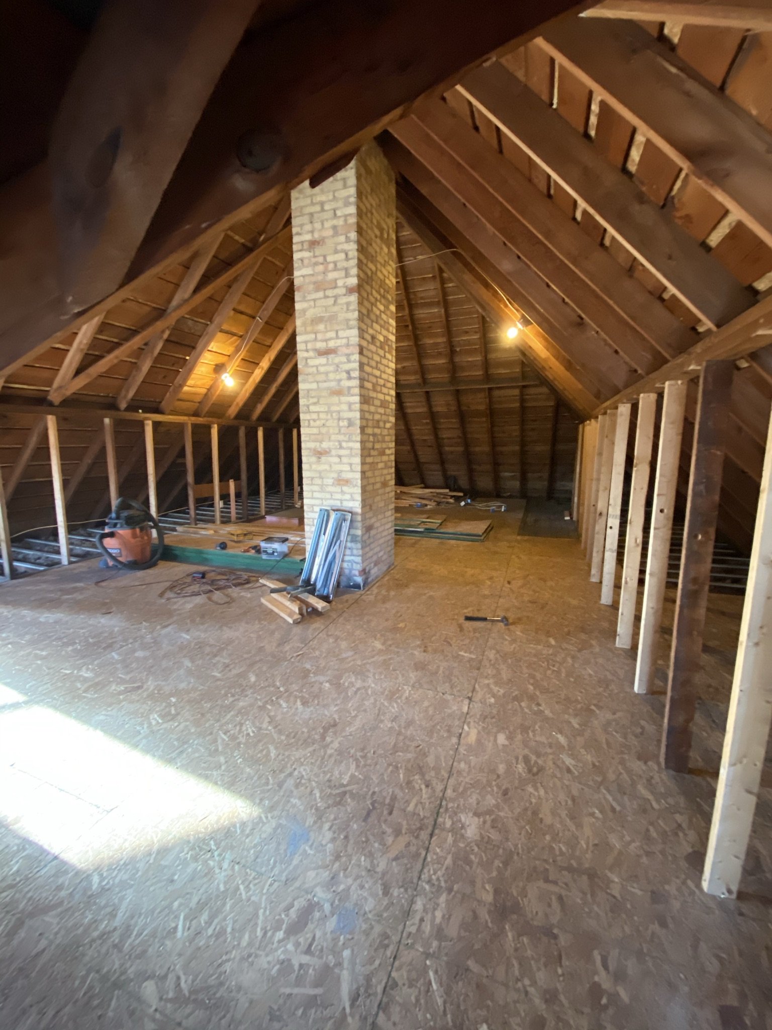
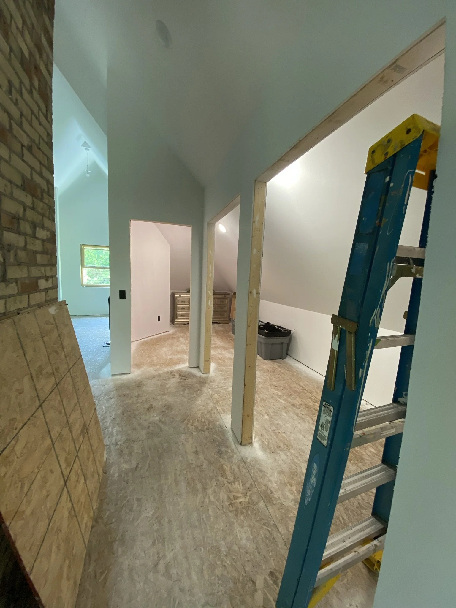
First order of business for the attic conversion was clean up and removing the ill-fated framing additions and insulation in the tower room.

Knowing what the space looks like now, it truly is amazing to look back at these photos. But I didn't, at this point, have a full idea of how the space would look when finished.

Here, the odd framing and insulation has been removed. I just loved the slope of the ceilings and was hoping they could maintain as much as possible.

Here we have OSB ready to lay on the wood floor (which was not usable as a finished floor, as the attic was never a finished space). In retrospect, we do wish the contractors had repaired the old floor and not installed OSB, or removed the old floor, as we now have a three-layer floor in the space.

Now the pink railing around the original stair entrance is gone, and the bathroom space is ready for work on the dormer.

The tower room has an asymmetrical ceiling at the entrance which will need to stay as-is.
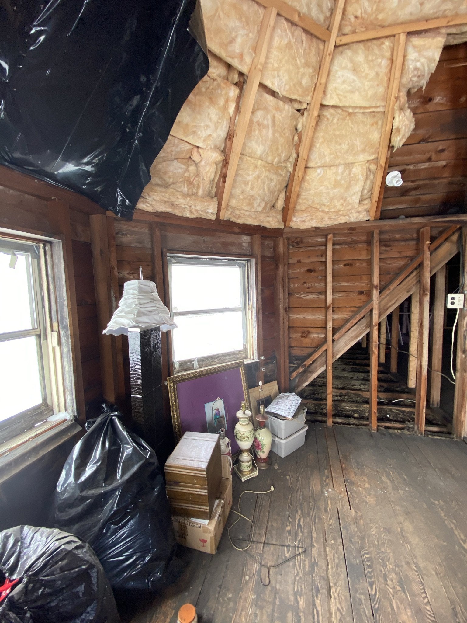
This view looks towards the closet at the far end of the room. I didn't have a clear idea of how usable the closet would be with the sloped ceilings. We had an attic closet in our last house which also had steeply sloped walls/ceiling, and it wasn't the most convenient.
In this photo, the staircase has been covered with OSB and the only way into the space is through the windows in the tower.
The plan was to have a large window at the back of the space, in the bathroom, which would be the only code-compliant window in the room. Even with the lack of windows in this space other than the tower room and the small dormer window, it did fill with light.

This photo shows orange LVL beams, which the contractors installed to provide additional strength to the structure. This was on the recommendation of an architect retained to evaluate structural issues for the project.

LVL work continues.

The window on the left was the sole point of access for all the giant LVL beams (and people, and everything else).

This photo captures the amazing ceiling height.

Unfortunately, we would lose a lot of the cool sloping ceiling effect due to the need to insulate the space. We did, however, take back the walls as far as possible which, in this location, would be three feet in height.

Eventually, we would be tucking a radiator into the corner by the dormer window.

Work on the LVL beams ongoing.
In terms of timing, I want to say this photo was taken in late February or early March of 2021.

This photo shows the state of things near the tower windows. I'm surprised there wasn't more damage given there were no actual windows left in the space.

Construction debris abounds.

Hip hip hooray!!!! The moment Mike and I had been waiting for! This photo was taken on March 24, 2021, and shows the roof cut out for the dormer. (The photo also shows status of the lounge addition, which was ongoing at the same time).

I was shocked by how fast the contractors put this together. The entire dormer was cut out and built within 24 hours.

Hello up there!
Ta dah! Beauty.

Now, we have an additional point of egress for the attic and it can become safe for habitable use.

This photo was taken on the same day, from inside what will be the bathroom. The space to the far right is part of the closet.

Most people who see the finished space now think that we added to the floor space, which we did not. That's just the difference adding a dormer makes.

Here is the bathroom! (Almost lol).

And a tiny hole to by which to crawl into the room. That will change!

The dormer was a game changer, as it added much needed ceiling height which, in turn, increased the usable floor space of the room.

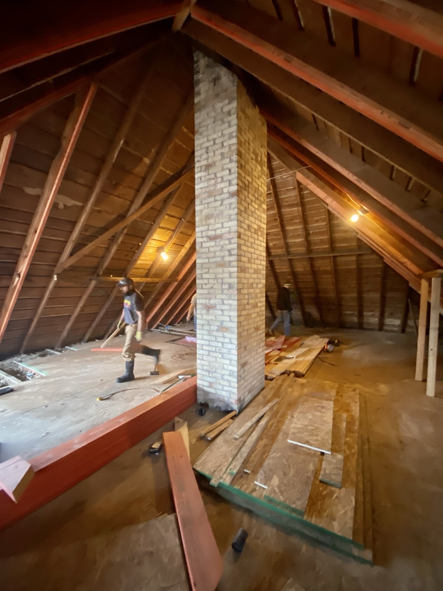
Mike surveying work status. I think he was just happy that, for the first time since we bought the house, someone other than him was doing the work.

View of the soon-to-be bathroom from the soon-to-be stairs.

We were excited enough about the project to enjoy our evening happy hour in the attic.

Another view of the new dormer and window.

This is the view from the tower room.

Happy hour.

View from the back of the tower room. Eventually, our television would go on the wall to the left and there would be a radiator on the wall to the right.

By this time, I think the LVL beam work was complete.

I was planning to paint the chimney metallic gold, but in the end, we decided to leave it be.

In retrospect, I wish I'd asked the electricians to wire that wall to the right of the window for sconces. I didn't have a mirror or cabinet picked out for over the sink and thus didn't know where the sconces would go, but we could've figured it out. Instead, we ended up using plug in sconces which is less than ideal. And in case you're wondering what Mike is doing, he's showing me where the bathtub will go.

Such a dramatic space, even unfinished.

The pigeons would need to find a new home.

Here, we can see the closet framed out.

This is the front dormer area, which eventually would be a combo sitting and dressing area.

Wall framing is going in. We pushed them back as far as possible, but still had to lose about three to four feet around the perimeter of space.
This angle shows the rest of the closet area framed out (to the right of the bathroom).

Again, this is the closet area behind the chimney being framed.

As previously stated, I didn't have a clear idea of how this closet would work given the ceiling/wall angles. I should've known Mike would have an ingenious idea for hanging clothes, which he did.

This angle looks towards the front dormer and the wall to the right on which (unbeknownst to us) we would eventually move the bed.

Here's the view of the framing from the staircase.

And here's the view from the main part of the closet. The closet continues on the left, and the main part of the room is to the right.

Another view of the closet. The idea was to install a door at the end and then two sets of double doors on the right, so we could access the closet from several locations.

The coffee bar would go to the left of the bathroom in what would otherwise be a useless space.

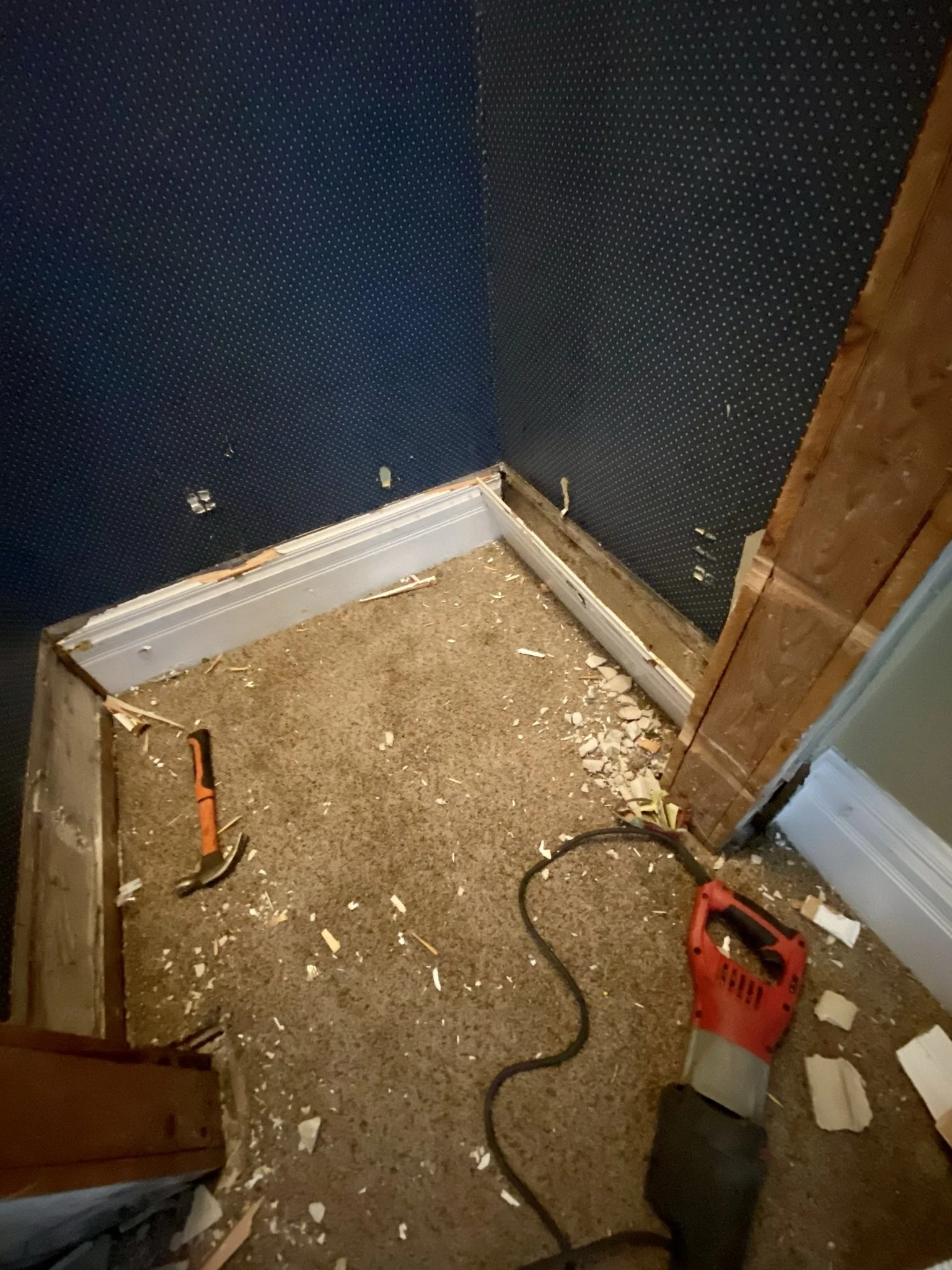
This was an exciting day...the old, dangerous stairs are being torn out!
This is the view in the maid's room, looking towards a small closet to the right and the stair access to the attic on the left.

This is the view on the day the stairs and closet were demolished.

Work commences!

The amount of debris this project produced boggled the mind.
View of the work from the entry to the maid's room.

Cross-heads and doors are out (we saved the doors).
Inside the closet.

Go baby go!

Our greatest concern about the new stairs was that they would not fit given the configuration of the adjacent lower staircase leading to the kitchen. This intrusion into the lower staircase was the only casualty lol! We left this as-is as a remembrance.

Here's the view with new staircase layout.

The view from the back of the maid's room.

Here we are at the base of the stairs looking up into the attic.
The view from the second floor hall.
We had hoped to make some fun "old house" finds in spaces like this, but alas, all we found was a golf ball probably from the '50's.

This is the view from the attic looking down the stairs into the maid's room.

View down the stairs.

Eventually, I want to put a mouse-daminium in this space (a multi-level dollhouse scenario with taxidermy mice).

Levi surveying his new domain.

This photo shows how the closet space was incorporated.

We would live with this stair opening for several years before Mike finished the railing and baluster system.

This shows a small media area framed out. We intended to put a television in the tower room and didn't want to look at electronics or cord clusters.
Levi is standing in the soon-to-be closet.

Where Levi aka Bees is standing will eventually be a sitting area. The original plan was to put the bed here, so we brought the wall out further into the room. However, we ended up liking the bed tucked into another location and jettisoned the original idea.

Hi Bees!

Another happy hour in the tower room.

This view looks towards the bathroom. The contractors have started working on the rough electrical.

Mike and I debated how many radiators the space would need, and the size. Ultimately, we decided on three. One would go near the front dormer window, one in the tower room, and the largest one directly across from the stairs in the main part of the room.
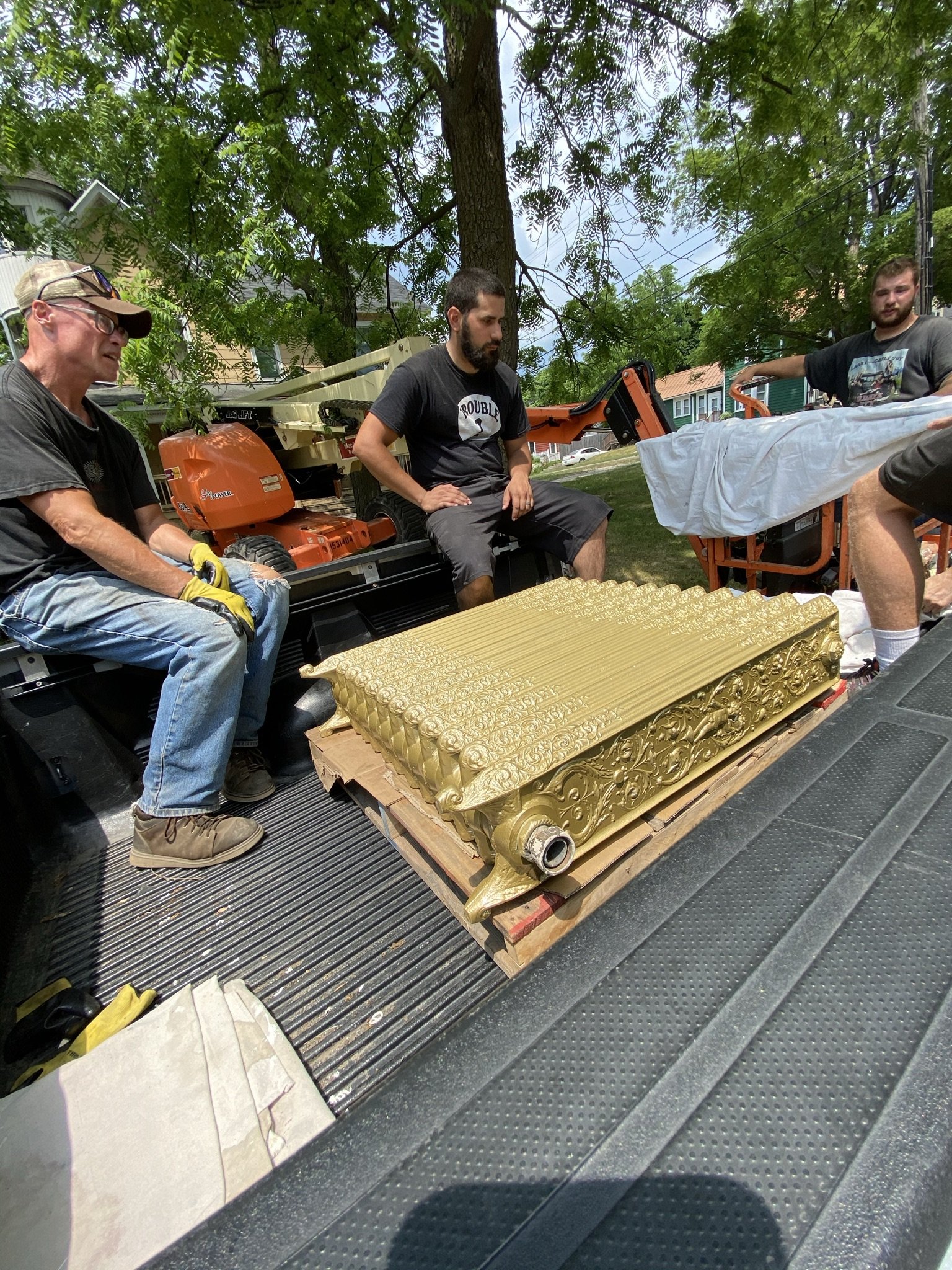
Here, the rads have been sandblasted and painted gold.
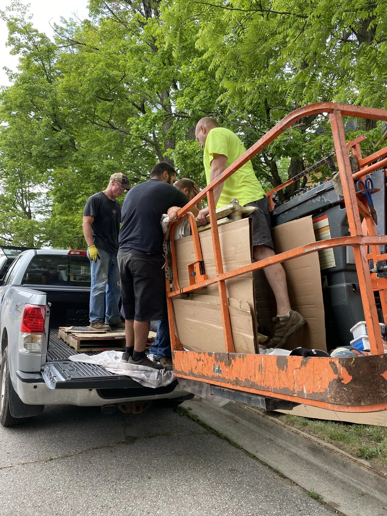
Because of the weight of the rads, the contractors had to bring them through the window via the lift.

The rads are spectacularly heavy. Five guys were unable to lift them, so they had to be rolled into location.

They really are beautiful radiators. We found them as salvage from what we understand was civic building in Philadelphia.

More progress. Here, we have spray foam insulation on the ceilings and bat insulation on the low walls.

Now we can see the space taking shape.

The view after insulation work from the coffee bar.
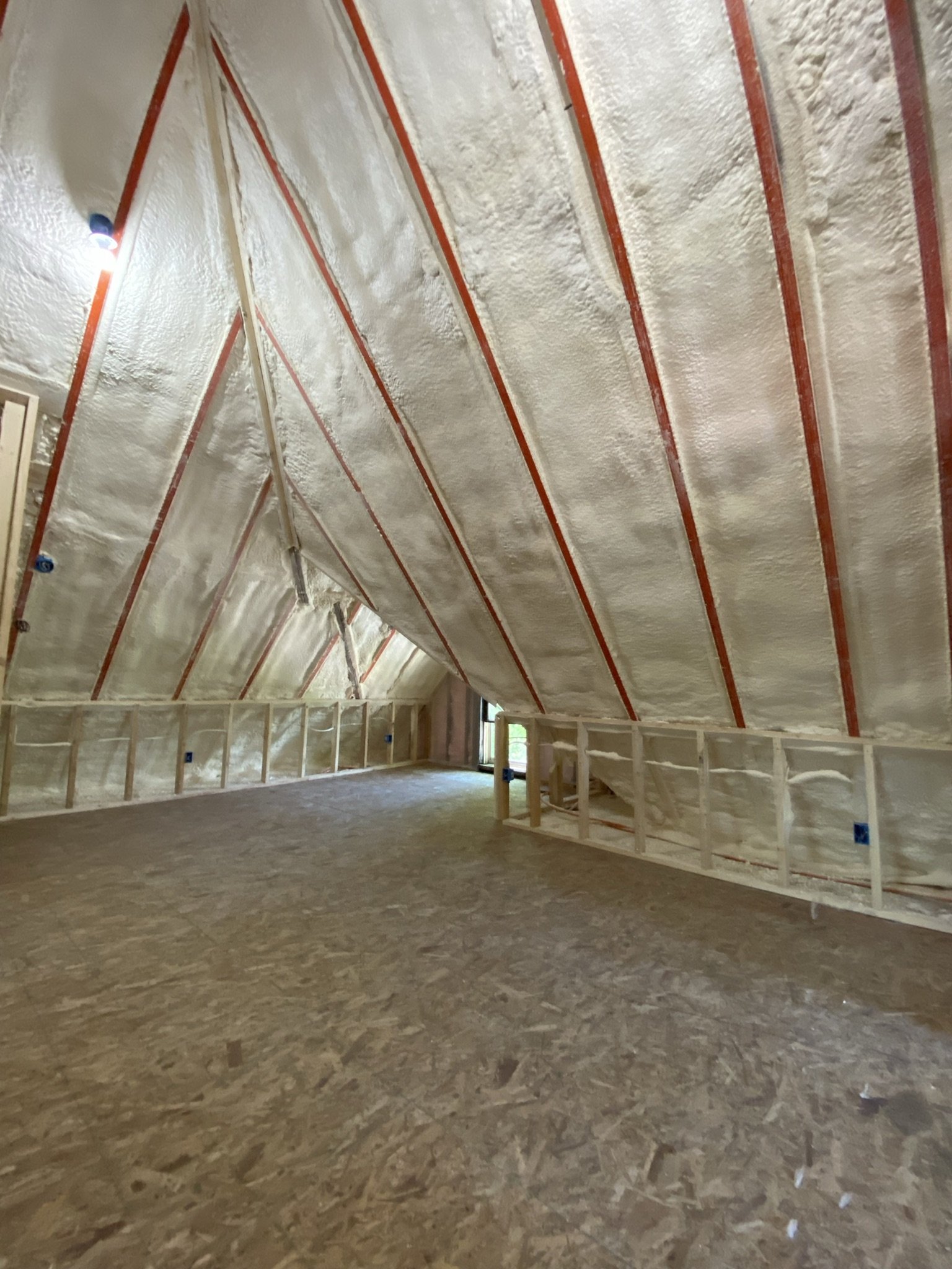
Even with framing and insulation, the ceiling height remains grand.

The spray foam insulation is incredibly efficient.

Things are starting to get exciting!

The view from the front dormer.
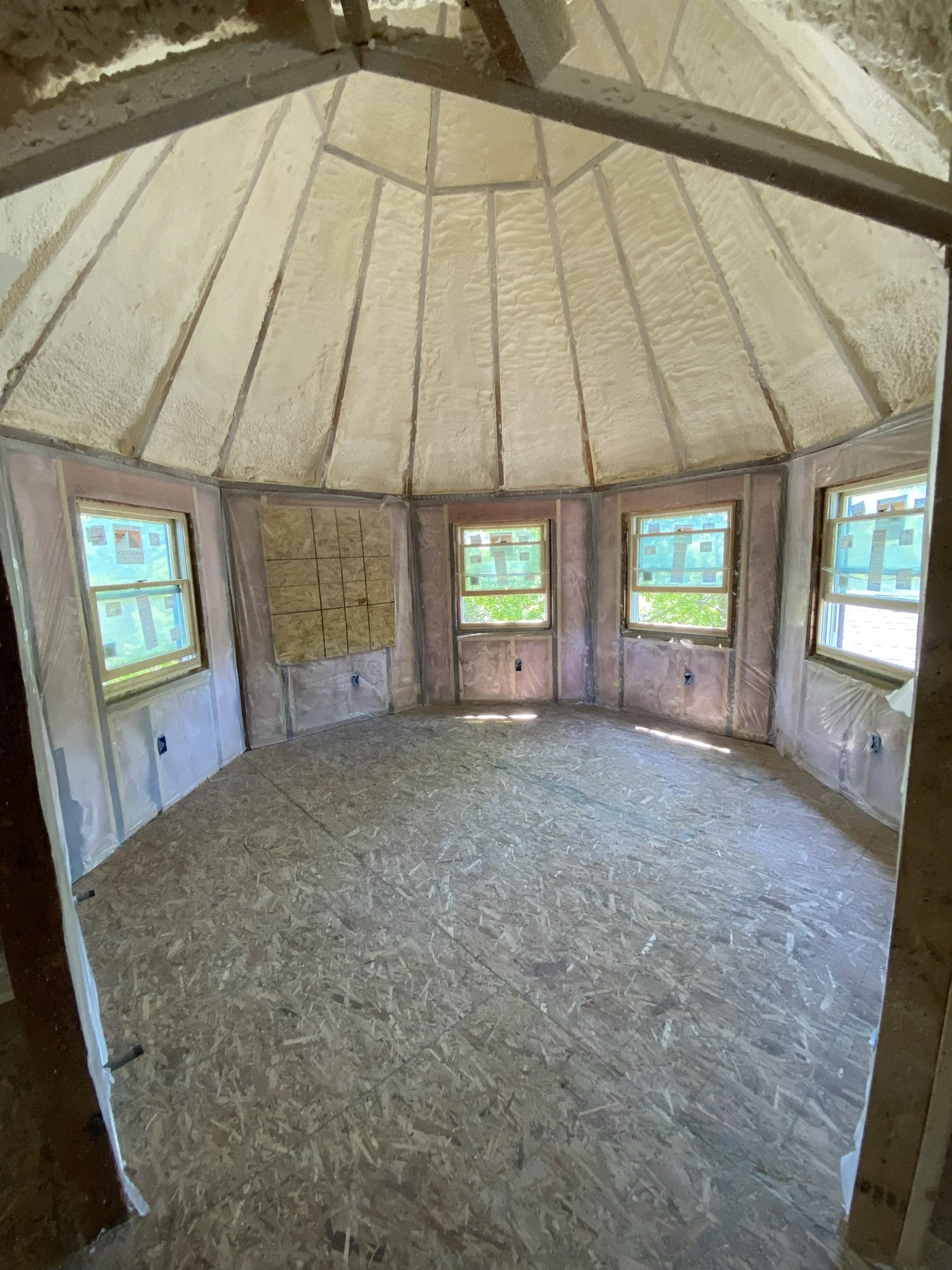
The tower room with insulation and new windows.

At this point, which was around July of 2021, I had decided I'd be painting some sort of mural on the ceilings. I just didn't know what the mural would be, or how I'd do it given I'm not an artist and have never drawn or painted anything in my life (that wasn't second-grade paint-by-numbers or drawing rudimentary horse heads inside my elementary school Pee-Chee folders).

The view looking out the tower room after insulation and before drywall.

I had numerous and wildly varied ideas regarding how I'd paint and decorate this part of the room. I have a Pinterest board that documents most of them.

Now it's time for installation of drywall.

This photo shows how far up the third floor is. That truck was enormous.

All the materials were brought through the same tower window that provided ingress and egress throughout the project.

The view from my office window on the second floor during drywall work.

The drywall workers did a terrific job. By far, they were the best subcontractors on this project.

Seeing the space all in white reminded me of the attic at our historic house in Orange, California. We had that room painted all white, and I loved it. For this room, however, I wasn't envisioning white.

More drywall pics.

And more.

I was loving the lines and angles of the ceiling.

Who doesn't love a wonky attic wall?
I still didn't really know how I'd paint this ceiling, but I kept having ideas of vines coming down as my prominent idea.

What an awesome, fun room this was turning out to be.
Looking into the front dormer. This is the only window that wasn't replaced (it is the original window and is in terrible shape).

The view looking out the front dormer.

Looking into the bathroom on the right and coffee bar on the left.

This is the view from the coffee bar area.

And now the mudding is complete. We spent extra for a smooth finish, as this was necessary for any type of mural. The closet is to the right.

Here's the coffee bar. Beneath that is the maid's room, which now served as sort of a pass through to the attic.

This view is from the coffee bar looking towards the closet.
This view takes in the area on the left where we'd eventually put the bed, the tower, the media closet, and a sitting area to the far right.

The view from the entrance to the tower.

Looking out from the front dormer.

Looking towards the dormer and tower.

The view from inside the closet.

Inside the tower.

Awesome!!!

Unbeknownst to us, the stairs would be the most complicated part of the finish work and we wouldn't complete them for another 3.5 years.
Another view of the stairs.

View from the coffee bar.
I still had no clue how we'd actually hang clothes in here.

The angles in this closet are just so odd. The ceiling goes from about 14 feet at the top down to three feet at it's lowest point.

The view from the maid's room, looking up into the attic.
ATTIC CONVERSION: TOWER MURAL AND CLOSET

We didn't start finish work until the winter of '21. Until then, we used the space for various projects.

Like I said, it was project central for everything from banquette seats for the downstairs lounge to arts and crafts projects to reupholstering boat seats.

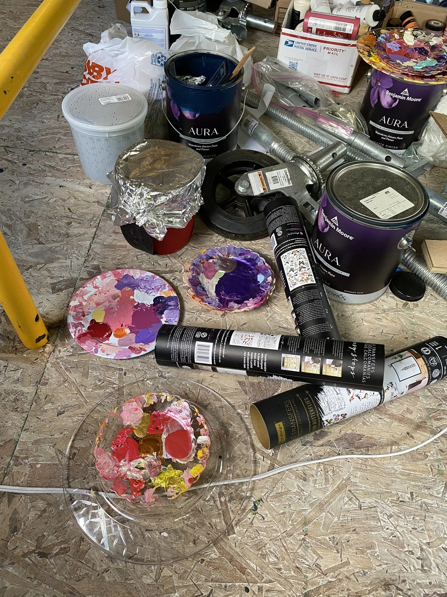
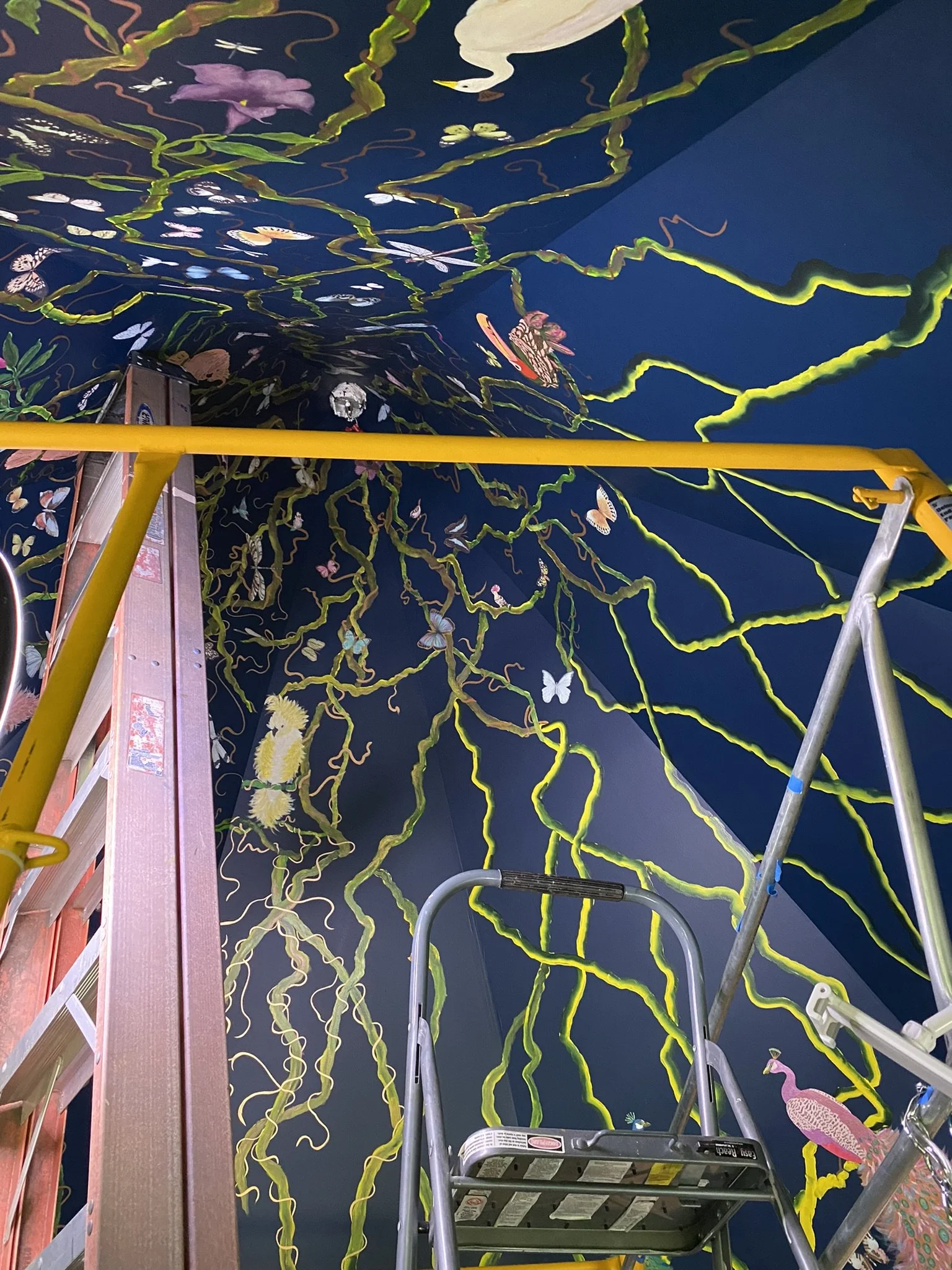
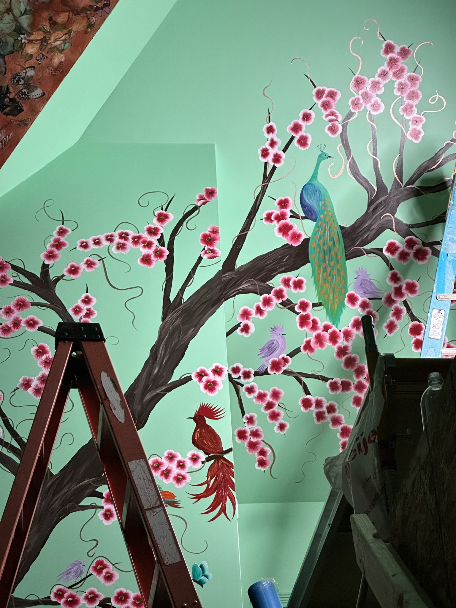
At some point, I got a vision in my head for the tower mural ceiling which included flowered vines working their way down from the peak to the top of the walls. I wanted the background color to be some sort of dark blue or teal and eventually settled on Benjamin Moore Hidden Sapphire.

During this time, Mike was working on trim for the closet. We just kept moving saws around the room as work progressed.
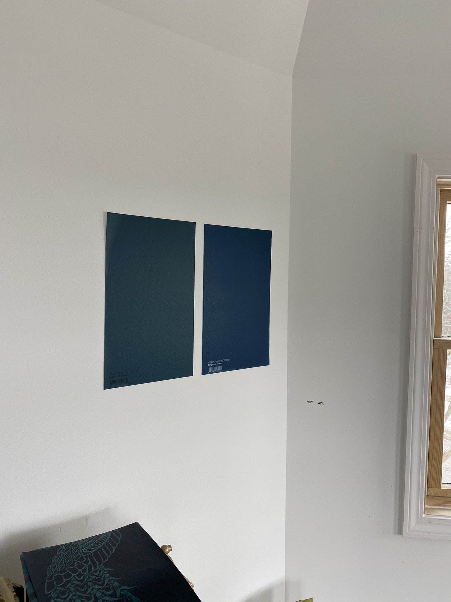
Here are the two finalists in the tower color competition. Benjamin Moore Dark Harbor is on the left and Hidden Sapphire is on the right. I also was considering these colors for the bathroom but ended up going in another direction.

In the background are some color samples that I was exploring for the main part of the room. For a second, I thought about using these colors in the tower room, but the darker vibe kept pulling me for this space.

I did the base coat with Behr Compass Blue, as it seemed like a reasonable alternative to using a dark primer.

Here is the tower painted Compass Blue, my makeshift primer.

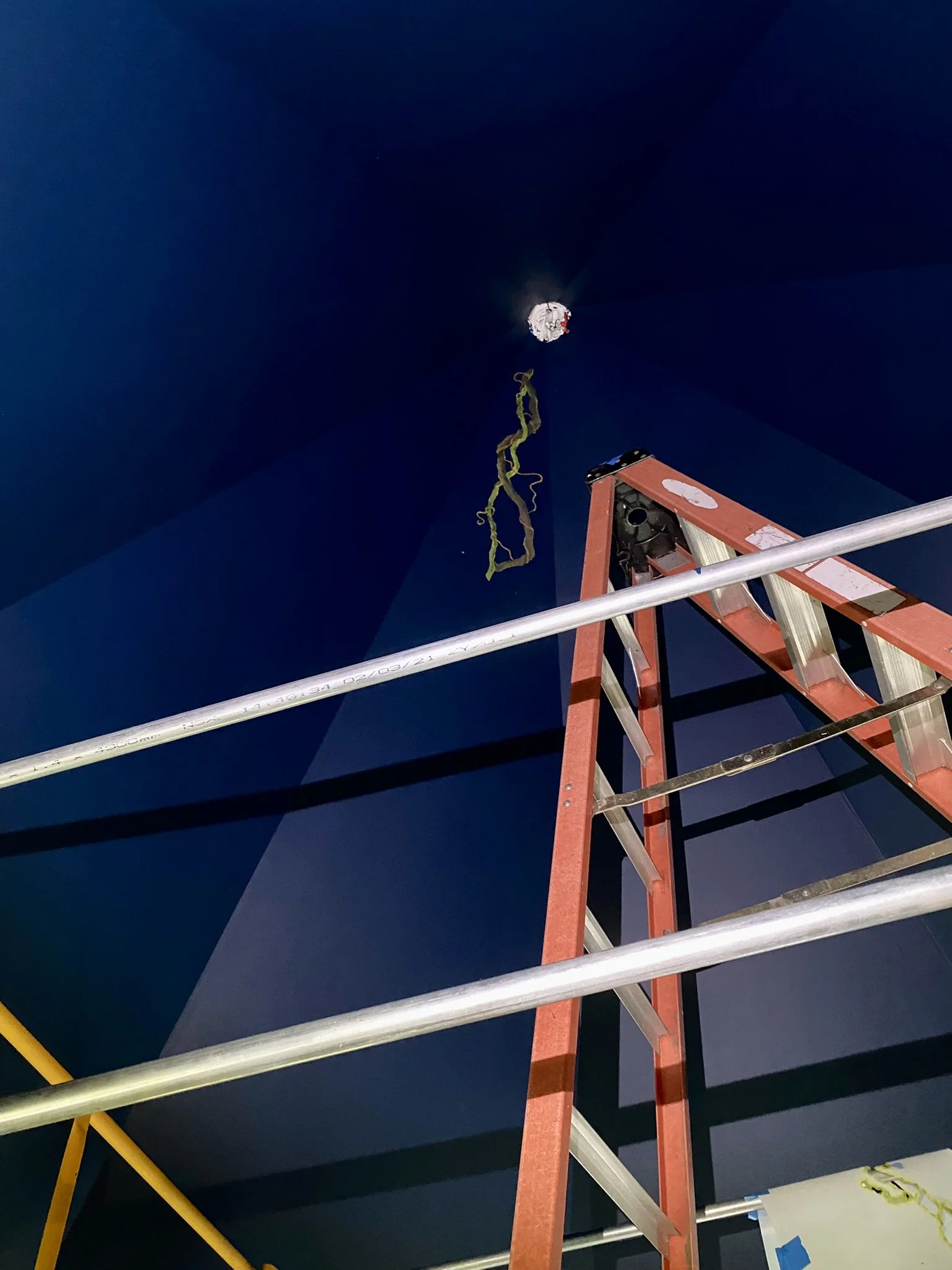
I got up as far as I could with the small scaffolding and eight-foot ladder with an extension rod. This ceiling peaks at 17 feet.

Here's a dollop of Hidden Sappire.

Here, I've started the first coat of Hidden Sapphire. The photo shows how much more depth it has than the Compass Blue. I will say that Benjamin Moore Aura is a beautiful paint, but the darker colors really need to be sprayed to avoid lapping. I have no issues with lapping using the lighter Aura colors, but really struggled here with lapping (and with a dark color in our lounge) using Aura in a deep color.

Here's a photo I took for an Instagram collaboration with The Crazy Chair shortly before I started the mural. I love our view of the Presbyterian Church. We actually have views of five different historic churches from the attic. You can also see Lake Cadillac from the tower, although the view becomes mostly obscured by trees in the summer and early fall.
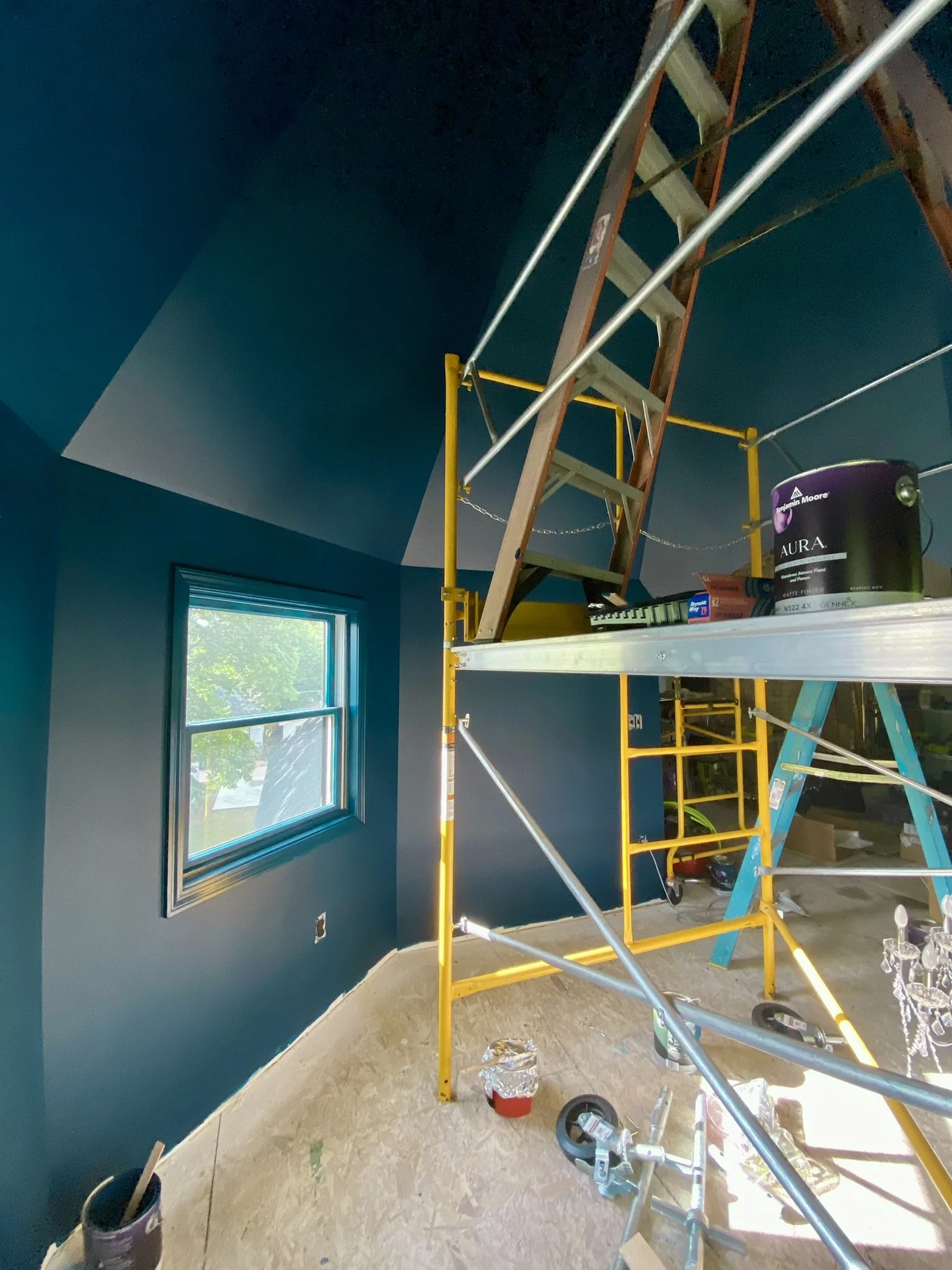
This picture shows how the color shifts from blue to green undertones depending on the light. Also depicted here is the large scaffolding we had to bring into the space for me to access the top of the ceiling.

This was my view for about three months while I worked on the tower mural.

You might wonder why someone who hasn't painted before and is not an artist by any stretch would make her first project a horror vacui mural on a 17-foot ceiling. Well, as it turns out, necessity really is the mother of invention. I figured I'd just use stencils to complete sections of the mural which were outside my skill set (which was the entire mural, tbh). The only challenge was cobbling together the right stencils in the right sizes to create a well-scaled composition.

Here, I have my first stencil taped. Looking at this makes me want to laugh and cry.

Here's the first layers of paint on the stencil and some vines, also stenciled.

Done! And it only took me two hours. Not kidding. Now you know why I want to laugh and cry.

Of course, I was working on an eight-foot ladder on top of scaffolding covered with numerous foil covered paint plates and cups, and I couldn't remember which cup had which paint.
The view from the floor. Obviously, I was very proud of this.

Here we are on day 2 lol! I grew a brain and started working on more than one stencil at a time to speed things up.

This was the status at the end of my second day painting the mural. I know. Not a lot of progress. The problem was, and is, that I don't really like the look of stencils. They look too "stencil-y," so the only way I can use them is to get the paint as opaque as possible, which means numerous layers of paint and extra shading.

Here we are on day three, and I'm starting to realize there has to be a better way to build this mousetrap.

I mean seriously, this is just bananas. At this rate, I wouldn't finish the mural before 2025.

I was even using stencils for the stupid tendril vines.

To redress the monotony of painting vines, I decided to start adding in some birds. At the beginning, as you can see here, I stayed true to the stencil design. That would change as the project progressed and I grew more and more frustrated with the restrictions and monotony of stenciling.

The stencils were getting out of control.

Here we have two cockatiels and one toucan in the books. I can't remember how long these took, but it was stupid.

These bird stencils involved multiple sheets/layers of stencils. The upside, of course, is that the process was teaching me how to paint. And the frustration of stenciling was driving me to take more risks.
You can see I've started a small peacock on the right of this photo. I was so vined out that I decided to paint birds and worry about the vines later.

Here's the small peacock, close up. I did do a little of this free hand, but not much.

Seeing the bird free floating, vineless, was difficult for my OCD brain. But not as difficult as figuring out how I'd line up vine stencils and get them down to the peacock so he could perch on them in some realistic fashion. I should have thought that through. Like I said before, necessity is the mother of invention, so in this case, I just started painting the vines by hand using sort of a one stroke painting process.

I decided to try this seven-layer peacock stencil made by Designer Stencils.
Here's sheet number one.

Rather than stenciling, I though I'd just use the stencil sheets for tracing and then paint as much as I could on the inside so the bird didn't look so "stencil-y."

Here's how that went. Oof.

I did use the stencils for the eyes on the tail.
Disaster. I used a metallic paint, which was very rubbery when not completely dry, so when I did the next layer of the eyes, all the paint lifted up with the stencil mylar.

So I ended up just painting the eyes the best I could.

I also used stencils to create the little bits of feather shading on the white wings. I thought it didn't turn out half bad! Even though it took me two days lol. Next on the agenda would be a pink peacock.

The stencil sketches were inscrutable. I couldn't tell what color went where, which is why I started giving myself poetic license with the colors.

Here we are with both peacocks complete and a first layer of paint on the vines which, by now, I was doing free hand.

I didn't have a composition fully in mind when I started, and pretty much added elements to the mural as it progressed. So randomly, I decided next to add a white peacock. I wanted to finish this one faster, so I used the first couple of stencil sheets to trace out the bird, then painted it free hand. The feathers were super easy to paint using this technique, which simply involved loading an angled brush with a ton of paint and kind of doing a flicking motion (I know...this sounds super technical and professional lol).
The tail was starting to get out of control. But seriously, how was I supposed to know when to stop?

It just kept going and going and going.
I did add slightly different colors and sheens within the tail which really helped make it look more realistic and textured. Not that this was planned. That's just how it worked out, as I was doing this mostly out of instinct. People have told me it actually looks 3-D.
Ta dah!

Next on the agenda were the trumpet flowers. As per the rest of the mural, I didn't know how to paint them freehand, but luckily, I found great stencils in the right size and scale on the Designer Stencils website.

The stencils are several layers.

My M.O. was to trace the flowers and then paint freehand within the sketch.
These took a LONG time. I had to continuously refer to the coloring on the example sheet to get the shading at least semi-realistic.

Adding more flowers. I figured I'd add the vines later.

As can be seen here, I did skip around the space rather than finishing a section at a time. I'm just not experienced enough to have the full mural in my head, or on a piece of paper, so moving around helped me as the composition unfolded.

I mixed a lot of my own colors. This purple was for the next peacock.

And here's how that went. I struggled again with the never-ending tail lol.

More progress aka more tail.
I didn't love how this one was turning out, and felt the tail was missing something despite being so voluminous.

Here's how it was looking from afar.

More tail. Sheesh. I didn't know what to do except keep on painting more tail.

Finally it dawned on me that the tail needed something whimsical, so I added butterfly furniture transfers. Most of the transfers are from Re-Design with Prima and Iron Orchid Designs.

More flowers and a branch for the peacock's perch. I painted this branch before I realized the one stroke painting technique would give a better effect than just multiple layers of paint.

Close up of the butterfly peacock. I felt it had a Christian Lacroix vibe. Ish.

BTW, I think this Lumiere Halo Blue Gold paint is literally the best peacock paint on the market.

Here I'm adding branches and twirling tendril vines. I still am laboriously shading the branches/vines because I still haven't realized one stroke is the best way to go. At least I wasn't using the stencils anymore for the branches and vines.

Now it's filling in.

My pink cockatiels were pretty faithful to the example sheet in the stencil packaging. I wanted this cockatiel to have fluffier feathers, so I went rogue and added more poof and personality.

Another small peacock. Again, by this time, I was deviating from the stencils and just using them to trace the bird before painting freehand within the lines.
Here's my workspace on a typical day.

More progress.

More furniture transfer butterflies. I felt these would be too time consuming to paint. Plus, at this point, painting butterflies wasn't in my comfort zone.

I still relied heavily on the stencil example sheets for the flowers. I wasn't using the one stroke technique yet for the flowers, so they were a struggle for me, more so than the birds.

Of course, each cockatiel was puffier than the last.

Now we're starting to get a sense of the horror vacui look I was going for.

For reference, I started painting the ground color in May of 2022. This photo was taken on July 22, 2022. I worked on the mural most weekdays.
This is the view looking up during the same time frame.

The dragonflies also were furniture transfers. Also notable in this photo are the branches, which I've started painting using the one stroke technique. I can't express how much faster this is than using the more traditional technique of multiple layers and shading.

This sort of shows how I loaded my brush to paint the branches with one stroke. I didn't follow the recommended technique you see on YouTube and TikTok videos. I just used gobs of paint and painted each branch downward in one foul swoop.

The branches to the right are an example. They literally are painted in one stroke. So easy! Who'd have thunk?

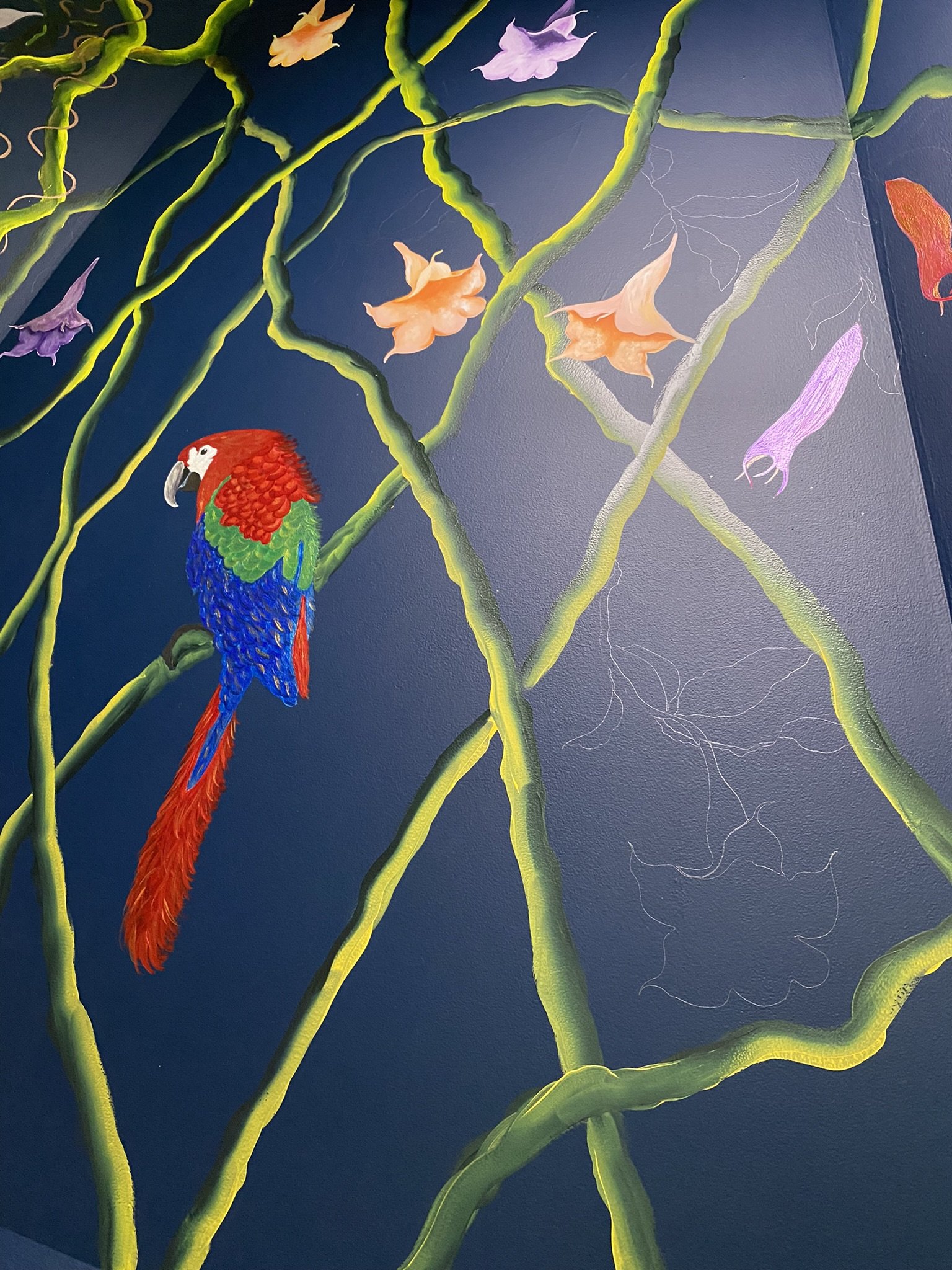
Next up is a parrot. Again, I used the stencil to trace.
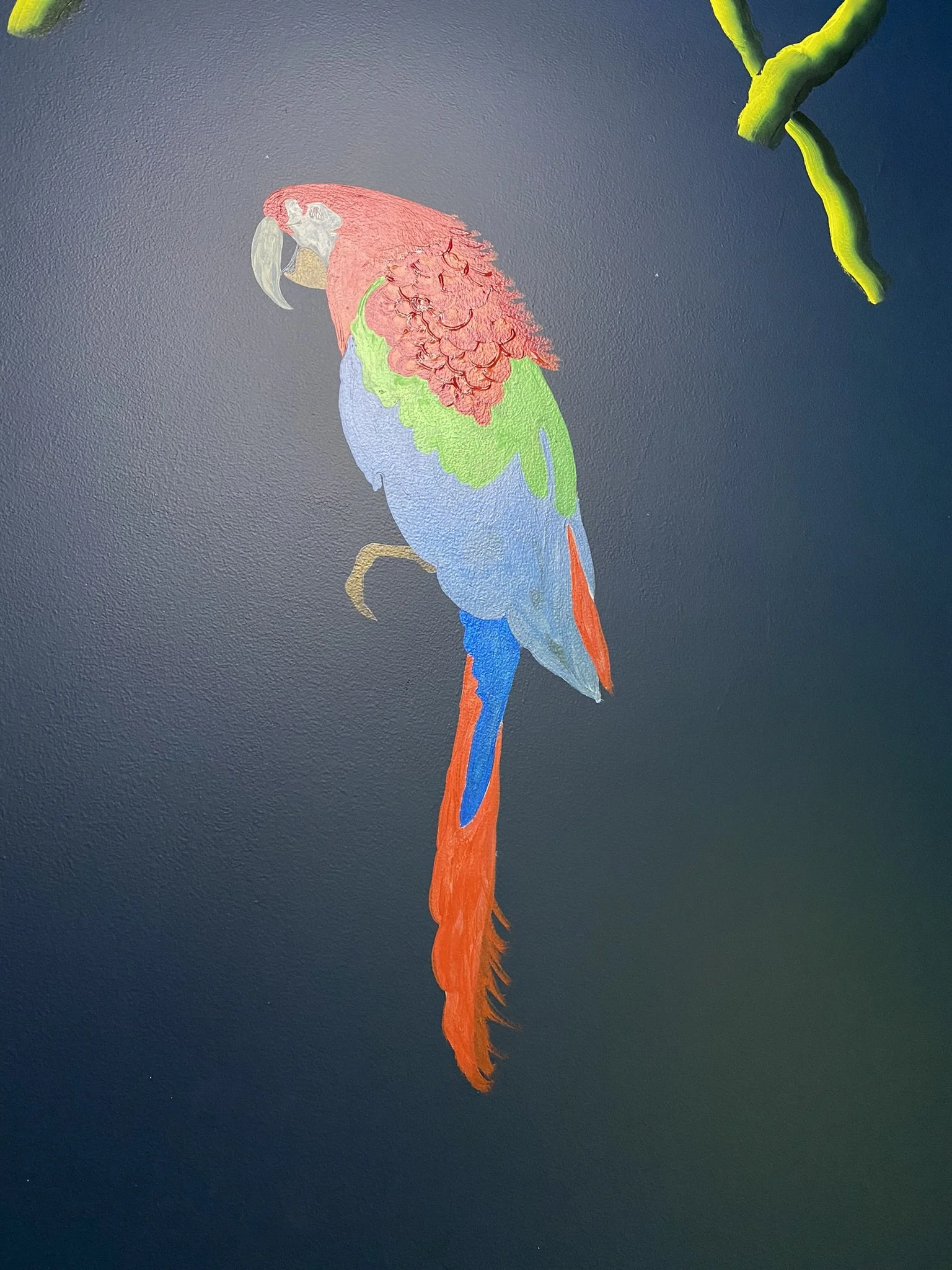
I used brush strokes and thicker paint to get the feather effect on the red part. Probably not the recommend technique, but I'm not a pro, so I had to do what I could figure out to get a decent effect.

Here he is finished.

Another bird. Extra fluffy. As with the others, this was traced with a stencil then painted free hand. Again, the vines are one stroke.

Here's how it was looking from afar.

It's filling in!

Here we are on August 4, 2022. I'm almost done.

I took this picture just before I started testing top coats.

And here's a close up of that process. On the left is Modern Masters Dead Flat Varnish. You can see how it really knocks back the sheen.

I ended up using the Polyvine dead flat, which had more sheen than the Modern Masters. The topcoat was necessary to protect the mural and also to even things out, since I used many different paints in many different finishes, including some metallic. I felt the Polyvine allowed more of the metallic to come through, which is why I decided to use it on this ceiling. Later, for the ceiling in the main room, I decided on Modern Masters as there was very little metallic paint in that mural.

I tested the topcoats before I finished the mural, mostly because I don't live anywhere near a paint store that stocks these brands and would need to order them with at least a week lead time. The mirrors are from Hobby Lobby.

I didn't paint behind the future location of the television lol.

Here we are on August 11, 2022, getting close to completion.

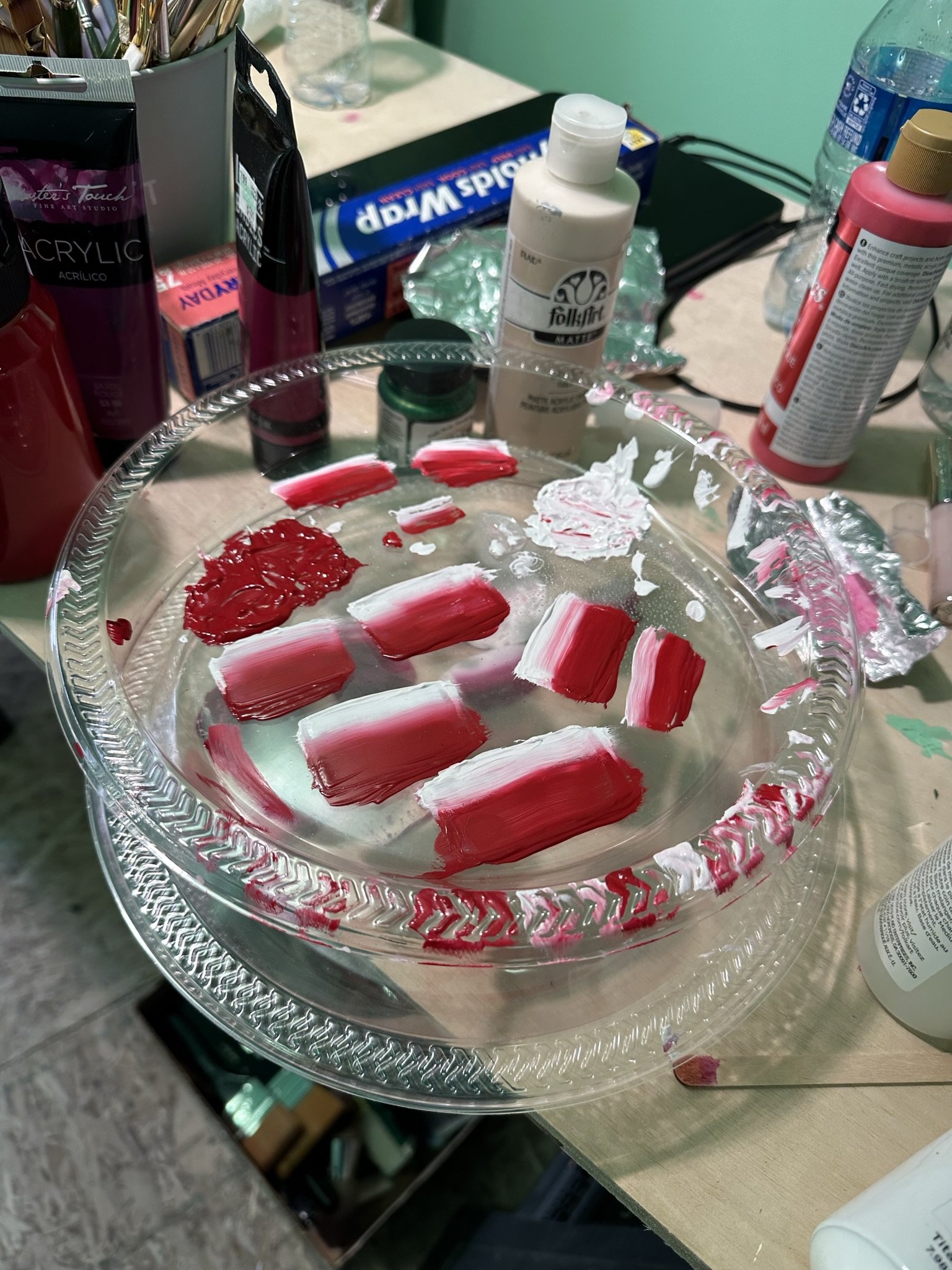
My palette on a typical day.

Vavoom!

And it's done. Ready for the topcoat.

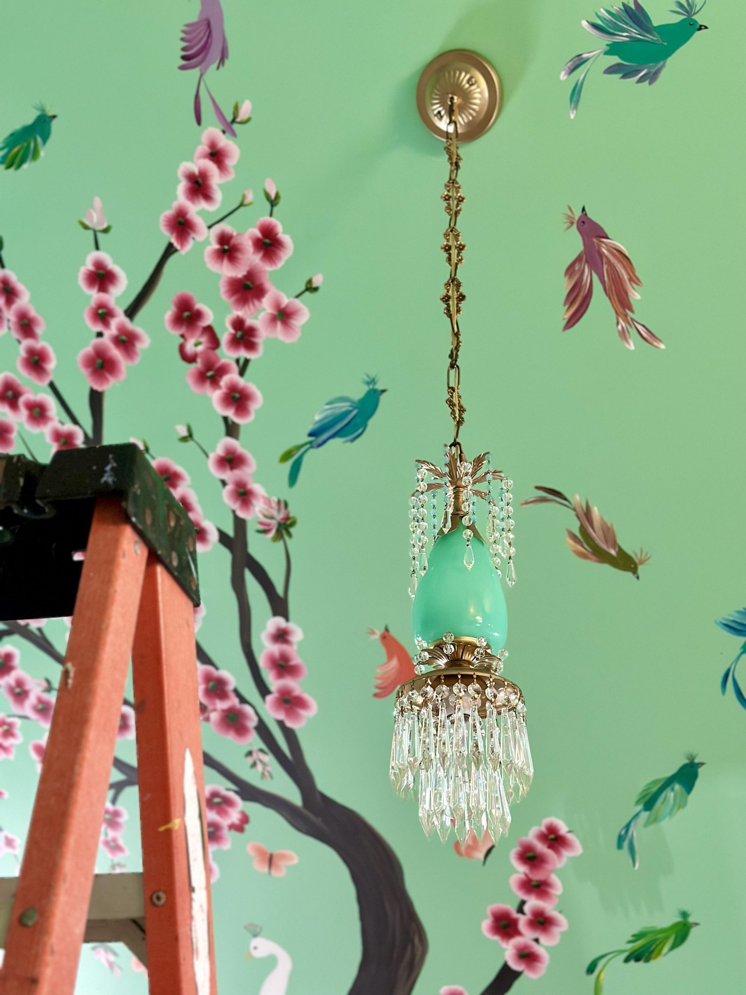
And it's also ready for the chandelier, which I'll address in another section of the gallery.

Here's how it looked from the ladder on the scaffolding.
This was the very last flower I painted in this room.

And it's done! Now, I just have to fill in some leaves, twirling tendrils, and lots of furniture transfer butterflies and dragonflies.

The artist (me).

Now we're going back in time and switching to the closet in main part of the room.

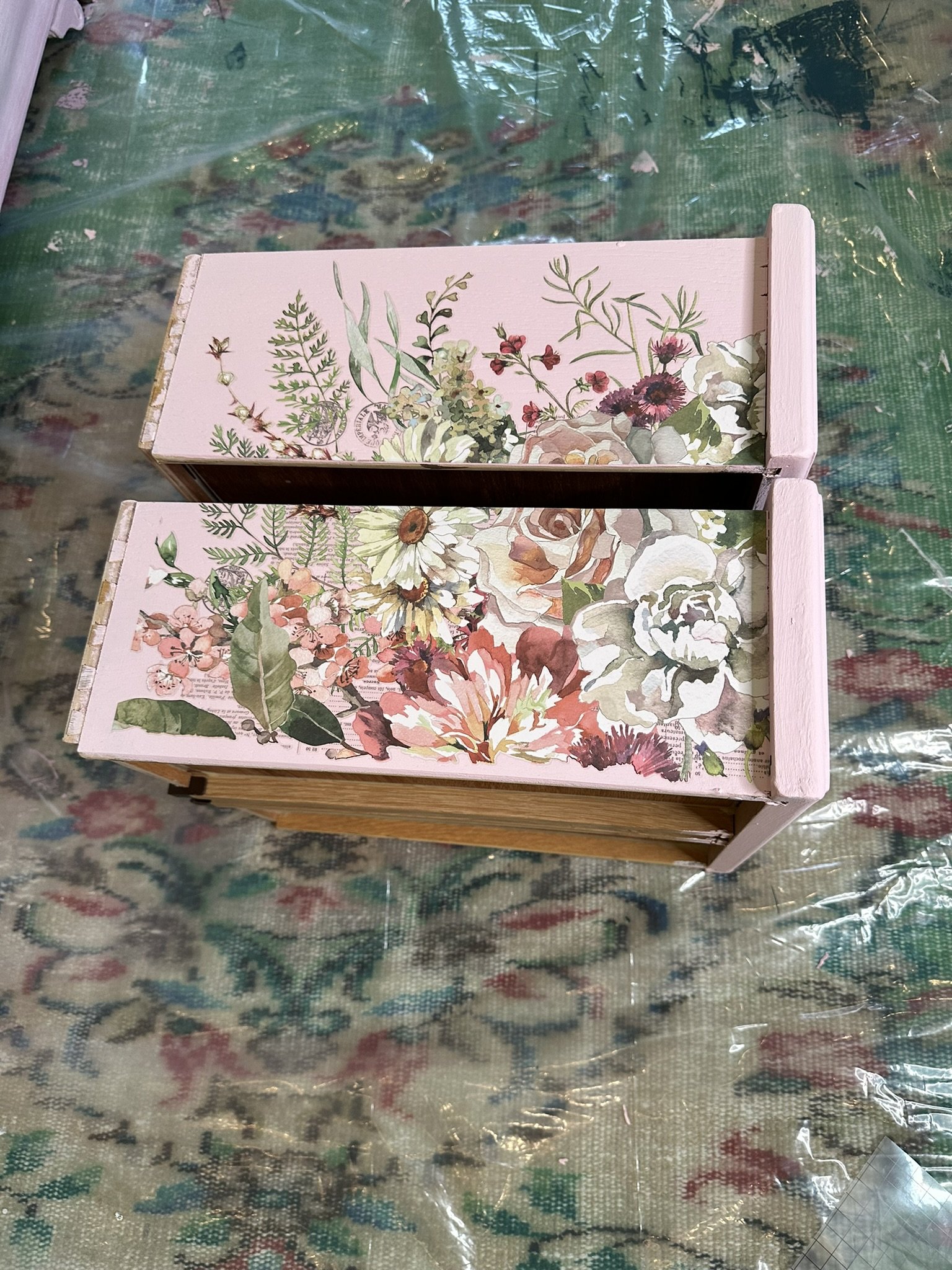
We found inexpensive hollow core doors at Home Depot. The plan was to add mirrors and trim to make them look better than they are.
First, Mike added trim and corner blocks.

Then I primed and painted the doors before Mike glued on sheets of mirror.

We added braided trim around the mirrors to finish the edges. As an aside, this greenish blue was the first color I selected for the main part of the room. I felt it had too much grey in it, so I switched to a different shade of green.

Me.

Another view of the closet, showing another point of entry. We knew that once we had clothes hung, it would be much more convenient to have several points of entry into the closet.

I found antique hardware on Etsy. The hardware was more expensive than the doors lol.

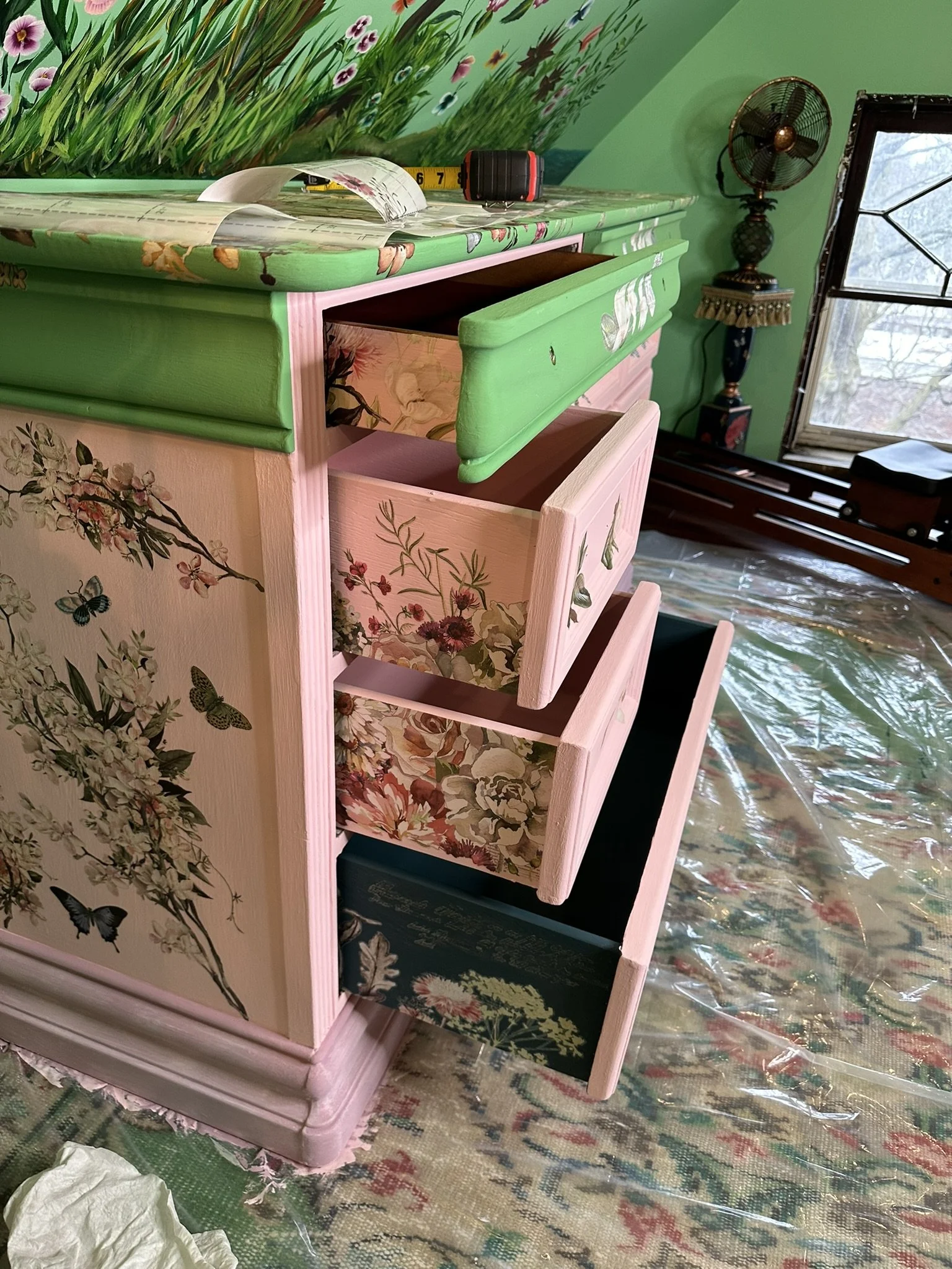
Here is the closet after I've repainted the room in with Pantone 344 U.

The closet served as a tool shed for about three years.

I mean tool shed plus debris.

Here, I've painted the closet interior with Benjamin Moore Heritage Red. I liked how the red worked against the art deco green.

The view from the other side of the closet.

Mike machined these rods to hang clothes at an angle. This allows us to get far more hanging space than using the low slung back wall.

We found the art nouveau glass door on eBay and I drove across the state to get it. It's from an old mansion on Lake Huron.

This photo shows the angled hanging space and also a free-standing rack that I like to use for excess hanging. Mike installed the shoe rack to the right and two inexpensive armoires to the right which we found on Amazon.

The view from the glass door. I did edit out the ugly can light, which we will eventually replace. The space is deceptively large, and we were able to use a long dresser which has lived in several rooms prior to this. I love having an unfitted closet and feel like I'm in a theater dressing room when I use it.
ATTIC CONVERSION: TOWER CHANDELIER, FURNITURE AND DECOR

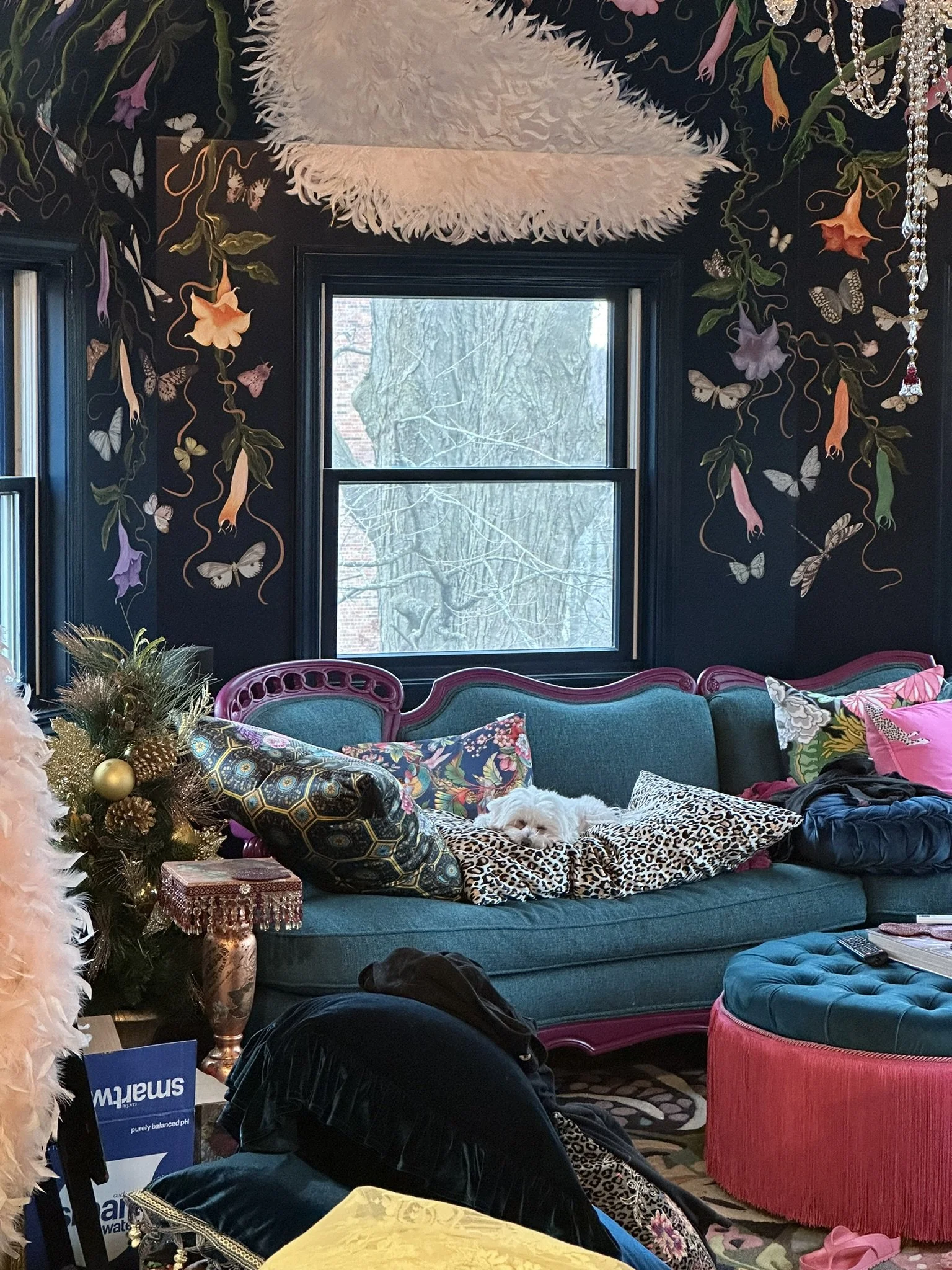
Back to the tower room! Here we are, before I started the ceiling mural, testing Chairish's "view it in your space" feature. Even the color worked. Plus, it was a sectional, which would allow us to get it into the attic, and it was vintage and $800. I don't think we could've found a more perfect sofa for this room.

The chandelier was another story. We had two of these, which we'd purchased years ago from Lamps Plus for the parlor. I don't know what I was thinking. They were way too large for the parlor, and had too much of a modern feel, even with the crystals.
So we deep sixed them in storage for 6-7 years before pulling them out to see if the scale at least worked in the attic. And it did. I knew I could mitigate the modernity issue with some junk jewelry, hot glue, and other sparkly things.

Here's Mike and his brother, Greg, hanging the chandelier low so I could work on it without having to ascend and descend the ladder every two minutes.

Needless to say, I have quite the stash of hobby items, trims, and pearl garlands. I buy them whenever I see them on sale.

I wrote a blog post on how I did this chandelier which you can visit at https://www.thebeigeblues.com/thebeigebluesblog/how-i-created-those-fancy-bejeweled-chandeliers.

The most challenging part of this project was working within the tight spaces with a glue gun. I tried bandages to prevent burns, but ultimately this didn't work as the glue built up and my hands stuck to everything.
I used rhinestone mesh (as in disco skirts) and long strands of pearl trim (which comes on rolls) for the arms.

Most of the trims I found on Amazon and at Hobby Lobby.

The swooping pearls are necklaces from Amazon.

Here's how it looked before it was hoisted overhead.

A closer shot.

And from afar.

This is a time consuming project, but it's not difficult.

Here it is after Mike hung it at the right height. It's definitely more fitting for the room now than it was in it's unadorned state.

The view from the ground.
I used jeweled buttons for additional sparkle.

The entire chandelier project took me five days, working 6-8 hours a day.

To date, I haven't cleaned this, but when I do, I'll probably lay a tarp and just spray it down with one of those drip and dry chandelier cleaners.

This photo was taken in late August of 2022. The floor obviously is not done, but I was excited to be able to take a few pictures.

Our house was featured in Siobhan Murphy's More is More Decor before we finished the attic.

I originally wanted a triptych mirror for this space, but the Hobby Lobby mirrors give a similar effect at a fraction of the price.
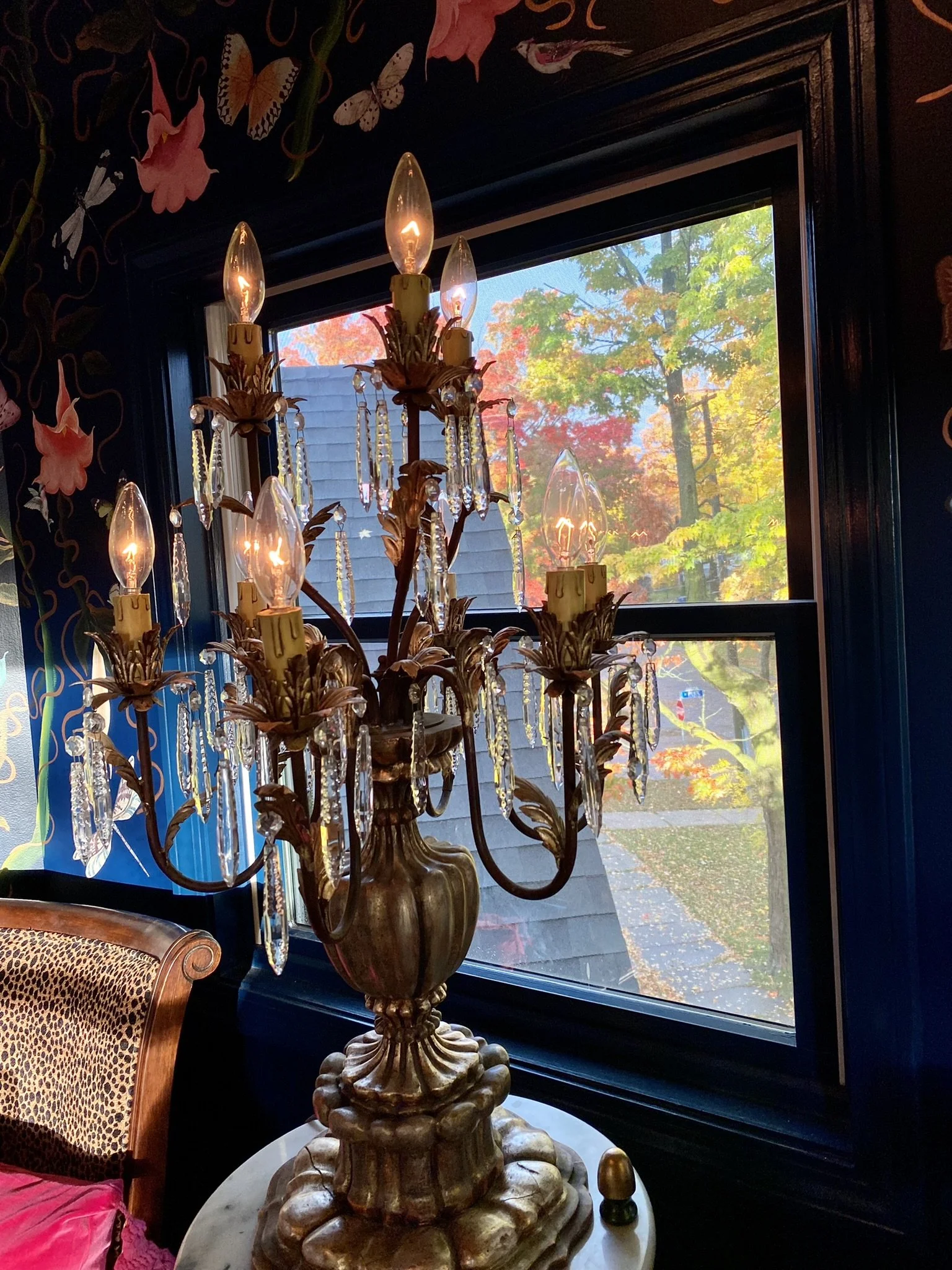
I found these candelabra table chandeliers downstate.

Here's Mike enjoying the room in early fall, 2022, before we began working in earnest on the main part of the room.

I knew I wanted a round ottoman instead of a table in front of the couch. This one was just short term until I found something I liked. Take note of the little white table. That's an inexpensive plant stand from Hobby Lobby.

And here's the plant stand after paint, trim and furniture transfers. They make perfect speaker stands and drinks tables. The little mouse hole to the right is a place saver. Eventually, we want to cut holes in the walls and create little taxidermy mouse dioramas.

I used decoupage for the top of the tables.

Our original idea was to use carpet in the attic. These are some of the samples I was contemplating.

The Samsung Frame television works great in the space.

Ultimately, we ended up doing hardwood in the entire attic space (with mixed results). Here, we have cowhide and a rug I found on Amazon (which happens to be the same line of rugs Anthropologie sells for like triple the price). Take note of the round ottoman in front of the sofa. You can find these at Bed, Bath & Beyond and Wayfair. They are great, because they provide a little extra storage. However, this one needed more vavoom.

So I added rope trim.

And several layers of chainette fringe.

Much better.

The throw pillows I found mostly on Etsy. The round velvet ones are inexpensive from Hobby Lobby.

Dog tested and approved.

This is the view from the entry to the tower room.

But I still needed end tables for the sofa. I really liked these, which I found on Facebook Marketplace.

The color, however, would not do. So I sanded them down,

Primed them.

And painted them a color close to the fuchsia accent color on the sofa.

Then I added furniture transfers.

I layered the transfers in sort of a collage fashion.

Then, on top of that, I layered a gold foil chinoiserie transfer.

Very fun!

I painted copper for the accents.
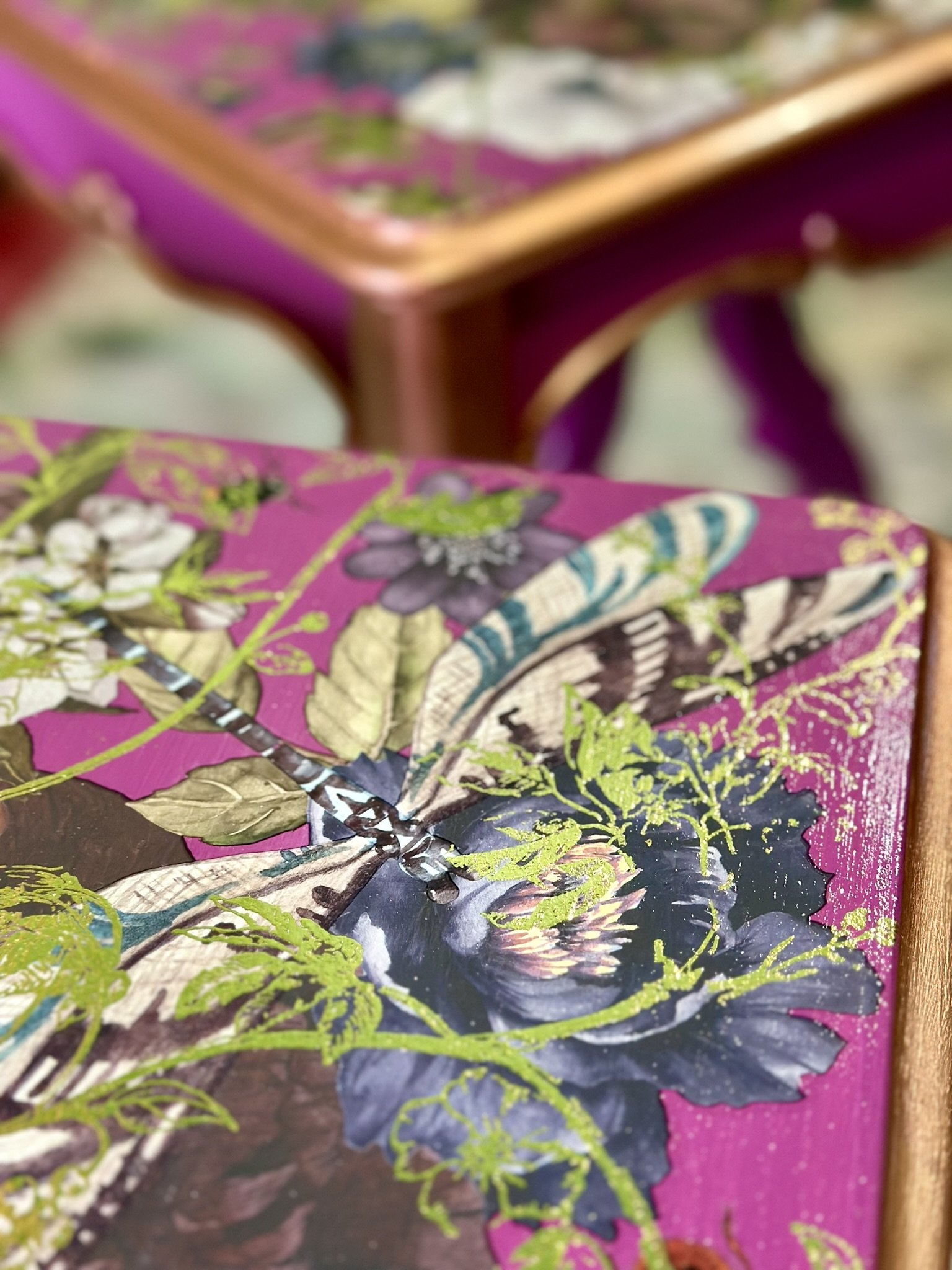
Here's a close up after applying several coats of a glossy varnish.

We wanted the tops to be durable, so we poured resin. Here, Mike is making sure the tables are level before we pour.

The dog slept through most of this.

More snoozes. Plus, in the window behind, you can see a preview of the mural I ended up painting in the main part of the room.

He spends a lot of time on the sofa lol.
Happy times.

Plus perches.

Television time in the tower. The floor lamp in the background I've had for years. It just happened to work well in this space. I tossed a piano shawl on the radiator for good measure.

The fabric on these pillows is from Designer's Guild.

The blankets and large silk throw pillow are from Johnny Was.

The green portiere is a double-sided velvet curtain from Etsy. I hot glued trim on it.

All in a day's work. Trust me. He needed that hot pad.

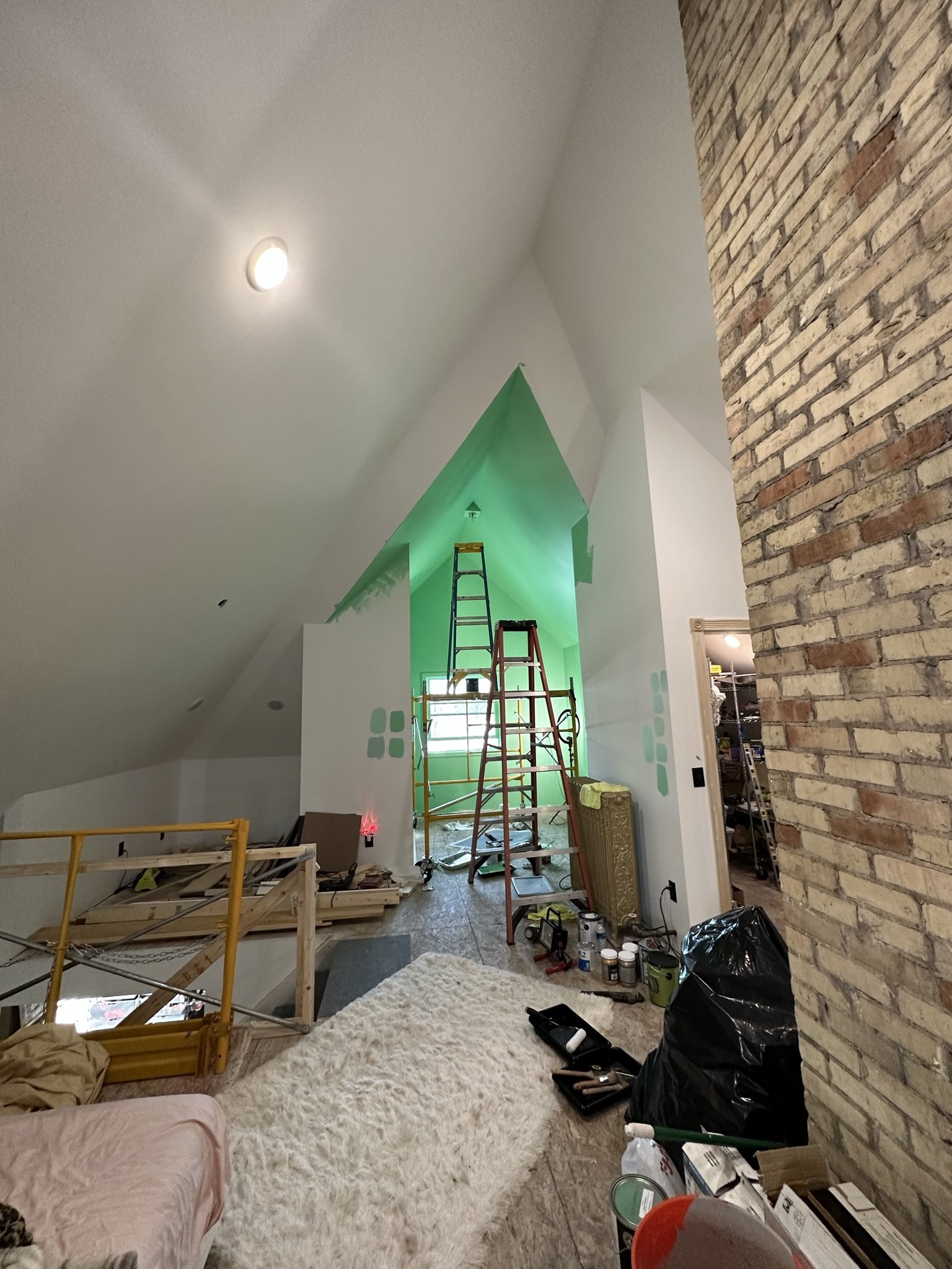
This was taken in the winter of 2023, when I had just started working on the mural in the main part of the room. It was nice to have a sliver of the room done here, so we could enjoy it in the evening while work was ongoing.

The large velvet leopard throw pillow also is from Johnny Was. I do like their home goods and clothing. The marble tiered table to the right would end up being moved to the main part of the room when it was finished.
aTTIC CONVERSION: BEDROOM MURAL
Moving on to the mural in the main part of the bedroom. This is my inspiration photo. It's the Belfry Chamber at the Sleeper-McCann House in Gloucester, MA. I've never seen it in person, but one day I will. It was designed by one of America's first interior decorators, Henry Davis Sleeper, in 1907-08.

I also was inspired by the textiles. When I saw this photo, I remembered I had a king size bed skirt made from a similar material as the coverlet on the bed tucked under the eaves here.

But the main reason I loved the Belfry Chamber is the Zuber hand painted panoramic wallpaper called "Decor Chinoiserie." This was WAY outside our budget. I've seen on Chairish a full set of used panels measuring in total 92" high and 101" long, which was marked down to $3,500 from $6,500. I've seen another 5 panels on grass cloth on 1st Dibs for $66,000! I would have needed at least 7 sets of 7 panels, and it wasn't likely I'd be finding them used lol.

I went through a lot of iterations of this space in my mind, but ultimately I kept coming back to these shades of green. Notably, the green in the Belfry Chamber likely isn't as punchy as depicted in the prior photos (which someone has edited along the way). The room is featured in the book "Zuber: Two Centuries of Panoramic Wallpaper" and the colors are more faded and subdued. Faded and subdued doesn't work well in our house, so I went with the Photoshopped inspiration photos instead.

Ultimately, I chose Pantone 344 U, which is a classic art deco green. It was mixed by myperfectcolor.com. Unfortunately, myperfectcolor changed from Benjamin Moore Aura to Kelly Moore paint right in the middle of our project, which created a huge hassle for me because, while the colors were the same, the sheens were off.

I decided this would be the first ceiling section I would paint, mostly because the height was more manageable than the rest of the room.

Here's the area from another vantage point.

Paints are out and the dog is ready for action!

I found the full panorama of Zuber's hand painted paper online and taped the sections together. Rumor has it that Henry Sleeper had to cut elements from the mural in certain locations of the Belfry Chamber to fit the angled ceilings.

Then I taped it to the wall, where it remained for the rest of the project as my reference.

The print out had handy numbering at the bottom for scale.

Since I wanted to remain faithful to the elements of the mural in this section of the room, I scaled out the numbers and sketched them on the wall.

Because I'm not an artist by training or experience, I used stencils as a crutch. I scoured stencil patterns online, looking for those which would enable me to cobble together a composition similar to the Zuber panorama. I worked in sections, from left to right.

This is a chinoiserie stencil from Designer Stencils.

The birds in the trees, and chinoiserie feel, obviously didn't "match" the inspiration, but it had the look and feel I was going for.

As previously mentioned somewhere in this gallery, I really don't like a "stenciled" look. Plus, I was using stencils from different sources, which meant the styles weren't consistent. So, in my case, the purpose of the stencils was to help with both scale and composition, and rather than applying paint directly over the stencil, I just used them for tracing.
My rudimentary experience with the one stroke technique on the branches in the tower was enough to convince me this was the best way for me, an amateur, to paint something that wasn't a stencil. I simply don't have the skillset as an artist to do complex shading in a manner approaching a Zuber artist.

Several years ago, I gave one stroke painting a try, as I had wanted to do some work on canvas. I was absolutely terrible at it, as this photo amply demonstrates. So, I gave up.

But necessity is the mother of invention. So I set up a work table with my iPad and watched endless YouTube videos, trying to imitate the strokes and techniques of this style.

This was a very frustrating process lol.

A lot of my flowers said please abort this mission and hire a professional.

I practiced for about a week and got to this point. Could they have been better? Yes. But, I didn't have the rest of my life to finish this mural, so good enough would have to be good enough.

This was my workspace. Try and try again.

Now it's time to get down to business. I first started painting the ocean horizon on the left and the ground on the right. This wasn't one stroke...it was just painting and shading the best I could.
Without the grass, the scale of this looks all wrong, but I knew the foliage fillers would correct the scale.

This part I painted all the way to the end of the section.

Here we are with my first flowers and a bird. I did like the three dimensional look created by the one stroke technique and the color contrasts.

It looks just as dimensional in person.
For the flowers, I was much more faithful to the one stroke technique taught by Donna Dewberry. She really does make the technique accessible to beginners and amateurs. I believe she claims to have invented the technique, but single stroke painting has been around since at least the early 1600's. During this time, the Japanese originated the hitofude ryuu technique by which they could paint the torso and other elements of dragons with a single brush stroke. I'm not sure how Dewberry's technique differs, but I am grateful for her online tutorials and the one stroke guide sheets she sells on Amazon.

The process was not without fumbles.

Here's where I was on the fourth day of painting lol. I didn't say I was fast.

As you can see, I used the stencil flowers as guidelines for placing my own painted flowers, birds and branches. Scale and composition were a big part of the battle, and the stencils solved that for me while still allowing me some freedom to create my own unique mural.

Next I added in leaves. Before this, I spent a good three or four hours practicing leaves. They aren't easy.
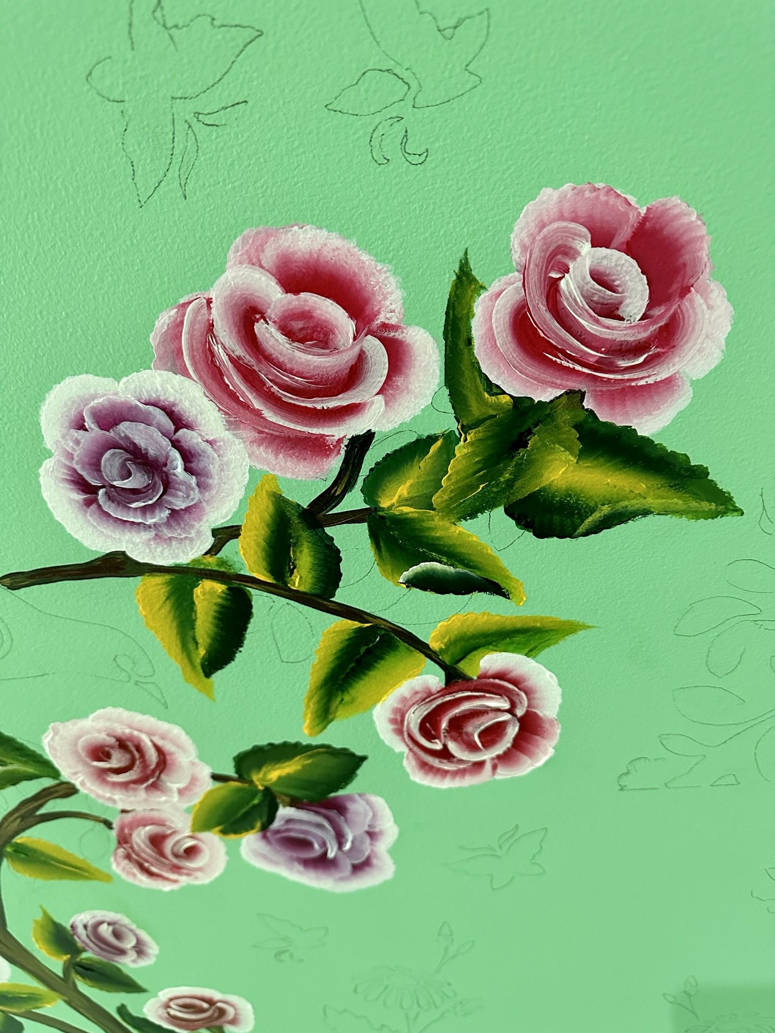
I love how the one stroke technique creates all the shading, detail and dimension you need for verisimilitude in literally just one stroke of the brush.

Now I've completed a full section of the stencil design, of course, with my own painted elements. I completed this on the fifth day of painting.

Red bird is a favorite.

I used the same fluffy feather painting technique that I employed in the tower room.

Then I moved on to the next section, which was a repeat of the first stencil scheme albeit inverted so it didn't look so rudimentary and matchy matchy.

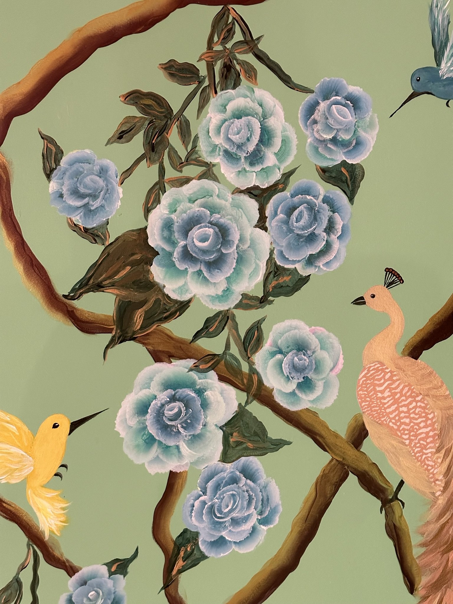
The green flowers were Mike's favorite. I liked the red ones.

Branches are added in, along with some leaves.

Hummingbird stencil sketch . . .

And it turned out like this.

Next I added a dogwood tree, again using a stencil from Designer Stencils to sketch out the elements.

I also used the one stroke technique for these flowers. There are numerous tutorials on YouTube for different kinds of flowers. I chose the dogwood tree stencil mostly because the scale worked with the other elements on this section of the ceiling.

More progress on the dogwood tree.

The Zuber panorama had a stylized peacock sitting on a tree stump. This is the same smaller sized peacock stencil I used in the tower room, and the scale worked well here for a bird on a stump. The stump is one sheet section from a larger palm tree stencil, again from Designer Stencils.

Here's how the bird on a stump turned out.

This is the Zuber bird on a stump in a different colorway.
This is how the dormer section of the mural looked before I added the foliage along the ground.

More frustrating blunders!

Here, towards the left, you can see I've started painting the ground cover.

This is how the groundcover was turning out. This stuff was surprisingly easy to paint.

A close up of the groundcover. Sort of looks like green flames. Whatever. My world.

Here I've added a few stalks of flowers. These also were sketches based on Designer Stencil traces with one stroke painting compliments of several YouTube videos.

Ta dah! I've reached the end of the ground cover, and also added some tropical looking red flowers. I don't think I used stencils for these.
The beginnings of a butterfly. I resolved to not use furniture transfers in the main bedroom.

Another butterfly in the works, again using the one stroke technique.

Another future butterfly.

More butterflies.

One section of the end result.

The next section.
I kept the bodies of the butterflies simple.

This teal butterfly is one of my favorites.

A close up of the tropical flowers, also using one stroke.
Close up of the dogwood flowers and a hummingbird with a super fluffy tail.

Close up of stump bird.
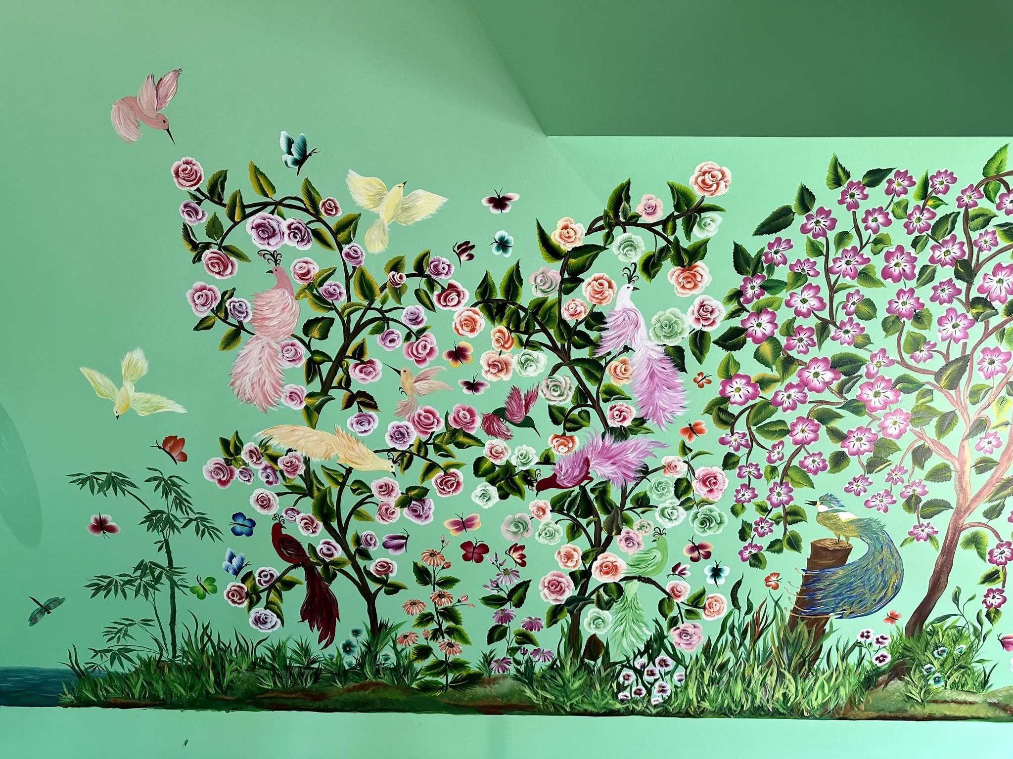
Here's the final version of the left side of the mural.

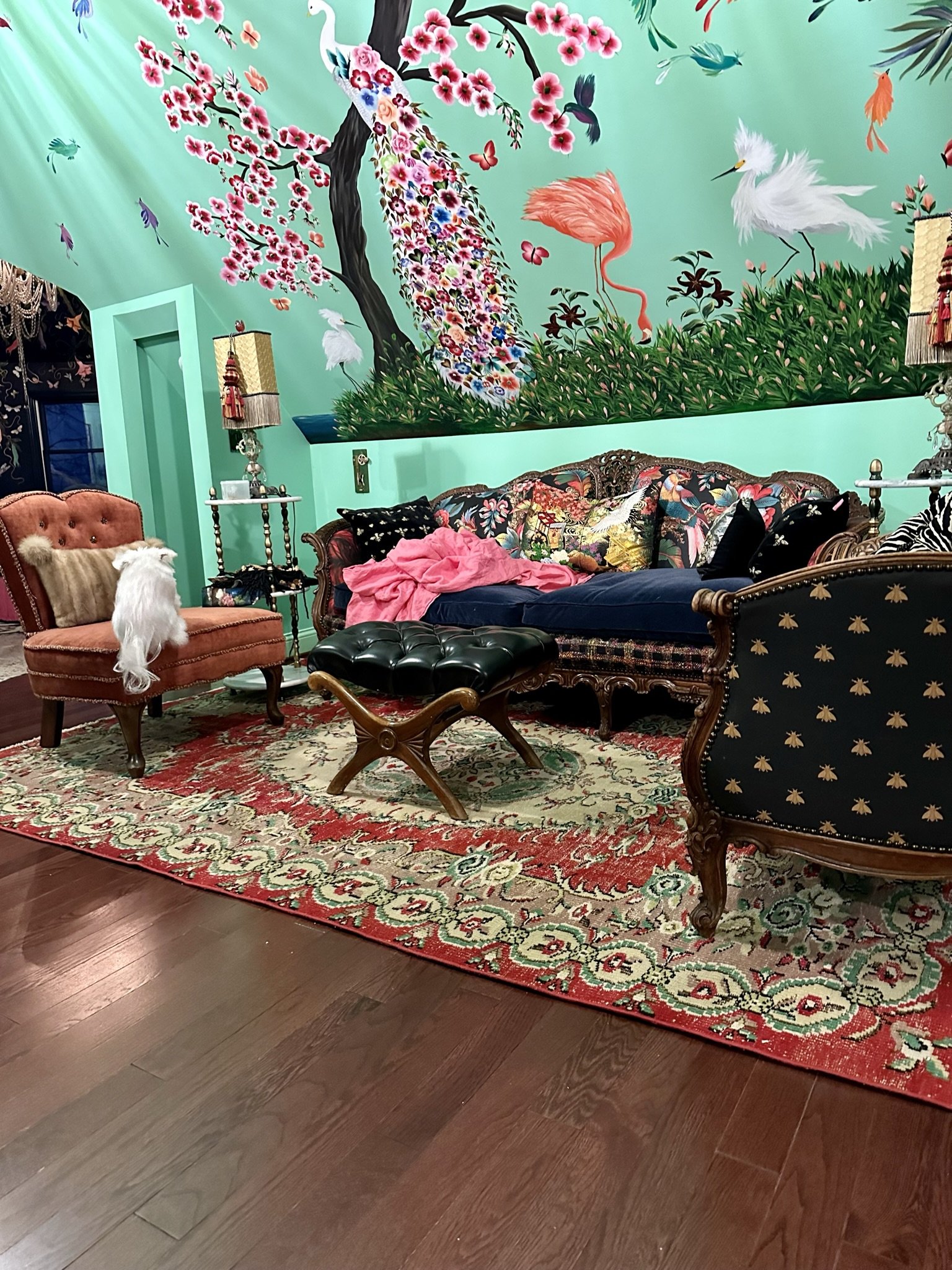
And here's the right side. It's 178" long, in total.

The whole thing.
On the opposite side of the wall, I wanted it simple, so I just painted the ocean and some zoom zoom birds (based on the Greater Racket-tailed Drongo Bird in the Zuber wallpaper).
The next section I tackled was this area, which eventually would be the location of our bed. The ceiling is much taller here than the section I just finished, so I didn't want to do the same mural elements. That's one advantage DIY painting has over Zuber wallpaper -- I could choose and scale my own elements.

I did want to keep the tropical fantasy feel, so again, I turned to Designer Stencils for this palm tree stencil. It's fairly enormous.

First I painted the ocean horizon and ground, just like the prior section.

More shading and stuff. It's amazing what can be accomplished by not getting too hung up on perfection or one's own amateur status.
I sketched out the palm trunk then set about painting in the lines.

More shading here.

Higher and higher. I had to start the trunk whilst standing on the floor, then do the middle sections on the scaffolding, then the upper sections on top of a ladder on the scaffolding. This part of the ceiling is a couple feet lower than the tower, so I was able to get away with a 6-foot ladder. The 8-foot ladder I used in the tower was rough to maneuver on the scaffolding.

For the palm fronds, I wanted more whimsical colors than just plain green. Again, my world.

I started out using the stencils for the fronds, which was a pain. Then I one stroke painted in the lines, which was a bigger pain.

Close up of the shading. All of this is done with one stroke.
From a distance.

More fronds.

Here's how it looked from the scaffolding.

I think by this time I was free-handing the fronds.

Another frond.

And one more frond, free-handed.

Not bad!
From another angle.

Here I've started another trunk on the right. My initial plan was to paint a large peacock on it.

This time, I didn't want to use a stencil, so I sketched this out free hand. Not great, but also not terrible.

Painting within my own lines.

Big fluffy tail!

Different colors. Bigger tail. Where's the trunk lol?

I used metallic paint for this bird. Honestly, I wasn't loving it.

So I added a few flowers on the tail.

Meh. I resolved to live with him for a while before making more changes.

Next up was this flying heron.

I used the stencil for most of this and stayed fairly close to it. Here's how he turned out. Also, you can see I've added some ground cover and flowers. These are all free hand.

Close up of the flowers.

This is how it was looking from afar.

I added more of those red tropical flowers, mostly because they were easy to paint.

I don't think these flowers actually exist in nature lol. I struggled with them.

More shading, trying to make the orange flowers look like they exist in nature.

The view from the staircase area. Oh, and that is a bed. We were using this as our bedroom while I was painting lol.

I added more fluff to the peacock but still wasn't happy with him. I also added more flowers, groundcover and a hummingbird.

Then, I added butterflies.
And zoom zoom birds overhead. They look like flying jellybeans.

From a distance.

Close up of the zoom zooms. I took this picture to make sure I liked the colors, and I didn't, so eventually I would change them.
Close up of zoom zooms and fronds.

Close up of flowers that don't exist in nature. I thought adding the black dots on the petals would help. It didn't. Flowers with measles.

I did like how the shading on the palm trunk turned out.

Zoom zoom.

Lone zoomer.

I changed the peacock's tail by adding these one stroke flowers. Definitely whimsical, but I liked this version better than the fluffy one.

The next section would be over what now is the sitting area, which would extend over the staircase and into the coffee bar area. By far, this is the longest stretch of mural space.

From another angle after painting the ground color.

And from another angle, after I painted the background.

Another vantage point.

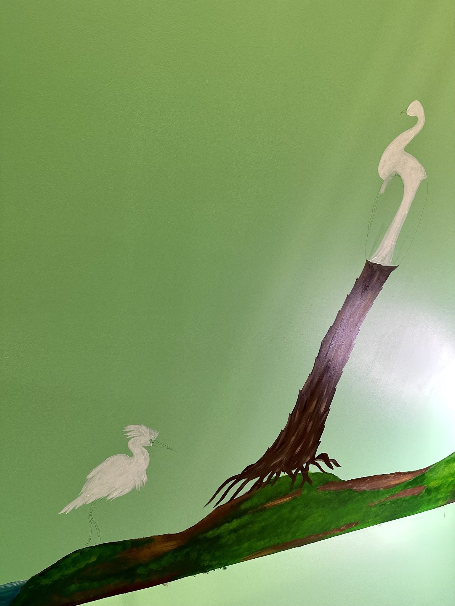
After painting the horizon and ground, I turned to my first bird. This is an image I found on Pinterest. It's a snowy egret. What's not to love? So much fluff!

I first sketched him freehand, using the photo as a guide.

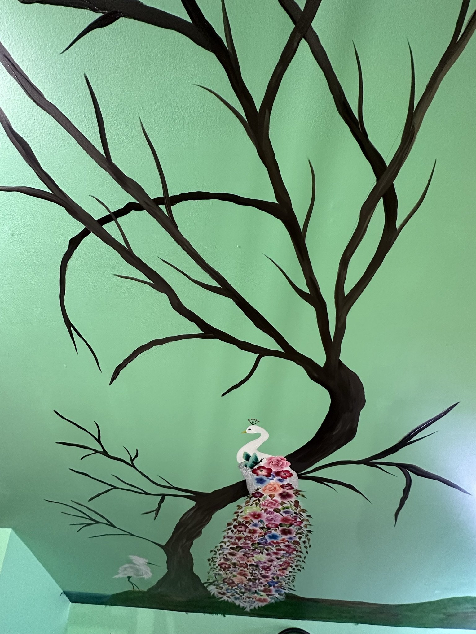
Before filling him in, I sketched a peacock on a stump.

Then I went back to the snowy egret and starting filling him in.
Then back to the peacock.

I added some shading to the egret, plus legs and beak and stuff. I also added more to the peacock, but felt he looked a little awkward.

I found this image online, and felt if I did something like this to the peacock, I could disguise some of the awkward.

So I started adding one stroke flowers.

And more.

More is more.

More and more is better. And I'm sure you've noticed there's so much tail that the stump has completely disappeared.

Could this be enough?

No, lol.

I added a few little feathery details and flowers and butterflies and voila! Most of the awkwardness is undercover. So is the stump lol.

Close up of the tail. This tail took me probably two days.

We were now sleeping in the relocated bed behind the dresser which was now my worktable.

I still didn't like the way the peacock looked because I lost the stump, so I thought I could add a tree that would cross behind him for a little visual interest and dimension and plus would look like he had a perch.

Here's how that went.

Close up of supplies. I used a ton of floating medium.
I painted all this free hand.

Then I started adding one stroke flowers. Technically, they aren't cherry blossoms because they only have four petals. So what are they? No idea. My tree, my rules.

I had to go back and forth between the scaffolding, ladder, and ground level.

I also added in some shading/highlighting on the tree trunk and branches to make it more realistic.

Not bad! The highlighting makes it look twisty.

Then I added centers to the flowers.

I had to continuously step back to make sure the scale worked.

It's turning out pretty!

This view is from atop the scaffolding.

Next I sketched a flamingo based on a photo I found on Pinterest. It turned out fairly faithful to the original image, except the neck was a little long. I didn't care lol.

Here's the photo I used.

I had to mix the colors to get it right.

And then soften the coral with lighter shades that I mixed.

I'm not experienced enough to paint the claws, so I figured I'd just paint grass over them.

Next I used this photo of a snowy egret as a model.
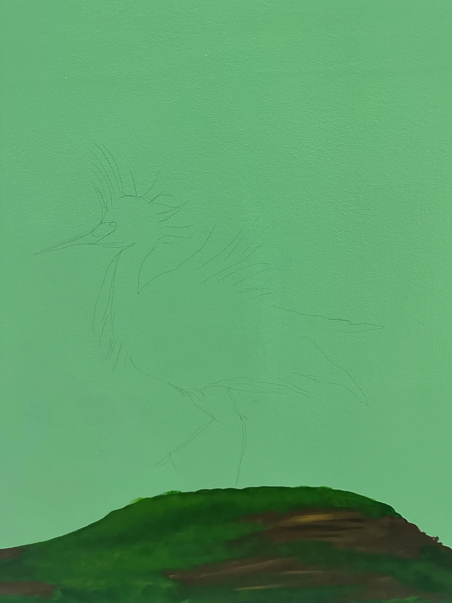
Here's the sketch.

I took a risk and painted a claw on this one.

These are easier to paint than they look.

Here I've added grass and flowers. All of this is freehand.

More grass and flowers on this side.

And here's the vignette.

I freehanded the hummingbird and butterflies.

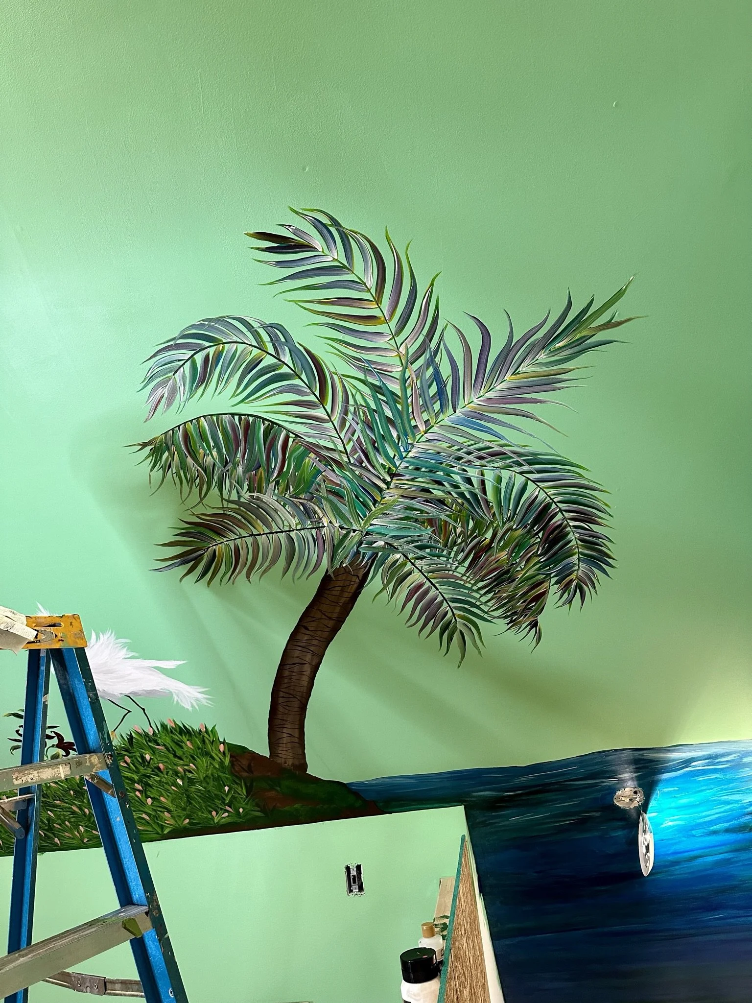
My plan next was to use this palm tree stencil, but I decided it was more trouble than it was worth.

So I used the trunk portion of the stencil as a guide and then free handed the fronds.

More palm progress.
You can see my solution for carrying the mural panorama across the stair hall. I just painted this portion as a continuation of the ocean.

Here's how it looked from a distance.

Zoom zoom birds were next.

These took a long time to paint, mostly because I had to change the colors.
Here I've started another palm tree in the coffee bar area.

Close up of the coffee bar area.

Adding the fronds.
Coming along!

I can't say I really had this side of the mural planned in advance. The elements sort of unfolded as I moved along.

Next, I used this flamingo photograph as a model.

I did try some of those mirroring apps to try to project the photo onto the wall, but that didn't work. So I just sketched it the best I could.

Starting the paint here.

And he's done!

I'm actually surprised I painted this lol.

This was my next element. Slightly more challenging.

Here's my sketch.

This is the color palette.
And here's how she turned out. Not bad!

I felt another bird was necessary to balance things out.

So I found this guy online lol.

He started like this.

He reminds me of Danny Devito's penguin character in Batman Returns.

A fun vignette!
This view takes in more of the panorama over the staircase.

And from another angle, taking in the bathroom.

This view is from the scaffolding, which we moved so I could paint the last parts of the mural.

And here's how that started. The original plan was to put a large piece of art on the wall over the radiator. I changed my thinking as I was working on the mural and had a vision of a great big tree that would cover the wall and cross over onto the ceiling.

This was extremely fast to paint. I think I had this done in a few hours (without shading).

Here's how it looked from the scaffolding. All of this is freehand.

The view from another angle.

This view takes in the mural on the other part of the ceiling.

Here's the view from the staircase landing.

All of the birds on this section of the mural are freehand.

Actually, the entire mural on this section is freehand.

I had learned enough using the stencils to do decent freehand work (especially since it's not for hire and I only have myself and my husband to please).

I never did erase the pencil outline for the beak. I wanted some of the pencil sketching to come through.

More birds landing. Tweet tweet.

For all of this, I am using acrylic paints from Hobby Lobby (I like their Master's Touch paints which come in larger containers and are very easy to work with using the one stroke technique).

For the birds, I just found images on Pinterest. Some of the Pinterest images were AI, but I didn't figure that out until later lol.

Here, you can see some of the shading I've added to the tree.

The obligatory red bird.

A larger profusion of one stroke flowers. By this time, I was getting very fast and these flowers.

This bend in the tree worked out well as it looks balanced from several vantage points.

Here I've started a freehand peacock.

The view from the staircase.

The tree is filling out.

Here, I've started to add some swirls/tendrils with gold oil paint.

And it's done. Just need to add some zoom zoom birds. Note how from this view, the tree looks like there's no bend where the wall turns.
A close up showing how well the bend around the wall turned out.

I amaze myself with this bend lol!

The bend from another angle.

This angle shows the bend around the wall.

Another angle.

Close up of my freehand peacock.

The last step: filling in the gaps with more birds.
ATTIC CONVERSION: FURNITURE, LIGHTING AND DECOR

We spent a lot of time trying to find lighting solutions which sufficiently illuminated the space AND were pretty. The can lights the electricians installed provided illumination, but were ugly, and the color wash from the LEDs in the can lights was not flattering. We finally settled on four matching vintage Murano pendants I found on Etsy.
Waaaayyy better than the cans.

I hate LED lights, but we did use LED bulbs simply because I could get more illumination from the LEDs. I may go back to incandescent in this room, assuming I can still find them. Incandescent is just far more beautiful and we don't get the horrible disco flash that LEDs are known for.

This area here originally was designated for the bed, but we changed gears and decided to make this a sitting area. I found this rug, and the other rugs in the main part of the room, at a Turkish rug shop on Etsy.

For the furniture, we asked our friend Kat Garrand of The Crazy Chair to reupholster vintage pieces she had on hand. The tropical Edwardian Parrot fabric worked well with the space.

Kat's style is collage/assemblage.

We had some of our young friends haul these heavy pieces up two flights of stairs.

And here they are in place.

Next on the agenda was a coffee table. I searched high and low for something that worked.
And ended up with this. Totally the wrong scale. Oops.

Then I remembered a friend told me she had a coffee table in her garage that she thought would look good in our house, so I took her up on the offer. The scale was perfect!
I just needed to change some of the color and finish. So, on the top of the table, I added furniture transfers to the existing metal leaf finish.

Then I painted the sides and legs with an Annie Sloan green chalk paint.

To protect the top surface, we poured resin.
This one took us two or three pours to get right. With resin, the temperature and mixing conditions have to be exactly perfect. In this case, this unfortunately meant not following the directions on the packaging completely.

Here's Mike getting air bubbles out with the blow torch.

Voila! Plus, you can see my hot glue portieres in the background.

Turning now to my vanity. We (I) found this vintage piece on Chairish long before the room was ready, so it sat in Mike's office for about a year before it could be moved into position.

Here it is in situ. Unfortunately, it had broken during shipping, but fortunately, Mike is the King of Bondo and can fix anything.

I love the adjustable triptych mirror style.
We put the vanity near the dormer window because the lighting here is so good. The struggle was finding low slung furniture and filling out the space.
This dresser was one of the first pieces of furniture I purchased on my own, after graduating from law school.

This would be the third time I painted it.

I used Annie Sloane and Dixie Bell chalk paint for this, and furniture transfers.
As I was working on the piece, I felt it looked too fresh and new.

Which wasn't necessarily a bad thing. It did sit well with the mural overhead.
I decided to go all out and use furniture transfers on the sides of the drawers.
Mainly I did this because Mike complains about me leaving the drawers open all the time lol.

My first step to toning down the "freshness" was a black wax. Didn't love it.

So I added a clear wax over it all, which knocked back the blackish finish. Better.
Then I added gold and copper waxes over it all. Even better.

I found this wonderful cabinet on Facebook Marketplace. The seller told me it was his mother-in-law's, and she used to travel the world. Based on that, and an almost identical cabinet I found online for about 8 times more than I paid, this appears to be an antique French medical cabinet used in a doctor's home office.

We also found this home bar on Facebook Marketplace.

Who doesn't need a home bar in their bedroom lol?

I was able to appropriate bedding from other places in the house.

Remember this view? I called that dormer area "saw corner."

Now it looks like this.

From the other direction. I love the Lord. And our dog.

Next up is the media cabinet. I wanted a curtain for this area.

When we were in France, I discovered textiles by Voglio Bene and bought a few. This Voglio Bene velvet tapestry, however, I found on Etsy. I added trim to it using hot glue.

Pretty fancy!
I also added trim (with hot glue) to some double sided "velvety" drapery I found on Etsy.

Then attached these with medallions to create portieres at the entrance to the tower room.

Mike enjoying the room's progress.

This originally was going to be our bathroom sink cabinet.

I painted it and added gold foil butterflies.

Then Mike realized it was going to be too small given the size of our sink, so we decided to use this piece in the coffee bar. We still wanted to pour resin on the top though for protection.

After putting it in the coffee bar area, we decided the black wasn't working with adjacent furniture.

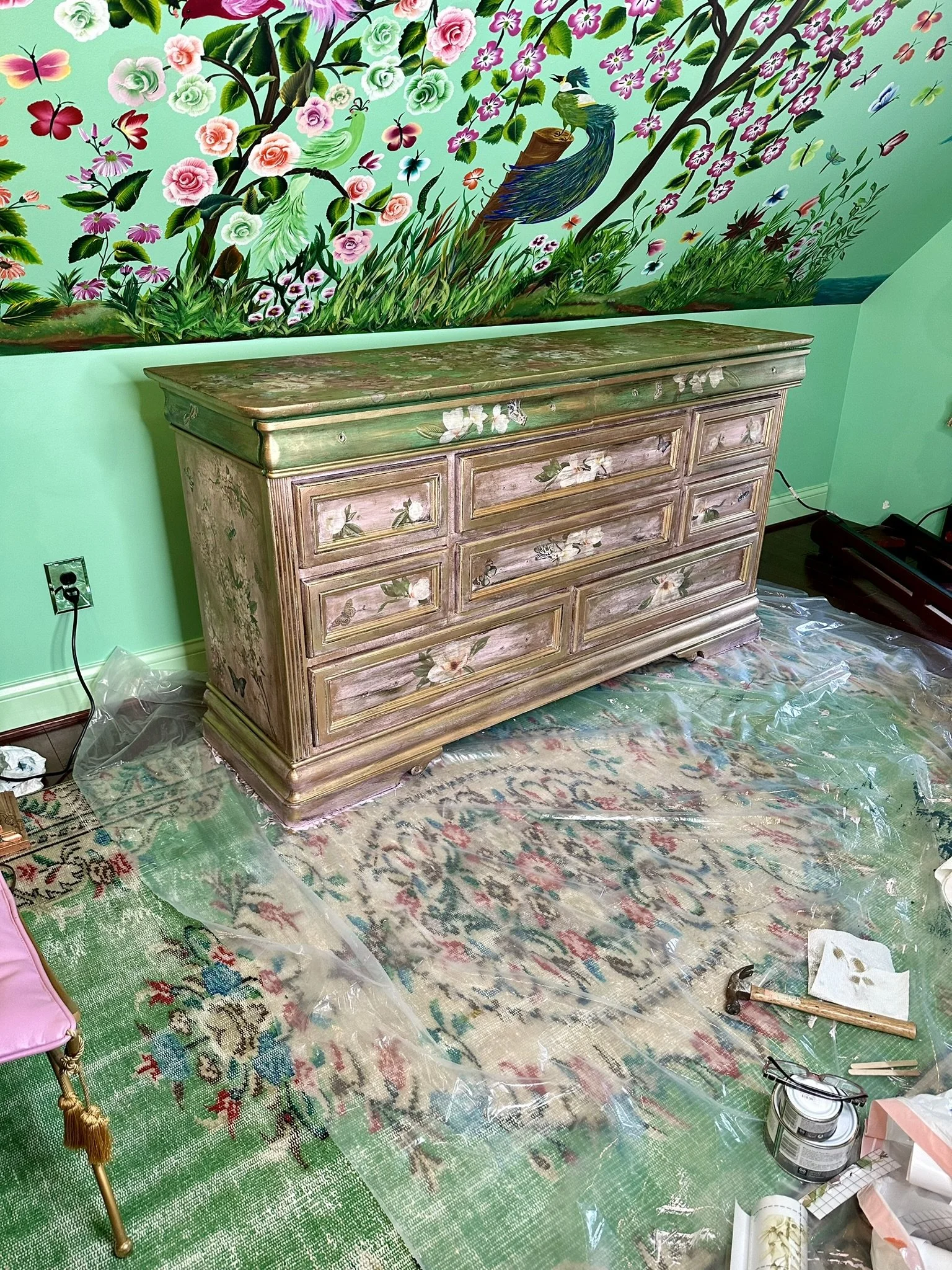
Which included this hand painted commode, of unknown origins, which we found years ago when we lived in Old Towne Orange. I did a Google Image search and found almost identical pieces on First Dibs ($3,800) and at an antique store in Florida ($5,800). We paid around $400 for it. The First Dibs seller listed it as a mid-century Central European chest. The Florida seller called it a vintage Spanish Colonial Buffet. I tend to agree with the First Dibs seller.

I painted the main cabinet area the same Annie Sloane green used on the coffee table so it would sit better next to the hand painted commode.

This was a much better look for the space.

I added some butterflies to the buffet to disguise some flaws in the paint.

I enjoy the reflections in the closet mirror. Plus Bees.
ATTIC BATHROOM MURALS, CHANDELIER, FITTINGS AND FINISHES
Remember, this is what the bathroom looked like when it was framed, after adding the dormer.

And here's how it looked after it was drywalled.

Because the bathroom and main bedroom are open, I didn't want to break up the base color.

I struggled mightily with a concept for this ceiling. My original thought process was something with Art Deco vectors. The angles just felt like the ceiling would lend itself to that type of motif.
The view from the other side of the room.

Meanwhile, back at the ranch, here's the winter view out the bathroom window. This was my view while I was working on the ceiling.

Turning back to the ceiling, I found this photo in a review section for either a paint or furniture transfer product on Etsy and thought it was beautiful, so I screen shot it. I thought this was something I could implement on the ceiling, and Mike encouraged me to go in this direction.

I ordered a bunch of decoupage materials, furniture transfers and copper leaf. Because it's a collage concept, I didn't really have a plan except to start whacking it all up on the ceiling.

I had to take care with the water based decoupage paste, as that would tarnish the copper leaf on contact. This meant allowing the decoupage to dry completely before starting a leafing section.

Basically, its a layering process. It wasn't looking great here, but I knew, with additional layering, it would turn out similar to the inspiration photo.

I had these little birds left over from the lounge front bar project.

I just kept layering materials over and over. I did a detailed blog post and tutorial about this ceiling which you can read at https://www.thebeigeblues.com/thebeigebluesblog/mixed-media-art-ceiling.

Here, I've layered more copper leaf randomly over the decoupage.
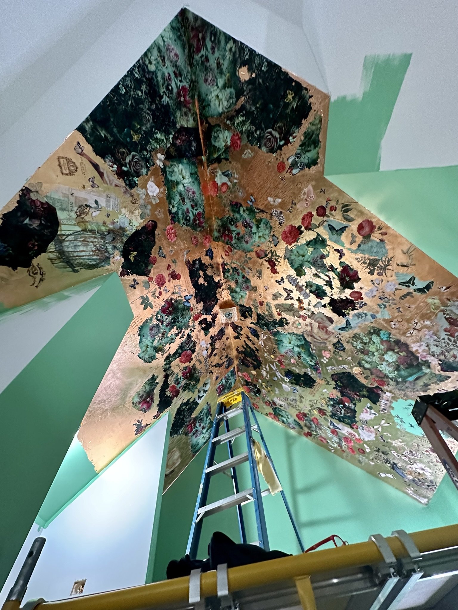
It's starting to look more like the inspiration photo.

More and more layers!

After getting the layers where I wanted them, I added some hummingbirds (I used stencils to trace these out then hand painted the birds).

This is how it looked before adding some glazes to deepen the copper leaf.

I rubbed on copper and gold pastes to give the copper a richer look.

I also used a rosy pink glaze.

This is the area over the shower. I applied multiple layers of Polyvine varnish over all of this as a topcoat, and it has held up well without tarnishing over the past couple years.

Next up was this wall area over the window. This was my first shot at the one stroke painting (I did this wall before the main part of the bedroom, so it was my maiden voyage).
I practiced the one stroke roses A LOT before I started this, and never had them perfected or even decent. I thought if I waited to get good at them, I would never finish or even start the mural. So, these aren't the best, but I learned a lot, and by the time I finished the room, I was a lot better at painting these types of flowers.

I also bedazzled the chandelier.

I used hot glue and doo dads from the craft store and Amazon.

You can read about the entire process for bejeweling chandelier at https://www.thebeigeblues.com/thebeigebluesblog/how-i-created-those-fancy-bejeweled-chandeliers.

The chandelier (I did one in the tower too) are inspired by the Erickson Beamon Custom Chandeliers. The Erickson Beamon Chandeliers are impossible to come by, and when you do, they are $25,000. So, I made my own version.
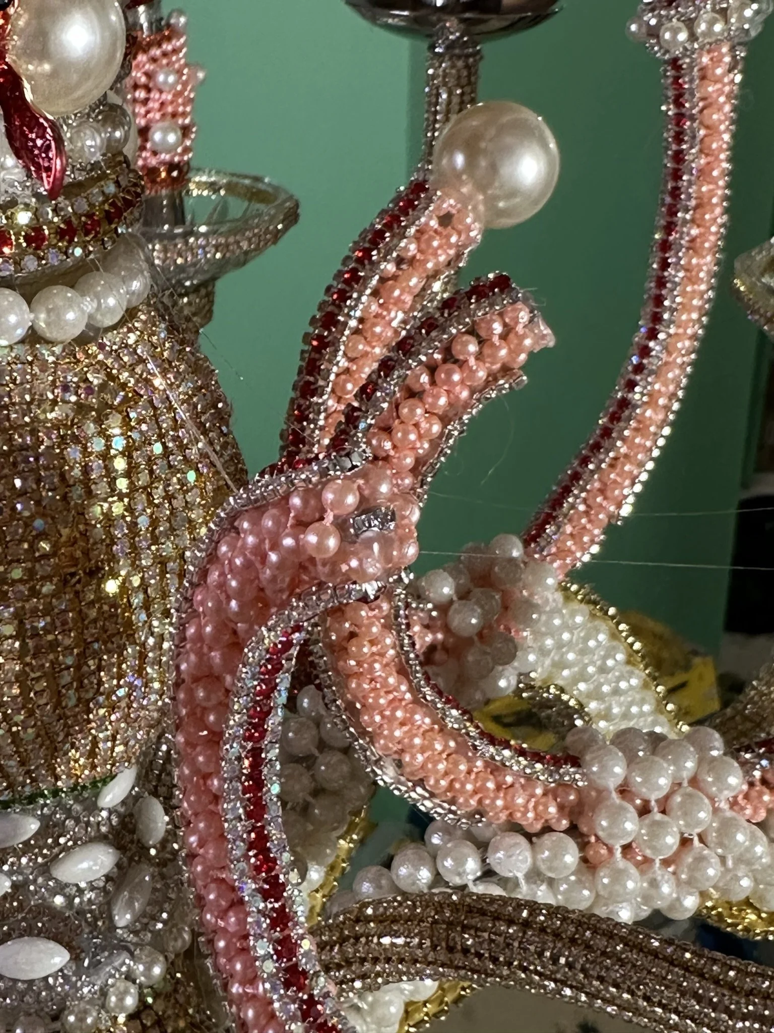
I pick up materials for these projects whenever I see them on sale. These are faux pearl garlands/trim rolls from the hobby store and loose faux pearls from Amazon.

There is a lot of layering and detail. The fish pins are from Amazon. Also, some of the materials come from Etsy. Just search for rhinestone trims.

Here's how it turned out.

I also added pinkish chandelier crystals which I found on eBay.

I also used rhinestone buttons (just cut the backs off with wire cutters).

Another close up.

The view at night.

Next up is the shower. Our first idea was to use red tile with this tile mural.
Mike was dreading this project, as the builder/contractor didn't do a great job on the shower. Nothing was even, straight, or plumb.
He used the Schluter system.
The project would've gone smoother if the builder had not drywalled the shower. This also caused us to lose a few inches of shower space.

Mike was completely perplexed by the builder's placement of the fan in the shower lol. Equally perplexing were several switches that controlled nothing (and remain useless to this day).

I didn't do photo documentation of the entire project, mostly because it was incredibly frustrating due to the previously mentioned issues. In any event, here is the beginning of Mike's tile work. As you can see, we switched to black tile.

Mike also covered up the absurd and useless bathroom fan-in-the-shower situation.

The tile is from Tile Bar. Nothing special.

Almost done!
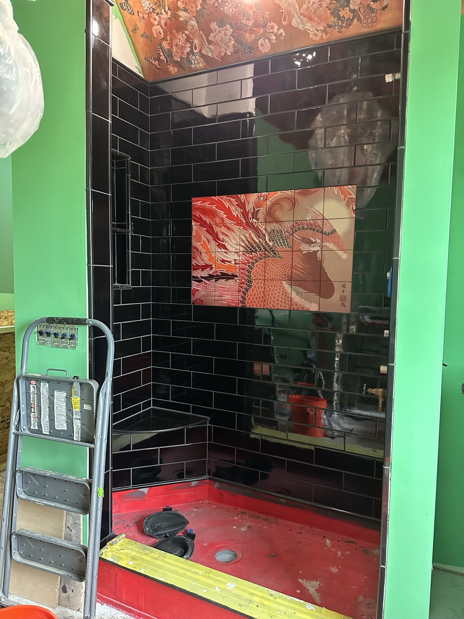
And the tile work is complete, at least on the walls.

Here we have the shower door installed (we had a local glass company do this work).

For the sink vanity, we found this antique or vintage buffet on eBay. It fits the space and has pretty good storage, even after losing the top drawer due to plumbing the sink.

I painted the top with a black chalk paint.
And then painted some detail with copper oil paint (this is model car paint).

Here's the sink, which is by Kohler. Oh, and here's the tub, which is acrylic.

We went with a small sized tub, but in retrospect we could've gone a little bigger. We just weren't sure how much space the sink vanity would take since we hadn't made that purchase at the time we needed to spec the tub for the builder/subs to rough out the plumbing.

Here's the tub basically where it will live, along an angled wall. I was testing rugs here. I loved the look of this rug, but it smelled horrible, so now it resides in the basement.
Here's Mike doing something. I have no idea what lol.

We found a garden variety medicine cabinet on the Bed, Bath & Beyond website and painted it black.

This was part of the resin pour process. One challenge was getting the cabinet perfectly level, as the floor in the space is massively uneven.

This also is part of the resin pour process. I had already added furniture transfers to the countertop, and we did a resin pour over the counter area. It's an Iron Orchid Designs transfer set called Wander, and it looks great with the sink.

This is the status quo for the dog.

Now, the resin is poured. We also had a snafu with this pour and had to redo it, as I should've wiped down the furniture transfers with rubbing alcohol to remove all residual oils. After I did that, the pour turned out great.

Ready for the sink.

And the sink is in place.

Here is some random decor. We found the pagoda shelf on Chairish.

I made these curtains with hot glue. No sew!

We found the mirror at an antique shop in Manistee, Michigan and the peacock oil painting above it at an antique shop in Elk Rapids.

I love having the tub open to the room.

I have a thing for mouse taxidermy!
STAIRCASE AND FORMER “MAID’S” ROOM

The LAST ROOM IN THE HOUSE is next on the agenda.

This is the original "maid's room," where the servant (no doubt, a maid) lived when the house was built in 1902.

This is the view towards a small closet on the right and the original stairs to the attic on the left.

Here's the view with the attic stairs door closed, which is how we kept it due to extreme temperatures + bats in the attic.
Someone at some point in time added these shelves.

Here, the shelves to the left have been removed and we're preparing for the contractors to tear out the closed and old staircase.
Here's the same view with the drywall.

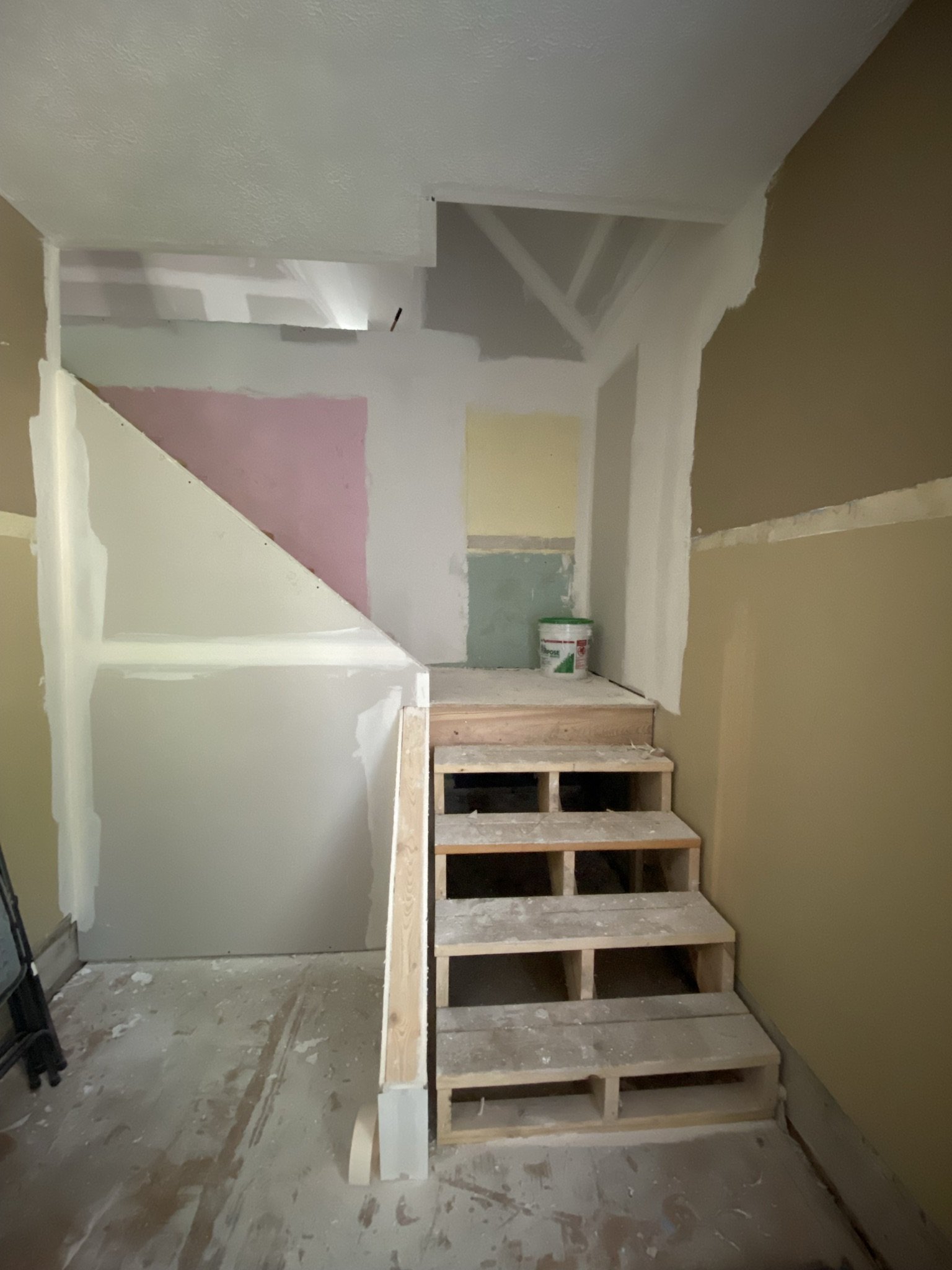
Stairs and closet are now demolished and the new stairs are roughed out. This only took a day.

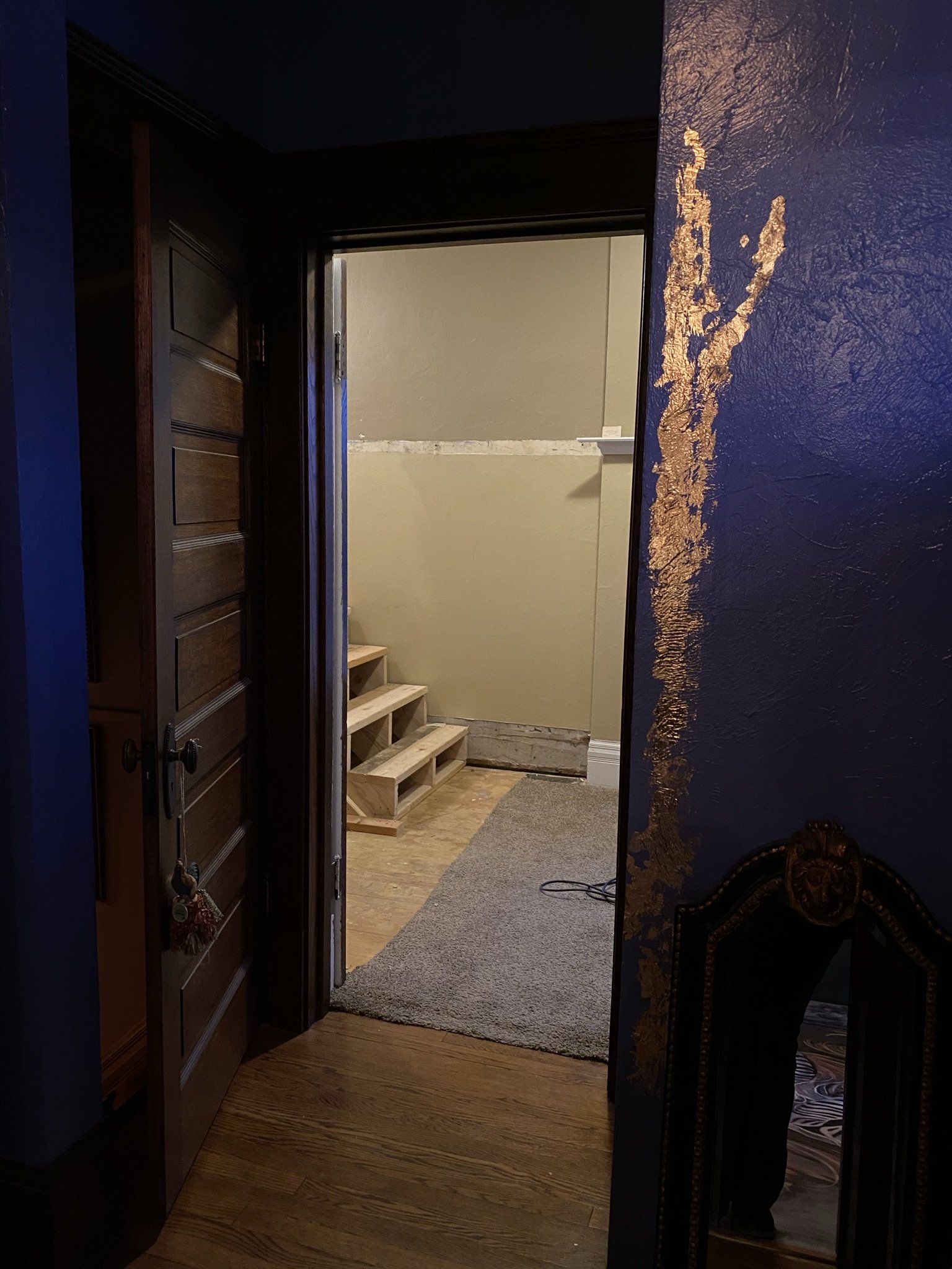
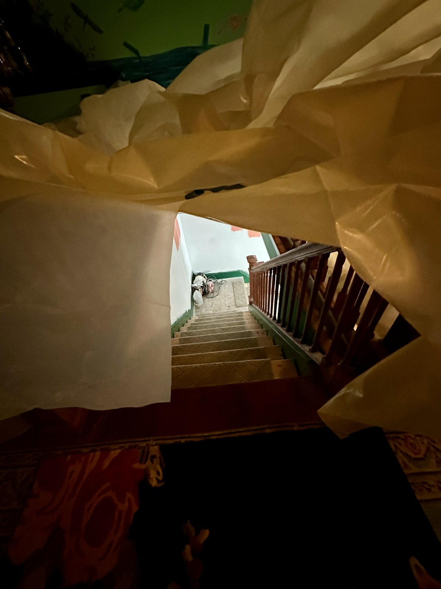
This dump was our view from the landing of the stairs for about three years. That's how long it took us to finish the attic and get the motivation to finish the staircase and maid's room.

This, again, was our view for about three years while we worked on the attic. I originally was thinking of a coral color for the walls but, as you will see, changed my mind.

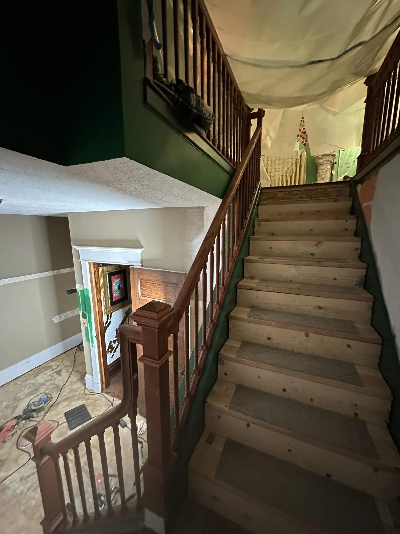
The view up the first run of stairs.

And the view up to the attic.

The contractor's job was to build the structure of the stairs and Mike's job was to do all the finish work. Because the stairs weren't built to the same depth (I'm not kidding), Mike ended up rebuilding them.

This was the view before we finished the stair rails.

Here we've taken out the safety barriers.

Mike at work building the safety railing.

I've started painting the trim a Benjamin Moore color called Rainforest Foliage and Mike has already rebuilt the steps and is beginning to install the newel posts.

Beginning to install the balusters (I stained these).

The only reason we were motivated to finish the stairs is I agreed to put our house on a holiday home tour lol. Otherwise, I doubt these stairs would be finished today.

Safety rails are up.

Mike and his brother doing measurements for installing the handrail.

This was a complex process, since Mike has never built stairs before. And he will never build them again lol.

It's coming along!

The view looking up.

The maid's room was still a dump though.
Staircase view after completion and before carpet.

Here I've started sanding the maid's room floor. These are the original wood floors which had been covered with an awful carpet adhesive.

This was a lot of work and made a huge dusty mess.
We hired someone to do plaster repair in the maid's room and to make the ceiling smooth so I can paint something creative on it. Here, we've tried to mask off the attic to protect it from the drywall and plaster dust, but it still was an unbelievable disaster.

The drywaller did great work!

The view before I painted.

This was the corner that had the shelves.

This is the view from the door/hallway.

I painted the ceiling a soft green/blue as I intended to paint clouds on the ceiling.

We found the antique light fixture on Etsy. Mike ended up rewiring it.

I painted the walls Amazon Moss and the trim Rainforest Foliage (both by Benjamin Moore). I rarely copy anything I see online (except birds lol), but I saw this color combination on Pinterest and just stole the idea. No shame.

The ceiling medallion is an inexpensive Amazon find, which I painted.

Here, I've started painting the floor the same color as the trim. I'll eventually do some sort of stenciling or mural design on this.

I love the color drenched look.

The green is absolutely gorgeous in certain light.

In my opinion, this is one of the best transformations in the house. It exceeded our expectations.

Next up is the staircase carpet. We ordered these area rugs (Safavieh) which Mike planned to cut and install.

Here are Mike and his brothers cutting and installing the area rugs.
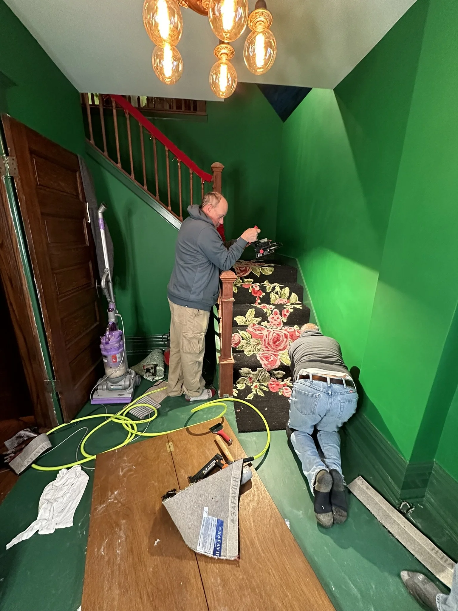
This was a lot of work, but far less headache than having to deal with contractors who may or may not show up and may or may not do good work.

Here, Mike has finished installing the carpet and the house is ready for the holiday home tour!

To the right is the armoire I painted in the same color as the trim with gold details. The green and metallic gold sheers are from Amazon, believe it or not. Plus, happy dog.